Fireball
Responsive Email Design Guide: How-To, Examples, Tips & More
This article has been contributed by Ajeet.
With the torrid growth in the usage of mobile devices, it has become quite crucial to accommodate responsive design in your email marketing strategy. That’s because when an email newsletter, which looks look superb on desktop, fails to render properly on a mobile device, respondents either hit delete or unsubscribe.

With responsive email design, you will not only be able to stay ahead in the email marketing game, but also can take the full advantage of the mobile revolution – an unstoppable change.
This article is written with the intention of making you expose to the exceptional benefits of implementing responsive design in your emails and teaching you the fundamentals of building responsive emails. Hopefully, it will help you make your email communications more effective, delivering your recipients an optimal viewing experience.
Why You Should Adopt Responsive Email Design
According to a recent study by Litmus, a reputed email analytic provider, over 51% of emails opens occur on mobile devices and people check their phones an average of 150 times a day. A survey conducted by BlueHornet, a leading email marketing solutions provider, has revealed that if an email is not optimized for mobile; over 80% of recipients delete it and another 30% unsubscribe it. Additionally, over 63% of consumers are interested to make a purchase, if they find an email look good on their mobile devices.
These all statistics not only demonstrate the rapid adoption of mobile devices, but also make you aware of how comfortable people have become reading emails on the go. Following are the key reasons why you should optimize your email for mobile devices :
1. Enhanced User Experience
When you incorporate responsive design in your email, your readers are able to access it while they’re on the move. They can navigate with ease and don’t have to pinch or zoom to read the content of your email. Bigger and better-spaced CTAs clearly tell them where they should click to make a purchase without having to worry about imprecise clicking. If they find your email look perfect on the receiving device, they can be interested in reading rest of your emails.
2. Increased Conversion Rate
If your emails and landing pages are well-optimized for mobile viewing, you don’t need to worry about low conversion rates which caused due to a non-responsive/faulty design. Responsive emails enable you match how you sell with how your consumers shop your products or services, hence you could get unlimited orders regardless of where your emails are consumed. No matter your customers are on the go or seated relaxed in office; they’re always ready to make a purchase.
3. Bigger Sales
Once you’ve got success in capturing the interest of your readers, chances are they will prefer to make the purchase on a mobile device rather than on a desktop or laptop. Responsive emails render perfectly on all types of devices, creating a great first impression with your customers. Think, if your customers take the decision to purchase your product/service while seated and relaxed, are you not likely to sell even more?
4. Higher Click-to-open Rate
Responsive design is more powerful and effective design technique than fluid and scalable design. Though it is little bit difficult to implement, but is the best mobile email design strategy to boost your email open rates. A recent study by MarketingProfs has revealed that responsive emails have a 21% higher click-to-open rate (11.9%) than non-responsive ones (9.8%). For this reason, it’s better to go 100% responsive than scalable or fluid.
5. Reduced Unsubscribe & Spam Complaint Rates
As we mentioned before, if an email doesn’t display well on mobile, 30% of recipients unsubscribe it. When your readers are not able to view your emails properly on their small screen devices, they can mark your messages as spam – an email reputation and deliverability killer. By adopting responsive email design, you can create a wining first impression and avoid frustrating your readers, resulting in lower unsubscribe or spam complaint rates.
How to Make Your E-mail Design Responsive
After understanding the importance of responsive email design, let’s learn how to incorporate responsive design in your emails.
Responsive emails make use of CSS media queries, also known as @media, which are the main part of responsive design. Media queries are a special set of CSS styles that work like dynamic CSS rules or conditional ‘if-then’ statements. They detect the screen size of a device and then apply different dynamic rules to render the content according to that screen size. Carefully implemented, they can optimize readability of your emails for different screen sizes.
Different types of mobile devices support different media queries. This means you need to target different devices according to their screen resolutions. For example :
<style type="text/css">
.standardCSS{
        		color:#5d5d5d;
       		 font-size:20px;
}
@media only screen and (max-width:480px){
.mediaQueryCSS{
color:#d9d9d9 !important;
font-size:25px; !important;
}
}
</style>
This media query restricts the rendering of CSS styles to the screen size of 480px or less. Every style rule you write within the media tag should end with “!important”. So that, the media query CSS override any inline style once it’s triggered. Following is a list of CSS Media Queries for most popular devices :
- Smartphones: Portrait
@media only screen and (max-width : 320px) - Smartphones: Landscape
@media only screen and (min-width : 321px) - Smartphones: Portrait and Landscape
@media only screen and (min-device-width : 320px) and (max-device-width : 480px) - iPads: Portrait
@media only screen and (min-device-width : 768px) and (max-device-width : 1024px) and (orientation : portrait) - iPads: Landscape
@media only screen and (min-device-width : 768px) and (max-device-width : 1024px) and (orientation : landscape) - iPads: Portrait and Landscape
@media only screen and (min-device-width : 768px) and (max-device-width : 1024px) - iPhone4
@media only screen and (-webkit-min-device-pixel-ratio : 1.5), screen and (min-device-pixel-ratio : 1.5) - iPhone 5: Portrait
@media only screen and (min-device-width : 320px) and (max-device-width : 568px) and (orientation : portrait) - iPhone 5: Landscape
@media only screen and (min-device-width : 320px) and (max-device-width : 568px) and (orientation : landscape) - iPhone 5: Portrait and Landscape
@media only screen and (min-device-width : 320px) and (max-device-width : 568px) - Desktops and Laptops
@media only screen and (min-width : 1224px) - Large Screens
@media only screen and (min-width : 1824px)
Email Clients That Support Media Queries
Unfortunately, media queries are not supported by all email clients and mobile devices. That’s why, it’s very crucial to know which devices have support for responsive email. Unless you have a complete list of media-query supported devices, you’ll not be able to ensure your email will be responsive on all mobile devices.
Keeping this in mind, we present to you a list of email clients/mobile devices with their media query support.
|
Client |
Media Query Support |
|---|---|
|
Android 2.1 Eclair |
No |
|
Android 2.2+ |
Yes |
|
Android 4.0 (Gmail) |
No |
|
Android 4.0 (Email) |
Yes |
|
Microsoft Windows Mobile 6.1 |
No |
|
Microsoft Windows Mobile 7 |
No |
|
Microsoft Windows Mobile 7.5 |
Yes |
|
Microsoft Windows Mobile 8 |
No |
|
Microsoft Surface |
No |
|
Apple iPhone |
Yes |
|
iPhone Gmail, Mailbox app |
No |
|
Apple iPad |
Yes |
|
Apple iPod Touch |
Yes |
|
iOS 6 |
Yes |
|
BlackBerry OS 5 |
No |
|
BlackBerry OS 6/6+ |
Yes |
|
BlackBerry Playbook |
Yes |
|
Amazon Kindle Fire/Fire HD |
Yes |
|
Samsung Galaxy S3+ |
No |
|
Palm Web OS 4.5 |
Yes |
|
Yahoo! Mail mobile app (all platforms) |
No |
|
Microsoft Outlook Exchange android app |
No |
Responsive Email Design Examples
TOMS Newsletter

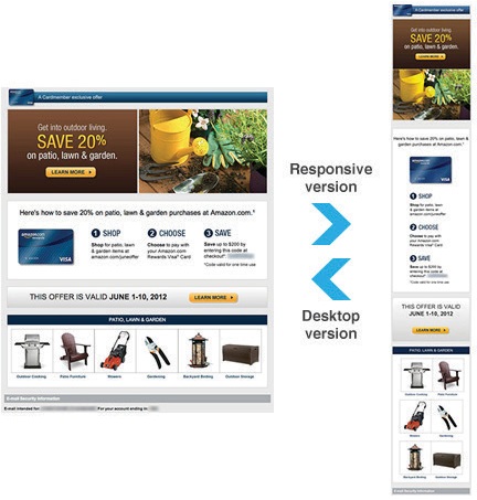
Amazon
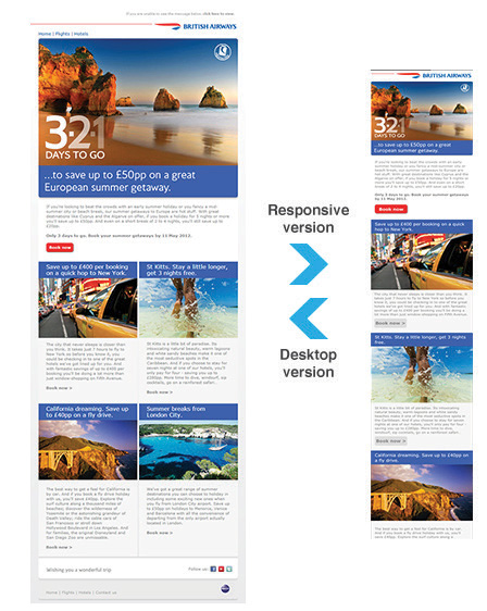
British Airways
Hilton HHONORS

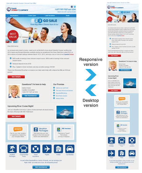
Cruise Help Center
Responsive Email Design Resources
- What 22 Billion Newsletters Tell Us About Designing For Mobile Email
- MailChimp Responsive Email
- 10 Handy Responsive Email Tips
- Email Design Lookbook
- Responsive Email Guide PDF
- From Monitor To Mobile: Optimizing Email Newsletters With CSS
–
Ajeet is an experienced web developer at CreativeWebLogix – Get Your PSD Converted into Responsive. His areas of interest are WordPress, HTML5, CSS3, and Responsive. You can follow @CWL_WEBDESIGN on Twitter. Photo Copyright: delightsoft / 123RF Stock Photo
Traffic
Figure Skating Diagrams
A Lament for Hastings
Rush Hour
Announced: 2014 Brand New Conference: Last Call
Online Registration Closes Thursday

This is it. Tomorrow, Thursday September 18, all day and all night is the last day to register online for the 2014 Brand New Conference in Chicago, IL on September 25 – 26. This applies to both in-person ticket and live webcast registrations.
Walk-ins will be accepted on the days of the event. Only full registration cost will be available — no half days.
Webcast registrations will NOT be taken after this deadline.
If you are on the fence about going or not going: I am biased but… GO, it's going to be a great experience, at least if measured by the insanity of work and e-mails currently going on at UCllc headquarters.
For those of you not attending expect blackouts of content from Tuesday or Wednesday on.

Kubrick - An Art Show Tribute
Don't Tell Me
Ray Bradbury estate
UNDDTTVEBXDUBXKTQ I, III, V, I, B, X
Band
Beko gets an update
Founded in Turkey 1954, Beko specialises in electrical consumer goods. Worldwide, Beko-branded goods are sold every two seconds.
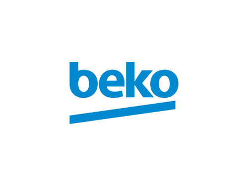
Sagi Haviv of Chermayeff & Geismar & Haviv has just finished redesigning the company’s wordmark. He kindly answered a few questions about the four-month project.
What did you feel was lacking with the old Beko design?
We were unhappy with the typography and the lack of balance in the existing wordmark. When you set the word in caps, you inevitably get an unbalanced composition with the very closed B and E on the left and the widely open O on the right.
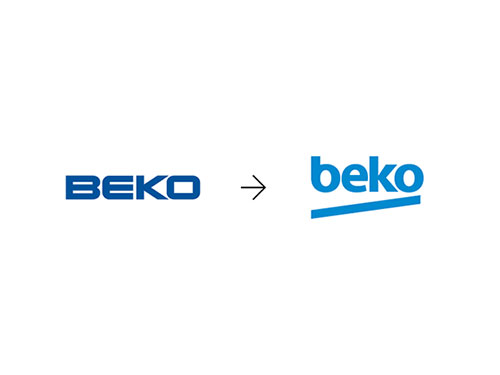
From a personality standpoint, it seemed to us that the existing design projected the wrong image. The brief we received from the client talked about the primary target audience being between 18 and 35 years of age and described the desired identity characteristics as youthful, dynamic, full of energy and approachable. The design they had with its elongated rigid all-caps lettering was the opposite of that.

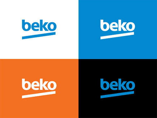
The challenge was to do something very simple that didn’t rely on color so it could translate well to the all-important applications on the appliances. Going with all-lower case was a way to bring in a youthful look and approachable attitude and also to balance the word visually. The tilted underline was a simple, almost rudimentary way of injecting energy and dynamism. We also suggested a brighter blue for a more optimistic overall image.
Did you design fully custom letterforms or did you customise an existing typeface?
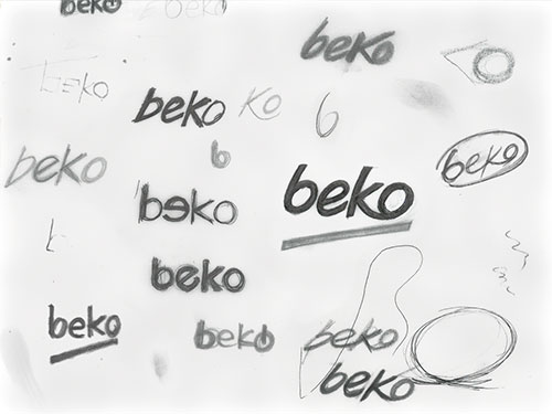
The letterforms were customized. Some of them grew out of a version of Myriad, but all were redrawn. Especially the ‘b’, as it was important to echo the ‘o’ and also to eliminate the stem, which was interfering with the thrust of the diagonal underline.
Did you create anything else for the client, or was your sole focus the wordmark?
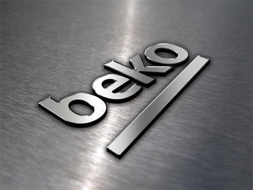
The wordmark was our main focus. It’s going to live in people’s houses on their washing machines, stoves, and TVs, so it is a significant thing for the Beko leadership, who think very strategically. Once the identity was approved, we developed an approach for store signage and designed basic guidelines for the logo’s use, including specifications for a distinctive corporate typeface.
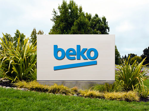

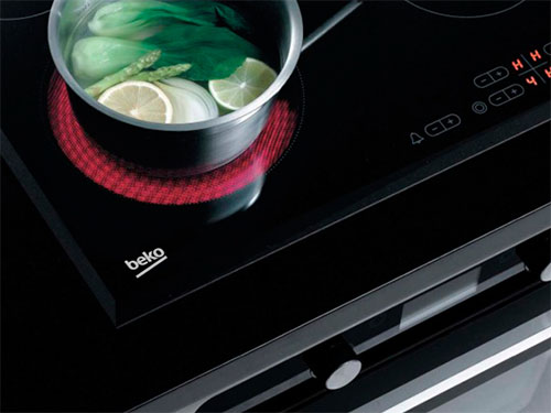
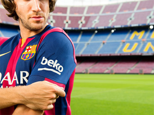
In 2014, Beko sponsored FC Barcelona, and the new design will now appear on team jerseys and stadium signage through to 2018.
Visit the Chermayeff & Geismar & Haviv website, and follow the team on Twitter.
Related, from the archives: An interview with Sagi Haviv.
Reviewed: New Logo and Identity for SSU by Snask
Social Democratic Youths Unite


Established in 1917, the Sveriges Socialdemokratiska Ungdomsförbund (SSU for short and Swedish Social Democratic Youth League in English) is, as its name implies, an organization comprised of over 10,000 young citizen members supporting Sweden's Swedish Social Democratic Party. This past September 14, General elections were held in Sweden where said party won after playing the opposition for eight years — a title given to the largest party not in government, as opposed to them being some kind of militia or Anonymous-like org. (Just thought it would be good to clear up that "opposition" moniker). In 2013, Stockholm-based Snask began working with SSU to create a unified identity to gear up for this election.
We translated the SSU brand platform into a spanking new graphic identity. The identity was launched a few month's before the start of the swedish general election campaign, enabling all proud members the right tools to create communications material. Most importantly, we unified all members of SSU under one brand and one coherent graphic identity. The identity has so far been used in tv-adverts, by members in the pride parade, in printed campaign material and in thousands of campaign activities all over Sweden. SSU's mother party the Social Democrats won the government election of 2014 after eight years in opposition.
Snask project page
 Logo detail.
 The ribbon is thought as something with a political feel where ribbons have always been linked to statements. Ribbons have also been frequently used in celebrations and SSU stands for celebrating freedom and equality for everyone.
Provided answer asking about why a ribbon?
 Logo detail with full name.
  Logo extensions.
 The previous logo looked almost like an American collegiate sports conference monogram, one of those endlessly italicized acronyms and, even in that realm, it wasn't particularly good. The new acronym sitting on a red ribbon certainly feels more stately and there is something interesting about using such a basic graphic device which most designers avoid for that very reason. It's almost too original in its unoriginality. If that makes any sense. It's obviously the application that makes this logo work, though.
 Identity elements.
 Various identity materials.
  Posters. They read: 1) "Together we can make a change, join SSU!", 2) "Do you want your own apartment?", and 3) "Do we want the best school?".
  One of the dioramas for the poster. (If you haven't seen Snask's work, they excel at making physical things for their projects).
  Balloons and boxes.
  Young people.
  Stefan Löfven, Prime Minister-designate, with his SSU supporters.
  Flag.
Flag. The full-on red color palette, the rough and condensed sans serif, and the deadpan execution give the identity a very energetic and confident presence and — although I kind of hate this term but here it applies like textbook — having passionate brand ambassadors, all working voluntarily for the same cause gives this kind of work an additional boost of relevance and appropriateness.

Aliexpress
FILM FX_L3.0
Cartoon Bomibing
So Long Captain
Noted: New Logo for About.com
About a Circle


Founded in 1996, About.com represents the best collection of expert, handcrafted content on the web, with more than 900 topic sites on everything from parenting and healthcare to technology, cooking and travel. A top 20 US web property, About.com is part of Ask.com, which is owned and operated by IAC."
Design by: In-house (I'm guessing)
Opinion/Notes: This is unquestionably an improvement not because the new logo is amazing but because the previous logo and about.com's identity over the years have been so poor. Despite going for the under-designed approach of sans serif in a circle, this is certainly the more designed about.com has ever been. Their web presence is relatively slick and part of its success is the simplicity of the logo. This is not the first or last logo that relies on a circle and at least about.com has been using a red dot in its identity for years so it's not completely gratuitous.
Related Links: Introducing The New About.com (mostly about the website)
 Logo detail.
  "a" monogram for social media icons.
  Various logo extensions.
  Inspirational header.
Introducing the new About.com
Linked: Retro Macbook Air

Link
For $3,499 you can own a 13-inch Macbook Air with the vintage Apple rainbow logo and a paint job that pays homage to the original beige Macs. Only 10 available from ColorWare.


