Interstellar
Felt Popsicles
Hold Them Together
“A great person attracts great people and knows how to hold them together.”
- Johann Wolfgang Von Goethe
Karl Oskar Blase
“Japanese Maple"
7685 Frames of Netherlands
Meet the Ipsums
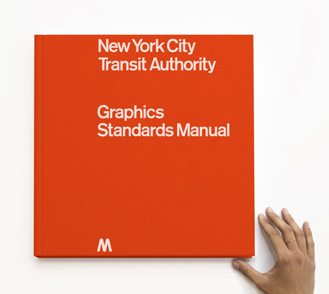
NYC Transit Authority Graphics Standards Manual Reissue
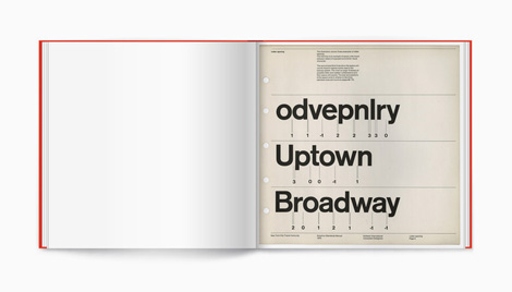
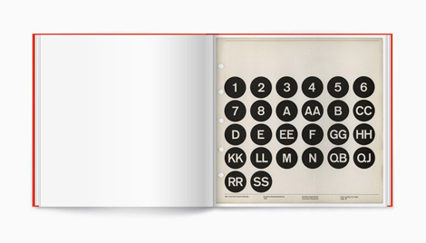
After discovering a copy of the NYC Transit Authority Graphics Standards Manual in the basement of Pentagram, designers Jesse Reed and Hamish Smyth have set out to reissue this unique piece of history. For a limited time you can support their efforts through a Kickstarter campaign that has been set up. Starting at the $118 level, each backer will receive a copy of the reproduction which will include an intro by Michael Beirut. After this campaign, the book will never be reissued again. See all the details here.
——————–
Also worth viewing:
Chad Michael Studio
Sarp Sozdinler
Tom haugomat
Follow us on RSS, Instagram, Pinterest, Wanelo,
——————–
Thanks to this week's Sponsor // CodeinWP: A PSD to WordPress development agency that provides quality themes to clients across the globe.
Reviewed: New Logo and Identity for Goodmans by Pajama
Rise of the Squirrel


Established in 1923 and originally well known for its loudspeakers and radios, Goodmans is a British consumer electronics designer and manufacturer specializing in entertainment technology. In its most recent incarnation, Goodmans offers audio and TV products like radios, sound systems, headphones, set top boxes, and, of course, speakers. Earlier this Summer, Goodmans introduced a new logo and identity designed by London-based Pajama.
Britishness, agility and resourcefulness are the hallmarks of Goodmans heritage and style. This spirit is captured in the new squirrel symbol, a smart friendly mascot. A squirrel is an amazing creature; storing nuts for the winter is simple, remembering where they are is brilliant. The bushy-tailed squirrel is drawn as a stylised G and will start to appear on the new product range and promotional material as an emblem of the Goodmans spirit.
Provided text
 Logo detail.
 The previous wordmark would have made Woody Allen quite happy but other than a slight vintage appeal to it, there wasn't much going on and it definitely looked dated, specially on the contemporary-looking products Goodmans is currently offering. The new logo has two good things going for it. The first is the introduction of a squirrel as the brand icon. This made me realize how underused and underrated squirrels are as logos. I'm not 100% convinced, though, that the squirrel is appropriate for entertainment technology products of this kind, but I'll bite. The "G"-tail is a cute concept and makes the squirrel more techie and up close, the crisp and hard edges do work nicely with the products. Small, on the footer of the website, the squirrel looks very convincing.
The new, condensed wordmark pairs well with the squirrel icon and has a more immediate connection with the products, with an industrial and contemporary feel. It has some modest notches that I'm currently digging in fonts like Burlingame (used exhaustively in this year's Brand New Conference identity). But I digress: It's a simple and solid wordmark that looks quite nice on the product.
 Wordmark on product.
  Product promos.
  Logo variations and new tag line.
  Business cards.
 Pajama should have quit while they were ahead with the squirrel icon and refrained from introducing the logo-as-window approach in application. This is one of the cases where it doesn't work — the shape does not provide a canvas broad enough to see images properly and there is plenty of detail in the icon that additional imagery makes it very busy and hard to read. The product promos are more successful in their restraint and it helps that the products are fairly sexy. Overall, it's a nice update and I deeply (and strangely) enjoyed thinking about squirrels as logos and what good associations come with it.

America's Best Drinking City 2014
Aerial Views
Leadership as Storytelling
Some interesting thoughts on leadership and storytelling by John Maeda. Are you subscribing to his Tinyletter newsletter? If not, you should. One of my favorites.
Death Valley
The Summharry
Cliff Jumping
Walk. Don't Walk. Dance.
Today's Office
Colorized
Noted: New Logo and Packaging for Philadelphia (Europe) by Dragon Rouge
Cheesy Swoosh


"Philadelphia (also known as 'Philly') is the world's most popular cream cheese. Available in regular, light, at-free and flavored varieties, Philadelphia cheese comes in regular and snack sizes."
NOTE: This rollout is for the European markets. It's hard to tell if it will also apply in the U.S.
Design by: Dragon Rouge (London)
Opinion/Notes: Mass-market packaging has never been my cup of tea or, in this case, my tub of soft cheese. It rarely manages to go beyond swooshes and gradients at its worst and some custom lettering at its best. This is a perfect example of that. The new "Philadelphia" lettering is relatively nice; the pompadour on the "A"s is attractive and the triple shadow works well. But then they've put a silvery swoosh under it and a type on a curve over it with a sunburst that makes you want to throw soft cheese at a wall. The packaging is your standard swoosh-plus-food-photography approach that is interchangeable with any other product on any aisle of the store.
Related Links: Dragon Rouge news item
Select Quote: The logo has been carefully crafted to work when overlaying the brand photography and across various print and digital channels that range from the recipe booklets that will accompany each pot of Philadelphia to the brand’s Facebook page. We’ve introduced a colour system that complements the flavours and generates visual impact in store and at each touch point with Philadelphia customers.
 Logo detail.
  Lid comparison.
  New packaging.


