VHS Decks
Navigating the Open Sea of Knowledge
Thoughts on navigating the open sea of knowledge by Maria Popova.
Baltic Heraldry
Owl Scouts
See Ya U2
Listen Up Phillip
The Last Saturday
WalkNYC
Recently Received
The mailman has been good to us this week and we’ve received an impressive list of titles. Included are new books from Lars Muller, Princeton Architectural Press, Laurence King, Chronicle Books, Rizzoli, Thames & Hudson and Nobrow. See all the goodies after the jump.
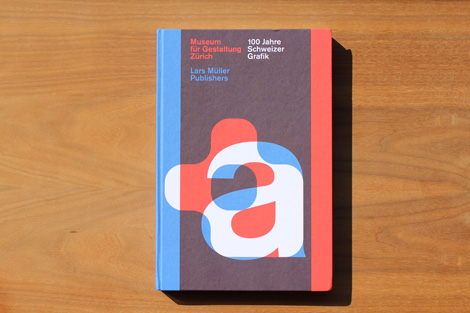
100 Years of Swiss Graphic Design
Edited by Christian Brändle, Karin Gimmi, Barbara Junod, Christina Reble, Bettina Richter, and Museum of Design Zurich
384 Pages / 8.7″x 12.9″
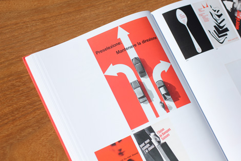
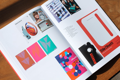
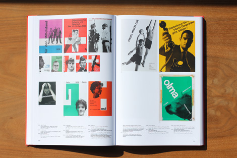
100 Years of Swiss Graphic Design takes a fresh look at Swiss typography and photo-graphics, posters, corporate image design, book design, journalism and typefaces over the past hundred years. With illuminating essays by prominent experts in the field and captivating illustrations, this book, designed by the Zürich studio NORM, presents the diversity of contemporary visual design while also tracing the fine lines of tradition that connect the work of different periods. The changes in generations and paradigms as manifested in their different visual languages and convictions are organized along a timeline as well as by theme.
Available at Amazon, Lars Muller, and your local book shop.
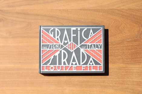
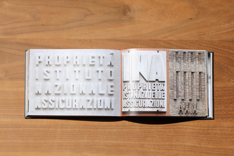
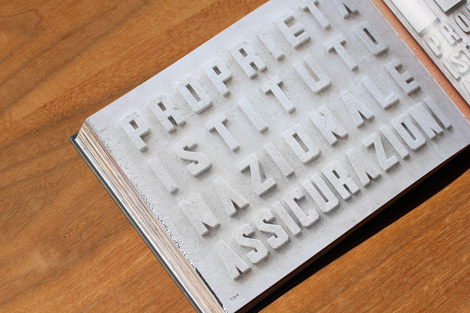
Grafica Della Strada: The Signs of Italy
By Louise Fili / Published by Princeton Architectural Press
264 Pages / 9″ x 6.5″
For more than three decades, renowned graphic designer and self described Italophile Louise Fili has traveled the cities and countryside of Italy cataloging the work of sign craftsmen in whose hands type takes on new life with a tantalizing menu of styles. Classical, eclectic, or Futurist; in gold leaf, marble, brass, wood, wrought iron, enamel, ceramic, or neon; painted, carved, inlaid, etched, tiled, or stenciled, the creative possibilities are endless. Grafica della Strada is Fili’s photographic diary of hundreds of Italy s most inventive restaurant, shop, hotel, street, and advertising signs.
Available at Amazon, PA Press and your local book shop.
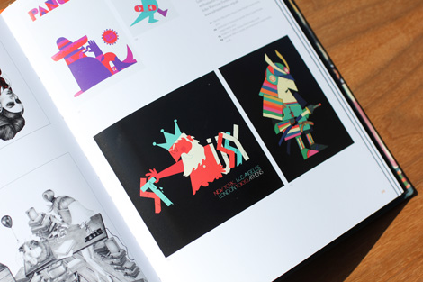
Fifty Years of Illustration
By Lawrence Zeegan / Published by Laurence KIng
384 Pages / 9⅞ x 7¾ ins
This book charts contemporary illustration’s rich history: the rampant idealism of the 1960s, the bleak realism of the 1970s, the over-blown consumerism of the 1980s, the digital explosion of the 1990s, followed by the increasing diversification of illustration in the early twenty-first century.
The book explores the contexts in which the discipline has operated and looks historically, sociologically, politically and culturally at the key factors at play across each decade, whilst artworks by key illustrators bring the decade to life.
Pre-order at Amazon, Laurence King or your local book shop.
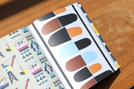
Marimekko: In Patterns
By Marimekko / Published by Chronicle Books
248 Pages / 8 11/16 x 11 in
Internationally beloved Finnish design brand Marimekko’s iconic patterns grace home décor, apparel, and accessories, and have informed and influenced tastemakers worldwide for over half a century. Richly illustrated with photographs and prints both classic and new, this vibrant volume offers a behind-the-scenes tour of the brand’s creative process. A colorful legacy is revealed, along with the innovative creators—from 1950s pioneers to twenty-first-century masters—who have shaped the company’s heritage and continue to make visual magic today.
Pre-order at Amazon, Chronicle Books and your local book shop.
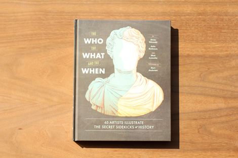
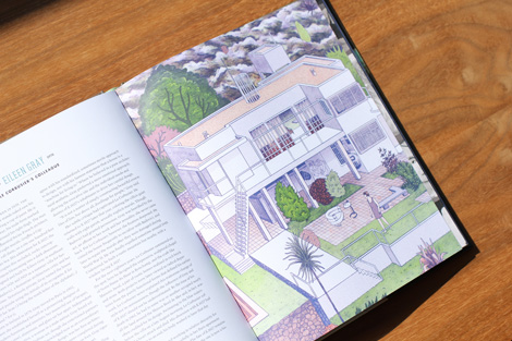
The Who, the What, and the When: 65 Artists Illustrate the Secret Sidekicks of History
By Jenny Volvovski, Julia Rothman, and Matt Lamothe / Published by Chronicle Books
168 Pages/ 8″x10″
In the bestselling tradition of The Where, the Why, and the How, this offbeat illustrated history reveals 65 people you’ve probably never heard of, but who helped shape the word as we know it. Muses and neighbors, friends and relatives, accomplices and benefactors—such as Michael and Joy Brown, who gifted Harper Lee a year’s worth of wages to help her write To Kill a Mockingbird. Or John Ordway, the colleague who walked with Lewis and Clark every step of the way. Each eye-opening story of these unsung heroes is written by a notable historian and illustrated by a top indie artist, making The Who, the What, and the When a treasure trove of word and image for history buffs, art lovers, and anyone who rejoices in unexpected discovery.
Pre-order at Amazon, Chronicle books and your local book shop.
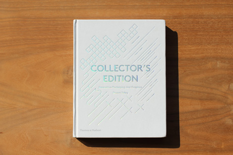
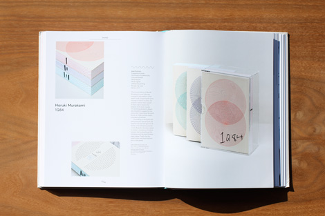
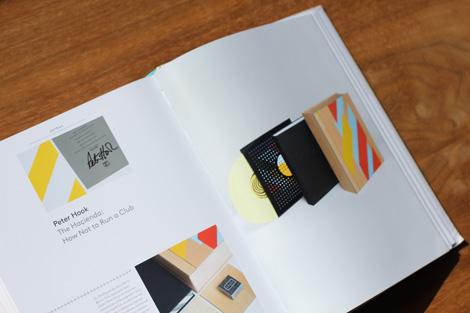
Collectors Edition: Innovative Packaging and Graphics
By Stuart Tolley / Published by Thames & Hudson
288 Pages / 8″x 10.1″
This global survey brings together over 170 examples of innovative and inspired packaging from the worlds of music, book publishing and magazines that have been released as a collector’s, limited or deluxe edition.
Organized into four sections – Boxed; Multiples; Hand; and Extras – each example is accompanied by a project description and vital reference information about the format, materials and finishes used in the design, and the client, record label, publisher and designer behind the work. A broad spectrum of formats and genres is included, ranging from editions of albums by international recording artists to ultra-rare and expensive publications.
Available at Amazon, Thames & Hudson and your local book shop.
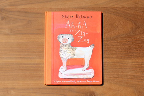
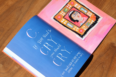
Ah-Ha to Zig-Zag: 31 Objects from Cooper Hewitt, Smithsonian Design Museum
Written by Maira Kalman
48 Pages / 5.9″x8.3″
Maira Kalman’s exuberant illustrations and humorous commentary bring design history to life in this inspired ABC book that celebrates thirty-one objects from the Cooper Hewitt, in time for its long-awaited reopening. “A. Ah-ha! There you Are.” begins Maira Kalman’s joyfully illustrated romp through the treasures of Cooper Hewitt’s design collection. With her signature wit and warm humor, Kalman’s ABC book introduces children and adults to the myriad ways design touches our lives. Posing the question “If you were starting a museum, what would you put in your collection?”, Kalman encourages the reader to put pen to paper and send in personal letters—an intimate, interactive gesture to top off her unique tour of the world of design.
Pre-order at Amazon, Rizzoli and your local book shop.
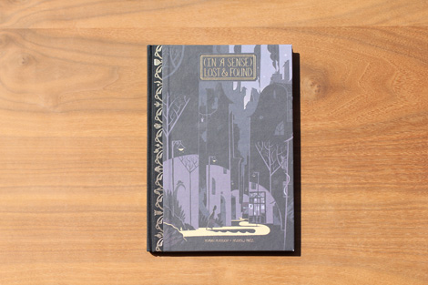
(In a Sense) Lost and Found
By Roman Muradov / Published by Nobrow
56 Pages / 5.9″x8.3″
(In a Sense) Lost and Found explores the theme of innocence by treating it as a tangible object – something that can be used, lost, mistreated. Muradov’s crisp, delicate style conjures a world of strange bookstores, absurd conspiracies and wordplay. A surreal tale told in the mould of the best American comics.
Available at Amazon, Nobrow and your local book shop
Disclosure: Some of the links in the post above are “affiliate links.” This means if you click on the link and purchase the item, we will receive an affiliate commission. Regardless, we only recommend products or services we use personally and believe will add value to our readers.
——————–
Also worth viewing…
2013 Book Gift Guide
Recently Received Books: April
Recently Received Books: May
Follow us on RSS, Instagram, Pinterest, Wanelo,
——————–
Thanks to this week's Sponsor // CodeinWP: A PSD to WordPress development agency that provides quality themes to clients across the globe.
Reviewed: New Logo for Louvre Abu Dhabi by Studio Philippe Apeloig
Ray of Light


Set to open in 2015, the Louvre Abu Dhabi is, as its name implies, an extension of the Louvre in Paris to be deployed in Saadiyat Island, a mixed commercial, residential, cultural, and leisure development half a kilometer off the coast of Abu Dhabi. Designed by Ateliers Jean Nouvel, the museum will "present major objects from the fields of archaeology, fine arts and decorative arts. It will also represent all regions, periods, including contemporary art and the narrative of art history," and will "reflect the region's role as a crossroads for civilisation". The logo for the museum has been designed by Paris-based Studio Philippe Apeloig.
 Building renderings. More here.
  Exposed grid behind the logo. Image source: Designboom.
 The first step was to identify what typeface to use. One of the most important considerations was the historical and global reach of the LAD collection, which represents many different civilizations. Ultimately, I decided upon a new version of the Frutiger latin font, a typographic masterpiece that symbolizes modernity. The new rendition, an original redesign by Adrian Frutiger himself, is called 'Frutiger LT Pro'. It was intended to be used for signage and has specific qualities for this. Frutiger also added a number of international glyphs that are very helpful when you have to deal with many different languages.
For the Arabic typeface, which became part of the logo we needed another solution. I imagined one based on Garamond, a Latin font that epitomizes typographic history. I wanted a new font that echoed the harmonious shapes and counter-shapes of garamond, but with the rhythmic gestures, ligatures, and wave-like qualities of arabic script. I asked a young lebanese typographer, Kristyan Sarkis, to develop an exclusive type family for the project. His solution was 'LAD arabic' a typeface derived from another of his designs, Colvert. Kristyan developed three variants of LAD arabic for use with the identity and signage.
Designboom interview with Philippe Apeloig
 Custom Arabic typeface, LAD Arabic, by Kristyan Sarkis.
 For the logo I chose to symbolize the building's spiritual dimension and to recreate its very particular micro-system and climate. The challenge was to evoke the mysterious whiteness and lightness of this exceptional space, and to take into account the area's extreme heat. The flat outline of the design alludes abstractly to the horizontality of the architecture, echoed and reinforced by the waterline. a thick, straight line perforated with hatchwork creates a series of hyphens of different widths that scatter in different directions, embodying not only the dynamic link between world cultures but illustrating and giving form to the kinetic effects of light. This concept, in turn, provided the foundation for the pictographic system. the logo consists not only of the broken line but a line of arabic script. The two are meant to be read non-hierarchically.
Designboom interview with Philippe Apeloig

 Logo detail in English and Arabic versions.
 There is no identity or application yet to review but I found the logo interesting enough on its own to warrant a review and discussion. Its sparsity and ambiguity are off-putting at first and it wasn't until I read the full interview linked above that I began to appreciate the subtleness — nonetheless, I'm not a full believer in the solution. My main problem is that I keep trying to find letters, perhaps the acronym LAD, in the white lines streaming down from the thick, black bar and even with the exposed grid above, there doesn't seem to be a clear meaning behind their angles and positioning. Perhaps a nod to the Paris museum's pyramid structure? The line is meant to represent the waterline and I would have guessed it would represent the dome, since it sits on top of the typography and is supposed to be letting in rays of light like the dome. And the detailed, latice-like rays of light let in by the dome, here are depicted as hard spotlights. So, it's confusing.
Once you see the thick line as a collection of hyphens I think it becomes more interesting, particularly in the horizontal version of the logo, connecting East and West and the potential for an interesting identity is very promising. Although I'm not a huge Frutiger fan — the font not the man — the neutrality of it lends itself well to the spectrum of proponents for whom a museum is a blank canvas. I also found it interesting that even though an Arabic version of the name would be enough contrast, Apeloig chose to make it even more contrasting by using a serif style. Overall it's an intriguing logo; it requires too much explanation and even with the explanation it's not entirely convincing but there is a deadpan allure to it that is hard to explain.

Milky Way Above Atacama Salt Lagoon
Cell Phone Lanes
Five Airports
The Photographic Time Machine
NASA Show
Leica M Edition 60
BAHFest
Noted: Somewhat New Packaging for Surge done In-house
Surge Redux


"After a 12 year absence, everyone's favorite energy soda, SURGE, is back! First launched in 1996, SURGE was a hit with teens and adults alike. After a hiatus, The Coca-Cola Company is bringing the drink back to the excitement and celebration of fans. SURGE is a beloved citrus soda with a fully loaded taste that awakens a familiar rush from back in the day. This is the first time a Coca-Cola beverage is being sold exclusively through an online retailer, Amazon.com." (Source: YouTube)
Design by: Coca-Cola Company
(Originally designed by Tom Cox in-house with Scott Graham and Malinda Sanna)
Opinion/Notes: I don't drink sodas anymore but when I did, nothing beat a good citrus soda and Surge was really one of the best. What's interesting about this — more than it coming back or being sold exclusively through Amazon — is the decision from Coca-Cola to go with nearly the exact same graphic design as the one it launched with in 1996, at the height of Grunge and Xtreme things. At the time, the design made perfect sense. Today? It's definitely weird and out of place, like an off-brand soda that you can only get in one gas station in one state of the U.S. But clearly, this was about building on the nostalgia and fan fervor of the original product and changing the design would have pissed off the same people that helped bring it back to market. Long live Surge!
Related Links: Coca-Cola Company press release
Surge exclusively for sale on Amazon
Surge Original Art and Design images from Tom Cox
Tom Cox, excited that Surge is back
Select Quote: The SURGE re-launch represents two additional firsts for Coke. The brand, which will be offered in its original formula in 12-packs of 16-oz. cans featuring the same retro design from yesteryear, is part of an innovative distribution deal between Coca-Cola and Amazon. A limited supply of SURGE will be sold exclusively through the online retailer at www.amazon.com/surge, marking the first time Coke has distributed a product solely through e-commerce.
SURGE’s return also will be Coke’s first launch to rely solely on social and digital media. The brand will forego all traditional forms of advertising, including TV and out of home, allowing excitement to build online (follow the brand's journey on Twitter: @SURGE).
 Can detail.
  Pack.
Pack.  Original design process drawings by Tom Cox.
Surge is back promo video.
Linked: Olive Garden Custody Fight

Link
Starboard Value LP, an investor in Darden Restaurants Inc. (which is Olive Garden's parent company), wants to take control over the board because it feels Darden is doing a piss-poor job. One slide of a 300-page document is devoted to the bad decision of redesigning Olive Garden's logo. The whole thing is kind of fun to read.

