Live LYT
Linked: Etsy Bans "Redskins"
Maps to the Stars
Melbourn Squash Club
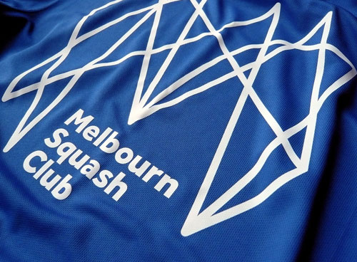
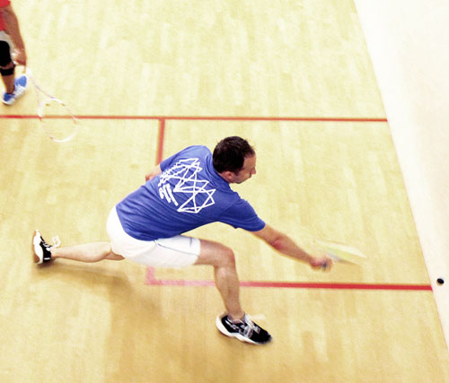
Here’s a lovely bit of work by Distil Studio for Melbourn Squash Club. Distil’s creative director, Neil Hedger, shared some details.
“The original ‘yes’ moment!”
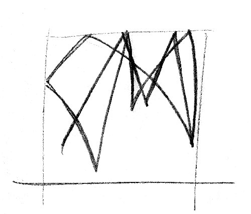
“More sketches — how abstract could we go?”
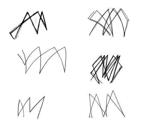
“This sequence formed part of our first presentation, to help the club understand our thinking.”
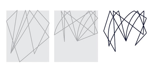
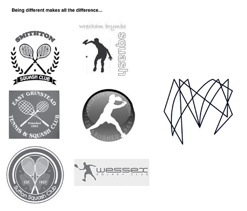
“Something that we strongly believe in is being original and visually different, for the right reasons. Here’s the page from our first presentation to help convince the club to avoid crossed rackets and silhouettes.”
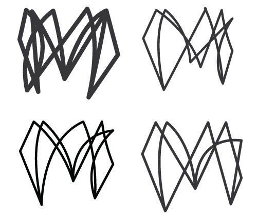
“We worked to simplify the icon further, but we also wanted to retain some of the complexity of our first draft.”
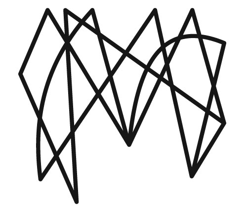
“The final icon — some of the more simple approaches just lacked the energy of our original thought. We kept much of the complexity of our first draft and opened up the spaces in-between to help visual clarity. The rebounds from the left and right provide a much stronger form. We also put in just a couple of curved sneaky drop shots to break up the rigidity of the lines.”
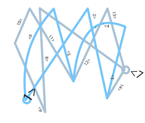
“To reflect a true squash match (and for animating the lines), we made sure the icon was formed from 2 continuous lines.”
“The ‘M’ is used both on it’s own and also as part of a lockup.”
View more work on the Distil Studio website.
#70: Retreat
|
A lament for the iPod Classic
Last week, as we swooned over all of the newness — the Apple Watch, the iPhone 6, Apple’s semi-responsive website — we missed the passing of the old. Quietly and without ceremony, the iPod Classic vanished forever from Apple’s online store, and took an era of music-listening with it.
The iPod Classic has been heading towards obscurity for some time: with no touch display and no network connectivity, it feels far removed from other iPod models and the world of music streaming; the notion of having to plug a device into your computer to sync with iTunes seems, in 2014, nothing short of antiquated. And its HDD-based storage is a reminder that it’s a model from another time — a time before we all got used to the speed and reliability of SSDs.
But that old-style hard drive in the iPod Classic has something very important going for it: it’s huge. So huge, in fact, that it can store the entirety of our iTunes library with space left over. Every single piece of music my wife and I own in a digital format is there, with no need for any sort of internet connection. No other iPod model comes close: the top spec iPod Touch maxes out at 64gb. My faithful iPod classic has 160gb.
However, I’ll be the first to admit that we no longer live in an era of locally-stored music libraries (and I’ve written about this previously). I’d guess that around 95% of the music my wife and I listen to comes via Spotify rather than our iTunes library. That concept of ‘ownership’ is dissolving rapidly and when it comes down to the actual legalities, we never really own music anyway. Even owning a CD represents nothing more than having a license to play that music. We’ve always been renting music — we just rarely think of it that way. But the trouble with streaming, as great as it is, is that it requires an internet connection and we’re still a long-way away from the oft-cited but rarely-experienced ‘always on’ connection. Even in major Western cities, mobile black holes are common. Out here in the Somerset countryside, mobile data is pretty much non-existent. At home, our iDevices are totally reliant on our home WiFi. So, until the internet really is everywhere — and mobile data doesn’t cost an arm and a leg — some sort of offline playback is required.
Of course, saving albums for offline access is something we do a lot with Spotify, especially for when we’re in the car, but changing tracks on a touchscreen while driving is a somewhat dangerous activity in which no responsible driver should be participating. On the iPod Classic, with its physical interface, skipping a track is a button press you can perform by feel: not recommended, exactly, but certainly no more dangerous than adjusting the volume knob on your car stereo. So with the Classic’s retirement there’s no longer a driving-ready iPod model, apart from the (kind of crappy) iPod Shuffle. This is most likely a deliberate move by Apple to ready consumers for their CarPlay interface, but it’ll be quite some time before that becomes the norm. (Siri, because of its need for a decent data connection, is no substitute as an in-car iPod controller.)
So when the iPod Classic disappeared from the Apple Store, it was a departure that felt, to me, just a tad too early. Dated and rather un-2014-like as it may be, a hole has been left in the iPod lineup: we no longer have a device to store our still-existent music libraries for times when streaming services don’t cut it (again, see ‘Music collections in the era of the cloud’), and we no longer have a device that is actually safe to interact with while driving. All the signs point to the Classic becoming obsolete, but its replacements can’t fill that hole just yet: the mobile internet is far from ubiquitous; data is far from cheap; a proper driver-friendly UI is far from mainstream. And so my faithful Classic still has some life left in it yet.
2 Essential Rules in Sales
1. Never answer a question that the customer hasn’t asked.
2. Never provide information that the customer hasn’t requested.
2 Essential Rules Most Salespeople Forget, by Geoffrey James
(In some way, we are all in Sales, aren’t we?)
Reviewed: New Logo and Identity for Royal Enfield by Codesign
Royal Ligatures


Incorporated in India in 1955, Royal Enfield is a motorcycle company with a history that dates back to the 1890s and has its roots in the town of Redditch in the UK. After the Indian government ordered hundreds of Royal Enfield's bikes for its police, an assembly plant was established in India building bikes from parts shipped from England, and later it bought the tooling to manufacture them locally. The British Royal Enfield company closed in the early 1970s but the India company, being independent and quite popular, continued producing bikes under the brand name and now sell them in over twenty countries. This past May, Royal Enfield introduced an evolution to its logo and new identity designed by Gurgaon, India-based Codesign.
One of the areas that needed a deeper understanding at the commencement of visual identity, was the quality and character of craftsmanship that the brand genuinely owned. This was critical as it guided decisions at both strategic and drawing-board levels for the visual identity.
One of the key insights, that the brand's view craftsmanship is human, led to the overall identity family's openness in embracing diversity and quirks. The resultant family of assets, was not oversimplified or brought under a strictly uniform mould. Instead, a consistency of richness and restraint, of beautiful functionality and purposeful craft, binds it together.
Provided text
 Logo detail, stacked version.
 The new Royal Enfield logotype is an evolutionary step forward from its predecessor, inspired by the commanding presence of the design of the motorcycles, and drawn for higher recall and finer translation into both 2D & 3D renditions. From the selection of a drawing direction that best represented the enduring legacy of the brand, close to 100 iterations of detailed drawing variations were created and refined to arrive at the final form, taking into account the nuances of provenance, power and craftsmanship.
Provided text
 Logo detail, linear version.
 The old logo was okay; even with its vintage patina it's not as cool as other early twentieth-century marks. The new wordmark is a playful evolution that retains some of the characteristics of the original but certainly attempts to establish an aesthetic of its own. There are aspects of it I like: the "Ro" ligature is successful and the flared serifs are elegant. Other aspects I don't like as much: The "En" pair is a little wobbly. As a whole, though, it's an attractive piece of lettering.

 Logo on bikes.
 And, let's face it, the new wordmark could be set in Comic Sans and it would still look awesome if applied on bikes like the above.
 Old crest and seal.
 The Seal represents the brand in a pithy visual nutshell, through a stronger drawing of the letter R, with a dual graphic of the letter E and wings, signifying the liberating exhilaration of the riding experience.
The Royal Enfield crest dates back to its origins in weapons manufacturing, reflected in the unit comprising of a canon and the motto "Made like a Gun". Moving forward, the new design weaves all the elements into a firm composition around the central powerful illustration of the gun, into a seal of pride that celebrates its provenance.
Provided text
 New crest and seal.
 In the new crest and seal, things start to get a little strange. The introduction of Emigre's Brothers brings and unfortunate cartoon-y look that takes away the genuine hand-crafted approach of the main wordmark. It's not that Brothers is a bad typeface — it's one of my favorite — but it's been used so much to convey vintage and rough that it's become a cliché. The bubbly drawing of the "R" and wings feels out of place with the wordmark and even the bikes, while the cannon in the crest is too illustrative and seems like part of somebody else's identity.
 Seal in use.
  Crest on bike.
 In application, both elements are salvaged through cool applications but the visual language does feel a little off.
The hand-drawn dual stripe on the tank of the iconic Bullet model from Royal Enfield is a living testament to its crafted approach to design. During the project, we identified and recreated this iconic element as a supporting graphic asset to be used across the entire brand spectrum with flexibility and malleability.
Provided text
Video of a guy with mad skills painting the dual stripe by hand on a tank. Store facade.
 Overall, based on the main wordmark, this is a redesign with great potential as long as they don't try to Harley-Davidson-ize it. Not a knock on H-D, I love H-D as well, but it feels like Royal Enfield is trying to introduce various design elements a la H-D but without the same organic evolution. In the end — and this is coming from someone who couldn't care any less about bikes — these are extremely handsome bikes and the identity design takes second place to their design.

♥ / Dropmark
A big thank you to Oak for sponsoring this week’s RSS Feed.
Dropmark is the smart way to organize all your links, files, and notes into visual collections. Perfect for creatives, teams, educators, explorers, and you.
All your stuff in one simple, visual, private place.
Try it for free at dropmark.com
(Interested in sponsoring a week of my RSS feed, learn more here.)
Noted: New Logo and Identity for Zapp by SomeOne
For your Spidey Sense


"Zapp [is] a wholly owned, independent, subsidiary of VocaLink with separate board, management and location. VocaLink is a leader in payment innovation; designing, building and operating world-class payment systems and ATM switching platforms that in 2013 processed over 10 billion UK payments with a value of over £5 trillion. Zapp is on a mission to establish a scalable, secure, competitive and exciting new Payments Network in under three years. A system that is built on the best of scalable technology and operations, on a business model that delivers value to all stakeholders and a product experience that is easy to use and puts the consumer in more control of their finances." (Source: SomeOne project page — better explain than Zapp's own about us page)
Design by: SomeOne (London)
Opinion/Notes: You have to hand it to SomeOne: if anyone can get away with naming a visual language the "tingle" and making that visual language the equivalent of soda fizz for an ambitious payment company, it's them. The choice of a thin slab serif for the wordmark is what makes this work, allowing the tingle to light up the letters like a light bulb filament. I question how sustainable its application is in the long run and how much in the way of communication the tingle will get in but in terms of something new and identifiable there is no doubt it works.
Related Links: SomeOne project page
Select Quote: The Brand World centres around the "Tingle", a graphic representation of the feeling you get when things just work, when they go your way — the sensation you feel when annoying things just simply get out of the way. Things become easier and faster. Things work… this is the Tingle.
 Logo animation. (See video below for smoother animation).
 The "Tingle" visual language.
  Sign.
Zapp promo video. Logo animation at the end.
Linked: VHS Intro Graphics
Link
Weird yet mesmerizing: 50 VHS production company logos, each looping, one on top of the other.

Amangiri Resort and Spa
Las Vegas & Reno
Forgettable Fire
Who is U2?
How I Resurrected My Creative Spirit
Life is a work of art. Every new day is a blank canvas that can be painted however we want. Many of us are artists who create things to reflect and examine where we are in life.
However, I started painting the same picture over and over again about a year ago because I got comfortable. My life’s canvas became more bland as I started losing a grip on my fiery creative spirit. The perfectionist in me got stronger and made it hard to accept ugly drafts that didn’t match with my ideal expectations. Every detail and decision was painstakingly edited and planned out. I was subconsciously holding back from being imaginative. Consequently, my creative spirit turned into a ghost of my self-image because I couldn’t let go of past artistic patterns.
So how did I learn to resurrect my creative spirit?
By losing myself in drawing.
MORNING SKETCH ROUTINE
I needed to escape from my pixel-perfect mentality of making things and get back to the basics of sketching. Therefore, I started a daily morning figure drawing routine. My main goal was to not spend more than 1-2 minutes on each drawing.
At first, it was incredibly hard to do because drawing didn’t give me the same instant gratification that Adobe Illustrator did. Gradually, I learned to accept mistakes and stop second-guessing myself in order to draw with more conviction and fluidity. Focusing on the now instead of worrying about expectations made me feel more openly honest with myself. Through humility and honesty, I was able to create from the heart again.

After a couple of weeks of warming up, I felt like I got the hang of drawing. Then I started to focus on a big side art project that reflected the big change in my way of creative thinking.
STARTING A SIDE PROJECT
I started drawing a sketch that shows a human figure emerging from the darkness while being attacked by wolves. Why? Because I’ve always been fascinated by creatures with scary teeth when I was a kid and fell in love with renaissance art figure poses in art history class. Also, the drawing captures my internal struggle with escaping my personal demons.

These demons represent the mental barriers (self-doubt, ideal expectations, and fear) that I needed to break down in order to have more honest expression and creativity. It would have been impossible to start this drawing if the concept did not come from an honest and very personal life experience.
CREATING A FORTRESS OF SOLITUDE
Without great solitude, no serious work is possible. - Pablo Picasso

Every evening after the gym, I would go home and lock myself in my basement. My phone was upstairs and laptop was there only for music and human anatomy reference art. I wanted to be totally focused on my art and sacrifice nonsensical activities to get better. Also, I projected my sketches onto a 4 feet by 3 feet piece of paper that was taped to my wall. The projection guided me to draw loose outlines of my large-scale art piece.
PLAYING WITH THE MEDIUM
I chose to use charcoal for this large scale drawing project because of its versatility. It can produce sharp/refined lines as well as painterly-like washes. I viewed my drawing as a combination of different layers of images instead of one flat dimension.
First, I drew a messy smudge of charcoal for the foundation. Then I added or removed different areas with more or less erasing and charcoal filling. I was constantly pushing and pulling in between the layers of images in my head without having a concrete picture in mind. The key was to keep the creative juices flowing and never grow stale.

PERFECTING MY FLAWED TECHNIQUE
I cannot draw perfect muscular figures like Michelangelo. Therefore, I decided to add my own grotesque twist to classical renaissance art. I embraced my flaws by turning accidental lines into beauty marks.
The incorrect body proportions and muscular definitions were wrongfully appealing to me. Sometimes I drew random marks without thinking and go with the flow afterwards. I wanted to prove that beautiful art can also spawn from scarred imperfections and controlled chaos.

LET THE ART CREATE ITSELF
I was totally immersed in the process of drawing. Often I would be in the zone and draw nonstop without any conscious thought. Time became irrelevant and the only thing that mattered was the “here and now” because I was able to simply let go. I put off critical judgement until my 15 minute break which occurred every 2ish hours.
THE FINAL PRODUCT
After two months of perseverance, the 4ft by 3ft large-scale drawing was finally finished. I feel so proud that I was able to create a badass piece that had a piece of my soul in it.
It’s a drawing that I can look back on and reflect on the mental journey that I had to go through in order to reignite my creative spirit.
RESURRECTION
As a result of my drawing explorations, I was able to reach a new level of creativity. I am now so much more creative and motivated in all aspects of my job at Viget. I can work faster, take bigger risks, and come up with more varied iterations because I’m not pigeonholing early ideas or critically judging myself anymore. Finally, I was able to let go of my ego by accepting my flaws which made made my creative decisions more deliberate and natural.
It’s only after we’ve lost everything that we’re free to do anything. - Tyler Durden, Fight Club
I believe that creative people naturally yearn to make something beautiful. However, their fear of going through an ugly process stops them from that great pursuit. Therefore, we have to let go… and lose ourselves in the dark corners of our minds. The best way to face our fears is by just taking that first leap of faith. Afterwards, we can become inspired to create with a fresh perspective after being humbled by “the struggle.” The culmination of our happy accidents and the never-ending adventure of individuation makes our lives rich and beautiful.
Shoutout to Kevan Lee for his Fast Company article, “How Creative Hobbies Make Us Better At Basically Everything.” It inspired me to write this blog.


