Zulkey's Policies on Free Advertising
Goncalo Viana
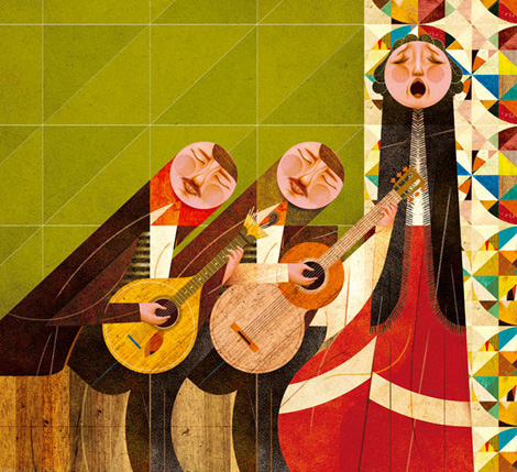
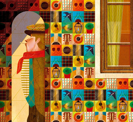
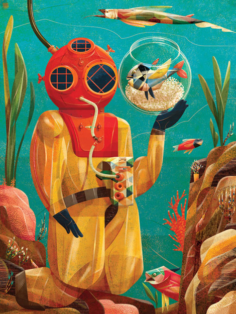
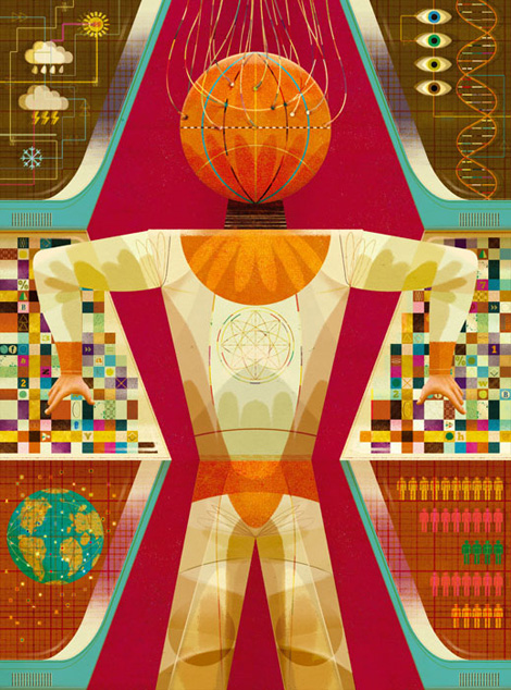
I’m loving the retro stylings of Goncalo Viana. A native of Lisbon, he originally studied architecture, but discovered his true passion lies with illustration. His portfolio is filled with dense, layered compositions brimming with geometric shapes and brilliant imagery.
Via Brave the Woods
——————–
Also worth viewing:
Chad Michael Studio
Sarp Sozdinler
Tom haugomat
Follow us on RSS, Instagram, Pinterest, Wanelo,
——————–
Thanks to this week's Sponsor // CodeinWP: A PSD to WordPress development agency that provides quality themes to clients across the globe.Sad Dads at One Direction
The BBA | Best Brand Awards
I’m excited to be apart of the jury of the BBA | Best Brand Awards for 2014. Below is some information about the initiative including how to enter.
The BBA | Best Brand Awards has been founded with the aim of rewarding high quality brands designed worldwide, recognizing excellence in visual communication internationally.

Award Categories
The BBA has two global categories and 6 geographical ones.
Global Categories
The Best Brand of the World - The brand with the best global score.
The Best Brand Designer in the World - The agency/designer with the best score in 4 brands, selected among submitters with a minimum of 4 pieces enrolled.
Geographical Categories
The brand with the best score in each zone, including Africa, Asia, Europe and Russia, Latin America, North America and Canada, Oceania.
The Jury
An international jury from around the world will make the selection of winners. The valuation criteria is based on the visual originality and consistency with the objectives. You can see some of the past winners here and the award below.

Enter Below
There are some small fees and rules associated with each entry so ensure you read the entry rules here. When you’re ready to enter, simply register here.

Good luck!
Blockbuster Movies Recreated with Stock Footage
'The Best Ideas from the Left and the Right'
Friday Link Pack
Tripp and Tyler Share a Clever Collection of Life Hacks to Make Life Easier
- What’s the brief? (thanks)
- Wallet-Sized Engagement Ring Case for the Sneakiest of Proposals
- “The Eyefi Mobi Card automagically syncs to your phone, resulting in a 20-second DSLR-to-Instagram workflow.”
- This Three in One Wagon is supercool. Makes me want to be a three year old.
- 101 years after the first box of Crayola rolled off the factory line, Wired looks at how the iconic crayons are made.
- I would have never thought I’d say “wow, these guns are gorgeous”. But I just did: 1890′s Handguns decorated by Tiffany
- Different kind of broken systems
- A Five Story House that hangs off the edge of a cliff. Seriously.
- You drink coffee, I drink tea.
- Why Starbucks spells your name wrong
- Helicopter drawing by Adel Abdessemed. Makes my job look boring.
- Wow: A Glass Pot.
- Get Dancing.
- Here’s how you make a Classic French Apple Tart.
- How sugar affects the brain.
- Here’s how your newsletter looks in various desktop mail clients. Found in Mailchimp’s Email Design Reference. It teaches you everything you need to know to build a mobile-ready template.
- The fine folks over at Mule are looking to hire a Junior Designer.
Reviewed: New Logo and Identity for Bristol Aerospace Centre by Elmwood
Grounding of the Concordes


Set to open in 2017 in the South West England city of Bristol, the Bristol Aerospace Centre will be a museum dedicated to "showcase and celebrate the region's continued world-class achievements in aerospace" which include the boast-worthy claim to fame of being home to the design, development, and port of departure and entry (for all maiden voyages) for the Concorde, developed in part by the Bristol Aeroplane Company. The museum will be built at Filton Airfield, using two "WWI Grade II listed hangars" and a new building, displaying over 8,000 aviation artifacts with the main attraction being the Bristol-built Concorde 216, which was the very last flight of the supersonic plane. Spearheaded by the Bristol Aero Collection Trust, formed in 1988, the new identity for the museum was introduced this past summer, designed by London-based Elmwood.
 Renderings of the museum by Purcell Architects.
 Elmwood brought to the life ethos of the Centre with a design that was not only modern but had longevity and a sense of dynamism, innovation and inspiration. Elmwood wanted to create an identity that celebrated the start of the aviation journey. The first airplane started as a sketch. The first engine was a pencil drawing. Concorde was once a scribble on a page. Elmwood's use of the paper plane in the logo highlights the possibilities and potential of an idea and the simplicity of a thought and the personal effort behind every feat of engineering.
Elmwood wanted to hero the Concorde in the new identity but was careful to avoid alienating the other key elements of aviation due to be shown in the museum. The paper airplane was the perfect design marque to envisage this, as it is the shorthand for any plane and the initial stage to any aviation idea.
Provided press release
 Logo detail.
 While this isn't a crucial identity to review and there aren't grand repercussions like some of the other reviewed identities this week, I found this to be absolutely charming and a swell representation of what a good, simple logo can do. The starting concept of using a paper airplane to represent high-wattage aviation design like the Concorde is a playful approach that brings these big, bold ideas back to their basics. But the key move in this logo was using the paper airplane not sideways like we are used to but pointing upwards, like a rocket. A cute paper airplane with wannabe superpowers — like a lab puppy that thinks its a pit bull. The subtle shading is enough to convey volume and the condensed typography literally gives it a sturdy launchpad.
The colour ways — red, white and blue in the branding are a nod to the transatlantic nature of the museum, connecting UK, France and America. The bold use of colour and simple clear design not only signifies the museum as highly credible but gives the project an engaging, creative and industrious tone of voice whilst remaining thought-provoking and forward-looking.
Provided press release

 Stationery.
  Business cards.
  Posters.
  Framed posters.
 In application there isn't much. Plenty of bold-colored, centered-typography layouts that are nice enough. The posters are cute, perhaps trying to work in far too many metaphors but they are striking and help convey the serious yet playful balance of the museum and its identity.

Crayola Crayon
The Nicest Place on the Inernet
Noted:
Healing Circles


(Est. 1874) Kinderspital Zürich (Children's Hospital Zurich) is a non-profit private institution in the service of all children and young people regardless of gender, religion and social origin. All employees of the hospital are committed to the dignity of every human being. It has approximately 2,000 dedicated employees who are committed to the welfare of year 100,000 young patients from the first day of life up to age 18.
Design by: Facing (Zurich)
Opinion/Notes: The old logo was not bad but it felt like Wolfgang Weingart was going to come out and take out your kid's tonsils. While the icon remains mostly the same — it does look like it's been improved a bit for readability — the more relevant part about this project is the design around it. It's child-friendly without being child-made. The typography is soft yet serious and the colorful dots that anchor the print materials give it a soothing bounce. None of this is transcendental design but it definitely improves the experience of what can never be a pleasant experience of being in a children's hospital.
Related Links: Facing project page
Select Quote: The logo now incorporates the term "university" into the word mark and endorses the funding body of the foundation as well as several fields of activity into the bi-lingual brand architecture. For corporate and marketing communication a new literature design concept has been created. With its use of dots in all colours (which derive from the round shape of the icon) it generates a less clinical but friendly and playful look and feel for children and parents alike. Beyond the brand design all office communication forms as well as internet and intranet design have been developed.
 Brochures and website in the old look.
  Logo detail and various sub brands.
  New brochures.
  Magazine covers.
  Water bottle.
Linked: Fun with LV Monogram

Link
Louis Vuitton lets Karl Lagerfeld, Rei Kawakubo, Cindy Sherman, Frank Gehry, Marc Newson, and Christian Louboutin play with its famed monogram pattern.

Gift of Divorce
I Am Silently Correcting Your Grammar
Indian Newspaper Nameplate Collection
Turbulent Flow
Mellowed Rhiannon
Michael Seitz
Michael Seitz is a talented designer based out of Minneapolis with a knack for creating work that is smart, sophisticated and effortlessly timeless. After stints at Modernista! and space150, he now serves as a Senior Art Director at Colle + McVoy. Recently, Michael launched a new site which features a wonderful sampling of the award-winning projects he’s produced over the years. See all the good stuff here.
——————–
Also worth viewing:
Chad Michael Studio
Sarp Sozdinler
Tom haugomat
Follow us on RSS, Instagram, Pinterest, Wanelo,
——————–
Thanks to this week's Sponsor // CodeinWP: A PSD to WordPress development agency that provides quality themes to clients across the globe.Reviewed: Friday Likes 100: From The Strangely Good, Samuel Byrnes, and Negra Nigoevic and Filip Pomykalo
From The Strangely Good, Samuel Byrnes, and Negra Nigoevic and Filip Pomykalo


A heavily blue-hued set of work in this centennial edition of Friday Likes with work from Singapore, Sydney, and Zagreb.
I'm planning on a massive, online round-up of all 100 Friday Likes — hopefully ready next Friday.
Provisions by The Strangely Good

P.V.S, short for "Provisions" is a women's shoe and accessory store in Singapore, carrying an eclectic range of brands. With an almost pharmaceutical Victorian era identity designed by local firm The Strangely Good, P.V.S delivers a full-on retail experience with props that include sea salt, aftershave, vinegar, biscuits, cherries, and their own branded milk bottles. There is a couple aesthetics going on… it's like bank notes meets hipsterism. And it works, with the limited color palette and strong use of white space (and also full space). Plus, polka dots. See full project
Whimsy & Co. by Samuel Byrnes

Roaming the streets of Helensburgh, a small town in New South Wales, about 30 miles out of Sydney, Whimsy & Co. is a coffee truck accompanied by a range of characters that, as Sydney-based designer Samuel Byrnes puts it, "aren't quite whole without their caffeine hit". With a name like that, there is really no way to go but whimsy. While the hand-scribbled script typography could come across as cloying and obvious, small details like adding "fee" in wobbly small caps to "Co.", or the "Est. just now", and the peppered coffee cups around it, make it more acerbic. With those giant eyes, the characters could be the stuff of nightmares but with the playful, scribbly line work and humorous approach they become better coffee companions. See full project.
Barba by Negra Nigoevic and Filip Pomykalo

Meaning "uncle, old gentleman, old man, man of the sea, fisherman" as a Dalmatian colloquialism, Barba is a counter-service restaurant in Dubrovnik, Croatia, serving seafood dishes. Designed by Zagreb-based Negra Nigoevic and Filip Pomykalo in collaboration with Marita Bonacic for interior design, the identity centers around an abstract uncle, old gentleman, old man, man of the sea, or fisherman with a bushy beard. (I particularly like that in Spanish, "barba" means beard). The drawing is charming and extremely expressive even though it lacks an actual face. I love how the waves integrate with the hair/beard and the pipe drawing is so great. The application is nice, nothing out of this world and there is an attractive set of icons that work really well on the adorning jars of sand. See full project here.

Noted: New Logo for MOO done In-house
The Cows Still ain't Coming Home
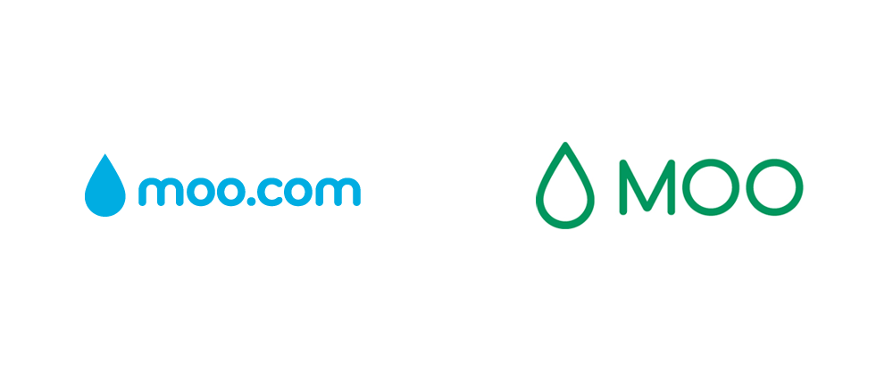

(Est. 2006) "MOO is an online printing company, creating beautiful products from your own photos or designs. We print with your photos stored on Facebook, Flickr, or SmugMug, or you can upload your images to MOO directly. MOO also works with some great designers, so if you wanted to make something different and personal, have a browse around — see what takes your fancy."
Disclaimer: MOO is a presenting sponsor of the 2014 Brand New Conference. This post was not requested by MOO nor part of any deal. MOO is a well-known company and they recently announced the logo change, so that's why it's on Brand New.
Design by: In-house
Opinion/Notes: Did you know that MOO was originally named Pleasure Cards? MOO founder, Richard Moross, explains in this video that he named it that because Pleasure is the opposite of Business, as in when you are flying, so the opposite of a business card is a pleasure card. Good logic, terrible name. I've always been intrigued by the choice of MOO, and other than it sounding funny there is no real reason given. I'm still also waiting for them to graphically acknowledge this cow-ness somehow in the logo. They don't have to go all Chick-Fil-A but something, anything. Instead, they've been relying on a drop of ink for their logo for many years now. It's a safe concept that makes sense and this latest iteration is probably the most refined. While their promos and products are top notch, there seems to be an extra big oomph missing from their identity.
Related Links: MOO blog post
Select Quote: Of course we still love to print, I mean we really_love_to_print. We heart it, big time. But we like other things too and, as we work to bring our look and feel up-to-date, our logo, fonts and colour palette all being refreshed, we thought we'd have a crack at updating our tagline as well. Today I'm proud to reveal our updated brand identity and new tagline, "Design works wonders". With the tagline we wanted something that stayed true to our values, but broadened our horizons beyond print. MOO has always been about more than that and we wanted our brand to say so explicitly.
Our logo has been simplified, but we wanted to keep the memorable and iconic ink drop that makes MOO so familiar. Our colour palette has expanded significantly, but still feels very MOO-y, and our fonts have been subtly ‘tszujjed' to feel a little more grown up, because we are.
 And older logo that is probably the most known.
  New logo with tagline.
Newest Moo promo. (New logo can be seen on the can of paint).
An older promo (with the old logo) but still one of my favorite pieces of promotion for the design industry.
