The First Product-Launch Keynote- 1928
Man Dives into an Exploding Volcano
Face Plant in the Oval Office
Noted: New Name and Logo for CVS Health by Siegel+Gale
Achy Breaky Heart


(Est. 2007, formerly CVS Caremark Corporation) "CVS Health is a pharmacy innovation company helping people on their path to better health. Through our 7,700 retail pharmacies, more than 900 walk-in medical clinics, a leading pharmacy benefits manager with more than 65 million plan members, and expanding specialty pharmacy services, we enable people, businesses and communities to manage health in more affordable, effective ways. This unique integrated model increases access to quality care, delivers better health outcomes, and lowers overall health care costs."
Design by: siegel+gale (New York, NY)
Opinion/Notes: It would be difficult to not improve on the previous merger logo with the conflicting CVS and Caremark logos stacked and a line sort of tying them together. The new corporate name is much stronger and streamlined and marks a unified single company — my only hesitation is that it sounds more like a healthcare division of CVS than the parent company name. The hard-angled heart is surprisingly, well, hard-angled and it provides a welcome rigidness and business-minded aesthetic as opposed to just a bubbly rounded heart. The thin slab serif "Health" type is okay, I guess. It could be better but it could also have turned out much worse.
Related Links: CVS Health full press release and videos
"Our new Name"
Adweek story
Select Quote: The change of our corporate name to CVS Health is an important milestone in the history of our company. It reflects our broader health care commitment and our expertise in driving the innovations needed to shape the future of health.
 Logo detail.
New name and logo introduction TV spot.
A shorter (slightly different version) focusing on how CVS is not selling cigarettes anymore at their pharmacies.
  The businesses of CVS Health, just to help clarify what they do.
Linked: Brand Values

Link
The values of different brands according to three industry standards: Millward Brown, Brand Finance, and Interbrand. At least they all agree about Toyota.

Peaks
Big Ol' Moon
Art of Decay
Navis Photography
'Loveless' In Reverse
Yellow Loveless
Wes Anderson//Vehicles
Wes Anderson | Vehicles
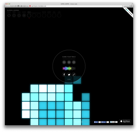
Super Looper
Super Looper. You have to try it! Make sure to put headphones on, then, get in the zone.
(via coudal)
Beyond Selfies
Vintage Apple Ads
Visione Periferica Street Art Festival.
Noted: New Logo and Livery for Frontier Airlines
Bass to the Future


(Est. 1994) "Frontier Airlines is an owned subsidiary of Indigo Partners. Currently in our 20th year of operations, we employ more than 3,800 aviation professionals and operate more than 350 daily flights from our hub at Denver International Airport. We offer routes to more than 75 destinations in the United States, Mexico, Costa Rica, Jamaica, and the Dominican Republic."
Design by: N/A
Opinion/Notes: I don't think you will get many complaints from going back to a Saul Bass-designed monogram — see first image below — but even without that knowledge, the update is an evident improvement. From the dowdy typography of the previous logo, Frontier has gone with a more active italic wordmark that properly integrates the old Saul Bass "F". It's not ideal, but it works. The livery is okay, nothing great, nothing horrible. The popular animals on the tail remain.
Related Links: Skift story
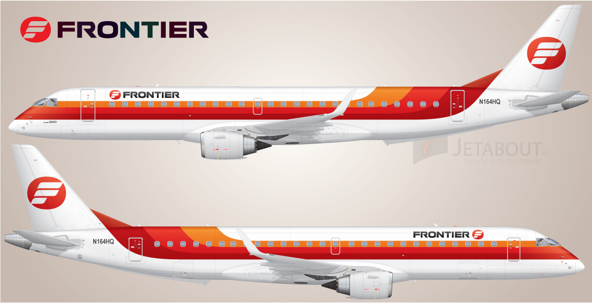 Logo and livery designed by Saul Bass in the late 1970s.
  Logo detail.
  A sample of the old livery, which has included animals on its tail for a while.
 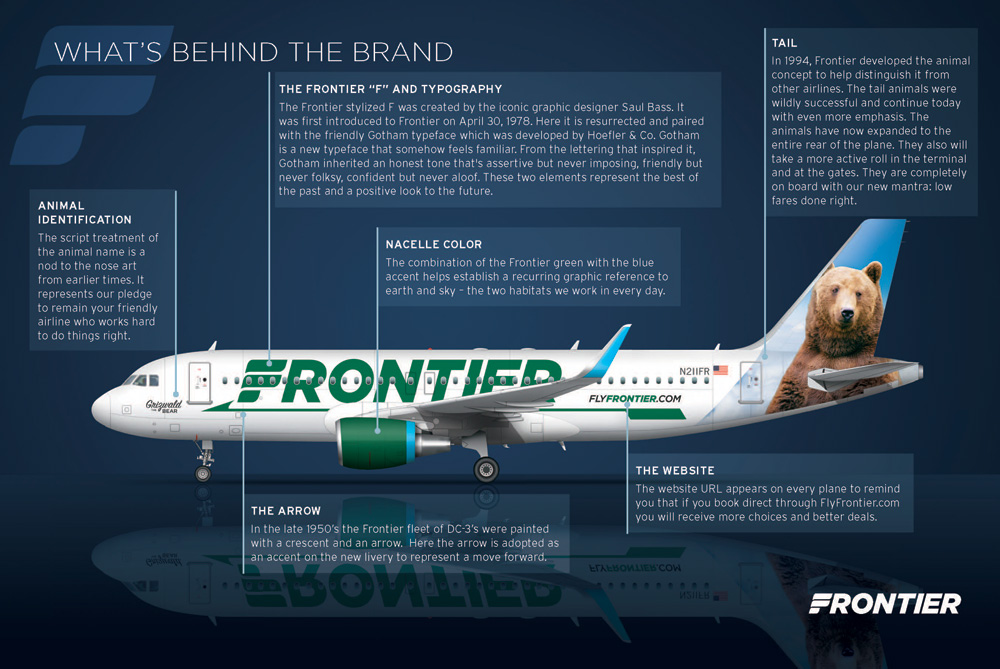 New livery explained.
 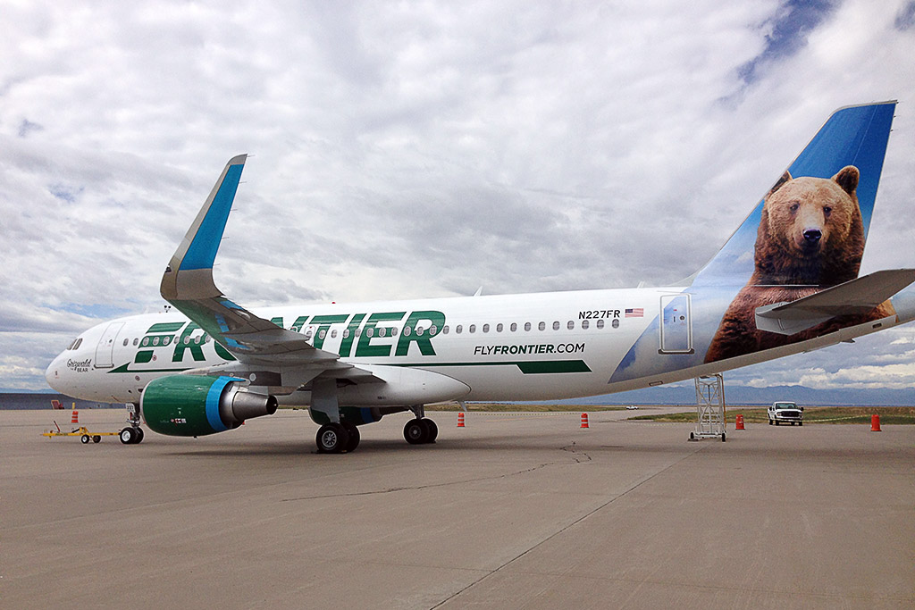 New livery IRL. Photo by Brian Sumers for Skift.
New TV spot.
Linked: NYCTA's Manual, Reissued

Link
The 1970 NYC Transit Authority Graphics Standards Manual by Unimark is being reissued as a full-size book. The only way to get it is by backing it on Kickstarter.

Shades of Gray — Yes, Really
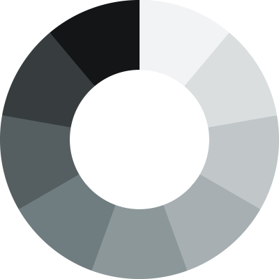
Get your head out of the gutter, this is about real colors, y’all—not that racy stuff you watch on the big screen. In my last post, I shared a method for creating a full range of colors using color mixing. Here, I’ll share a similar process for grays or neutral colors.
Quarters & Thirds
It used to be that I would separate my grays into quarters and thirds as a way of covering a good range with memorable increments; but, it always bothered me that the gaps weren’t equal. In other words, you end up with shades that gather closer to the middle of the range than on the ends. When this happens, you miss some good contrasts on the lighter and darker sides of the range.

Fixing the In-betweens
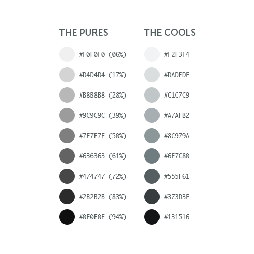
More recently, I’ve worked to fix this imbalance by moving outward from a 50% middle with increments of 11%. This does a couple of nice things. Not only does it retain a perfect middle at 50% -- it goes further to create perfect middles at each gap in-between. I also get two additional grays (17% and 83%) closer to each end of the spectrum for more options using lighter lights and darker darks. An added bonus is that it eliminates the pure blacks and whites which are nice to keep reserved for limited use, if any.

Warming & Cooling
Of course I could stop there -- but that would be boring. I usually like to add a hint of color for further interest and distinction. The first step is to decide whether or not to warm or cool the set. In this example, I’m cooling things down with a bright blue from the Viget color palette. I’ll simply overlay the blue and create an opacity of 10% so that the grays are still visible and dominant through the transparent blue. It’s hardly noticeable, but doing so nicely cools our grays with a subtle hint of blue as seen here:

The Full Range
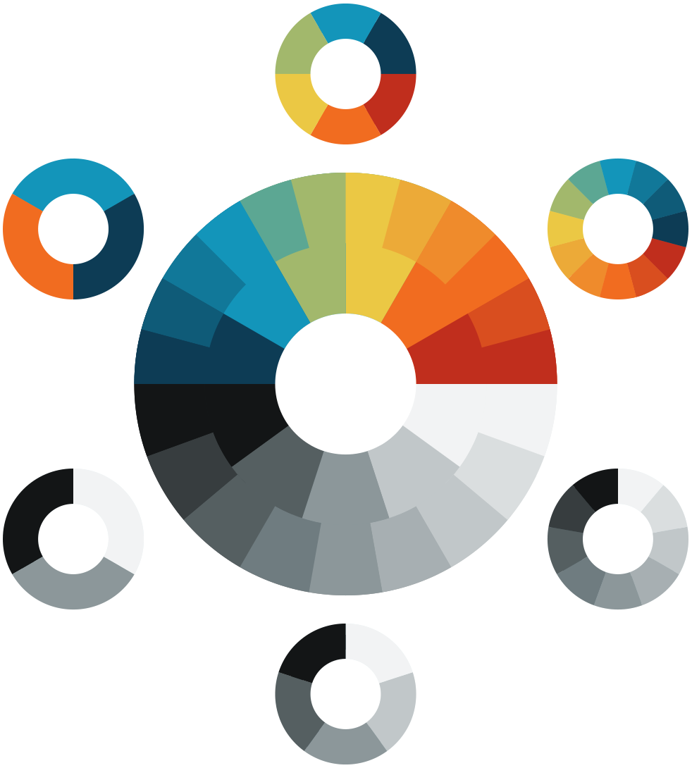
Voila! That’s it. Now we have a full range of cool neutrals to use alongside a full range of bright colors. Here’s what they look like together in an extended Viget color palette.
See also:
- Add Colors To Your Palette With Color Mixing
- Using Word Association to Select Brand Colors
- Equating Color and Transparency
- Using HSB Inputs in Photoshop’s Color Picker
