Quantcast
Channel: Positive Influences
Viewing all 13789 articles
Browse latest View live

Reviewed: New Look of the Games for Baku 2015 by SomeOne

$
0
0

A Pomegranate for your Thoughts

New Look of the Games for Baku 2015 by SomeOne

Taking place for the first time in 2015 from June 12 to June 28, the inaugural European Games will be hosted by Baku, the capital city of the Republic of Azerbaijan. (Hopefully not to sound too uncultured: first time I hear of this land). The duties were won by Baku back in 2012 when 49 National Olympic Committees voted its approval — it was the only bidding city. Approximately 6,000 athletes from 49 countries will compete in 19 sports. In November of 2013, the Baku organizing committee introduced the event's logo, designed by Ankara, Turkey-based Adam Yunisov, and at the end of August it unveiled the Look of the Games, designed by London-based SomeOne.

The multiple elements of the logo and their meanings are explained in detail in this press release. (Too lengthy to repeat here).

New Look of the Games for Baku 2015 by SomeOne Logo as originally presented in November.

Laden with meaning — a carpet! a flame! a wave! a "benevolent, mythical flying creature"! a pomegranate! — the logo manages to scrape by as decent simply by ambitiously capturing various relevant elements of Baku's culture and history. As a graphic device, though, it lacks sophistication and has far too many swooshy flares no two of which seem to be visually related… I think I am being far too forgiving: looking closely at the icon, it's a real mess. Luckily, it seems SomeOne was given permission to clean up some of the shapes — see detail directly below — with the benevolent flying creature benefitting the most. (It would be the least productive use of both your and my time to even get into the cons of the original logo's typography).

New Look of the Games for Baku 2015 by SomeOne Refined logo and typography.
Central to the new brand is the pomegranate tree, which symbolises unity in Azerbaijani folklore. Interwoven with the branches of the tree are historical symbols of the country's heritage and culture, along with eye-catching pictograms of the different sports and disciplines.

Incorporated in the eye-catching new designs are other symbols of Azerbaijani heritage including the colourful stained glass shebeke, the ornamental detail of the buta and references to carpet design and weaving which play a significant part of the country's proud history.

Baku 2015 press release

New Look of the Games for Baku 2015 by SomeOne Pomegranate tree detail. New Look of the Games for Baku 2015 by SomeOne The tree graphic cropped for different applications.
This inspired the creation of a living property — the Baku 2015 pomegranate tree. Alive with athletes, Azerbaijani art and the pomegranates themselves, the tree has been designed to be adaptive, celebrating elite sport in the amazing setting of Baku.

Baku 2015 press release

Tree graphic animation.

Probably knowing from the very beginning that there wasn't much potential in the logo itself, SomeOne smartly introduced a whole new set of visual elements to create the Look of the Games, using some of the original logo's elements. Mainly, the pomegranate tree. Created in a rich, sinuous, eclectic style, the main tree graphic is vibrant and colorful, sprouting with equal glee leaves, pomegranates, and athletes. It's a highly attractive design and lends itself quite nicely for different crops and framing.

New Look of the Games for Baku 2015 by SomeOne Some of the pictograms. New Look of the Games for Baku 2015 by SomeOne
New Look of the Games for Baku 2015 by SomeOne
New Look of the Games for Baku 2015 by SomeOne Pictograms in action. New Look of the Games for Baku 2015 by SomeOne Publications. New Look of the Games for Baku 2015 by SomeOne Poster. New Look of the Games for Baku 2015 by SomeOne T-shirt.

From the concept images shown above, it's easy to tell there is great potential in the identity as it's a very flexible and interchangeable set of elements that provide endless consistency no matter the application. It will be interesting to see how it translates in real life, though, as I'm guessing the ultimate application and execution will fall to the in-house design team of the organizing committee. But for an inaugural edition, Baku has already established a strong design precedent that hopefully will carry on for future editions every four years.

Many thanks to our ADVx3 Partners

♥ / Sound Blaster Roar | By Creative Labs

$
0
0

A big thank you to Creative Labs for sponsoring this week of my RSS Feed.

The critically-acclaimed Sound Blaster Roar is Creative Labs latest accomplishment – a portable NFC Bluetooth wireless speaker which boasts of doing the impossible of achieving powerful, balanced, well-defined audio without compromising on size, looks, battery life or feature set.

The #1 bestselling, Red Dot Design Award-winning Roar has received consistent 5-star reviews on Amazon since its launch. Now available, at an attractive price of $149.99 via Creative.com and Amazon.com.


(Interested in sponsoring a week of my RSS feed, learn more here.)

Your Brain and Meditation

$
0
0

Dan Harris explains the neuroscience behind meditation and predicts that the exercise will soon become regularly scheduled maintenance, as commonplace as brushing your teeth or eating your veggies.

Noted: New Logo for ShopRunner done In-house

$
0
0

Run Shop Run

New Logo for ShopRunner done In-house

(Est. 2010) "ShopRunner is a members-only service for online shoppers that provides unique benefits across hundreds of the best online stores. ShopRunner's members save time and money with benefits including free 2-day shipping with no minimum order, free and easy return shipping, exclusive member offers, and easy 2-click check out. Participating stores include Toys"R"Us, Brooks Brothers, Calvin Klein, Tommy Hilfiger, GNC, American Eagle Outfitters, Drugstore.com, Blue Nile and hundreds of others."

Design by: In-house

Opinion/Notes: I highly recommend reading the linked story above; it's kind of humorous and quite misguided about representing what designing a logo costs — specially coming from a CMO who thinks (or, worse, believes, Pepsi's logo cost $1 million or BP's $250 million). Instead, for $20,000 of internally-spent money, ShopRunner got two swooshes (each, presumably $10K) that are meant to be a monogram for an "S" accompanied by some old-school, low-bar sans serif that I'm guessing they see as fashionably chic yet only comes across as cheap. In the interview, the CMO mentions there is a "micro-space" between the "P" and the "R" so that you can still read it as Shop, space, Runner instead of it being a company dedicated to prunning shos. The old logo was admittedly too dot-com-ish but this new version is not any better in terms of establishing ShopRunner as a contemporary retailer.

Related Links: Bizwomen.com interview with ShopRunner CMO, Megan Hanley

Select Quote: After floating dozens of options, the rebranding team decided on a more abstract logo — the two crescents' representing the "duality" and integration of the business model because members can browse on the ShopRunner site or directly at the partner sites, [ShopRunner chief marketing officer, Megan] Hanley said.

New Logo for ShopRunner done In-house Logo detail. New Logo for ShopRunner done In-house Alternate logo lock-up. Many thanks to our ADVx3 Partners

Linked:

$
0
0

A&F Logo Doesn't Sell
Link
Preppy retailer Abercrombie & Fitch is stopping sales of merchandise with their logo (sometimes showcasing a moose) on it in the U.S.. Previously a staple of teenagers, these items have been selling like the opposite of pancakes.Many thanks to our ADVx3 Partners

Announced: 2014 Brand New Conference: Ticket Giveaway

$
0
0

At Least 32 Tickets Up for Grabs

2014 Brand New Conference: Ticket Giveaway

We have at least 32 (!) free tickets up for grabs today for the Brand New Conference in Chicago on September 25 – 26. Read on for details.

16 free tickets come courtesy of our following sponsors:

MOO (8 tickets)
LiveSurface (4 tickets)
Hoefler & Co. (4 tickets)

We might have a few more listed before the end of the day and the final quantity will be confirmed tomorrow.

The other 16 come courtesy of UnderConsideration.

Rules

1) Leave a comment in this post saying "Me" or "I" to enter the drawing.

2) Make sure you use or have a REAL e-mail to comment in your Disqus profile. They don't show up live, but I see them in the system. If I can not contact you you can not win.

3) You have until 1:00 PM Eastern Time tomorrow on Tuesday, September 9 to leave your comment.

4) We will put all the names in a bag, shuffle ’em and pull out 32 winners (plus 6 for wait-list). We will record and post the video for authenticity.

5) Winners will be announced shortly after that.

6) Only submit your name if you are clear to attend the conference on Thursday and Friday, September 25 and 26; do not take away someone else's chance to attend.

7) Travel and accommodations are your responsibility.

8) People who have already registered for an in-person ticket (as opposed to a webcast) are not eligible.

9) Winners must register online by 11:59 pm Eastern Teim on Thursday, September 11, 2014.

Reminder: The last day to register online will be Thursday, September 18. You will have all day and all night to do so. This applies for both in-person tickets and webcast registrations. No exceptions.

Many thanks to our ADVx3 Partners

Grand park

Type Safari with James Victore


Super-Looper

Quim Marin Design

Download The All-Inclusive Design Bundle

$
0
0

Design resources and stock are available all over the web, but to be honest there is a lot of junk out there so when I came across the awesome deals over at DesignCuts I was pleasantly surprised and had to share. The deal they have going on right now is their biggest & most varied design bundle ever and I highly recommend getting it while it’s available. The deal expires on the 15th.

The bundle includes best-selling fonts, hundreds of vectors, dozens of textures, brushes, Photoshop actions, stock photos, print effects, hand-drawn items, ebooks, and more.

There’s no filler content and they all come with an extended license meaning you can use them in commercial projects and items for resale.

These resources will be incredibly useful for your regular work and the best part is that they are organized into carefully labeled folders with a PDF guide. Oh and it’s only $29, rather than $876 if you bought these individually!

All Inclusive Design Bundle

So grab this all-inclusive deal at 97% off. I highly recommend it!

Revs Digital Library

$
0
0
Stanford's new Revs Digital Library "provides a web-based tour through the world of the automobile - its past, present and future." Nice, thanks RPB.

Moonbow Beach

Childhood's End

Top of the Lake

$
0
0
Four episodes into Top of the Lake and am solidly hooked. Please, don't let it be the hot dude in the tent. I don't camp, ever, but would give up my condo for him.

Kubrick - An Art Show Tribute

Aerial Views Adria

NOI Worktable

$
0
0

Noi Worktable

Gasp! NOI Worktable by OHIO Design is the most beautiful, minimal giant desk I have ever seen. You can customize it in length and you can chose from a variety of surface materials. Me, I am all for white.

This Week in Fonts

$
0
0

A highly functional sans by HVD Fonts, a powerful script from Dai Foldes, a hard working slab by Fort Foundry, a charming script from Drew Melton, an energetic script by Laura Worthington, a unique text face from Canada Type, a versatile sans by Stone Type Foundry, and an ambitious slab from Hoftype.

HVD Fonts: Brix Sans

Designed by Hannes von Döhren & Livius Dietzel

Brix Sans is a family of 6 weights with matching italics, which works perfectly for corporate & editorial design. Combined with Brix Slab, high and complex typographical challenges can be solved.

Dai Foldes: Globe Script

Designed by Dai Foldes

With tenacious rhythm and dynamic connections, Globe Script gives power to your headings and overlays.

Fort Foundry: Factoria

Designed by Mattox Shuler

Born out of Industry, Factoria is a geometric, square slab. The hard-working family can jump from the side of an industrial building and into a sports magazine in a jiffy.

Drew Melton: Ballpoint Script

Designed by Drew Melton

Ballpoint Script’s smooth, single-weight lines and charming variations provide the ideal balance of humanity and clarity.

Laura Worthington: Voltage

Designed by Laura Worthington

Voltage is an unexpected and energetic standout in the world of script fonts, breaking free from formal classifications while retaining the degree of personality we treasure in hand lettering.

Canada Type: Dokument Pro

Designed by Jim Rimmer

Dokument Pro’s range of weights, styles and features allows for multi-application versatility and clear, precise emotional delivery.

Stone Type Foundry: Magma II

Designed by Sumner Stone

Magma II is a rare sans serif typeface family designed explicitly for use in both text and display applications.

Hoftype: Orgon Slab

Designed by Dieter Hofrichter

Orgon Slab consists of 16 styles and is well suited for ambitious typography.


Sponsored by Hoefler & Co.
and


This Week in Fonts

Reviewed: New Logo, Identity, and Livery for Southwest Airlines by Lippincott

$
0
0

Love is in the Air

New Logo, Identity, and Livery for Southwest Airlines by Lippincott

Established in 1971, Southwest Airlines is one of the most liked and well-regarded airlines in the U.S., from its low-cost options to uproariously and authentically funny and chillaxed flight attendants — although the effect can sometimes be grating. Southwest travels to 93 destinations in 40 states, operating more than 3,600 flights a day, transporting more than 100 million customers a year with the help of 45,000 employees. While other airlines have suffered bankruptcies and layoffs, Southwest has remained profitable for 41 consecutive years. With expansion to big-market destinations like New York and Washington, D.C., and other growing plans, Southwest introduced yesterday a new logo, identity, and livery designed by New York, NY-based Lippincott. (Additionally, Southwest has gone the extra mile by crediting all its creative partners: GSD&M, VML, Razorfish, and Camelot Communications).

"Our collective heartbeat is stronger and healthier than ever, and that's because of the warmth, the compassion, and the smiles of our People," said Gary Kelly, Southwest Airlines Chairman, President, and Chief Executive Officer. "The Heart emblazoned on our aircraft, and within our new look, symbolizes our commitment that we'll remain true to our core values as we set our sights on the future."

Southwest press release

New Logo, Identity, and Livery for Southwest Airlines by Lippincott
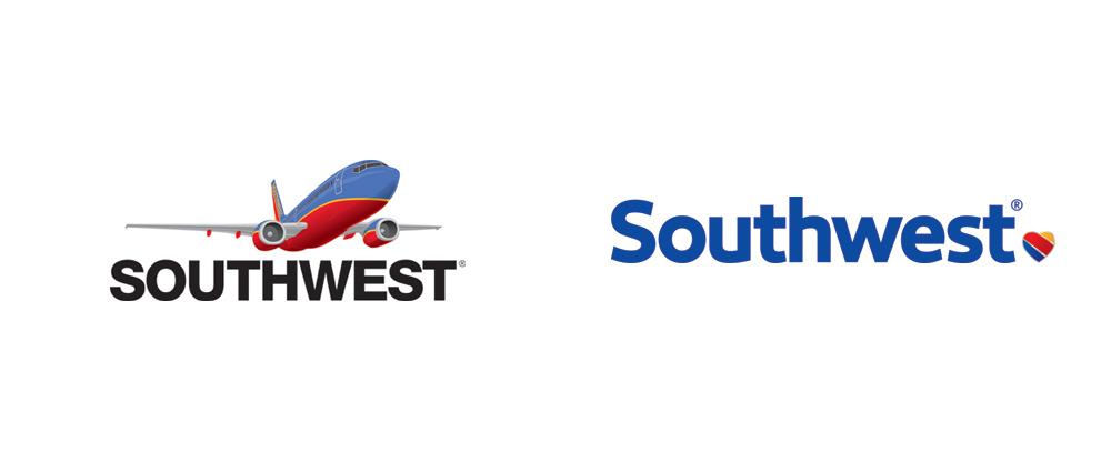
New Logo, Identity, and Livery for Southwest Airlines by Lippincott Logo detail in full color and single color. New Logo, Identity, and Livery for Southwest Airlines by Lippincott Variation with heart-com.

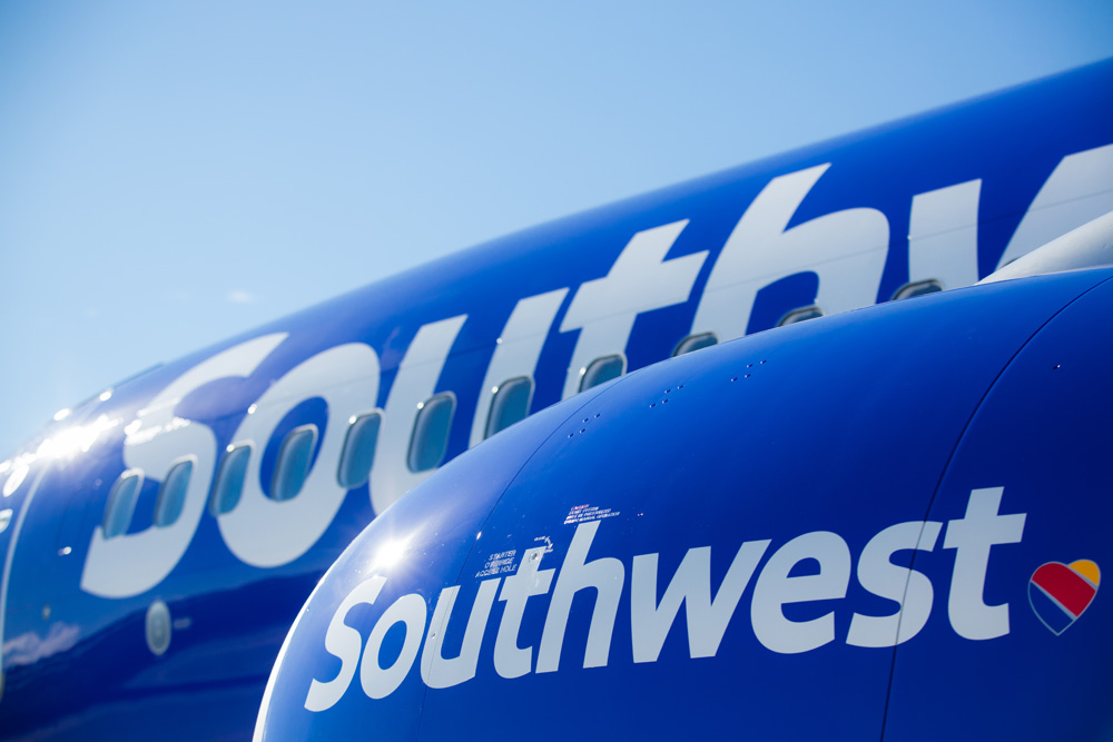
I had never really acknowledged that the old logo was, in fact, a plane with the livery and the name of the airline under it. Fantastically lame, no? It's as if Apple's logo were a picture of the iPhone and the word Apple underneath. Moving away from this overly literal approach, Southwest has adopted a heart as its icon and main identifier. And it's so great. No other airline has a heart — either as their logo or as in having any empathy to how shitty the coach-flying experience has become — so they automatically stand out. It's one of the boldest airline logo changes we've seen, even more so than American Airlines which simply went with an updated eagle icon. This heart icon makes a grand statement that only Southwest can make. Its execution is also on target: it's not a sentimental or cloying or child-like heart but cast more like a pin that anyone (man, woman, or child) would gladly wear on their shirt. The sizing of the logo is also key. It's small and serves like punctuation so it's not a "LOOK AT ME" kind of icon. It's there to accompany the rather nice wordmark that is refreshingly contemporary, well kerned, and has enough personality of its own to be recognizable. My only minor complaint would be the "u" — I just don't like all these stem-less "u"s out in the world.

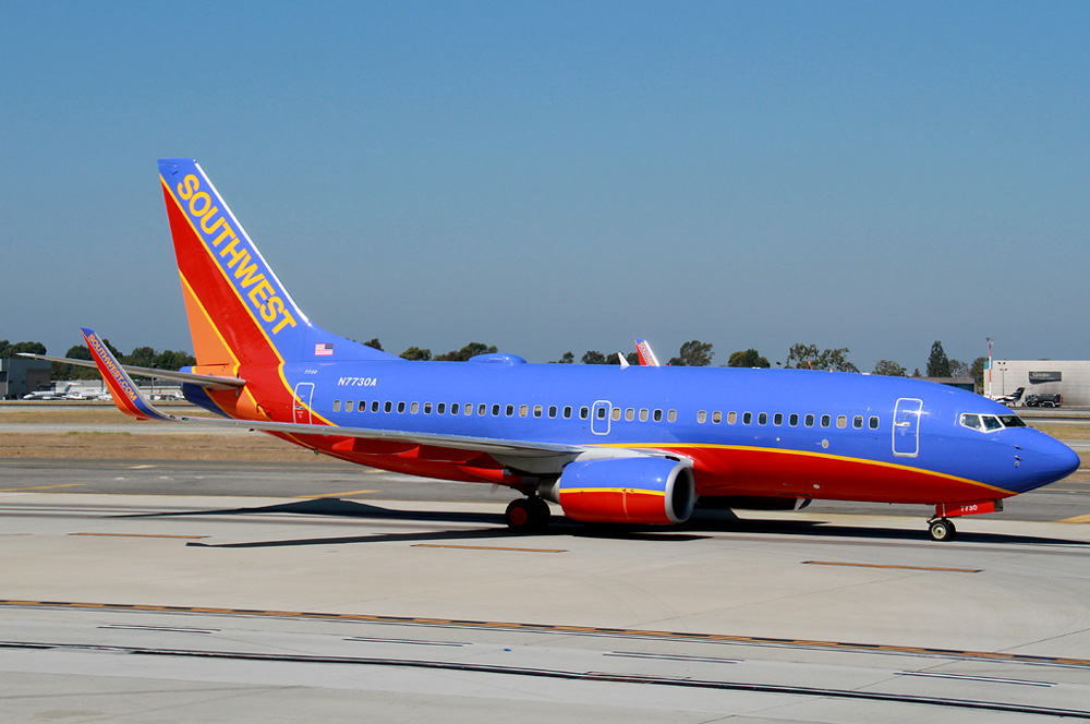
New Logo, Identity, and Livery for Southwest Airlines by Lippincott Old livery.
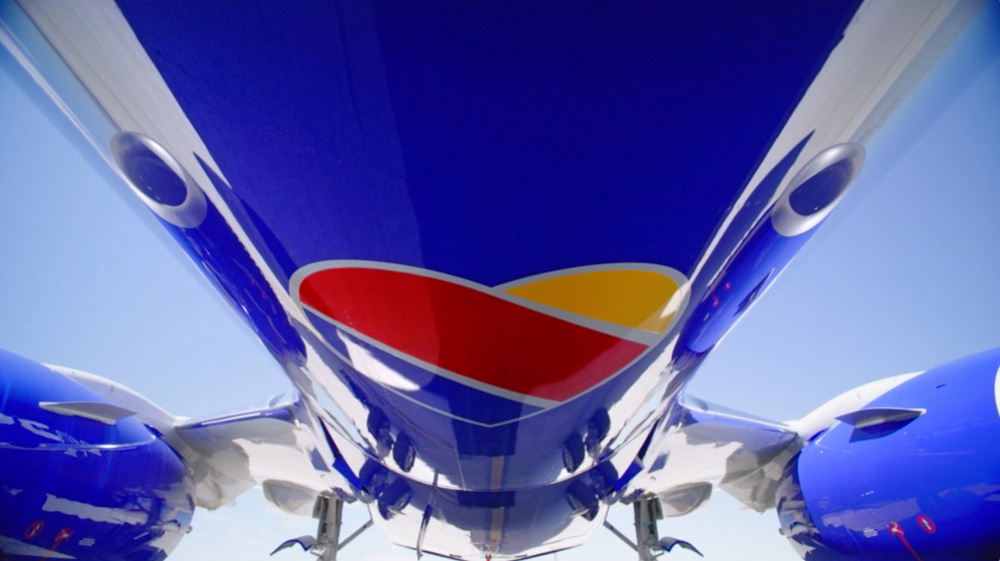
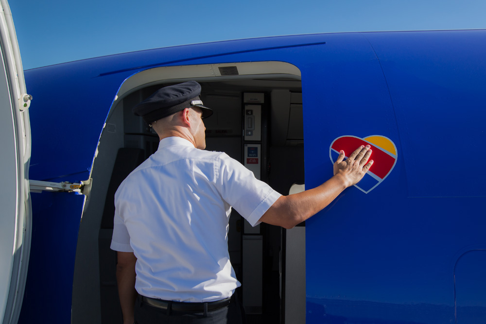
Southwest Airlines and its partners did comprehensive research and held numerous focus groups with Employees and Customers to determine how best to create the new look. The airline heard that it was important to remain unique and to retain its personality; for these reasons, Southwest continues to use the vibrant color palate and striped tail that has long identified the carrier, while adding a modern touch, proudly displaying the Southwest name on the side of the fuselage and presenting the Heart on the aircraft belly. Southwest has had several different liveries and logos throughout its 43-year history; remaining current and relevant is critical to the sustainability and future growth of the brand.

Southwest press release

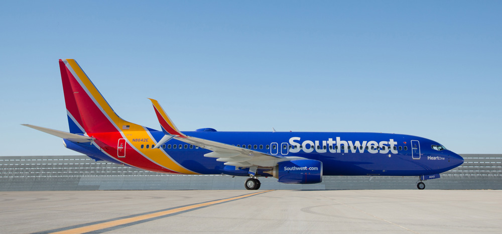
Painting the new livery. New Logo, Identity, and Livery for Southwest Airlines by Lippincott New livery. New Logo, Identity, and Livery for Southwest Airlines by Lippincott
New Logo, Identity, and Livery for Southwest Airlines by Lippincott A couple of sexy livery detail shots. You can see plenty more here.

There were some rumors that Southwest would be getting rid of its heavily painted livery, which makes for really high paint job costs but Southwest clearly realized that their planes are some of the most recognizable from the ground, with their giant red bellies and have decided to continue dropping buckets of paint unto them. The old livery was fine but this new one is absolutely stunning — maybe it's simply the fact that it's literally a fresh coat of paint and the one plane that's been painted looks as bright as it will ever be. Nicknamed "Heart One", the new livery features the new wordmark large across the fuselage and the heart icon on the belly, making the planes even more identifiable.

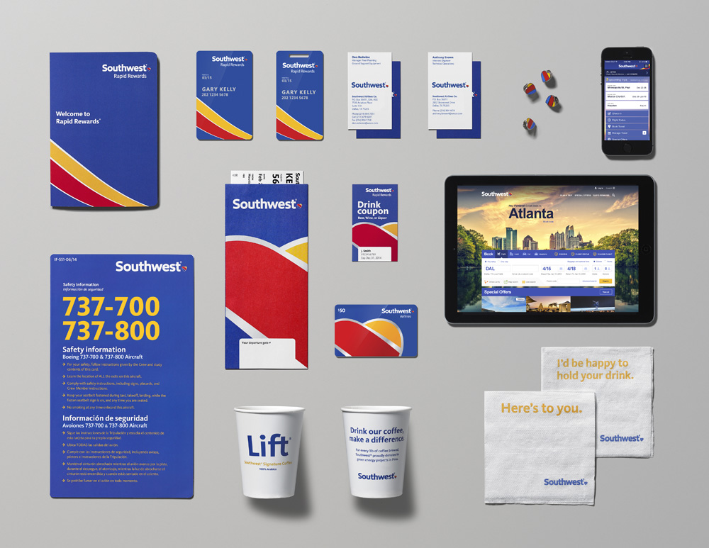
New Logo, Identity, and Livery for Southwest Airlines by Lippincott New ticketing counter look. New Logo, Identity, and Livery for Southwest Airlines by Lippincott Print materials.

Not much to say about this: looks sharp, clean, and colorful. I like how they are blowing up and cropping the heart in some of the print applications.

New Logo, Identity, and Livery for Southwest Airlines by Lippincott
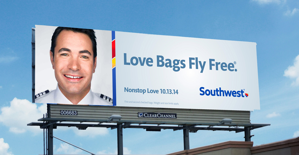
New Logo, Identity, and Livery for Southwest Airlines by Lippincott Sample advertising.
TV spot.

The advertising so far is okay. The introductory TV spot, with the catchy message of "Without a heart, it's just a machine" is quite nice. The print ads… meh. Trying a little too hard.

The new "DING" mnemonic.

I used to really like the old "DING – You are now free to move about the country" mnemonic but the updated, minimalist version is also quite catchy, although then I start thinking about The Clapper.

New Logo, Identity, and Livery for Southwest Airlines by Lippincott Cute.

Overall, I think this is one of the best airline redesigns we've seen in many years. There is a clear pride in it from Southwest, given all the materials they've made available and how they talk about it. It's almost rare for a company to have this much confidence in a rebranding launch. The heart is no Pan-Am globe, or Lufthansa crane but — because the competition has been so weak and timid about putting forth any identity with any real story to tell or message to convey — I'll bet you it will become one of the most recognized airline logos in the next ten years.Many thanks to our ADVx3 Partners

Viewing all 13789 articles
Browse latest View live


<script src="https://jsc.adskeeper.com/r/s/rssing.com.1596347.js" async> </script>