John Howe
Ideas Are Scary
Awesome Mockup Templates to Show Off Your Work in Style
As you guys know, I only share things that I know will be incredibly valuable to you. Today’s recommendation should have a real impact upon your design and client work.
My friends Tom, Matt and Darren at Design Cuts have managed to bring together hundreds of best-selling mockup templates, into one huge bundle, for a limited time 93% discount. This bundle is only available this week, but I just had to share it with you, as I know what a profound impact mockup templates can have upon your design work.
Mockup templates are the perfect way to transform your design work into something with far more impact. Rather than showing off your work as a boring flat file, you can show exactly how it will look across a range of media (such as poster prints, framed pictures, business cards, flyers, stationary, devices, notepads and much more). As you can imagine, this not only makes your personal design work look much more impressive, but can work wonders for your freelance and client projects. Clients often don’t have the imagination to picture the final result, and by showing them exactly how your designs will look out in the real world, it ups the perceived value of your work like nothing else.
The result? Happier clients and often the ability to charge higher fees!
Take a look at a tiny selection from this bundle, to get an idea of the quality of these files. Remember, this is only a fraction of what’s included in the main bundle:
As I mentioned, this bundle is expiring this week so I recommend grabbing it while you can.
» Click here to get the Ultimate Mockup Templates Bundle 93% Off.
Enjoy and feel free to share your creations in the comments below.
Reviewed: Friday Likes 99: From Dániel Nagy, Trüf, and Lo Siento
From Dániel Nagy, Trüf, and Lo Siento


Plenty of rich, textural work today on Friday Likes with work from Budapest, Santa Monica, and Barcelona.
Lamantin by Dániel Nagy
For his thesis project at the Hungarian University of Fine Arts, Dániel Nagy decided to redesign the real-life Lamantin Jazz Festival which, as you can see, isn't very exciting. To capture the improvisational nature of Jazz, Dániel created a generative wordmark that reacts to sound, by distributing "the different hertz values among the letters of the word 'LAMANTIN'," where "every time a certain value is sounded, the corresponding character springs into motion. The movement's intensity is dictated by the volume of the note." You can get a taste in the video above but to really appreciate the nuance with which the letters react you can see a working sample here with preloaded jazz tunes and/or input from your microphone. The wordmark itself is quite nice and Dániel has built a comprehensive system around it that's well worth a look. See full project
Echo Capital by Trüf

With offices in Denver, Los Angeles, and San Francisco, Echo Capital is an investment firm focusing on investing in young entrepreneurial types and its minimal logo and identity have been designed by Santa Monica, CA-based Trüf. Avoiding "echo-o-o-o-o" clichés, the identity has a fresh, contemporary feel through an elegant color palette and engaging set of patterns made out of squares and circles. I love how the logo takes some actual effort to decipher and it doesn't take any shortcuts to do it. The website is pretty snazzy too. See full project.
Bar Brutal by Lo Siento

I was on the fence about posting this identity and restaurant graphics for Bar Brutal in Barcelona, designed by local firm Lo Siento. We've seen the painterly approach before and probably done more ambitiously but that brush "B" is to die for and the sign painting on the windows oozes vernacular charm. (The text in the image above, by the way, translates loosely into "To cool the belly"). The identity goes into a few other brush styles but the most effective and attractive is definitely the condensed sans where the height of the letters break up the streak of the brush in very sexy ways. See full project here.

Noted: New Logo for Volvo by Stockholm Design Lab
The Ironmark Endures


"Volvo has been in operation since 1927. Today, Volvo Cars is one of the most well-known and respected car brands in the world with sales of 427,000 in 2013 in about 100 countries. Volvo Cars has been under the ownership of the Zhejiang Geely Holding (Geely Holding) of China since 2010. It formed part of the Swedish Volvo Group until 1999, when the company was bought by Ford Motor Company of the US. In 2010, Volvo Cars was acquired by Geely Holding. As of December 2013, Volvo Cars had over 23,000 employees worldwide."
Design by: Stockholm Design Lab
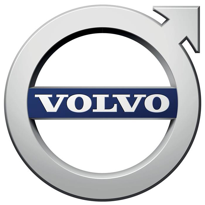
Opinion/Notes: Although it's one of the biggest car brands, the update to Volvo's logo lands in Noted instead of Reviewed since there aren't many supporting images and it's not a drastic change. Also, the critique is minimal: Much better! Moving away from the heavier chrome look into a matte finish makes the logo far more elegant and moving the type inside the ring makes it more integrated. The difference between the Volvo Cars and AB Volvo logo is so minimal I question why it was necessary — it's bound to create confusion and wrong usage.
Related Links: Stockholm Design Lab news
Volvo press release (mostly about the new XC90)
Select Quote: Volvo needed a re-design of the iron mark, optimized for communication and versatile for all types of applications. The logo has been simplified in its purest form and conveys the brand’s vision; to be the world’s most progressive and desirable premium car brand.
 Logo detail.
  Two different renderings exist of the "Ironmark": one for Volvo Cars (above, left) and one for AB Volvo (center). They share the same flat logo (right).
  XC90 event invite and new business card.
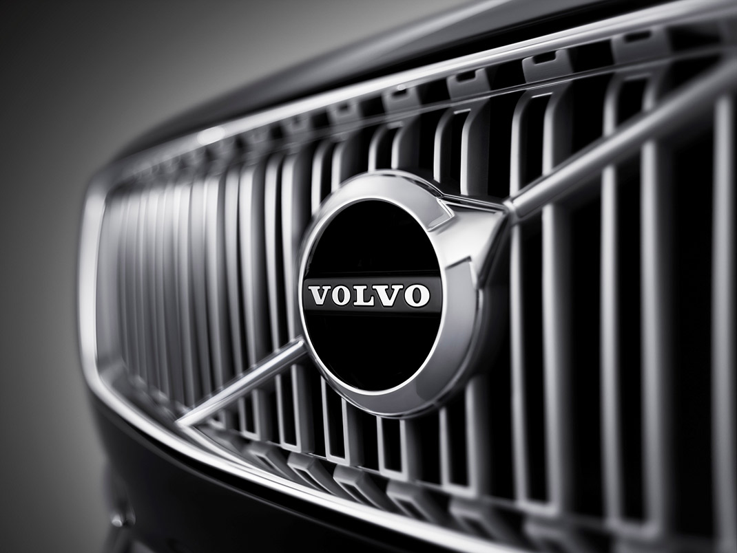
  The new logo on the new XC90 grill.
Insect Eyes
Linked: Hershey Tops "Logo" Google News

Link
Yesterday's post about The Hershey Company's new logo triggered a poo-emoji reaction, launching the logo to the top result for "Logo" search in Google News. Somewhere, the Bélo breathes a sigh of relief as another logo takes media center stage.

Friday Link Pack
Here’s unique way to show your logo/type work.. Dan Cassaro’s design sense is nothing short of impressive.
- A 1983 Volkswagen Golf Covered in Popcorn
- Love this: Free Mailbox Stickers Signify Goods Residents Are Willing to Lend Neighbors
- Summer of ice cream sandwiches. Made me smile.
- The Makers Manual by PSFK
- Places on Earth by Oliver Jeffers.
- 8 Things I’ve learned about marriage, by Joanna Goddard
- The Philosopher’s Mail never disappoints.
- I want to mount one of these over my desk.
- Push it away, it’s the long weekend.
- My favorite tape dispenser.
- Business Cards of Minimal Designers.
- A House with Rotating Rooms. Wow.
- The Price of Admission: Dan Savage on the unsettling secret of lasting love
- Team Tattly is looking to hire a Front-End Developer / Designer.

