Jackie Robinson Winners Come Home
Paris Through Pentax
Lego Thing
Noted: New Logo for Chicago Public Schools by Two Teenagers
Growing Pains

"Chicago Public Schools (CPS), officially classified as City of Chicago School District #299 for funding and districting reasons, in Chicago, Illinois is the third largest school district in the U.S.. For the 2012-2013 school year, CPS reported overseeing 681 schools including 472 elementary schools, 106 high schools, 96 charter schools, and 7 contract schools. Chicago Public Schools serves 400,000 students. Students attend a particular school based on their area of residence except for charter schools and selective enrollment schools. The school system reported a graduation rate of 65.4 percent for the 2012-2013 school year. Unlike most school systems, CPS is headed by a chief executive officer rather than a superintendent." (Wikipedia)
Design by: Phuong Le (14 years old) and Ivan Delgado (17 years old)
Opinion/Notes: Yeah, I guess it's cute to let the students design the logo and it's not much worse than what a paid professional designer might deliver but, c'mon, the third largest school district in the U.S. not only deserves better but should lead better by having a logo done properly and not farming it out to kids. Regardless of the process, and possibly ending these kids' dreams of becoming graphic designers, the logo is quite terrible. The three silhouettes are literally literal about growth and education and the typography is as bland as it gets. The thinning circle doesn't help in any way either.
Related Links: Sun-Times story with details on the students and their ideas
Chicago Public Schools announcement
Select Quote: The new CPS logo has been in the works since last spring, when CEO Barbara Byrd-Bennett challenged students in grades 6-12 to come up with an original design to represent their schools. Nearly 300 designs were submitted and ten finalists chosen. These designs were then voted on by representatives from the Mayor's Office, the Board of Education, the Student Advisory Council, and the CTU, as well as CEO Byrd-Bennett.
In the end, two designs were chosen, and the student artists worked with a graphic designer to combine and shape the new logo. Like the timeline that adorns the new website, its distinctive design represents CPS students growing and ultimately graduating from high school ready for success in college and career.

Linked: Coca-Cola is Not Natural?

Link
Two people are suing Coca-Cola in Federal Court over their "natural" branding after realizing the soda has phosphoric acid. I'm thinking about suing these two morons for confusing soda with a natural product — misleading branding or not.

Glenwood Caverns Adventure Park
Plus Plus
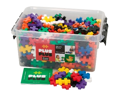
My daughter (8) is madly in love with Plus Plus. I am amazed at what she comes up with. I am all for toys that fuel my kids’ imagination.
Art Supplies Tattly
Why It's Impossible To Make Plans Anymore
As Above, So Below
Shy Boys' 'Life is Peachy'
Fairies
Noted: New Logo and Packaging for BrewDog
New Dog, Old Tricks

"BrewDog is redefining the UK craft beer scene as you know it… Back in 2007, James and Martin said sayonara to industrially brewed lagers and stuffy ales and — after brewing their first batch of beer in James' garage — set about making hardcore beers full time. Both only 24 at the time, James and Martin leased a building, got some scary bank loans and spent all their money on stainless steel. Luckily the gamble paid off and after just three years, BrewDog has managed to kick-start the UK craft beer revolution and with wave upon wave of cool, contemporary and progressive beers continues to challenge perceptions of beer and brewing the world over."
Design by: In-house (I think)
Opinion/Notes: This is such a great update. The new logo is so much more iconic and badge-like now that the typography sits on the outside. It lets the weird dog thing do its thing. The whole woodcut texture and vibe is nothing new but feels right on the logo. And the labels, how can you not like them? Again, nothing innovative in terms of aesthetic, but the fact that all the labels are done in letterpress, layer by layer, is a great fit for a craft brewer.
Related Links: BrewDog, "Time for a Change"
BrewDog, "Our New-look Website"
BrewDog, "New Packaging"
Select Quote: In an effort to ensure the look and feel outside our bottles matches the craft and passion inside them, we've started some experimental trials using real wood-cut and metal letters at one of the UK's few remaining letterpress studios. No computers. No photoshop. It's time for our packaging to become as hand-crafted as our beer.
Everything you see on these labels will be real. Real texture. Real ink. Real layers of colour. Hand-cut prints with character you can feel.
 Logo detail.
 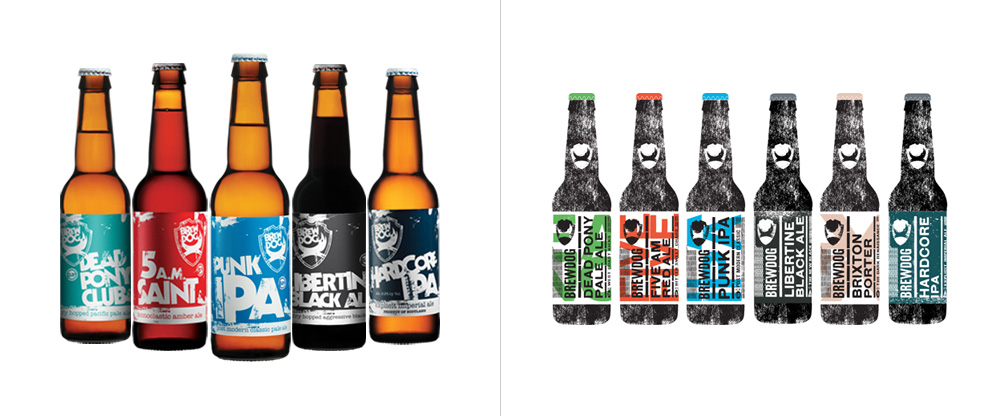 Before and after comparison of labels.
 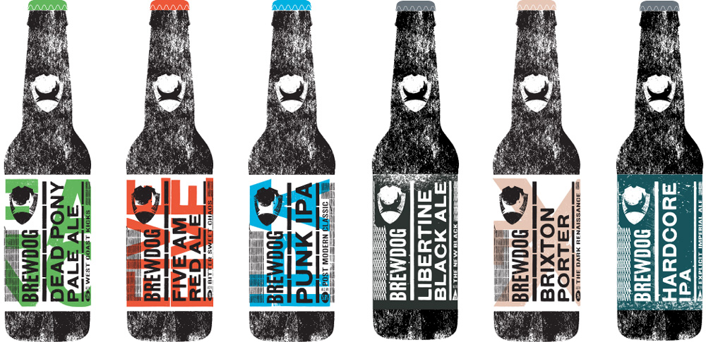 Rendering of a few of the new labels.
 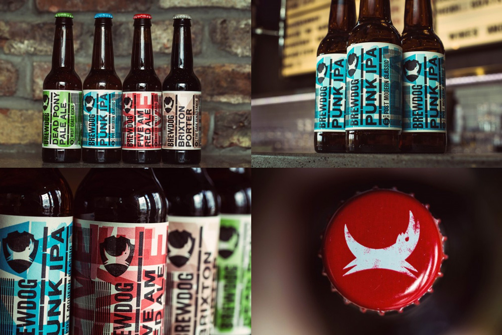 Bottle details.
  Fun with woodblock.
Printing with woodblock typography.
Linked: Alfa Romeo's Vicious Logo

Link
I'm not a car guy, so I had never really paid close attention to the Alfa Romeo logo but, dude, there is a dragon eating a human being in it. Jalopnik gets to the bottom of it.

