Quantcast
Channel: Positive Influences
Viewing all 13789 articles
Browse latest View live

Pavlov Visuals

$
0
0

Pavlov Visuals on grainedit.com

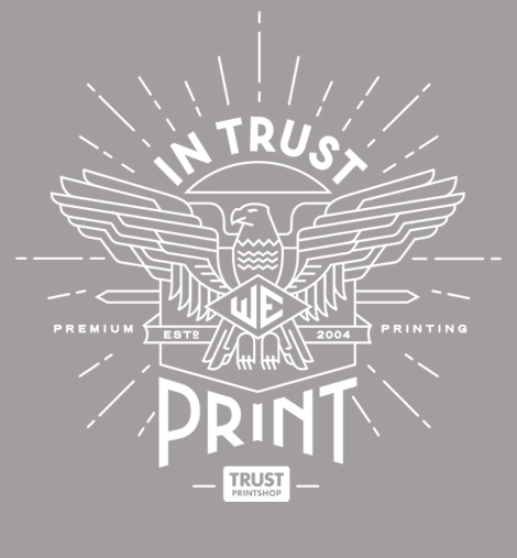
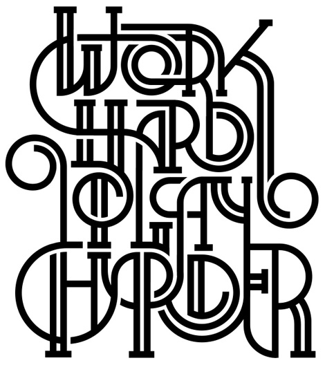
Pavlov Visuals is a versatile design studio with an established presence in the U.S. and Amsterdam. Their uninhibited style pulls inspiration from the past, but remains fresh and contemporary. While there’s lots to admire in their portfolio, i’m especially drawn to their fluid line work and slick typography.


Pavlov Visuals on grainedit.com

Pavlov Visuals on grainedit.com

Pavlov Visuals on grainedit.com


——————–

Also worth viewing:

Missy Austin
Josh Emrich
Tom haugomat

Follow us on RSSInstagramPinterestWanelo

——————–

Thanks to this week's Sponsor // CodeinWP: A PSD to WordPress development agency that provides quality themes to clients across the globe.


Space Shuttle and Space Station Photographed Together

To the contributors

$
0
0

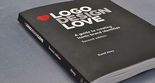
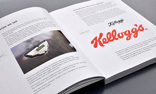
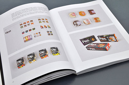
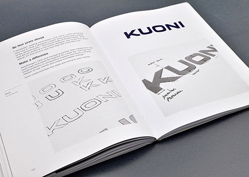
Five years after the first edition of Logo Design Love was published, the second edition is now available. A huge thank you to the following people and studios.

Logo Design Love, second edition

160over90 (@160over90)
300million
Adrian Hanft
Andrew Sabatier (@andrewsabatier)
Antonio Carusone (@AisleOne)
Believe in (@believeindesign)
Blair Enns (@blairenns)
Bravo Company (@bravo_company)
Brian Alexander Gray
Bunch (@BunchDesign)
David Hyde
Gerard Huerta (@gerardhuerta)
Glad Creative (@GladCreative)
High Tide (@HighTideNY)
ico (@icodesign)
id29 (@id29)
Ivan Chermayeff
Jerry Kuyper
johnson banks (@johnsonbanks)
Jon Large
Kevin Burr (@KevinBurr)
Lindon Leader (@LindonLeader)
Maggie Macnab (@MaggieMacnab)
Malcolm Grear Designers (@MGDesigners)
MetaDesign (@MetaDesignSF)
Moon Brand
Moving Brands (@movingbrands)
Nancy Wu (@nancywudesign)
nido
Pentagram (@pentagram)
Richard Weston (@AceJet170)
Roy Smith (@F1REBRAND)
Sagmeister & Walsh (@sagmeisterwalsh)
smashLAB (@smashLAB)
SomeOne (@SomeOnes_Tweet)
Stephen Lee Ogden
studio1500
Thoughtful Studios
UnderConsideration (@ucllc)

It’s an absolute pleasure to feature your work and thoughts.

Logo Design Love, second edition

Logo Design Love, second edition

Logo Design Love, second edition

And much respect to Nikki, Cathy, Danielle, Mimi, David, and Liz — the team behind the publishing scenes.

See more inside spreads. Available to buy from these booksellers.

#68: On Sacrifice

$
0
0
#68: On Sacrifice
link
Sunday.
I've been thinking a lot this week about sacrifice. In premodern cultures it was performed ritually for fertility, to appease the gods, bring order to the realm. Sacrifice was a necessary part of life. Today our media messages seem to convey the opposite, that we need not sacrifice—time, attention, anything, except maybe the money it costs us to buy or use or do the thing. You might say that sacrifice in primitive cultures was inhumane, but maybe its disappearance also leaves some gap in our humanity. By not killing the goat, we diminish the notion of honoring and respecting tradeoffs and the natural order.

Sometimes I am inundated with things to do and want to do so many of them that I can't decide on one, and eventually my decision is made for me. This is an alarmingly passive way to live, this waiting until you have no choice, like waiting until you get laid off to leave a job you hate. You let external forces eliminate your need to choose instead of making the choice yourself and taking responsibility for the consequences. It is a life lived by default.

Ritual sacrifice is a conscious act: I give this up for the growth and harmony it will bring in the future. This same active quality is the difference between a scarcity mindset and one of abundance; the way to cultivate plentifulness is not to have more things but to give them away even when you have few.

I was emailing with Ben about last week's letter (in which I said I was reading ten books at once) and he showed me a list he'd made of books he wanted to read and crossed out were all but the two he most wanted to read. The other morning I looked at my to-do list and decided to leave one thing on it undone. A couple weeks ago I deactivated my Facebook account. And lately, when I meet someone new and they ask what I do for a living, I try to come up a new way of answering the question without repeating an answer I've given before, like how a stand-up comedian might throw out their old material, regardless of how well it worked before. I sacrifice these metaphorical goats to bring abundance and harmony to the realm.

Perhaps a corollary to Agent Cooper's advice in Twin Peaks would be: Every day, once a day, make a little sacrifice. Just let it happen.
—Jack
Written from Brooklyn, New York. Questions, comments, hellos—all welcome. Just hit reply.

unsubscribe 

Email Marketing Powered by MailChimp

How to Write a Winning Web Design Proposal

$
0
0

This article has been contributed by Mike Hanski.

When you embarked on your chosen career path as a designer, your decision was probably driven by your right-brain thinking. You are a creative person, so you are naturally drawn to artistic ways of expressing yourself.

But what happens when left-brain activities creep into your day-to-day operations? Do you break into a cold sweat when you have to confront a slow-paying client? Does the thought of prospecting for new clients cause you to lose sleep at night?

How To Write Web Proposal

No matter how hard you try to avoid it, analytical thinking and administrative tasks will encroach on your design business. Rather than stress about this fact, learn to master it.

The Necessity of a Web Design Proposal

This section is going to be short and sweet. Why do you need to worry about mastering the art of writing web design proposals? Because if you don’t, you won’t be able to pay the bills.

Is that incentive enough?!

Web Design Proposals vs. Web Design Estimates

Many designers take the easy way out. Rather than draft an entire proposal, they simply opt for an estimate. After all, that is what your client asked for, right? “How much will it cost to redesign my website?”

That might be what the client wants to know, but that isn’t the information you should provide. Rather than focusing on the money, you need to focus on the problem and how to go about fixing it.

This approach – a persuasive proposal rather than a cut-and-dry estimate – is much more likely to see results. Rather than pointing out the large upcoming expense the clients will have to deal with, you need to show them there is a real problem happening and your solution will make everything better.

Outline of the Perfect Proposal

Do you remember presenting a persuasive argument in your high school public speaking class? You were probably assigned some controversial topic like gun control or abortion and asked to convince the rest of the class about your opinion in X amount of minutes.

Writing a web design proposal isn’t that much different. You have a very short amount of time to persuade the client to take action. You have one shot to convince the client you are the best person for the job.

Proposal Overview

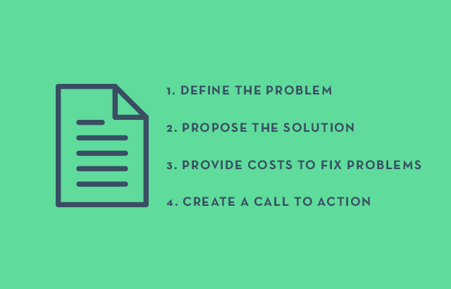
Here are the four main categories you’ll want to focus on:

  1. Problem Statement (Define The Problem)
  2. Proposed Solution (Propose The Solution)
  3. Pricing Information (Provide Costs To Fix Problems)
  4. Next Step(s) (Create a Call To Action)

1. Problem Statement

Define The Problem

This is probably going to be the most challenging portion of the proposal writing process. You need to get to the root of the client’s problem. The client probably won’t be too jazzed about discussing the company’s problems – airing dirty laundry in public, and all.

On the other hand, you may find the client simply has trouble articulating the problem. Business owners aren’t necessarily marketing professionals. They might not know exactly what the problem is – they just know sales are dropping and something is to blame.

You are going to have to dig. Find out what the real problem is. Then, you can go about finding a solution.

While this step might be challenging, it is absolutely necessary. Your entire persuasive argument breaks down if there is no problem to begin with. In your high school class, there would have been no point in discussing gun control if there was no such thing as murder. Now, there is no point in doing a website redesign if the original is working just fine.

Here is an example of an inefficient problem statement:

Best Pizza Ever is interested in a website redesign to give them a fresh new look. The redesign will include…

Why is that a bad problem statement? Because there is no problem! Why does the company need a fresh new look?

Here is an example of a better problem statement:

Best Pizza Ever has seen a significant increase in competition lately. A lot of the competition utilizes modern-looking websites. Those trendy, hip sites are starting to draw customers away from Best Pizza Ever. Best Pizza Ever needs a fresh new look to ensure existing customers remain loyal and new ones are attracted.

2. Proposed Solution

Propose Solution

Now that you (and the client) know what the problem is, you can go about solving it.

Obviously, you’ll want to tell them how you’ll meet their needs. However, you also want to tie everything back to business – how your solution will boost sales, increase visibility, etc. Not what you are providing in list format.

The sub-par proposal would say:

Best Pizza Ever needs an entire website redesign. It will include a new logo, contact form…

The better proposal would start out with:

To effectively recapture the market, Best Pizza Ever needs a website redesign. To do that, we’d start with a needs analysis session. This will help establish the key elements of the website, identify different types of customers, and determine the most effect call to action… The next phase, the content plan, will accomplish… Later, the design phase will incorporate…

Show how you will actually meet the clients’ needs and help improve their bottom line.

This step must be successful. Otherwise, the next portion of your proposal (pricing information) could scare them away. Make your solution so effective the client won’t mind the price – or better yet, think the price is a bargain!

3. Pricing Information

Provide Costs

This section will be the hardest for the client to hurdle. Make the information easy to digest and easy to read. Your best bet is to place the data in a grid. This is commonly referred to as the Fee Summary.

THE BAD WAY

As we’ve already seen, there is usually both a good and bad way to do things. When it comes to pricing information, a bad proposal would share something like this:

WordPress installation $400
Theme purchase $50
Customization of theme $250
Creation of 10 WordPress pages $500
SEO Audit $300
Total Cost $1,500

Why is this a bad example? It is far too technical. From your point of view, you’ve outlined everything that needs to be done. From the client’s point of view, this is a confusing list of jargon that comes with a hefty price tag but really means nothing.

THE GOOD WAY

Rather than come at this like a to-do list, think of the client’s needs. How much will it cost to fix their problem and meet their needs?

Create custom website $700
Write website content $500
Ensure website is visible in search results $300
Total Cost $1,500

From start to finish, the entire proposal is about fixing the client’s needs. The pricing section is no exception.

In addition to the Fee Summary, you might want to include a Fee Schedule. If the project is fairly large, you’ll want to establish a way to tie payments to applicable milestones. This will also help you create a timetable for the project. The client will be able to envision how you’ll progress through the steps over time.

4. Next Step(s)

Call To Action

As a designer, this step is right up your alley. You need to create a call to action. What do you want the client to do now? Let the client know exactly what needs to be done to set the project in motion.

Consider creating an online proposal. Rather than mail a Word document, grant the client access to a digital version. In this case, the call to action is incredibly simple. All the client has to do is click a button. Online proposals have a much higher success rate and get answered much more quickly. You could even provide a link to make a deposit online.

Can I Create a Template?

Our right-brain thinking often rebels at the idea of drafting a new proposal for each client. Can’t you create a template and copy+paste new information for new prospects?

Yes and no.

If you want a template, we’ve just given it to you – the four steps of the writing process. Beyond that, a template isn’t a good idea. Paragraphs of text that are used for each proposal – regardless of the client – are a bad idea. Each project is different; therefore, each proposal should be different.

If you do want to include a few generic paragraphs about yourself, your company or your past clients (a bit of a portfolio, if you will), do it at the end of the proposal. In order to be as persuasive as possible, you need to focus on them – not you.

Putting it All Together

As long as you successfully determine the clients’ needs and then make those needs the main focus of your proposal, you’ll be able to persuade them to take action. Dealing with all this administrative stuff sure isn’t appealing to most designers. However, it is a necessary evil of business. You might as well learn to do it right!

Mike Hanski is a content strategist and a blog writer at Bid4papers.com. He specializes in writing papers and short essays on history and literature and provides editing services to clients from various industries. You can contact him at Google+.

Linked: Logo Design Love v.2

$
0
0

Logo Design Love v.2
Link
The second edition (in a tasty Plike-like cover) of David Airey's popular Logo Design Love is now available. (Disclaimer, I guess: our work is included).Many thanks to our ADVx3 Partners

Recently Received

$
0
0


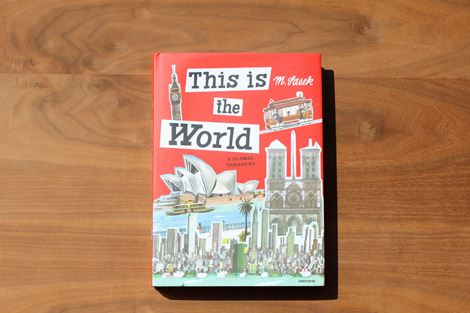
This is the World - Miroslav Sasek


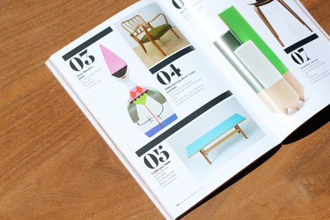
Here’s the latest round of books and goods to hit our shelves. This week’s entries include items from Nobrow, Chronicle Books, Universe, Korero Press, Ryan Gillett and Mid Century Magazine.


This is the World - Miroslav Sasek

This is the World - Miroslav Sasek

This is the World - Miroslav Sasek

This is the World - Miroslav Sasek

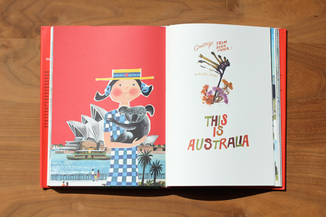
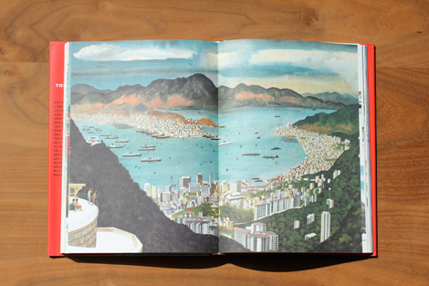
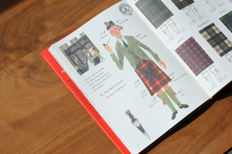
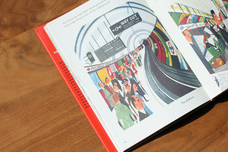
 This is the World: A Global Treasury
By Miroslav Sasek / Published by Universe
 234 Pages / 9.1″x12.6″

A compilation of abridged versions of M. Sasek’s most popular children’s travel books. From London to Hong Kong, Sydney to San Francisco, readers will delight in this charming journey through the world’s great cities. With deft strokes of his paintbrush and a witty voice to match, master illustrator and storyteller M. Sasek captured the essence of the world’s major capitals and brought them to life for an entire generation of young readers. Now, more than fifty years later, those same readers are passing these stories down to their children and their children’s children, and Sasek’s This is series has officially reached iconic status. Collected here for the first time in one affordable volume are some of Sasek’s most beloved adventures.

Pre-order at Amazon, Rizzoli and your local book shop.


Paul Rand - Thoughts on Design

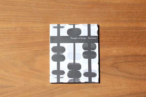
Thoughts on Design
By Paul Rand / Foreword by Michael Beirut / Published by Chronicle Books
96 Pages /  6 7/20 x 7 3/4 in

One of the seminal texts of graphic design, Paul Rand’s Thoughts on Design is now back in print for the first time since the 1970s. Writing at the height of his career, Rand articulated in his slender volume the pioneering vision that all design should seamlessly integrate form and function. This facsimile edition preserves Rand’s original 1947 essay with the adjustments he made to its text and imagery for a revised printing in 1970, and adds only an informative and inspiring new foreword by design luminary Michael Bierut. As relevant today as it was when first published, this classic treatise is an indispensable addition to the library of every designer.

Available at Amazon, Chronicle Books and your local book shop.


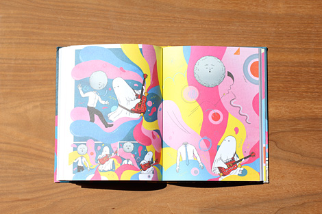
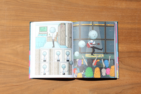
Moonhead by Andrew Rae

Moonhead by Andrew Rae

Moonhead by Andrew Rae

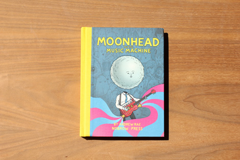
Moonhead and the Music Machine
By Andrew Rae / Published by Nobrow
176 Pages / Hardcover

Meet Joey Moonhead. A normal kid in every way.  Except one… He has a moon for a head.

Life is a peach when you have a moon for a head. Your head can wander out of the atmosphere into galactic reveries, drift blissfully across star specked plains, roll lazily into jungles with undiscovered artefacts or soar closer than Icarus to the sun’s seething glare. Snap! Back to reality – the world of a teenage boy is a much crueler place, the taunt “crater-face” is a very literal insult and the cool kids have an unremitting supply of abuse. And so, as the law of divine providence state, when the school talent contest takes its yearly turn, it is the role of the outcast to take part. Thus, Joey Moonhead begins a stellar mission to create a music machine that rivals all those in existence.

Available at Nobrow, Amazon and your local book shop.


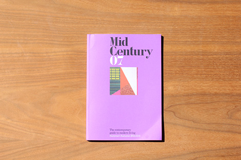
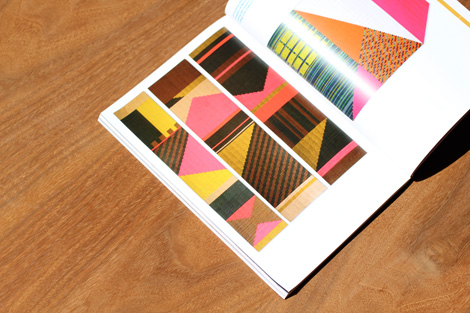
Mid Century Magazine

Mid Century Magazine

Mid Century Magazine

MidCentury Magazine
Issue 07 – Summer / Autumn 2014
148 Pages

Features articles on Pioneers of architectural photography, Orla Kiely on creating a home, a buyers guide to Peter Hvidt and much more.

Available at Midcenturymagazine.com


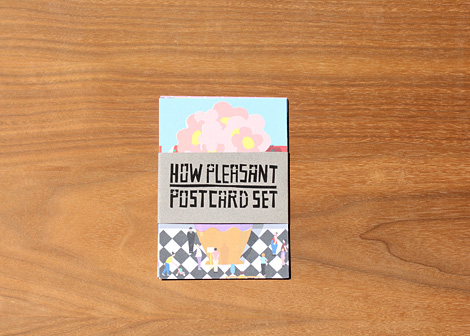
Ryan Gillette

How Pleasant Postcard Test
By Ryan Gillett


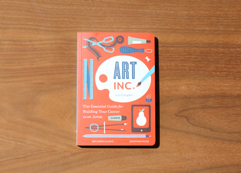
Art inc

Art inc. - The Essential Guide for Building Your Career as an Artist
By Lisa Congdon, Edited by Meg Mateo Ilasco, Foreword by Jonathan Fields
184 Pages / 5 1/2 x 8 in / Published by Chronicle Books

Artists who dream of turning their passion into a career need only the expert guidance in Art, Inc. Lisa Congdon unveils the multiplicity of ways to make a living from art—including illustration, licensing, fine art sales, print sales, and teaching— and offers practical advice on cultivating a business mindset, selling and promoting work, and more. Trade secrets from art world pros including such luminaries as Paula Scher, Nikki McClure, and Mark Hearld makeArt, Inc. the ultimate resource for aspiring artists ready for success.

Available at Chronicle Books, Amazon and your local book shop.

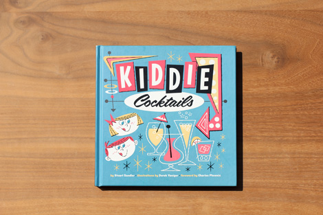
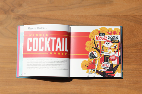
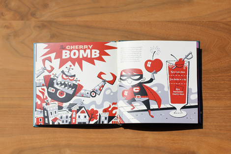
Kiddie Cocktails by Stuart Sandler

Kiddie Cocktails by Stuart Sandler

Kiddie Cocktails

Kiddie Cocktails
By Stuart Sandler / Illustrations by Derek Yaniger / Published by Korero
112 Pages / Hardcover

Calling all junior mixologists ! Check out the coolest-ever collection of fabulous drink recipes in every flavor and style under the sun – sharp and tangy, smooth and sweet, fizzy but never flat, crisp and fruity, or rich and creamy – all minus the hooch ! Surprise your friends with a Kosmic Kooler, get the party started with a Dream Punch, or cruise to Hawaii with a Little Pink Pearl. You’ll also find tips on setting up your own kiddie cocktail bar – with advice on choosing everything you’ll need to make your cocktails look as amazing as they taste ! The entire book is lavishly illustrated by the internationally renowned artist Derek Yaniger.

Available at Korero Press and Amazon


——————–

Also worth viewing:

Helmo
Timothy Hunt
Tom haugomat

Follow us on RSSInstagramPinterestWanelo

——————–

Thanks to this week's Sponsor // CodeinWP: A PSD to WordPress development agency that provides quality themes to clients across the globe.


Noted: New Logo and Identity for BUAP by Cato Brand Partners

$
0
0

Shield Goddess

New Logo and Identity for BUAP by Cato Brand Partners

"The Benemérita Universidad Autónoma de Puebla (BUAP) (Meritorious Autonomous University of Puebla) is the oldest and largest university in Puebla, Mexico. Founded on 15 April 1587 as Colegio del Espíritu Santo, the school was sponsored by Society of Jesus during most of the Spanish colonial era before turning into a public college in 1825 and eventually into a public university in 1937. The religious origins can be seen in many of BUAP's buildings in Puebla city centre, which were once colonial-era churches. The flagship campus is located in the city of Puebla, although more than nine facilities are distributed across the state." (Wikipedia)

Design by: Cato Brand Partners (Australia)

Opinion/Notes: The previous shield was really hard to read (graphically-speaking) and in a difficult vertical configuration to use comfortably in applications. The new shield is a lovely and very well executed evolution with a lot of great details. The blue on blue application is really nice. Too bad about the lifeless BUAP wordmark, it's like dry oatmeal. The prototype applications — more of them in the linked PDF — are fairly standard and competently done; there is the introduction of a slash of color here and there that helps break the blue tone.

Related Links: Brand Guidelines (PDF)
Angulo7 story (most details, in Spanish)

Select Quote: During the development process it was found that the identity value BUAP more significant is its shield, and in this, the presence of Minerva or Athena, goddess of knowledge and war. It remains a symbol of great strength, the shield BUAP potentiated by the interaction you have with the phoenix and the history of the University, it was decided that the behavioral axis of this new image was the Minerva or Athena.

New Logo and Identity for BUAP by Cato Brand Partners Another old version of the logo. New Logo and Identity for BUAP by Cato Brand Partners Shield detail. New Logo and Identity for BUAP by Cato Brand Partners Shield with word mark. New Logo and Identity for BUAP by Cato Brand Partners Big and small versions of the logo (notice less detail on the right-side version). New Logo and Identity for BUAP by Cato Brand Partners Bus prototype. New Logo and Identity for BUAP by Cato Brand Partners Banner prototype. New Logo and Identity for BUAP by Cato Brand Partners Sweatshirt prototype. Many thanks to our ADVx3 Partners

Viewport Industries has now closed for business

$
0
0

Illustration for Viewport Industries has now closed for business

As of today, Viewport Industries Ltd.— the company I formed with my friend Keir Whitaker back in 2011 — has officially ceased trading.

It’s a bit of a sad day because I’m immensely proud of what we achieved in the last three years: we’ve hosted Insites: The Tour, Insites: ConfShop, and Insites: The Xmas Special; published the 256-page Insites: The Book; created the Countdone iPhone app (which is now free); and published last year’s Digest magazine. However, due to our multiple commitments, it’s time to turn off the lights at VI HQ. Don’t worry, though: it’s all entirely amicable. This isn’t an H&FJ story, in case you’re wondering! You can read about our decision to close VI on Keir’s blog, too.

For a long time now, neither of us have been able to commit much time to the company, and in the last year the sole VI product has been Digest magazine. So what does the VI closure mean for Digest? Well,if you follow me on Twitter, you will no doubt have seen that I’ve been slowly talking more and more about the magazine that’s taking Digest’s place: it’s called Lagom, it’s being published by my main company Elliot Jay Stocks Design Ltd., and I’m going to tell you more about it very, very soon. (You can also sign up to Lagom’s mailing list to find out more and potentially win a case of IPAs!)

By the way, Keir and I will still be hosting this year’s Insites: The Xmas Special together, so if you’re coming along to that, we’ll be in touch with more info fairly soon.

Thanks for supporting VI over the years! I can’t wait to tell you about Lagom and the next chapter.

Announced: No Reviews this Week

$
0
0

Reviewer in Croatia

No Reviews this Week

Due to half-business, half-vacation travel in Croatia I will not be able to write Reviews (and most likely any content) for Brand New this week. The above image (from a couple of photos I took in Zadar) is meant to represent both the sadness I have for not being able to provide you with the content you deserve and the glee I have because Croatia, I'm in it. The rest of the week I will be in Zagreb, taking part in the 2013 – 14 Croatian Design Exhibition. Back the week of September 8. Dobro!

Many thanks to our ADVx3 Partners

Alex North

Monoscope

Pejac's Silhouettes

design team war room

2014: A Facebook Odyssey


♥ / Design

$
0
0

A big thank you to Joshua Lepley for sponsoring this week of my RSS Feed.

Design is LOVE. Design is a visual love language that can be appreciated by anyone and everyone. Spread the message.

joshualepley.com/design-is


(Interested in sponsoring a week of my RSS feed, learn more here.)

Portuguese Man-Of-War

$
0
0
"The Portuguese man-of-war is infamous for its painful sting, but one photograph finds the beauty inside this animal's dangerous embrace."

How to remove a temporary tattoo…

$
0
0

Did you ever wonder how to best remove a Tattly Temporary Tattoo? Nic and Ace created the above video to show just that. Leave it to my team to turn something as seemingly boring as an instructional video into something seriously fun. They are the best!

Jon Setzen on The Great Discontent

$
0
0

“I’ve had shitty jobs and internships: folding t-shirts at radio stations, working in a stock room at Nordstrom, delivering pizzas, and all of that. It’s important to have those shitty jobs so you understand when you actually find a good job.”
- Jon Setzen

Read the full interview over on The Great Discontent

Geometrie #1

Viewing all 13789 articles
Browse latest View live


<script src="https://jsc.adskeeper.com/r/s/rssing.com.1596347.js" async> </script>