Chicago, the font
Public Library of the City of Detroit
Robot Jox
Pacific Rim As Robot Jox
#67: Speed of Life
|
Reviewed: New Logo and Identity for Mauritshuis by Studio Dumbar
Bringing the Huis Down

Established in 1822, the Mauritshuis— "Maurits House" in English, a large residence built in the 1630s named after its owner Johan Maurits van Nassau-Siegen, governor of the Dutch possessions in Brazil — is an art museum in The Hague in the Netherlands that is home to the "Royal Cabinet of Paintings", a collection of more than 800 Dutch Golden Age paintings. Its most famous possession is Johannes Vermeer's Girl with a Pearl Earring with other paintings from Rembrandt van Rijn, Jan Steen, Paulus Potter, Frans Hals, and Hans Holbein the Younger among others. The museum closed for renovation in 2012 and just opened this past June, introducing a new identity designed by Studio Dumbar.
 Logo detail.
 Inspired by artists' monograms, the new logo overlaps reproductions of key paintings to communicate a clear link between the Mauritshuis and its collection. Supported by a contemporary wordmark, the logo hints at the museum's heritage while placing it in the 21st century. Golden Age paintings are known for their details: look closer and you'll see more. We expressed this idea in the logo and a new photographic style: paintings are shown in context, through doorways. The core colour evokes royalty, the Golden Age and the house's baroque interiors, while a brighter secondary palette echoes its famous damask wall coverings.
Studio Dumbar project page
 Monogram detail.
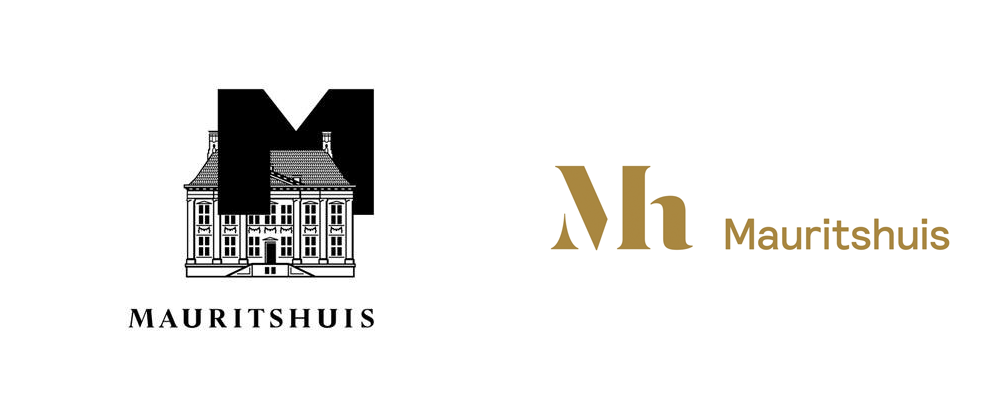
 The old logo, OMG, even for Dutch, weird-factor standards was super weird; it was like the house was about to be abducted and probed by this giant "M" that came from outer space. Really, really bizarre logo, designed in the 1980s by UNA designers. The new logo consists of a simple, contemporary, sans serif wordmark and one of the most stunning monograms I've seen all year. In the vein the disappearing-serif-stencil trend from typefaces like Dala Floda or logos like Blank this logo takes it to its most refined and elegant execution yet. It's perfectly readable, it's sexy, and it's a wonderful blend of contemporary and classical.
 Stationery.
  Folder.
  Catalogue.
  Brochure.
 Shopping bags.
 Rendered in gold metallic against black and white canvases, the logo works as a serious institutional identity for use in stationery and catalogs but when printed against bold, rich colors for retail use it takes on a flamboyant consumer brand aesthetic that most fashion houses wish they had. Consistently used at large sizes, with the monogram spreading from margin to margin, the applications convey a commanding confidence in its identity. This is a fantastic redesign that continues to establish Studio Dumbar as one of the best in the business. (And it's also good for the museum, yeah).
Spotted on BP&O.

♥ / The Blueprint
A big thank you to The Blueprint for sponsoring this week of my RSS Feed.
The Blueprint is an online retail site for the next wave of connected devices and wearables. The Blueprint provides a thoughtfully considered collection of beautifully designed products like Drop — the iPad connected kitchen scale.
Drop is a smart scale that makes perfect baking easy with interactive recipes, smart substitutions, mobile alerts and more. With Drop, you’re on your way to creating one perfectly yummy masterpiece after another. Drop pre-orders are available today on The Blueprint.com for 20% off retail.
Check out Drop now and discover more tech to charge your life here at The Blueprint.
One Of Many
My studiomate Wesley Verhoeve launched a fantastic new project called One of Many. Over the next few months, Wesley will travel to 12 cities across the US and over the course of a week immerse himself in their creative communities. The results are beautiful essays with stunning portrait photography and personal stories. Check out Charleston.
Wesley, who is the most outgoing person I have ever met, can strike up a conversation with anyone. When visiting these cities, he will be seeking out designers, chefs, woodworkers, farmers, engineers, writers, coffee brewers and anyone else making something that moves people.
Wesley believes that being a small business owner or a creative independent is exhilarating, but it can also be quite lonely and stressful. With One of Many Wesley wants to remind us that we are not alone. We are part of a growing movement. We are one of many.
(Above photos are all by Wesley Verhoeve, part of the Charleston series but previously unpublished. From top to bottom: David Lee, Diego Castro Oliva and Kate Nevin, members of the Charleston community)
The Young Ones
Mercury's Transit: An Unusual Spot on the Sun
Noted: New Logo for SBT by Publicis Brasil
Pinwheel of Fun


(Est. 1981) Sistema Brasileiro de Televisão (SBT for short, "Brazilian Television System" in English) is one of Brazil's main television networks.
Design by: Publicis Brasil
Opinion/Notes: The evolution graphic below shows that SBT has never been one for simplicity or restraint, putting as much visual goop on its logo as possible, save for the 1988 version, where the logo looks the most like Paul Rand's abc logo. The last three disco-ball versions have been replaced for a very relatively flat version that uses a radial, overlay effect and the typography finally has no beveling making for a comparatively cleaner evolution. Maybe in ten years they will catch on to today's extra flat trend.
Related Links: Publicis Brasil project page
SBT announcement
Select Quote: In the new logo created by Publicis Brazil, the sparkles and 3D volumes give rise to a 2D composition that overlaps various colored ellipses, symbolizing agility, modernity and the constant process of evolution of the station.
 Logo evolution.
  Logo detail.
New logo and look introduction.
Linked: Blue Jays Vs. Bluejays

Link
The Toronto Blue Jays (Major League Baseball team) have filed a notice of opposition with the U.S. Patent and Trademark Office opposing the trademark application of Creighton University's athletics teams' logo for the Bluejays.

THE Young Ones
North Korean Films
Rag's Rag
Joel Kefali Reel
Sponsor // CodeinWP: How to Build a Mobile WordPress Theme
CodeinWP is a PSD to WordPress development agency that provides quality themes to clients across the globe. Working with the latest technology they convert your static PSD files into pixel-perfect WordPress websites. In addition, they can provide sought after features and site enhancements including parallax scrolling and retina-enabled themes. In an ongoing series of blog posts CodeinWp explores the process of building a performance oriented mobile theme for WordPress. In part 1 they reveal some of the initial challenges. See all the details here.
——————–
Interested in sponsoring grain edit? Visit our sponsorship page for more info.
——————–
Also worth viewing:
Themeisle
Anymade Studio
Tom haugomat
Follow us on RSS, Instagram, Pinterest, Wanelo,
——————–
Thanks to this week's Sponsor // Bitrix24: Free account with 10GB extra storage
Blok Design
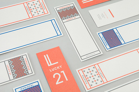
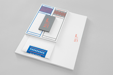
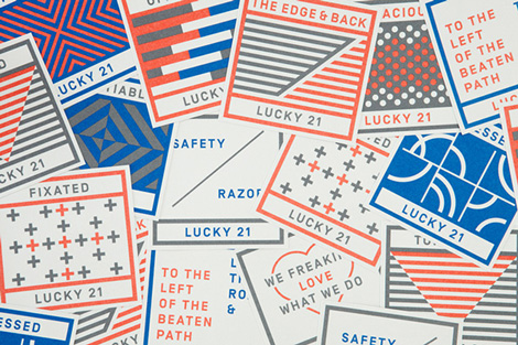
Blok Design created this spirited campaign for Lucky 21, a film production company based in Dallas and LA. . Tapping into the company’s humor and passion, Blok crafted an identity system that is bold, yet still allows the brand’s playful voice to shine.
——————–
Also worth viewing:
Chad Michael Studio
Sarp Sozdinler
Tom haugomat
Follow us on RSS, Instagram, Pinterest, Wanelo,
——————–
Thanks to this week's Sponsor // Bitrix24: Free account with 10GB extra storageMy Hipster Boyfriend Was Just Amish
Reviewed: New Logo and Identity for NewSpring Church done In-house
Shed a Teardrop
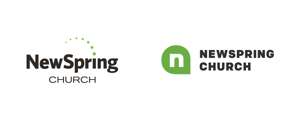

Established in 2000, NewSpring Church is a Baptist Christian "megachurch" — a moniker assigned to churches with at least 2,000 people in average weekend attendance — with ten locations in South Carolina and 27,000 people attending each weekend. (The average NBA arena holds 20,000 people). The church offers various services beyond the weekly service, including groups for kids and teenagers, missions, baptisms (more than 6,500 last year), and a 2-year college education. NewSpring Church is not your parents' church by any means: football-arena-sized screens project the service, led most notably by jeans-wearing senior pastor (and founder) Perry Noble, and punctuated by festival-quality musical acts. This month, NewSpring introduced a new identity designed by its in-house creative team.
I will say this upfront: please be respectful in the comments. Religion-related topics, even about logos, tend to bring out the nastiest in those that don't share the same views. So, please, chill.
 Logo evolution.
  Samples of old print materials.
  Sample of old identity use.
  Sample of old entrance sign.
 The previous logo was not terrible. It wasn't original or anything either. Given what they had to work with, the creative team had done a good job in creating an engaging system revolving around the bright green color, some splashes of handwritten typography, and overall proper execution.
 Logo detail.
  "n" shown over the Empty Tomb (of Jesus).
 The new logo isn't that original either. We've all seen the teardrop shape a hundred and twelve times — and that's on one Sunday alone. However, it's not something you see on a church everyday and in this context, it's a remarkably novel approach. The lowercase "n" is meant to convey the entrance to Jesus' Empty Tomb in Jerusalem. It's a great concept to tell but, yeah, it's a stretch. And I don't mean that in a jerk way, you could pretty much put any letter over that shape and make it somehow fit. (Okay, perhaps not any of the V, W, X, Y, and Zs). What I do like about the "n" is that it counters the holding teardrop shape with a sharp corner of its own. It's a small detail but it helps sell the monogram (to me at least).
Another element that makes the logo (and identity) work is the choice of Process Type Foundry's Colfax type family which, as PTF rightfully (and much better than me) describes, is a "refined oval sans serif of 20th century origins and 21st century sensibilities". It's a beautifully crafted, strong sans serif that has a very peculiar aesthetic that gives all of NewSpring's materials a solid, confident visual language.
 Various collateral.
  Notecard.
  Bulletin (with pen).
  Nametag.
  Exterior sign.
  Service.
  T-shirt.
Redesign process.
 I am not a fan of the teardrop shape by any standard but of all the attempts at adopting it as an identity element — beyond Duffy & Partners' Bahamas identity — this is one of the most convincing and successful executions. I really like the placement of the "n" monogram on the lower right corner, taking advantage of the holding shape. (A nightmare for printers, though!). I have been fascinated by the efforts churches make to appear more accessible, younger, hipper, more consume-able, and I think NewSpring and its creative team have found that balance between trying to be cool and actually being cool. Case in point: check their annual report— this is on par with other online annual reports from companies like Kickstarter or MailChimp. Overall, there is a tremendous amount of work that has gone into this identity and its deployment to the tens of thousands of people who interact with it, and it's a great example of an in-house team's positive impact.


