Comic Sans for Cancer
American Cool
La Vespa
Steve Connell
Automata
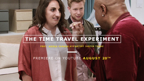
Sponsor // IKEA Launches Hypnotizing Time Travel Experiment
It’s no ordinary illusion. Together with hypnotist Justin Tranz, IKEA let young couples experience their future in a fascinating time travel experiment.
In the experiment, world-renowned hypnotist Justin Tranz put a young couple in deep trance before they’re being exposed with potential life-changing events in advance. Guided by Tranz, the young couple embarks on a time journey where different life predictions awaits them – from celebrating a birthday for their imaginary 6-year old daughter, to an odd meeting in the bathroom with the same daughters future boyfriend, years later.
“The everyday is exciting! It’s on those seemingly ordinary days life happens and changes. And when it does, so does our home”, says Johan Wickmark, Global Catalogue Manager.
Justin Tranz has done well over 6,000 stage shows and is the only hypnotist in history to ever legitimately perform on Broadway. He has helped thousands in their bid to stop smoking, lose weight or attain other personal goals. He has also worked with medical professionals, corporate executives, and athletes in all sports and levels of competition.
With the Time Travel Experiment, IKEA collaborated with Tranz to put the spotlight on events that change how we live and our everyday lives. And in this film becoming parents is portrayed, which is one of the biggest transitions of them all.
“In the new IKEA catalogue you can find solutions for every episode in life”, says Johan Wickmark, Global Catalogue Manager.
——————–
Also worth viewing:
Helmo
Timothy Hunt
Tom haugomat
Follow us on RSS, Instagram, Pinterest, Wanelo,
——————–
Thanks to this week's Sponsor // Bitrix24: Free account with 10GB extra storageStudio Alexander
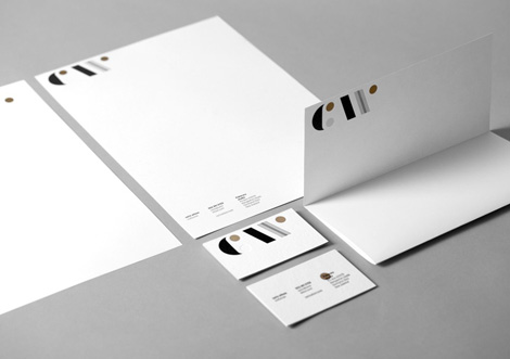
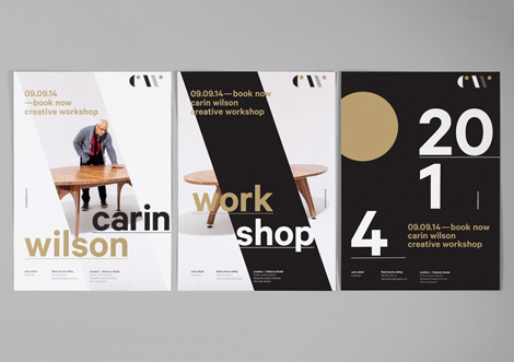
I love this identity kit created for Carin Wilson by Auckland -based Studio Alexander. The slick and well-polished system was recently announced as a finalist in this year’s Best Awards.
(via BP&O)
——————–
Also worth viewing:
Chad Michael Studio
Sarp Sozdinler
Tom haugomat
Follow us on RSS, Instagram, Pinterest, Wanelo,
——————–
Thanks to this week's Sponsor // Bitrix24: Free account with 10GB extra storageVintage Chicago Postcards
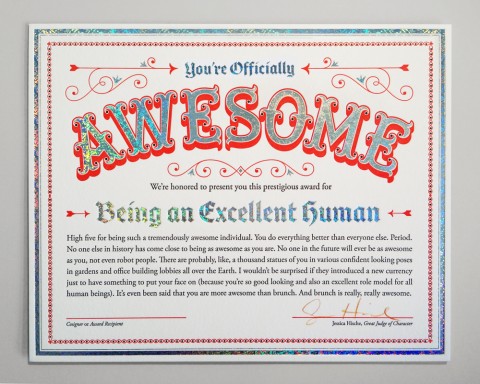
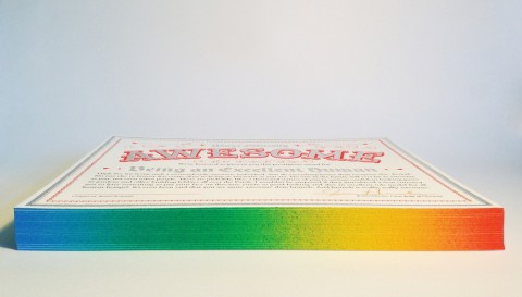
You’re Officially Awesome
This is the best thing ever: You can buy a Certificate of Awesomeness to give to whoever deserves one, designed and signed by Jessica Hische. Look! It has rainbow edge-painting! Over the top? Yes!
All certificates ship with a rainbow pencil so the recipient or co-signer can add their own signature. That Jessica Hische! Always coming up with awesome stuff!
Perfectly Useless
Friday Link Pack
- Color coded photography. Stunning.
- Smokers lungs vs healthy lungs. This will make you stop smoking.
- 10 websites that help make you more money-savvy
- Take a closer look at how half-a-dozen ceramics masters practice their craft.
- Also from Jason Kottke’s blog: Texting in movies
- History of an Icon: La Vespa (via coudal)
- “There are countless forces in our lives that are out of our control. That doesn’t mean we can’t do anything about how they influence our work and our life…” Totally and completely out of my control
- Yoga Hacks: How to Undo the Damage of a Desk Job
- ‘Complements’, A bizarre collaborative portrait series by a creative couple
- How to be polite (via)
- Love these abstract compositions by Aaron Robbs.
- Avocado stuffed meatballs. Wait, what?
- Cargo, a desktop organizer.
- Why is it impossible to make plans anymore. So true.
- Every Sunday Mark Bustos gives free haircuts to NYC homeless.
- Team Tattly is looking to hire a Front-End Developer
Reviewed: Friday Likes 98: From MAUD, Fanakalo, and Block
From MAUD, Fanakalo, and Block


An eclectic range of simple work mixed in with some abstract work and highly ornate work from Australia and South Africa keep us entertained this fine Friday.
Edgeboard by MAUD

Made in Australia, the Edgeboard features a perpendicular edge on one of its sides to prevent spillage, a feature that serves as the basis for the logo and identity designed by Redfern-based MAUD who made a great "EB" monogram that can only be read (or be read properly) when applied on an edge, breaking the monogram into an "E" on one side of the corner and a "B" on the other. It's a pretty original way of treating a monogram, specially when it looks like just an elongated "B" when seen flat. This would pose a problem for other applications but the ambitious wood-based business cards also feature a fold where the monogram can be creased and in the letterhead it's placed in the upper fold, creating the edge effect. (No, the effect doesn't fax). Simple and clever — not what you would expect from cutting board branding. See full project
Khulu Soap by Fanakalo

Made from traditional African herbs Khulu Soap is delivered in a fantastically rich range of packaging designed by Fanakalo in Stellenbosch, South Africa. Decorated with generously colored patterns and infused with playful typography, the little boxes are a wonderful mash-up of Victorian packaging, vernacular illustration, and modern-day typefaces. The "For Men" illustration needs to be made into a t-shirt. Now. See full project.
District by Block

Formerly known as Table & Chair, District offers much more than tables and chairs for corporate, hospitality, and residential applications. Designed by Block in Perth, Australia, the identity features a combination of neatly cropped and clipped product shots and an abstract, custom alphabet that takes its cues from architectural blueprints. The combination leads to what I can only describe as ethereal, alien-like, interior design chic. Some words are more successful — like "work" — than others — "futio"? — per the examples above but identity definitely establishes a distinct visual language for District. See full project here.

Are You Here
Ryman Eco
Hippie Island
Venus and Jupiter at Dawn
Badges by Allan Peters
The Strange & Curious Tale of the Last True Hermit
Noted: New Logo and Livery for Vistara by Brand Union | Ray+Keshavan
Flying Yantra


"Vistara is the name of the joint venture between India's Tata Sons and Singapore Airlines. The new carrier, announced in 2013, will be a full-service airline based in New Delhi. The two companies will initially invest a combined US$100 million to start the carrier, with Tata Sons owning 51 per cent and Singapore Airlines (SIA) owing the remaining 49 per cent. Vistara will operate mainly on trunk routes, focussing on the northern part of the country. The airline will have 87 weekly flights linking its hub in Delhi to Mumbai, Goa, Bangalore, Hyderabad, Ahmedabad, Jammu, Srinagar, Patna and Chandigarh." (Wikipedia)
Design by: Brand Union | Ray+Keshavan
Opinion/Notes: This is a rather nice, good-looking logo. The icon is relevant and elegant — if, perhaps, interchangeable with any other India-based company — and the extended wordmark, despite my utter disapproval of the uppercase "R", is competently done. The livery is quite straightforward and the symmetry of the icon plays well on either side of the tail.
Related Links: Brand Union press release
Bangalore Aviation story
Select Quote: Vistara is derived from vistaar means 'infinite expanse' in Sanskrit. It is the perfect cue for an airline that will push back the boundaries of air travel and create seamless experiences. It also conjures up the image most associated with a smooth flight– an endless, blue horizon.
The Vistara star is derived from a yantra, an ancient symbol that depicts an unbounded universe in a perfect mathematical form. At its heart, is an 8 pointed star derived from the compass rose that signals the brand's commitment to excellence in everything that it does.
 Logo detail.
  Livery.
  Uniform sketches.
Linked: The Dark Side of Branding

Link
Batman-branded ecstasy pills in Australia are turning out to be quite dangerous. At least they are easy to recognize (and avoid).

