Soviet Ghosts
The Chemistry of a Football Shirt
The Film Before the Film
100 Slightly Strange London Bus Stop Names
746 Phone
Gotham 's Villains
Noted: New Logo for Imperial Oil
The Imperor's New Clothes
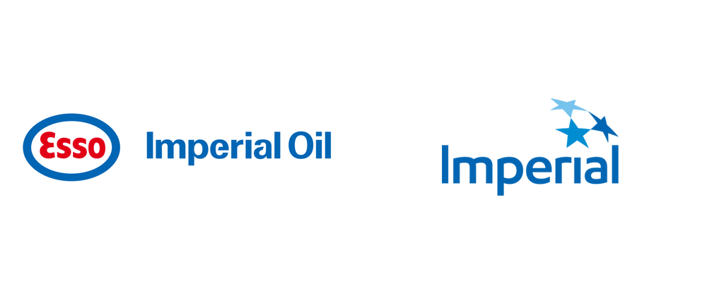

(Est. 1880) "Imperial Oil Limited is a Canadian Petroleum company. It is Canada's second-biggest integrated oil company. Exxon Mobil Corp. had a 69.6 percent ownership stake in the company as of December 31, 2012. It is a significant producer of crude oil and natural gas, Canada's major petroleum refiner, a key petrochemical producer and a national marketer with coast-to-coast supply and retail networks. Its retail operations include Esso-brand service stations and On the Run/March´ Express and Tiger Express-brand convenience stores. It is also known for its holdings in the Alberta Oil Sands. Imperial owns 25 percent of Syncrude, which is one of the world's largest oil sands operations." (Wikipedia)
Design by: N/A
Opinion/Notes: Even within merger-y logo standards, the ESSO-Imperial lock-up was an unintegrated flop — I would mostly blame the "Imperial Oil" wordmark with its terrible, awful, useless stencil versions of the "e" and "a". The new logo drops the ESSO logo and the word "Oil" for an FF Dax-like wordmark that is a relative improvement and I could even say I like it were it not for the sorry excuse of an "r". The 3 stars come from an older Imperial logo (shown in the video at some point) and are sort of fine. The wrapped-in-a-globe approach makes me think of a dozen other star logos I've seen but forgotten right away. Overall, an improvement simply because of the reduction in elements and usability of the old logo but not an entirely satisfying new one.
Related Links: N/A
Select Quote: Our new logo builds on our heritage with a dynamic representation of the former three-star design, symbolizing high standards as well as the forward motion and bright future ahead of us. The corporate name Imperial now stands on its own, reflecting the company’s diverse opportunities for future growth. Our widely recognized retail brands will continue to be marketed under the Esso and Mobil 1 logos, providing premium fuel and lubricant products to our customers nationwide.
 Logo detail.
Extremely soft-spoken introduction of the new logo.
Linked: TM

Link
TM: The Untold Stories Behind 29 Classic Logos by Mark Sinclair, Deputy Editor of Creative Review, looks quite promising.

Solargraphic
Making Better Digital Maps
Flight Skies
Saint Dolly
America the Photogenic
Chad Michael Studio
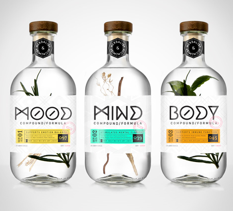
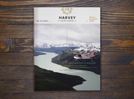
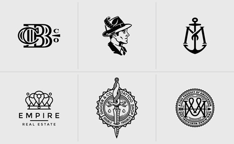
Chad Michael is a designer & illustrator specializing in package design and unique branding. A recent graduate of the University of North Texas, he has already received numerous awards and accolades including the DSVC Top Design Portfolio and the Gary Baseman Illustration award.
——————–
Also worth viewing:
Helmo
Timothy Hunt
Tom haugomat
Follow us on RSS, Instagram, Pinterest, Wanelo,
——————–
Thanks to this week's Sponsor // Bitrix24: Free account with 10GB extra storageToots Raitt Cos
YoAz
Reviewed: New Logo and Identity for Tatts Group by Hulsbosch
Stars Among Us
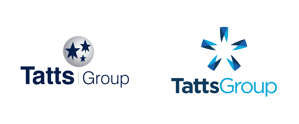

With roots as far as back as the 1880s through managing the sales of Tattersall's — the leading auctioneer of race horses in Ireland and the UK — in Sydney and Tasmania, Tatts Group is a leading company in the wagering, lotteries and gaming industries operating in Australia, New Zealand, and the UK. It manages eleven different lotteries with annual sales of over $4 billion and five sport and race betting providers with sales of $3.6 billion. It also operates three businesses that provide monitoring and support services to gaming venues. With a wide range of consumer brands under it, Tatts Group decided it was time to improve its own presence as the parent company and introduced a new identity designed by Sydney-based Hulsbosch.
Research conducted by Hulsbosch, revealed that a new level of disruption in the brand's narrative was required to increase the awareness levels. In particular the need to elevate the Tatts Group corporate brand to a position that could communicate to the market they are a trusted provider of entertainment products and services.
Provided text
 Logo detail.
 The simple, clean, contemporary logo style is composed of two components: the top graphic known as 'the star' and the distinctive lettering 'Tatts Group'. In addition the colour palette brings scale and boldness to the brand identity.
Provided text
New identity introduction. Some extra applications shown throughout and logo animation at the end.The old logo was kind of funny, with the misfortunately shaped stars on the ball looking really sad and droopy — makes you pine for the stars of yesterday's Imperial logo. The new logo provides an alternate interpretation of stars by hiding one inside five strange, pin-like graphic devices. Even though I really have no idea what those five overlapping things are, there is something nice about the icon… the spacing, the colors, the tension created by the sharp points. I wouldn't marry it but I would take it on one date. The wordmark looks like all other Hulsbosch wordmarks — Gotham-ish, Effra-ish, etc.-ish — and is a perfectly acceptable parent company choice. The "tt" ligature is nicely treated.
 Sample guideline pages.
  Cap.
Cap.  Business Card.
 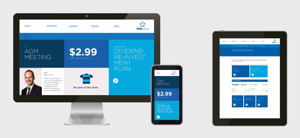 Online presence.
 In application there is lots of pretty blues, plenty of white space, and basic repetition of the logo throughout. Nothing groundbreaking but, again, just what a parent company needs. Overall, a clear improvement.

Noted: New Name, Logo, and Identity for ding* by DixonBaxi
The Sound of Your Phone Getting Credit


"Established in 2006, ding* has always had the same vision — to keep the world's mobile phones topped-up. Now with the largest international top-up platform, ding* is directly connected to 300 mobile operators in over 100 countries with a reach of 3 billion phones."
Design by: DixonBaxi (London)
Opinion/Notes: To clarify one thing: the Ezetop logo and name still exist as the parent company of ding* and other top-up services but the service now provided by ding* was provided as Ezetop to consumers. The new name is quite catchy and I like how it sounds like you just won a prize — ding! — for either topping up someone's phone or getting yours toped. The chunky wordmark is right up my alley and that "g" is fun and playful. The magenta tittle and asterisk compete for attention more than needed but they add a welcome splash of color. Combining the condensed Brauer Neue from Lineto with the wide shapes of the wordmark make for a nice combination while the royal blue and magenta combination provide a distinctive palette for the service.
Related Links: DixonBaxi project page
Select Quote: The result is a new 'brand way' for ding* that brings to life the simple product that has a big impact on people's lives. The design system has established a visual metaphor for top-up and a distinct tone of voice for the brand with a phraseology that reflects that quick, snappy, bite-sized functionality of the product. Key phrases have been created that reflect how the brand feels about what it does. For instance, a top-up is about making small practical gestures rather than simply giving a gift, so the phrase 'Hours not Flowers' has been adopted as an internal ding* mantra. Everything about the brand graphics reflects the simplicity and speed of the product and gives the business fantastic cut through as it continues to drive the growth of international top-up sector.
 Logo detail.
 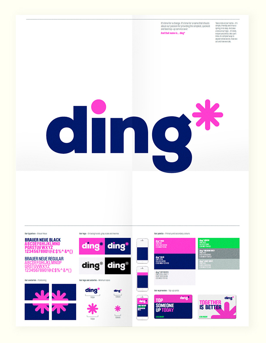 Poster/guidelines.
  What ding* is all about.
  Cards for ding* credit.
  Billboard and promo items.
Linked: Manuals 1 Porn
Link
Get turned on with this short video of Unit Editions' Manuals 1. (We will have a few of these hard-to-get books for sale at the Brand New Conference).

