Quantcast
Channel: Positive Influences
Viewing all 13789 articles
Browse latest View live

Reviewed: New Logo and Identity for Sensis by Interbrand

$
0
0

Hear me Squeak

New Logo and Identity for Sensis by Interbrand

Established in 2002, Sensis is an Australian company that provides a network of local search and digital marketing solutions for small and medium businesses; this includes familiar products to all of us like Yellow Pages® and White Pages®, as well as Whereis® digital mapping solutions and request-for-quote service Quotify. Previously placing focus on its paper directories, the company has needed to change and evolve to focus on digital marketing services. To better explain its role, Sensis has transformed from a passive business-to-business company into an active brand with a new identity designed by Interbrand Australia.

The expression of the new Sensis brand needed to show how it could educate and empower organisations of all sizes to be better marketers. It needed to present itself as a guide for Australian businesses as they navigated from the physical to the digital. It needed to be a brand that could engage and motivate by demystifying technology and simplifying complexity.

The new brand is based around the character of a mouse: a metaphor for the resourceful, determined and industrious businesses Sensis works with. The mouse is the hero and platform for all of our communications.

Interbrand project page

New Logo and Identity for Sensis by Interbrand Logo detail. Wordmark is set in FF Netto.
"Dash represents the characteristics we need continue to succeed in the future: agility, adaptability and resourcefulness. He is a metaphor for our ambition to help our customers.

"Regardless of their size, most Australian businesses have a number of things in common. They're hardworking, resourceful and nimble; just like Dash. They solve problems, take calculated risks and keep a close eye on their resources."

Sensis press release

New Logo and Identity for Sensis by Interbrand Sensis' business-to-consumer brands: Yellow Pages, White Pages, True Local, WhereIs. New Logo and Identity for Sensis by Interbrand Sensis, explained.

The old logo, and even the name actually, was perfect for a prescription brand medicine with some ambiguous swooshes and ragtag gradients. While the name remains, it's amazing what a little rodent can do to change the perception of the same word, going from something rather empty and generic to a name that makes you think of using your senses and even something with a feeling of sensitivity. "Dash", as the little mouse has been christened, is a curious choice for a corporate logo but in its simple and charming execution manages to be convincing. When every company wants to be a lion or a bear it's kind of refreshing for someone to latch on to the values of some other animal. With its long (long) tail shaped as an "S", Dash is executed with the most minimal amount of strokes that make him quite appealing and is matched with FF Netto for the wordmark, giving it that "digital" look.

Dutch illustrator Tim Boelaars was commissioned to create a menagerie of characters who interact with the Sensis mouse to help tell the story of Sensis and its customers.

Oliver Maltby, Creative Director of Interbrand Australia, comments: "Each individual story uses a simple metaphor relevant to a business issue, such as growth (Giraffe), knowledge (Owl) and technology (Robot). Using characters along with straightforward encouraging language presents digital marketing in a way that's human and accessible."

Interbrand project page

The range of Sensis' characters created by Tim Boelaars. New Logo and Identity for Sensis by Interbrand
New Logo and Identity for Sensis by Interbrand
New Logo and Identity for Sensis by Interbrand Sensis' mouse and friends. New Logo and Identity for Sensis by Interbrand Print ads. New Logo and Identity for Sensis by Interbrand Outdoor ads. New Logo and Identity for Sensis by Interbrand T-shirt.

In application things are kept simple with a lot of white space, minimal typography, and the sprinkling of a menagerie of animals. The addition of these — while very nicely done — start to take Sensis into too playful territory, risking looking not serious enough for businesses to spend money on their services. The mixing of animals and business metaphors through copywriting is fun and brings the identity together and, again, while most companies try to play grown-up with very serious identities, Sensis' approach may be exactly what sets them apart positively. Overall, it's a clear improvement that brings the Sensis name to the forefront with an unexpected brand ambassador but I feel like there is some visual or verbal bite missing to make it roar more than squeak.

Many thanks to our ADVx3 Partners

Pre-War NYC Apartment Floor plans

I Can't Sell This Car- It's Too Hot. Plus, It's the Popemobile

$
0
0
"The engine runs on a mixture of gasoline and holy water. The stereo is configured to only play hymns. Hell, the cup holder only fits grails! Oh, I shouldn't say 'hell' near this thing, it may have some anti-Satan security device. Or maybe they just banked on God keeping it safe.

Star Trails Over Indonesia

Noted: New Logo and Identity for V Festival by Saffron

$
0
0

Feel the Vibe

New Logo and Identity for V Festival by Saffron

(Est. 1996) "The V Festival is an annual music festival held in England during the penultimate weekend in August. The event is held at two parks simultaneously which share the same bill; artists perform at one location on Saturday and then swap on Sunday. The sites are located at Hylands Park in Chelmsford and Weston Park in South Staffordshire. Although predominantly a rock music festival, a wide range of musical genres are accepted; in recent years pop acts have become more common. The "V" represents the Virgin Group, with the event being sponsored by Virgin Media." (Wikipedia)

Design by: Saffron

Opinion/Notes: It's always nice when logos go flat and this is another good example. To their credit Virgin Media had adopted a flat version of their logo back in January— which I somehow missed to post — and the V Festival has followed suit. But the more interesting part of it is the festive, splashy identity that Saffron has created around it. Part rave, part 1980s minty colors, part corporate event, this year's look definitely had a fun vibe to it. More images at the link above.

Related Links: Saffron project page

Select Quote: A number of insights emerged, none more fundamental than the thought that despite each festival being essentially the same (field+music+sunshine = good time) each of them had a peculiar identity that makes a lasting impression on attendees. And so the thought of the V Festival VIBE was born — that intangible, almost inexpressible essence that makes the festival what it is. Intangible and amorphous, yet real and visible; uniquely individual yet necessarily shared - thoughts, emotions and experiences inevitably come together in what can only be described as a singular, and incredibly powerful, V Festival VIBE. We created a statement — 'Bring the VIBE’ that expressed the idea and invited all comers to be a unique part of one of the summer’s most special gatherings.

New Logo and Identity for V Festival by Saffron Paint splashes. New Logo and Identity for V Festival by Saffron Words of encouragement. New Logo and Identity for V Festival by Saffron Tickets. New Logo and Identity for V Festival by Saffron Paint splashes plus word of encouragement. Many thanks to our ADVx3 Partners

Linked: Free Design

$
0
0

Free Design
Link
This is great: Hussein Alazaat and Ali Almasri have launced Wajha — "facade" in Arabic — in Amman, Jordan, a social initiative that brings effective design to small businesses and their facades.Many thanks to our ADVx3 Partners

TM, The Untold Stories Behind 29 Classic Logos

$
0
0

TM, the untold stories behind 29 classic logos

“The seeds of this book were sown in a special issue of Creative Review magazine, in which my colleagues and I attempted to tell the stories behind the creation of some of the world’s best-known logos. As with the issue, this book is also a group of favourites, rather than an attempt at a definitive ‘best ever’ list. The logos are not ranked in any order; while they have each vied for attention in the real world, they are not in competition here.”

TM, the untold stories behind 29 classic logos
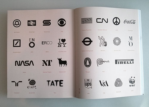
All 29 logos featured within the book

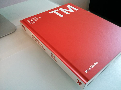
Written by Mark Sinclair, deputy editor of Creative Review, and published by Laurence King, TM is a new hardback that gives an intriguing insight into 29 classic marks.

300 colour illustrations
224 pages
280 x 216 mm
ISBN 9781780671659
Published August 2014

TM, the untold stories behind 29 classic logos
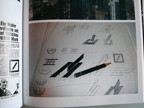
Initial sketches for the Deutsche Bank symbol

TM, the untold stories behind 29 classic logos

There’s 30% off through Laurence King if you enter the code LOGOLOVE30 at checkout. Or you can pick up a copy here:

on Amazon.com
on Amazon.co.uk

35 Common Mistakes Web Designers Make & How To Avoid Them

$
0
0

This article has been contributed by Helga Moreno.

“While one person hesitates because he feels inferior, the other is busy making mistakes and becoming superior”.

- Henry C. Link

Even the most experienced professionals make mistakes. We are only human. Below you will find a list of some of the most common mistakes web designers make, as well as some friendly reminders on what makes a website successful.

Hopefully with this list, you can avoid the common pitfalls and really up your game as a web designer. Enjoy!

Most Frequent Web Design Mistakes

  • Unorganized content layout. Everybody knows that a massy page prevents users from quick scanning. You should always keep in mind a clear hierarchy of your design and don’t place the users into a confusing position when they don’t know where to look first. Guide their eyes through the page and it will be a success.
  • Poor navigation. It’s good practice when site visitors always know where they are at any given moment and have the possibility to travel through website pages freely and swiftly. Designers solve this issue different ways. Some include pagination into design, others prefer one page layouts. The availability of different filters that simplify customers’ search works well either.
  • Poor readability & legibility. We know that good readability is basic, but some designers manage to neglect it in their burst of creativity.
  • Bad use of color and contrast. It’s impossible to give instant advice to this issue. Each designer should know color theory and be able to apply its rules. If you can’t fully rely on your knowledge of color and contrast, there are plenty of online tools that will help you choose the optimal match.
  • Complicated or no registration forms. Nobody will sweat filling out the multiple fields of your registration form, so it should be as short and simple as possible. Also try a tiered approach, loading questions in sequences rather than all at once.
  • Use of heavy images, flash based graphics and animations. The heavier your website is, the slower it downloads, especially on mobile devices. Would like to increase your traffic? Make your website lightweight. And let flash finally RIP.
  • Cluttered web pages. Leave enough white space for your content to breathe. Learn more about minimalism here. Or is it just a trend?
  • Splash page. Think well if you really need a splash page… If you don’t provide access to pornography, alcohol or gambling, where certain age restrictions are required, why not give the users what they are looking for all at once.
  • Irrelevant, out of date content or no content at all. Your website should provide current up-to-date information.
  • Pop-up windows. This will inevitably lead to visitor’s disorienting experience. So, keep in mind that only one pop-up window should be accessible at a time or use lightboxes where all distraction is grayed out for better perception. And don’t forget that the user should have the possibility to close a pop-up clicking anywhere on the screen.
  • Not testing a website on all devices or going live without testing. Most websites should be responsive by now and they should be tested across all popular devices and show optimized performance.
  • No call-to-actions or improper use of them. Each website is created with a certain purpose. So, if there is no clear call-to-action on the page your chances to reach it are second to none.
  • Broken links. Links leading nowhere are signs of unprofessionalism in web design. Such small details can ruin the general impression even if the design is splendid.
  • No responsive website. If your website can’t adjust to all major screen resolutions, you will potentially lose a lot of visitors as their experience has not been optimized.
  • Over-promising to the client and agreeing to unrealistic timelines. All of us lay ourselves out in order not to lose a single client. Some designers are ready to promise the moon to the customer, but then can’t meet the deadline or fail with other requirements. Under promise and over deliver.
  • Not asking enough questions throughout the process. Design isn’t an easy process and it’s normal to ask questions on every step leading to finish. It’s important to have a design brief to work from as well.
  • Failing to see when a project requires an extended deadline or more resources to meet a deadline. It’s better to foresee all possible delays and extra expenses. Every project is exposed to financial or other kind of risks. Assuming that things will go smoothly is a sure fire way to fail. Factor this in to your project management.
  • Not updating their own personal website. Keep in mind that clients searching for an expert web designer, will study their company websites carefully. A up-to-date, user-friendly website is the face of your agency and your prospective customers will decide if they want to work with you depending on their impression.
  • Ignoring search. A search bar should be present on nearly every site, in a very prominent place. It simplifies customers’ navigation greatly and saves their time.
  • Over-engineering – trying to make your interface do everything for everyone. It’s a utopia to be loved by everybody. People’s tastes and needs differ, so you’d better focus on your targeted audience. Be extremely clear with yourself about who your 90% users are and ruthlessly drive the design with them in mind. You’ll have more chances to succeed. “A bird in the hand is better than two in the bush”.
  • Designing before content is figured out. Understanding what media and subject matter is utterly important. This knowledge lets the designer think about “interactive” design, rather than simply graphic execution.
  • Forgetting to make your website accessible and backwards compatible. Your website’s should be accessible by all and work on all devices, including screen readers.
  • Causing excessive scrolling on mobile devices. The basics of responsive design is that horizontal grids can collapse into vertical lists. In some cases, this works great. In other cases, the horizontal grid makes for a very long vertical list. You should consider ways that shorten the page by grouping or reorganizing content.
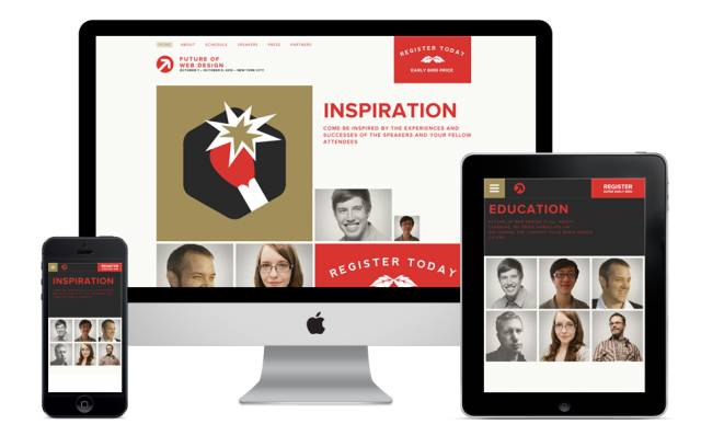
Responsive Web Design
  • Including user interface elements that do not work well on mobile. A gigantic registration form is difficult to fill out on a mobile device. Turning the registration form into a responsive layout makes it marginally easier, but one has to wonder whether it is still a reasonable expectation for the user to fill out all of the information that you ask. Consider this: when one registers on the website from a mobile device, the website is intelligent enough to skip a few steps in filling out the profile, letting the user complete those steps on a desktop or laptop computer. Learn more about forms on mobile devices here.
  • Jumping to problem solving, skipping the analysis. You can’t solve the problem until you know what the problem is. For that you need to analyze the problem, supporting the analysis with research as needed. Yet many UX folks begin a project by opening Photoshop or Axure. These aren’t problem-solving tools. Once a design is created, its author will tend to defend, but they’re defending their work, not a solution.
  • Confusing phasing with project completion. Within the Agile development process particularly, UX professionals must learn to create experiences that also support a phased release schedule. Confusion over what constitutes a phase, often leads to incomplete ‘under construction’ releases that are merely part of an incomplete whole. Real phases are both individually complete and part of a greater whole. As such, an early phase may not resemble the final product at all, yet inevitable leads to it.
  • Not ensuring that there is a primary action and secondary action on each and every screen. Screens are still often stuffed with too many actions to take (especially home pages and index pages), but content pages and lower functionality pages often leave users with no next action to take to continue their journey.
  • Not being able to articulate a rationale for a particular design. Whether it’s to stakeholders, fellow designers, or in job interviews, too many UX designers (still) only talk about their work according to process and technique, rather than problem solving and design thinking. Be bolder and speak up for your thinking, not just your pixels.
  • Making users register before showing value. Users have plenty of apps to choose from. There is no shortage. When you make a user share their information before communicating the value that your app has to offer, you risk losing them immediately.
  • Not collaborating with the developers – communicating the hows and whys of the design early in the process is very important, and “they don’t really understand design” is never a good excuse for not trying hard enough.
  • Too much attention to homepage. It’s difficult to argue that a home page makes the first impression on the user, so it should be marvelous. Though, the subpages are not less important as they also contain essential info, so they shouldn’t look like designer’s step daughters.
  • Borrowing too often. Today plenty of features and functionalities are available online through open source codes, libraries, frameworks etc. Be careful in not trying to accomplish something that someone has already implemented. Write the code yourselves from time to time to improve your skills.
  • No proper documentation. Bear in mind that you know your projects like a book because you developed them. Other people need detailed documentation to understand your train of thought.
  • Buried new content. Unless the sites you’re designing are completely static, somehow showcasing new information is vital to good design. Returning visitors are likely going to be interested in what’s changed since they last visited. Generally, this is done automatically on blogs, with posts appearing in descending order based on date. But what about other types of websites? There are a few ways to approach this. You can devote an entire section to new content. This could be a page linking to the newest content. Or this could be a section within the home page or another page that links to the newest updates. Making this prominent is important. The goal is to make it easy for returning visitors to find it.

Conclusion

Never say, “oops.” Always say, “Ah, interesting.”
- Author Unknown.

Follow this principle, make mistakes, fix them, learn new things and strive for perfection. We believe that there is nothing shameful in making mistakes; only those who do nothing. We hope that our long list of the most frequent web design mistakes will help you to avoid them. Also see these Ten Mistakes to Avoid When Designing Your Website.

* * *

Helga Moreno is a learning junkie, requiring a new dose of fresh information every day. She diligently puts down all her thoughts in order to share the most interesting of them with web community in general and TemplateMonster’s readers in particular. Visit her Google+ profile.


the shakedown

$
0
0
FoTA Daniel Zarick made a really dumb app that also happens to be really really fun (if you're into pointless competition). Check out The Shakedown.

I Love Summer

The Coldest Case

$
0
0
"In a dust,, seemingly empty field 60 miles east of L.A., Dr. Alexis Gray, a forensic anthropologist from the San Bernardino County Sheriff Department, points to a chain-link fence far in the distance, the mountains rising beyond in the hazy heat. 'There are 7,000 people between us and that next fence there,' she says. For almost a decade, her job has been to confirm the identification of every single one of them."

Pencil Lamp

Think Big!

Fiero + Harley

The Al Capone of Tarnow


Bragg #Ferguson

Canvas Messenger Bag

Hidden Message Necklace

$
0
0

Beth_Macri_Desgns_Hidden_Message_Necklace_BKLYN_SHOWN_02__52854.1407754846.1280.1280

These customizable hidden message necklaces by Beth Macri really put a smile on my face. I first learned about it via Rachel of Story. Today I met a lovely lady at the gift show that was wearing one. Definitely wishlisted.

Reviewed: New Logo and Identity by and for Safari Sundays

$
0
0

With Steves like these who Needs Enemies?

New Logo and Identity by and for Safari Sundays

Established in 2005, Safari Sundays is a design firm in New York, NY, with clients like Pepsi, Carlsberg, Lays, Doritos, and more. In their words, they are a "creative collective of nomadic designers, thinkers, inventors, misfits, explorers, muppets and makers seek clients who aren't afraid to take the open road". There is no obvious reason why you should know of them — other than they designed this previously reviewed project— and you are probably wondering why they are getting a Review if more well-known design firms that redesign rarely get one. I'm always very intrigued by how designers design for themselves and this new identity for Safari Sundays is unexpected and worth a discussion.

New Logo and Identity by and for Safari Sundays Sample templates of the old identity for notecards, business cards, and sticker label. New Logo and Identity by and for Safari Sundays Logo detail. New Logo and Identity by and for Safari Sundays Alphabet.

The old look was fairly annoying with the rave-like wordmark and heavy use of alternate rounded corners. The new identity starts out by throwing out that smooth-electro-suave look and adopting an unapologetically bizarre wordmark that has so many twists and turns it's like reading a Penrose triangle haiku. As an exercise in weirdness, the alphabet directly above is quite successful leading to some interesting shapes, combinations, and interpretations. Oddly enough though, "Safari" is set in this impossible-object typography while "Sundays" is not and instead it's set in some absurdly ugly (not the good kind) Helvetica with tiny flared serifs. Unpleasant and extremely timid compared to the rest of the identity which really goes out there.

Who is Steve?

Our sight, smell, sound and sixth sense.

A taste factory that changes skin. A monster, wrong in all the right ways...

Steve is at the heart of our new identity, the proud icon of Safari Sundays.

[…]

Steve; weaving together the Safari and the Sundays, exploring the wilderness to find something fresh and then taking stock, seeing potential and creating something new.

Steve; mischievous and marvelous, where nothing is quite as it seems, a living identity with volume and mystery that changes everything it swallows into something better.

Steve; fluid and rigid, for now and everything ahead, driving our own work and transforming our client's brands into exciting visual, verbal, tactile and aural stories.

Press release

New Logo and Identity by and for Safari Sundays "Steve".
"Steve", animated.

What got my attention was this… thing. "Steve". I think the fact alone that it's called a generic American name makes me love it. Steve is a gangly mess of curves that, in the end, manage to make the shape of a n "S" and it is then colored and adorned in a multitude of ridiculous ways. Yet… it maintains its consistency and establishes a high-octane visual language that has the freedom to do anything. The animation above is very MTV-ish but it's addictive to look at and listen to.

New Logo and Identity by and for Safari Sundays Banner. New Logo and Identity by and for Safari Sundays Stationery. New Logo and Identity by and for Safari Sundays Pattern. New Logo and Identity by and for Safari Sundays Piece of meat wrapped in pattern with "Steve" sticker. New Logo and Identity by and for Safari Sundays Mess.

In application, the oddness continues with bizarre patterns, odd framing devices, and questionable typographic layouts. Clearly, along with the way the company talks about itself and the new identity, there is a very calculated method to the madness — which at times grows irksome — that clearly sets up Safari Sundays for the kind of consumer brand work they want to do and this approach is as appropriate as all the serifed wordmarks of larger design firms looking for their own kind of clients that will most likely never hire Safari Sundays. And that's alright.

Many thanks to our ADVx3 Partners

Birdhouse Bookshelf

$
0
0

Birdhouse Bookshelf

This designy, wall mounted, bedside table made me chuckle. The best part of the design: Birdhouse Booklshelf lets you place your book on its roof.

Viewing all 13789 articles
Browse latest View live


<script src="https://jsc.adskeeper.com/r/s/rssing.com.1596347.js" async> </script>