Quantcast
Channel: Positive Influences
Viewing all 13789 articles
Browse latest View live

♥ / Brainbean

$
0
0

A big thank you to Brainbean for sponsoring this week of my RSS Feed.

Parents! Let your kids explore their creativity with Brainbean It’s a brand new, free iPad app with fun and colorful creative mini-games.

“The perfect game to inspire family-time creative play,” says Common Sense Media. “Educational but not necessarily just for kids,” wrote msn.com. Gizmodo described Brainbean as “a brain training app suitable for anyone from the ages of nine to 109. With eight games available, based on various scientific exercises, with the aim of challenging your brain to the full.” One teacher who uses the app in her classroom wrote: “Brainbean is a colorful, kid-friendly game that will boost your students’ critical thinking and problem solving skills.”

Download Brainbean for free from the iPad App Store.


(Interested in sponsoring a week of my RSS feed, learn more here.)


Sarah Loertscher

Mushroom Shakers

Art and Craft

How John Oliver Beats Apathy

$
0
0
"That means a child attending her first day of school the day you found out would be old enough to die driving one of your cars the day you f*cking did something about it." How John Oliver Beats Apathy.

Rebrand of USPS

Prototyping Mobile Animations with Pixate

$
0
0

As a project manager here at Viget, one of my responsibilities is making sure my team is actually available to work on a project. We have a great internal process for planning resources, but it can be challenging to reserve team time for internal projects that we launch via Pointless Corp. when we've got so much awesome client work going on. During these busy times, we sometimes have to get creative and figure out ways to make progress even if the ideal team member isn't available. This happened recently on a mobile web app we're building internally; our front-end development team was all booked, but we wanted to start building out some fun animations that are integral to the app.

It was perfect timing that Justin Belcher came to the Viget office to demo Pixate, a web-based mobile animation prototyping tool, which allows you to preview animations in a native mobile app. The tool, currently in beta stage, is intended for designers, but the interface was intuitive enough for me to create a quick prototype that would help us nail down exactly what we were going for.

All I needed to get started was a few images, which Senior Designer Mindy Wagner kindly provided me, and I was off to the races (after taking an hour or two to get used to the tool). While I can’t share the internal app we're building, here’s a quick rundown of some of the exciting things I was able do in Pixate using Pointless Corp. images instead.

Overview

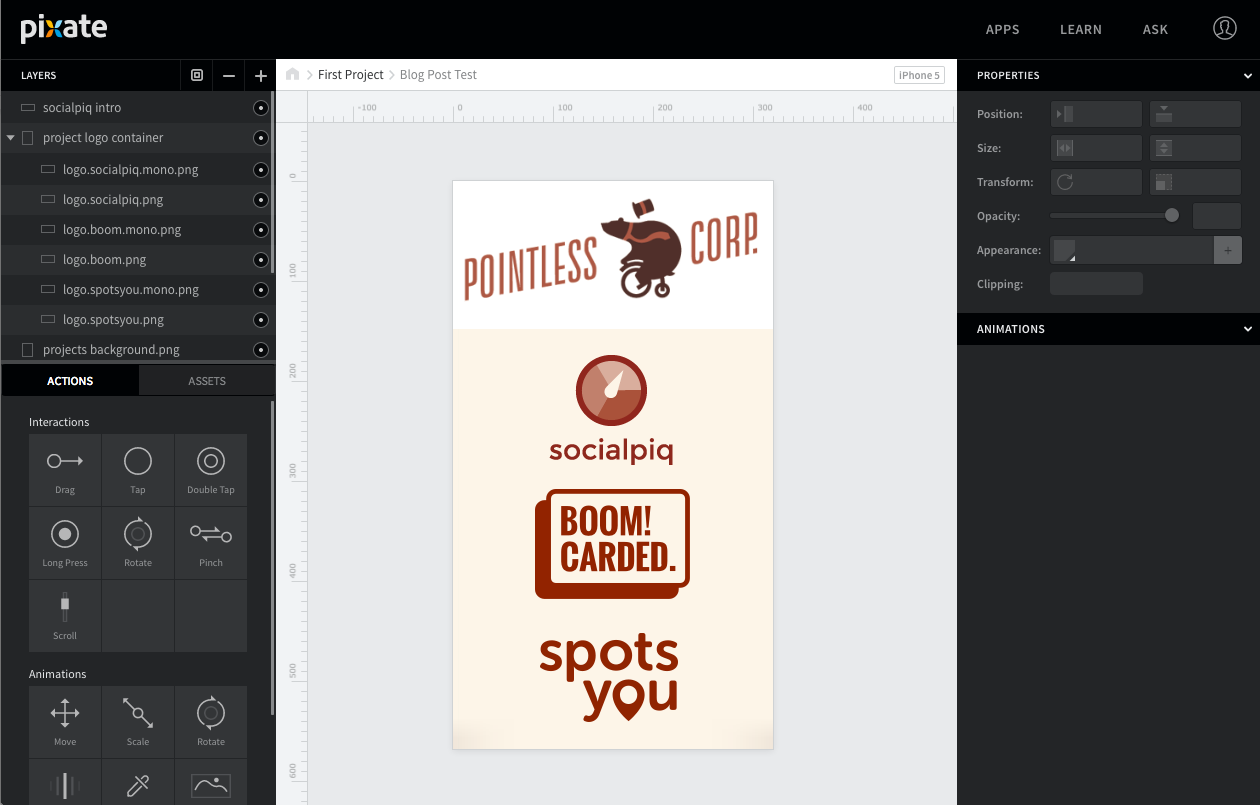
Pixate allows users to create "screens," which live within projects. The screen view is where most of the editing happens, and the slick interface looks somewhat similar to other photo editing tools I've used in the past: 

On the left side of the page, you can create layers and see the available interactions and animations that can be added to the screen. On the right side of the interface, you can specify details for each of the layers, such as size, position, opacity, and add specifics and conditions to animations and interactions. And, of course, in the center is the canvas that represents the page you're building.

Let's dive into some of the details!

Interactions vs. Animations

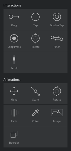
Pixate breaks down the various types of events that can happen on a screen into Interactions, which are triggered by a user (such as a tap or drag), and Animations, which are events triggered by a certain type of interaction. Pixate currently supports these Interactions and Animations:

Move Animations

In our internal app, we wanted some of the screen elements to move when other elements are tapped or dragged.

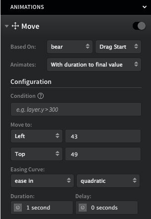
I can do this in Pixate by adding a move animation to an asset and specifying which interaction I want to trigger the animation. In the demo case, I’ve set up the word “Pointless” in the logo to move when the bear is dragged. I can specify all sorts of fun details like how I want the move animation to look, how long it should take, and where it should end up. The settings look roughly like this:

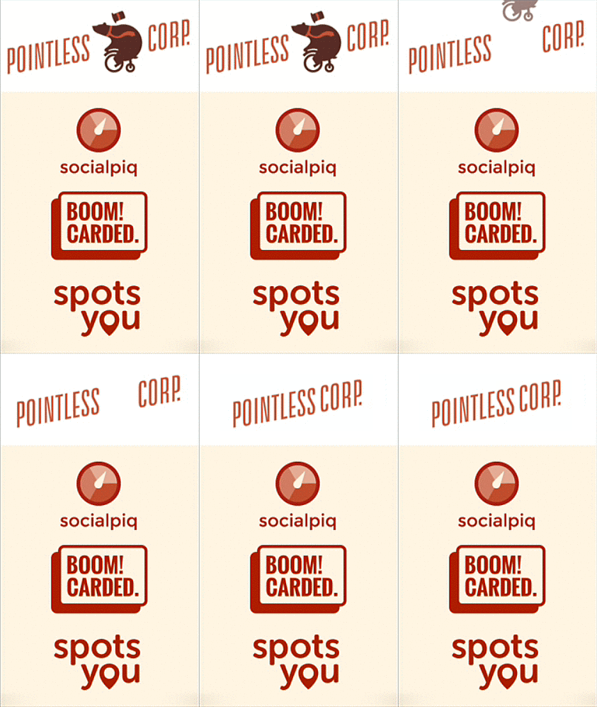
I can then create a similar animation for “Corp.”, and the result looks like this when I drag the bear:

Fade Animations

Some elements in our app appear or disappear when other elements move around them. I can visualize this action using fade animations. The Pointless demo feels monochromatic, so let's say I want to add a pop of color to make it a bit more visually interesting. I set this up by adding a fade out animation to the monochrome logos, and fade in animation to the full color logos when the bear is tapped.

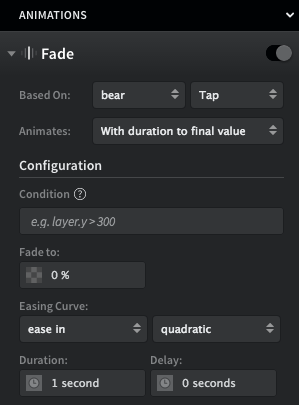
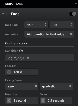
Here’s what the settings in Pixate look like:

This tells Pixate that when the bear is tapped, the monochrome logo should fade to 0% opacity. The fade animation will take 1 second. Then, I want the colored logo to appear, so I’ll have it start animating 0.5 seconds after the bear is tapped, and “fade” to 100% opacity:

Now, I have a smooth fade out/fade in action when the bear is tapped. Fun!

Scale Animations

Another important feature of our internal app is allowing users to see more details for specific elements, which we want to handle by increasing the size of that element. Using scale animations in Pixate, I can increase or decrease the size of any asset on the page.

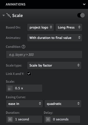
Let’s say I’m feeling a bit overwhelmed by all the large logos on the Pointless page and want to shrink them down. I can do this by combining all the logos into one layer and shrinking them when I long press that layer:

The end result is something like this:

Looks a bit weird, but now I’ve got a bunch of space to work with!

Combining Animations

The real magic happens when you combine different types of animations. Say I want to reveal more info about one of our Pointless projects with some slick animations. I could do this by moving and shrinking the other logos, and fading in some additional info about the project.

Check it out!

Some "Gotchas"

While I found Pixate to be pretty intuitive, there were a couple small issues I ran into when building my prototype:

  • I wanted to add a couple different types of interactions to one of my elements. Sometimes Pixate would treat a drag interaction as a tap interaction, so I would accidentally trigger more animations than I wanted when dragging the asset.
  • In a previous version of Pixate, the configuration fields for some of the animations included example settings - for example, when setting a fade animation, Pixate displayed "0%" for the opacity setting. A few times, I mistakenly mistook this as a default setting rather than a suggestion, so was confused when the asset didn't actually fade. Each setting needs to be manually input.
  • Rookie mistake: Pixate sets a grey background for each layer by default, so my transparent PNGs were showing up as sad grey blocks for a while. This is adjusted easily by clicking the color swatch next to the file name of the layer, or by creating the layer by dragging an asset directly to the canvas.

This is just the beginning of what you can do with a prototyping tool like Pixate. I’ve definitely found it helpful in creating something quickly and easily (and without bothering one of our front-end developers!) so the team can move forward. Here's a bit more about Viget's philosophy on prototyping and creating prototypes with Omnigraffle.

I’d love to hear what projects you think Pixate would help with and other tools that have helped you on past projects!

Noted: New Logo for WWE

$
0
0

Let's Get Ready to Rumble. Sort of.

New Logo for WWE

"WWE (World Wrestling Entertainment), a publicly traded company (NYSE: WWE), is an integrated media organization and recognized leader in global entertainment. The company consists of a portfolio of businesses that create and deliver original content 52 weeks a year to a global audience. WWE is committed to family friendly entertainment on its television programming, pay-per-view, digital media and publishing platforms. WWE programming is broadcast in more than 150 countries and 35 languages and reaches more than 650 million homes worldwide.

WWE's operations are organized around the following four principal activities: Media Division (consisting of WWE Network and pay-per-view, Television, Home Entertainment and Digital Media Segments), Live Events Segment, Consumer Products Division (consisting of Licensing, Venue Merchandise and WWEShop Segments) and WWE Studios Segment. The company is headquartered in Stamford, Conn., with offices in New York, Los Angeles, London, Mumbai, Shanghai, Singapore, Dubai, Munich and Tokyo.

Design by: N/A

Opinion/Notes: The new logo was first used when WWE launched the WWE Network — a 24/7 streaming network of the complete WWE/WWF library and Pay-per-view events — in February of this year and I think even at that time it was somewhat clear the sharp new "WW" monogram would replace the scribbled version that was one of the last ties to the old WWF days. The new is sharp, literally not metaphorically, and it goes better with the much more business-oriented nature of today's WWE than yesteryear's WWF that, although popular in the 1980s and 90s, didn't have the massive mainstream appeal it does today. It's not a horrible logo but there is nothing really impressive about it either — exactly what you'd expect, I guess.

Related Links: WWE Press release

New Logo for WWE
New Logo for WWE Vince McMahon, Chairman & Chief Executive Officer, shows off the new logo (and the $9.99 starting price of the WWE Network. Many thanks to our ADVx3 Partners

Linked: Who's on First?

$
0
0

Who's on First?
Link
Apparently an accident, the Mets gave away a promotional toy truck with the Phillies logo on it, while the Phillies gave away one with the Mets'.Many thanks to our ADVx3 Partners

best 200 tracks of the decade

Natasha Cousens

Spider fangs

#66: This is Darkness

$
0
0
#66: This is Darkness
link
Sunday.
Sometimes when I come home to my apartment late at night, like last night, after driving back from a weekend in Montreal, I feel around in the dark toward my bedroom trying not to bump into furniture along the way, and come to realize that the totality of the darkness is anything but; that if instead of resigning command to my other senses I use my eyes, I can actually see.

It's not unlike going to a new place. I find myself on a layer of metaphor, of comparison to places I have already been. The surrounding farmland is Northern California. The bridges over the river are Portland. Rue Notre Dame is old town Sucre. This is New York, this is New York, this is not New York. I am saying, effectively, "This is Darkness."

Metaphors calm the chaos of noticing everything, and at their edges you can start noticing one thing at a time: the proportion of the streets, the dress of the locals, the shape of the lampposts (and how much of that New York quality comes from our predominance of fire escapes?).

These comparisons are a template for seeing. Yet they also restrict seeing. They introduce a tyranny of what Alan Watts calls "the grid of words." Every word is a metaphor, and the moment you name something a small earthquake happens. Paved road breaks into rough stone and the fissures between are infinitely deep. You stand on your metaphors while avoiding the cracks, and fail to get closer to actual seeing, which is a chasm activity. You fail to get past the idea of This is Darkness.

DB and I spent the afternoon Saturday walking on Mount Royal, the namesake park in the middle of the city. When I set out on a hike I am usually thinking about hikes I've been on before. I am thinking about the clarity I'll have on the mountain and start to panic when I'm not achieving the same clarity from the last hikes. It's only later, when my imagined hike ends, that the real hike begins. I have stayed on the mountain long enough for the crust of ambition to fall away. I have stood still in the darkness and realized that, yes, this is darkness, but I can see, too.
—Jack
Written from Brooklyn, New York. Questions, comments, hellos—all welcome. Just hit reply.

unsubscribe 

Email Marketing Powered by MailChimp

Babadook

Martina Paukova

$
0
0

Martina Paukova on grainedit.com

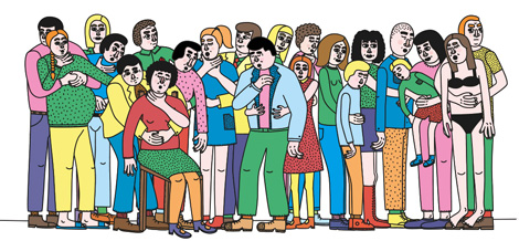
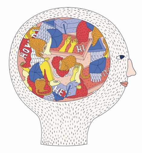
Slovakian illustrator Martina Paukova initially studied politics before discovering that her heart desired a more creative outlet. She then enrolled in the Graphic Design program at the London College of Communication where she could further explore her passion. With a degree now under her belt she creates work that investigates and uplifts the body, the everyday and the banal.


Martina Paukova on grainedit.com

Martina Paukova on grainedit.com

Martina Paukova on grainedit.com


——————–

Also worth viewing:

Helmo
Timothy Hunt
Tom haugomat

Follow us on RSSInstagramPinterestWanelo

——————–

Thanks to this week's Sponsor // Bitrix24: Free account with 10GB extra storage


This Week in Fonts

$
0
0

A fast moving script by Process Type Foundry, a versatile sans from The Northern Block, a decorative serif by Zeune Ink, an energetic script from Sudtipos, a characterful grotesque by Commercial Type, a harmonious slab from Dada Studio, a comfortable sans by Font Bureau, a spirited grotesque from Latinotype, a condensed sans by MCKL, and a neutral face from Type Dynamic.

Process Type Foundry: Pique

Designed by Nicole Dotin

A script with a crisp energy and buoyancy that only the collaboration of paper and screen can lay claim to.

The Northern Block: Loew

Designed by Jonathan Hill

Loew is a versatile sans serif with simple and honest geometry aimed at a wide range of modern applications.

Zeune Ink: Wallington

Designed by Sandi Dez

Wallington is a decorative serif embodying vintage & elegant curves with functional structure.

Sudtipos: Horizontes Script

Designed by Panco Sassano & Alejandro Paul

Relaxed, energic and very natural. With different alternatives of proportion, a wide range of ligatures, initial letters, terminals, floritures, Horizontes Script comes in two weight for large and small formats.

Commercial Type: Marr Sans

Designed by Paul Barnes & Dave Foster

Marr Sans revels in the individuality of the nineteenth century, and is like an eccentric British uncle to Morris Fuller Benton’s Franklin and News Gothics.

Dada Studio: Servus Slab

Designed by Michał Jarociński

The light and bold weights are perfect for display use and the regular weights create a harmonious structure that provides good legibility in long texts.

Font Bureau: Apres

Designed by David Berlow

The plain-spoken geometry is regular and balanced, without being static or mechanical, for a friendly and forthright familiarity.

Latinotype: Grota Sans

Designed by Eli Hernández & Daniel Hernández

A complete family of 40 fonts, 10 different weights and their respective cursives, and an alt version, Grota Sans is a grotesque font with a latin spirit.

MCKL: Fort Condensed

Designed by Jeremy Mickel

Neutral enough to take on information design, corporate identity, and small text sizes, the refined details and personality of Fort Condensed shine in display.

Type Dynamic: Sailec

Sailec is a low contrast, neutral typeface that includes 7 weights, from hairline to black, with corresponding italics.


Sponsored by Hoefler & Co.
and


This Week in Fonts

Not An Uber

Motor Oil

Ale Giorgini

Warp Speed Bubble

Viewing all 13789 articles
Browse latest View live


<script src="https://jsc.adskeeper.com/r/s/rssing.com.1596347.js" async> </script>