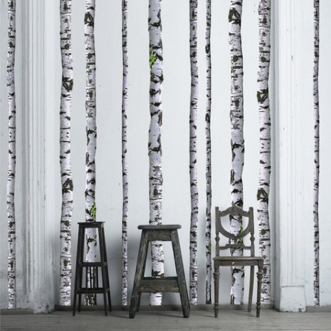
Birch Tree Wall Decal
Reviewed: Friday Likes 96: From A Friend of Mine, SILO, and Bosque
From A Friend of Mine, SILO, and Bosque


From minimal to exuberant in this week's selection with work from Melbourne, The Hague, and Buenos Aires.
Waffee by A Friend of Mine

Specializing in waffles and coffee, hence the name, Waffee, is a small chain of waffleries in Australia with an unexpected mascot: a raccoon. Illustrated by Melbourne-based A Friend of Mine, the raccoon parades across elements of the identity they designed that also features a fun, geometric abstraction of a waffle with the "f"s pulling double duty as the ridges of the waffle. The use of gold elevates this to a whole other, delicious level. See full project
Dutch Creative Council by SILO
Seeking to establish the creative industries as a "top sector" area in the Netherlands, the Dutch Creative Council is leading by example with a smart and simple identity designed by The Hague-based SILO. Working as parentheses, the two "C"s in the name help frame all kinds of Dutch design examples in both simple and frenetic ways (see print examples at the link). It's a basic, repeatable idea that carries that special minimal quirkiness/edginess that the Dutch excel at. See full project here.
La Fábrica del Taco by Bosque

If La Fábrica del Taco— a taco joint in Buenos Aires, Argentina — sounds familiar it's because the identity was designed by Anagrama back in 2009. Now, with an update around the existing logo by local firm, Bosque, this taco place is going full-on Mexican with a highly entertaining illustrative style that adorns everything from menus to t-shirts to posters to (most awesomely) chairs' upholstery. At some point it stops being identity work and turns into general graphic design goodness and ideas but by the time you finish scrolling the length of the project page on Behance all you'll be able to think about is tacos. That's muy bueno branding. See full project.

Trent Jaklitsch
Paste's 100 Craft Beers Every Beer-Lover Should Drink
Noted: New Logo and Identity for Brigantine by MiresBall
Anchors Away


(Est. 1969) "The Brigantine is more than just home to some of San Diego's finest seafood. It's a place where locals and visitors alike come to share a lively atmosphere and authentic sense of community. The Morton family opened the first Brigantine on Shelter Island in 1969, with a vision that embraced the beach town lifestyle, a dedication to flavorful food, and a passion for friendly service." Brigantine has six locations in San Diego.
Design by: MiresBall (San Diego, CA)
Opinion/Notes: The improvement here is undeniable. From a sea-side shack look to a bonafide restaurant enterprise. I'm not a fan of the Copperplate-ish word mark choice but the anchor icon is good enough to make me enjoy the overall presentation.
Related Links: MiresBall case study (click through the red arrows on top to see a bunch of stuff)
San Diego magazine story
Select Quote: The Brigantine wanted to reboot their online presence, and was also updating their interiors and menu offerings. We recommended using the opportunity to clean up what had become a mishmash of legacy logos, often displayed together. Inspired by the sea, the overhauled brand identity positioned the restaurant as a classic destination for a new generation of seafood lovers.
 Logo color variations.
  Menu comparison.
  New menu.
  Polo.
Polo.  Beer pints.
Linked: Hear Me Roar
Link
8-plus-minutes of most, if not all, MGM logo animations.

This Way Up
Zelda Monopoly
Soxettes
LYT
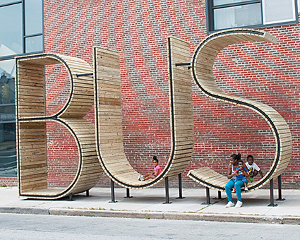
Bus Stop
Friday Link Pack
Broadway cast of ‘The Lion King’ takes over NYC subway, sings ‘Circle of Life’ I love this city. So much.
- 5 Hard-to-kill houseplants
- Couple Performs ‘You’re the One That I Want’ From ‘Grease’ in Sign Language While Driving
- OMG. This. Is. Hilarious: How to stop a baby from crying by Katy Perry Dark Horse
- What the heck is toothpaste anyway?
- “Google to collect data to create a full picture of what a healthy human being is.” (via)
- Uber keeps impressing me with how they push their service forward. Now, you can ‘car pool‘.
- Discover the saddest, most lonely tweets you ever tweeted. (Can it be that I had only one sad tweet out of 22.8k tweets total? I doubt it!)
- Here’s what Brooklyn Summer looked like in 1974
- Wow, Accurat does some seriously legit information design.
- The Art of Not Moving, with Laure Courtellemont. The latest installment of the urban dance video newsletter called Why Aren’t We Dancing by Yoko Ohama.
- Layer Tennis is back! I once participated in a global match. Most stressful 15 minutes of my life.
- Just re-watched this conversation between Gary Vaynerchuk and Chase Jarvis.
- Infographic: Porn Vs. Real Sex, Explained In Food
- Most spoken language by NYC neighborhood – aside from English or Spanish. (via)
- The fine folks over at Brooklyn based Hyperakt are looking to hire a front-end developer.
Redemption Song
Water Trampoline
I saw this image and thought: Must buy a lake! Then this aqua trampoline. Oh, the fun that would be had!
In Tune With What You Love
“…the difference between people who are successful and not are that those who are successful seemed to know from the age of 7 or 8, maybe older, they’re very in tune with what they love. I compare it to a voice inside their head, not literally a voice but something that says “you really are drawn to this subject” and they hear it throughout their lives. For me it was writing and books, since I was a kid. At any time I deviated from that love and went into something else, I was just so unhappy and I knew that I wasn’t doing the right thing. It’s just this voice that keeps drawing you back to what you really, really love.”
- Robert Greene
Found the above quote via this blog post, feed your head + find your soul, by Justine Musk. Something I think about a lot, hoping I’ll be able to help my kids find what they really, really love.
#65: A new cycle begins.
|
Reviewed: New Look of the Games for 2014 Commonwealth Games by Tangent
Ring Around the Everything


Recently concluded, the 2014 Commonwealth Games held in Glasgow, Scotland, from 23 July to 3 August 2014, have been hailed as one of the most successful editions in the history of the event — from volunteers to organization to athlete performance. 36 teams from the Commonwealth of Nations participated in 17 sports with England, Australia, and Canada taking in the most medals. Even the Look of the Games — which we've never heard of them being a thing to keep an eye out for — turned out interesting, as designed by Glasgow-based Tangent.
After inheriting the logo four years ago we went on to shape every aspect of the Games brand identity. Early projects included the Pictograms, the official typeface, a set of sub-brand logos and the interior graphics for the Organising Committee headquarters. We proceeded to work on the full suite of publications, including the Official Ticketing Guide and Spectator Guide before art directing the TV graphics, and developing the creative strategy for the 'Look of Games' — the venue dressing, city dressing and sports equipment at Games-time.
Provided text
 Event logo, designed by Marque Creative.
 The highly forgettable logo was designed by Marque Creative and like past and future Commonwealth logos it wasn't particularly good. It did serve as a starting point, with the geometric, concentric circles, for Tangent to first develop the pictograms and later the complete Look. Custom typeface.
  Sample brand guidelines page.
 Pictograms.
 Pictograms in situ.
 A little odd at times — basketball, weightlifting, bicycling — the pictograms had some nice moments like in swimming, wrestling, and gymnastics with a good balance of thick and thin lines and the pointier ending of some of them. When blown up big in application — as it happens with most design elements — the pictograms look quite good and full of energy.
 Culture program.
  Detail of look book.
  Spectator guide.
  Official ticket.
 The Look starts to get interesting in the print applications, with crops of thick-stroked concentric circles and plenty of white space.

 Venue "dressing".

 Event graphics.
 The best use, though, is in the supergraphics where the rings and pictograms take over facades, walls, and event backdrops.
 Banners.
  Bib.
Bib. What I enjoy the most about this identity is how Tangent was able to extract one visual idea from the logo and turn it into something far more exciting than one would have expected. Overall, it's not nearly as ambitious as any Look of the Olympic Games but it's definitely a strong demonstration for the Commonwealth Games to take design more seriously and hopefully try to make something good out of the hot mess of the 2018 logo.


