Quantcast
Channel: Positive Influences
Viewing all 13789 articles
Browse latest View live

Noted: New Logo for Twice Daily Gas Stations by Onoma

$
0
0

Twice as Nice

New Logo for Twice Daily Gas Stations by Onoma

Twice Daily started as a mid-size convenience store network in Tennessee and now offers a private label gasoline brand distributed in the state and Kentucky. The private label brand "Twice Daily" offers gasoline with a more competitive price point than the major oil companies such as Shell, Mobil, Gulf, Sunoco and BP. To differentiate from these major oil brands, a new identity for the "Twice Daily" products was designed, implemented and launched earlier this year.

Design by: Onoma (New York, NY)

Opinion/Notes: This may come across as either praise or scorn but I haven't seen a logo like this since the 1980s. There is something so romantically old school and almost textbook about it that makes it work so well. You could easily picture someone drawing this with a Rapidograph and having a standards manual in a three-ring binder. I hate Gill Sans but I like the way that single "t" sits in the circle with the unapologetic wing-burst-thing coming out of it. The existing Twice Daily logo and wordmark and the rest of the company's identity is pretty ho-hum but the extended identity into car fuel works nicely.

Related Links: Onoma project page

New Logo for Twice Daily Gas Stations by Onoma Logo detail. New Logo for Twice Daily Gas Stations by Onoma Existing Twice Daily grocery store identity and retail. New Logo for Twice Daily Gas Stations by Onoma
New Logo for Twice Daily Gas Stations by Onoma
New Logo for Twice Daily Gas Stations by Onoma Gas station. Many thanks to our ADVx3 Partners

Linked: Adidas Brand Audit

$
0
0

Adidas Brand Audit
Link
The proposed solution is okay but the analysis by Oğuzhan Öçalan of the problematic and confusing Adidas brand is pretty interesting. Many thanks to our ADVx3 Partners

Hotel Zenden

Are You Sitting Comfortably?

$
0
0
"Buildings are all very well, but it seems you haven't truly made it as an architect until you've given us something to sit on."

BUS

$
0
0
"Each letter stands fourteen feet tall and seven feet wide. BUS is a place to enjoy, interact, and meet while waiting for the bus."

LYT 4 Doubleheader

Fake Hollywood Money

Reviewed: New Name, Logo, and Identity for Brightspace by Hyperakt

$
0
0

Twist and Learn

New Name, Logo, and Identity for Brightspace by Hyperakt

Established in 1999 as Desire2Learn, Brightspace is an "integrated learning platform" that offers software and online solutions for teaching students from K-12 through higher education and for training employees at all kinds of professional organizations. More than 1,100 institutions that range from elementary schools to universities to corporations contract Brightspace products to teach a combined 15 million people. With 800 employees in offices around the world, the company operates now as D2L with Brightspace being the consumer product brand name — its identity has been designed by Brooklyn, NY-based Hyperakt.

Hyperakt's approach was based on a single strategic insight: Brightspace enables a pathway to lifelong learning. This insight informed our creative vision of Brightspace guiding users down their unique paths. We aimed to mirror Brightspace's flexible platform, which adapts to learners' needs and provides personalized solutions for educators and students.

The Brightspace mark needed to resonate as credible and approachable to a large spectrum of learners and educators. It also needed to encompass what learning with Brightspace looks like and feels like. We designed an iconic "B" made up of lines that mirror the myriad twists and turns of learning. The mark is paired with a customized logotype, to provide maximum legibility and impact across all sizes and applications.

Hyperakt project page

New Name, Logo, and Identity for Brightspace by Hyperakt Logo detail. New Name, Logo, and Identity for Brightspace by Hyperakt Starting with Chevin, Hyperakt shows how the wordmark was customized.

I'm always fascinated by these giant companies with a huge influence that I have never heard of and I'm always proportionally amused by what terrible logos they use to get there. Set in Verdana bold italic and punctuated by some random molecule, the old logo was pretty terrible and looking at the name all I can think of is 2 legit 2 quit. The new logo is a most welcome change that better represents this level of company. The "B" monogram is attractive and engaging, forming a "B" without being completely prescriptive about it. Somehow it also reminds of an open book. The wordmark goes very well with the monogram and has a lovely rhythm to it.

New Name, Logo, and Identity for Brightspace by Hyperakt Sub-brands. New Name, Logo, and Identity for Brightspace by Hyperakt Business card.
The brand extends into a visual language of twisting, transforming paths. Custom iconography helps explain and introduce Brightspace's proprietary approach to online learning, while bright fresh colors evoke positive energy and optimism. Bright colors are also positive in learning environments.

Hyperakt project page

New Name, Logo, and Identity for Brightspace by Hyperakt Icons. New Name, Logo, and Identity for Brightspace by Hyperakt Animated logo surrounded by icons. New Name, Logo, and Identity for Brightspace by Hyperakt
New Name, Logo, and Identity for Brightspace by Hyperakt Brochure. New Name, Logo, and Identity for Brightspace by Hyperakt Pencils and pins.

Hyperakt does a great job developing icons for their projects and these not only complement the monogram really well but extend the visual style into other applications and can become the leading visual device in each item. Most of the applications are renderings but show the extent to which the line-y approach can generate a consistent identity without simply repeating the logo over and over. Overall, a very friendly, approachable, yet professional update.

Many thanks to our ADVx3 Partners

♥ / Zuki — WordPress Theme by Elmastudio

$
0
0

A big thank you to Elmastudio for sponsoring this week of my RSS Feed.

Elmastudio just launched Zuki — a gorgeous, minimal WordPress theme for magazines, news sites and blogs. With Zuki you can create a beautiful, super flexible front page, by tossing different Recent Posts widgets into the themes front page widget areas. This flexibility makes it almost impossible to find two websites using Zuki that will look exactly the same. So it’s time to get creative!

Of course also don’t miss out on Elmastudios complete WordPress theme collection for further great finds.

Starting today, Elmastudio offers a 15% discount exclusively to Swissmiss readers on all themes and the theme bundle. Just use the coupon code “swissmiss” at checkout. This offer will end on August 10th 2014, 11:59 p.m. (EDT).


(Interested in sponsoring a week of my RSS feed, learn more here.)

Some Personal Issues

Overlook Facade

Sainer

Noted: New Logo for 2015 MLB All-Star Game by Fanbrandz

$
0
0

Handlebar FTW

New Logo for 2015 MLB All-Star Game by Fanbrandz

"The Major League Baseball All-Star Game, also known as the 'Midsummer Classic', is an annual baseball game sanctioned by Major League Baseball (MLB) between professional players from the National League and the American League, currently selected by fans for starting fielders, by managers for pitchers, and by managers and players for reserves."

The 2015 edition will be hosted by the Cincinnati Reds, one of the oldest MLB teams.

Design by: Fanbrandz (Montclair, NJ)

Opinion/Notes: Traditionally elaborate, the logos for MLB's All-Star Games have been pretty decent over the years. Of all sports events, they are the least spiky too. This latest iteration exudes so much nostalgia you'll want to drive up to the game in a Ford Model T. The moustache and striped square cap are awesome elements, particularly for today's avant grade sports-lovin' hipster. Overall, it's simply a fun, well-done logo.

Related Links: Fanbrandz blog post
MLB press release

Select Quote: The primary logo in the center of the illustration depicts the handlebar mustache and old-style square cap worn by the Reds' most traditional mascot, Mr. Redlegs. His perfectly round head sits on top of the Reds' classic oval-shaped "C."

The crossed bats represent a traditional baseball design, while the addition of deep red creates dimension to the Reds' colors of red and black.

New Logo for 2015 MLB All-Star Game by Fanbrandz Logo detail. New Logo for 2015 MLB All-Star Game by Fanbrandz Merch. Many thanks to our ADVx3 Partners

Linked: Eat Cock

$
0
0

Eat Cock
Link
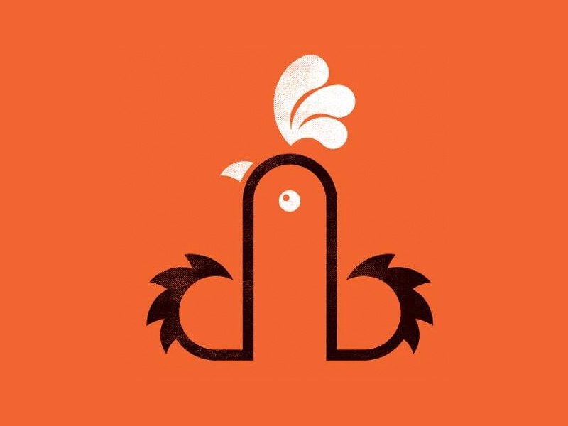
Dirty Bird, a food truck serving fried chicken in Cardiff, UK, has been raising eyebrows because look at it. Owner denies phallic approach. Designed by MarkJames_Works and judging from the poster on his site I question their innocence.Many thanks to our ADVx3 Partners

Learning to Love letters!

$
0
0

I love letters. All kinds and types of letters: small, large, drawn, sketched, painted, rough, smooth, serif, sans serif, script, roman, italic, oblique, digitized, old and new, uppercase, lowercase, all materials and media, three dimensional… Yes, I love letters, except for those that are poorly or incorrectly proportioned. For those poor ugly letters, I feel pity and sadness.

In the hope of creating an appreciation of beautiful letters and avoiding further letterform abuse, I try to share my passion for letterform design with my graphic design, typography and calligraphy students at the Rochester Institute of Technology.

My challenge in teaching calligraphy and typography is to make letters and words come to life: to make letters exciting, tangible and meaningful. My objective is to instill in my students a passion for the inherent beauty and integrity of letterforms, an understanding of history, terminology, structure and proportional relationships, and a highly developed sensitivity to the selection and application of alphabet designs for effective and powerful communication.

2983_Frear_079

Helping students with letters. Photograph by Elizabeth Torgerson-lamark

It has been my experience that not all students come to typography or graphic design with an innate love of letters or type. Over the years, I have tried many methods of infecting students with the type virus…the term I use to describe the typographic obsession acquired by designers. I have found that introducing calligraphy in my typography courses has been the most successful, fun and interactive way to reinforce fundamentals and to develop a high level of typographic sensitivity. It is a far more satisfying approach than tracing letters, which is viewed by most students as torture and which they pursue as such. Calligraphy, on the other hand, is a rewarding and meaningful skill that reinforces lessons learned in typography lectures and demonstrations. Graphic design student Elizabeth McGrail said: “Calligraphy is very beautiful and it was fun to learn about it as well as learning how to do it. I love knowing that I know calligraphy and I can do it whenever I want!” This year’s Hand Lettering Club President and graphic design student Elizabeth Wells stated: “After studying calligraphy, I felt that I understood the anatomy of typography better. Making characters by hand makes you think about every aspect of the letter and the words as a whole.”

2983_Frear_094

Photograph by Elizabeth Torgerson-lamark

Drawing letters is an interactive, physical experience in which students learn proportions, stroke sequences, anatomy, and letter, word and line spacing without even realizing it. They begin to see letters as beautiful and functional symbols that have artistic and expressive potential. Students develop a comprehensive understanding of the systematic nature of typographic design. They see letters as physical forms and not just as shapes on a screen or a page. This in turn helps students understand the process of designing an alphabet and the challenges faced by a typographer in creating a new typeface. Many design students have an AHA! moment when drawing an oblique letter such as a W, finding that they understand stroke weight variation for the first time. Similarly, a student drawing an O by hand may comprehend the meaning of stress for the first time, although he or she may have traced an O or read previously about typographic stress in a book. Mysteries of letterform design and structure are solved when students have firsthand experience drawing letterforms. As graphic design student Lauren Spath said, “Calligraphy was one of the most eye-opening things I have done in awhile. It showed me how to appreciate the letters in typefaces I use every day and changed how I think about letterforms and their intricacy.”

In this 6–9 hour exposure (two or three studio sessions), students use broad-edged steel nibs and ink to draw the minuscules of Chancery Cursive. Drawing families of similar letters (such as n, h, m, r, u) helps students see the systematic foundation of alphabet design. When creating bowls, counters, serifs and flourishes, students become highly aware of the tiny, yet critical details and nuances that give typefaces personality and uniqueness. As they begin to write words, students practice the letter proportions, and incorporate letter and word spacing. In writing sentences and paragraphs, students begin to understand the importance of line length, sense breaks, and line spacing. Graphic design student Emily Butler expressed this well when she said: “Learning calligraphy helped me to understand how the letters flow together. Each character needs to work with the surrounding characters to create words and to look beautiful as a whole. Calligraphy opened my eyes to the different widths and heights of individual characters as well as the terminology that goes with typography. Calligraphy was a great introduction to learning the mechanics of typography.”

Studying calligraphy also provides students with great respect for the challenges faced by lettering artists and typographers in the creation of alphabets. This makes it less likely that they will bastardize typefaces in the future. (Bastardization is the term I use for pseudo-italicizing or scaling type on the computer without making visual adjustments.)

At various times during this process, students have an AHA! moment when they see the connections between the past and present and the hand-drawn and the machine-made. Letters become exciting, tangible and meaningful.

Although today’s students have little experience in drawing letters, I have found that they LOVE working with their hands. In fact, they CRAVE it. Certainly, a part of the attraction is that it is a new experience and a welcome break from the digital world. As graphic design student Giovanni Leoni said: “The art of calligraphy is extremely zen and relaxing. It causes the artist to focus on each and every stroke, revealing the secrets of typography.” And graphic design student Samantha Watson described the experience: “Having calligraphy in a course was a very relaxing way to end the day… the kind of homework I would save as a treat because I looked forward to it.”

In addition to the change of pace drawing by hand provides, I believe the current trends in calligraphy and expressive lettering represent the human need for personal, unique and expressive communication that is difficult to achieve exclusively through digital media. Inspired by lettering seen on websites and blogs, students regularly experiment with lettering in their projects. A fundamental understanding of letterform structure, proportions and relationships is more important than ever if we are to help students create gorgeous, competent letters and not more ugly ones. It is critical that students have a fundamental background in order to create alphabets that are cohesive and aesthetically pleasing.

This is one of the many benefits of the the RIT Hand Lettering Club, a multidisciplinary group consisting of illustrators, fine artists and photographers in addition to graphic designers. Offering lectures, demonstrations and workshops, the club provides students with no typographic background with the key fundamentals of good letterform design with feedback and encouragement. Hopefully, this contributes to the creation of some beautiful new letters!

calligraphy practice

Image of demo letters. Photograph & letters by Lorrie Frear

Through the years of incorporating calligraphy in my typography courses, I have used the terminology and information from both areas in a reciprocal, back-and-forth dance. This has assisted students in gaining sensitivity to typography that occurs naturally and with a sense of personal accomplishment. I have also found that introducing calligraphy as part of a university typographic education increases refinement of design issues such as the use of negative space and composition. Graphic design student Autumn Wadsworth stated: “Learning calligraphy and lettering by hand makes a huge difference in your design skills. Every little typographic detail just makes so much more sense, and my typographic and design skills have improved because of it.”

In conclusion, graphic design student Rachel Nicholson provided her viewpoint:

“I have found an outlet in lettering. Whether it’s calligraphy or custom hand lettering, there is something so powerful about language and words in general and then to pair that with the artistic ideals of composition and balance and flow…there is a real a beauty in that. The natural connection between the pen, hand and paper is relaxing, rewarding and immediately gratifying. Lettering allows you to see the alphabets as shapes and lines. I found this new way of “seeing” not only to be a challenge, but a wonderful lesson in design: to simplify the world around you into contours and forms that have endless potential to inspire, create and function.”

It is greatly rewarding for me to introduce students to calligraphy and type, to witness their genuine enthusiasm for letterform design, and to observe their growth as they explore and improve. It’s an inspiring, humbling and magical experience.

———

Header: Photograph by Elizabeth Torgerson-lamark

AUTHOR BIO:
Lorrie Frear is an Associate Professor in the School of Design/College of Imaging Arts and Sciences at the Rochester Institute of Technology in Rochester, New York, where she teaches graphic design and calligraphy. Lorrie also conducts calligraphy and lettering lectures and workshops nationally that are tailored to the needs and interests of the audience. Her professional and student work can be viewed at the RIT website.


Sponsored by Hoefler & Co.
and


Learning to Love letters!


The Theory of Everything

Weird Al Super Bowl Halftime Show

$
0
0
To: NFL
Have Weird Al Yankovic headline the Super Bowl XLIX Halftime Show.
Sincerely,
[Your name]

Helmo

$
0
0

Helmo on grainedit.com

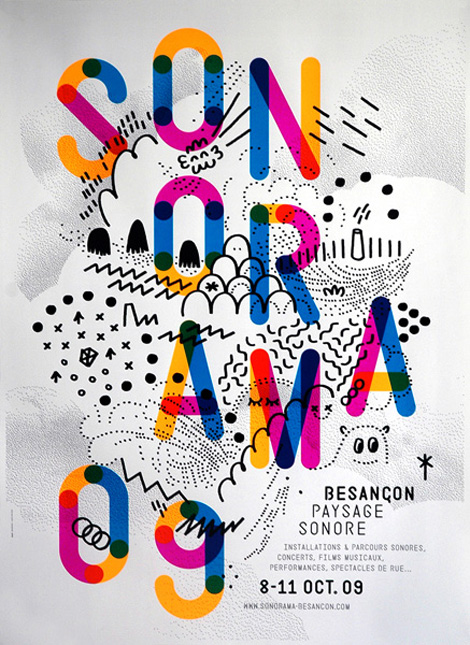
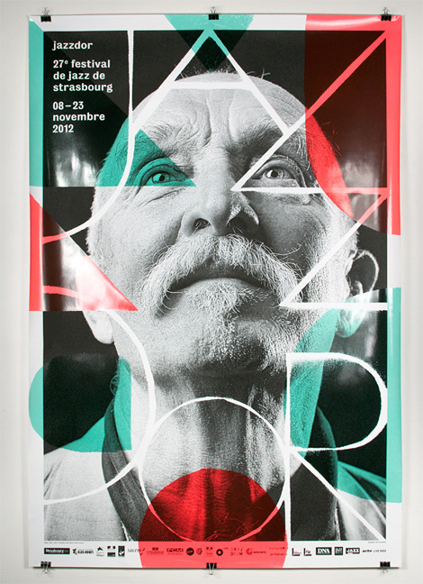
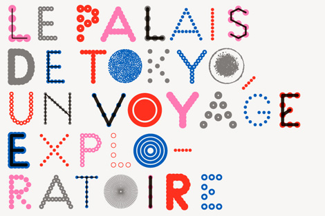
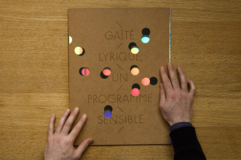
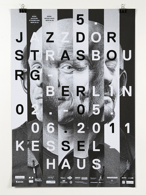
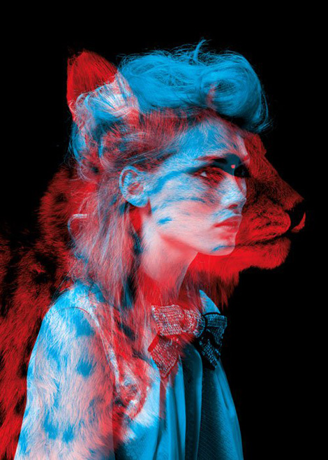
Thomas Couderc and Clément Vauchez are the creative minds behind the French design studio Helmo. The two met during their studies in Besançon before pursuing separate careers in Paris.  They later reunited at the design collective La Bonne Merveille before launching their own studio.


Helmo on grainedit.com

Helmo on grainedit.com

Helmo on grainedit.com

Helmo on grainedit.com

Helmo on grainedit.com

Helmo on grainedit.com


——————–

Also worth viewing:

Michela Picchi
Timothy Hunt
Tom haugomat

Follow us on RSSInstagramPinterestWanelo

——————–

Thanks to this week's Sponsor // ThemeIsle: WordPress themes


Announced: 2014 Brand New Conference: A Few Updates

$
0
0

After-party venue / New sponsors / VSA speaker switch / Where the New Yorkers at?

2014 Brand New Conference: A Few Updates

We are 50 days away from the 2014 Brand New Conference and have a few updates and notes to share:

1) After-party
The venue for the after-party has been contracted at the very ample upstairs area of John Barleycorn on 149 West Kinzie Street. Non conference attendees and friends of conference attendees and nice people are welcome to attend at no cost — you'll just have to pay for your own booze and not eat the food.

2) New sponsors
Every year we are fortunate to have relevant and supportive sponsors. Since we first launched this year's site and speaker list we've added four new sponsors: MOO, Extensis, FontShop, and Airbnb.

3) VSA Partner speaker change
Due to a client conflict, VSA Partners' Jamie Koval will not be able to present. Lucky for us they have a deep pool of talent and Sol Sender— you know, of Obama ’08 logo fame — who joined the company in 2011 will be taking his place.

4) Attendee geography
We have nearly 500 attendees and we are delighted with this number so far. Our goal is 750 and we hope we can make it happen. We obviously have a big crowd from Illinois at 135. From the nearby Midwest we have 27 from Indiana, 13 from Michigan, 12 from Ohio, and 8 from Wisconsin. California is coming in strong with 32. Over 75 people are coming from outside the U.S.! From London, Stockholm, Spain, Moscow, Guatemala, Mexico, Canada, Australia, Sri Lanka, and Hong Kong. We love this. But we do have to ask: Where are the New Yorkers? Only 40 so far. Maybe you are offended we took the conference away from your home court? It's a quick flight to Chicago, so c'mon down, okay?

5) Ticket giveaway
On September 8 or 9 we will be doing our usual ticket giveaway courtesy of sponsors who may have unused tickets and our matching giveaway.

6) Last day for online registration
Finally, a reminder that online registration will close September 18. Walk-in registrations will be accepted.

Many thanks to our ADVx3 Partners

Game of Thrones Transit Map

Viewing all 13789 articles
Browse latest View live


<script src="https://jsc.adskeeper.com/r/s/rssing.com.1596347.js" async> </script>