Quantcast
Channel: Positive Influences
Viewing all 13789 articles
Browse latest View live

Noted: New Logos for Tribune Media Company and Tribune Publishing Company

$
0
0

The Tribunal is Out

New Logos for Tribune Media Company and Tribune Publishing Company

Formerly known as the Tribune Company, the organization has split into two separate businesses, a cool one and a not-so-cool one:

"Tribune Media Company is home to a diverse portfolio of television and digital properties driven by quality news, entertainment and sports programming. Tribune Media is comprised of Tribune Broadcasting's 42 owned or operated local television stations reaching 50 million households, national entertainment network WGN America, available in 72 million households, Tribune Studios, and Tribune Digital Ventures, including the websites Zap2it and TVByTheNumbers, and Gracenote, one of the world's leading sources of TV and music metadata powering electronic program guides in televisions, automobiles and mobile devices. Tribune Media also includes Chicago's WGN-AM, the national multicast networks Antenna TV and THIS TV. Additionally, the company owns and manages a significant number of real estate properties across the U.S. and holds other strategic investments in media."

"Tribune Publishing Company is a diversified media and marketing solutions company that delivers innovative experiences for audiences and advertisers across all platforms. The company's diverse portfolio of iconic news and information brands includes 10 award-winning daily titles, more than 60 digital properties and more than 150 verticals in markets, including Los Angeles; Chicago; South Florida; Orlando; Baltimore; Carroll County and Annapolis, Md.; Hartford, Conn.; Allentown, Pa., and Newport News, Va. Tribune Publishing also offers an array of customized marketing solutions, and operates a number of niche products, including Hoy and El Sentinel, the country's largest Spanish-language publisher. Tribune Publishing is headquartered in Chicago."

Design by: N/A

Opinion/Notes: Not a lot of information on this but not that much is needed, really. Tribune Media, which now runs all the entertainment stuff, is the more boisterous brand while Tribune Publishing Company, which gets all the struggling newspaper outlets, is the more staid brand. Neither is very good. (Nor is either really terrible to be fair). The "T" in Tribune Media is a little confusing, with the right crossbar just kind of floating and lacking integration with the gradient approach. The "t" in Tribune Publishing Company is kinda interesting but not quite and the all-lowercase "tribune" wordmark is weak as newsprint.

Related Links: Press release

Tribune Media introduction. Family of logos at the very end. Many thanks to our ADVx3 Partners
Linked: Bear-ing Similarity

Tony Stella

The Medium

$
0
0
"Try discussing a brand new language via Skype with two hearing linguists, plus another via text, who happens to be deaf, and see what you learn." The Medium, by Michael Erard. Fascinating.

Controllers

Maria Popova: 7 Things I Learned

Text / Email / Phone Call

$
0
0

Swing Bin


SuperMoon

Slot-Machine Science

Hollymatic goes The Distance

Archaeologist's Junk Drawer

Playing LYT

Elyx In Paris

Silvertop


Barbican Theater's Hamlet promo posters

The Perfect Advertisement

$
0
0

I was recently reading an article about key words that convert and within it I found a reference to the “perfect advertisement “ from back in 1961.

It utilizes the ten “most persuasive” keywords in the English language;

  • you,
  • discover,
  • easy,
  • proven,
  • save,
  • money,
  • guarantee,
  • health,
  • happiness,
  • love,
  • results.

So when you combine these into a sentence it creates the “perfect advertisement”:

You can discover an easy and proven way to save money, and help guarantee your future health and happiness. Buy a home in one of America’s finest communities. You’ll love the results. “

Perfect Advertisement

Be prepared to be ‘persuaded’.

A Fistful of Dollars Outtakes

The Floyd Leg

Reviewed: New Logo and Packaging for Brand Bier by VBAT

$
0
0

On Brand

New Logo and Packaging for Brand Bier by VBAT

Established in 1340 in Limburg, the southernmost of the 12 provinces of the Netherlands, Brand Bier is the oldest Dutch brewery. Its main product is a pilsner and it also produces seven other — Heavy Blonde, Double Bock, Lentebock, Up, Imperator, Sylvester, and Weizen. This past July, Brand introduced a new line of packaging designed by Amsterdam-based VBAT.

There is a press release here but doesn't really say much.

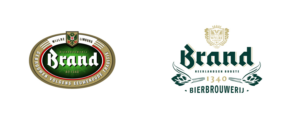
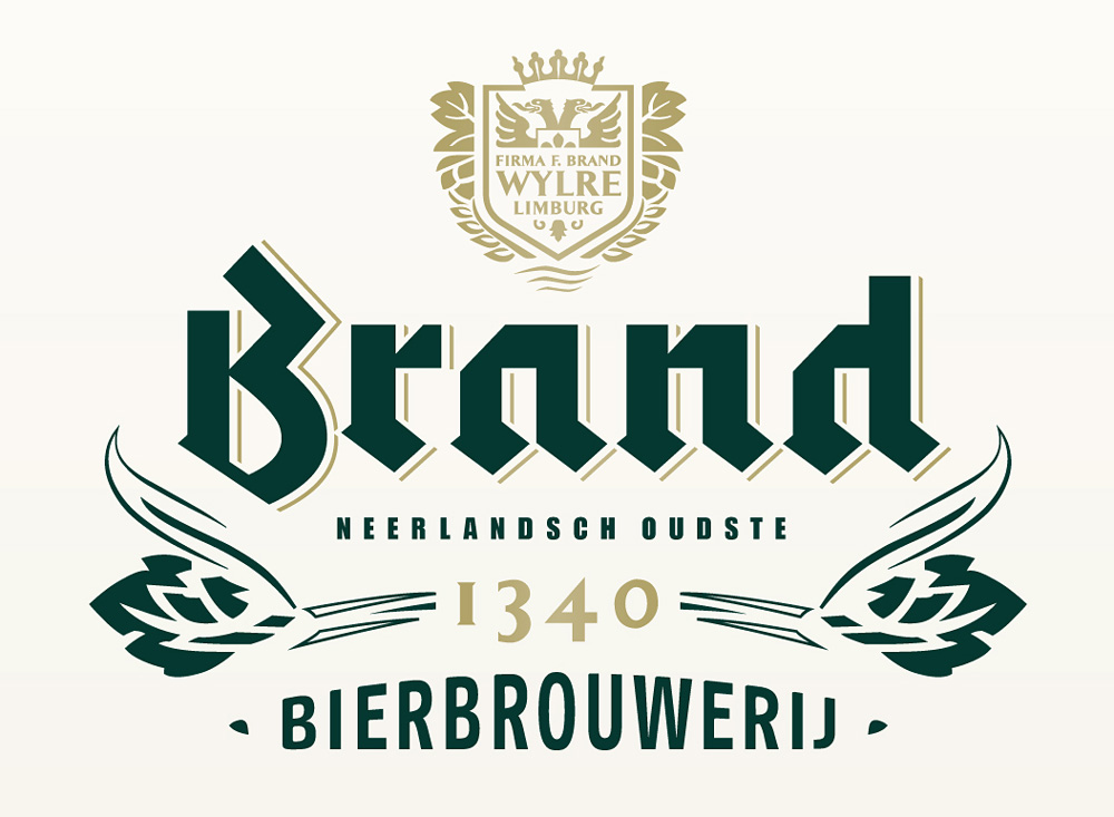
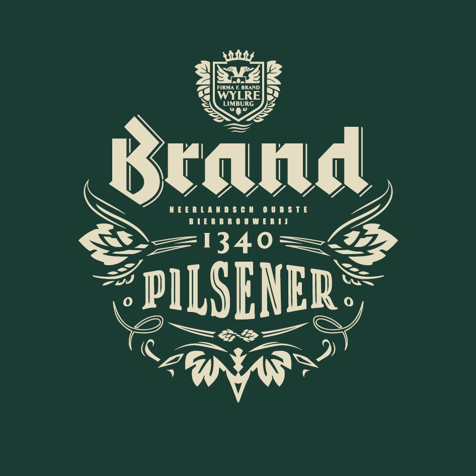
New Logo and Packaging for Brand Bier by VBAT Logo detail.

The main element of the logo — the stunning and bad-ass blackletter — has been kept the same in the evolution but everything else has been well refined. Most refreshingly, the logo has been taken out of its constricting oval and given room to breathe. The shield, although now with more elements and complex, feels cleaner than before and the typography overall has been vastly improved. The only fault is the drawing of the barley, it's like they ran out of energy on it as it looks nothing like any of the other elements.

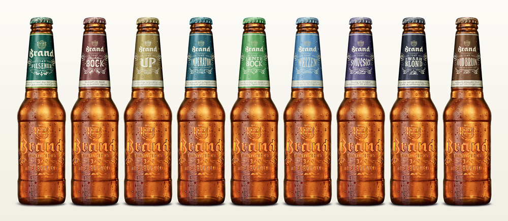
New Logo and Packaging for Brand Bier by VBAT A sample of the old look of their flagship pilsner beer. New Logo and Packaging for Brand Bier by VBAT Old look of other Brand beers. New Logo and Packaging for Brand Bier by VBAT New bottles.
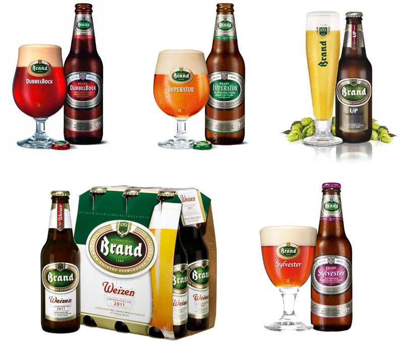
The previous look wasn't offensive in any kind of way but it wasn't memorable either. The heavy oval with the brewery name or beer kind on it was a bit oppressive and the consistency in type application left a lot to be desired for. The new bottles, on the other hand, are quite amazing. The mostly-label-less bottle has been embossed with a large version of the logo that wraps around the full front and provides (I'm imagining) a great tactile experience with the product. The only distinction now between the beers is the neck label and color-coded caps. It might be a little more difficult to distinguish quickly but it's a really elegant and cool approach.

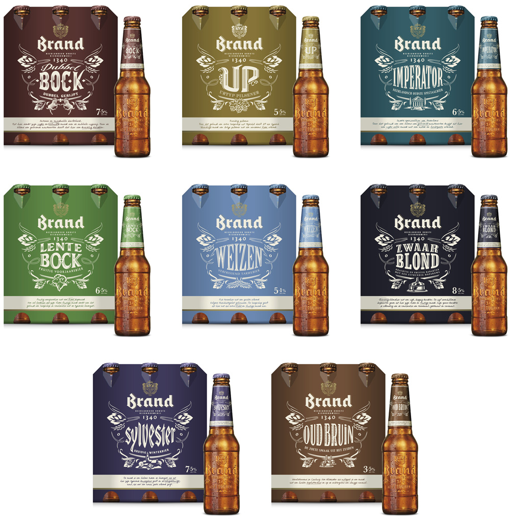
New Logo and Packaging for Brand Bier by VBAT Bottles and 6-packs.

Each beer kind now has its own logo derived from the main logo, with a more consistent (and heavily ornamental) typographic approach that give the 6-packs a commanding shelf presence.

New Logo and Packaging for Brand Bier by VBAT Pilsner logo.
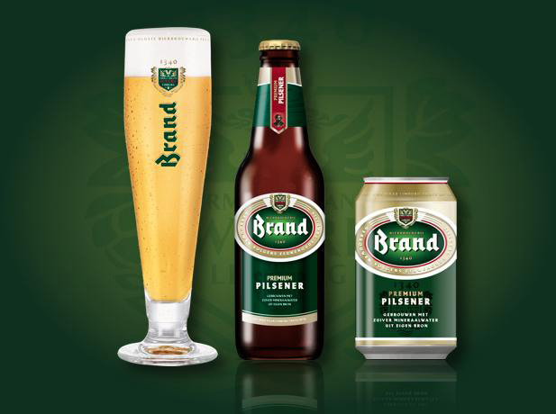
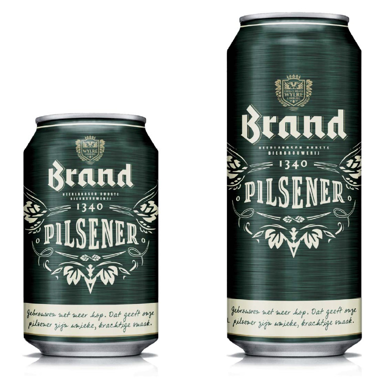
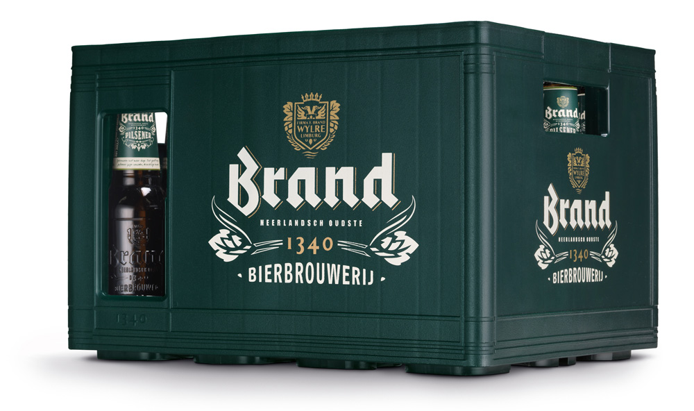
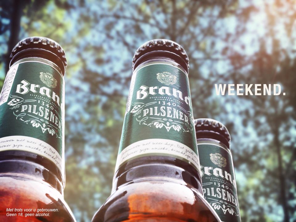
Introducing the new look for the pilsner. Epic score. New Logo and Packaging for Brand Bier by VBAT Detail of new pilsner bottle. New Logo and Packaging for Brand Bier by VBAT Pilsner cans. New Logo and Packaging for Brand Bier by VBAT Pilsner crate. New Logo and Packaging for Brand Bier by VBAT Pilsner and the word weekend; no explanation necessary.
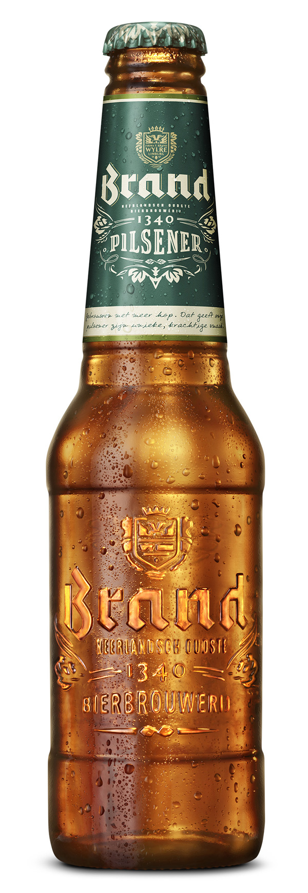
A lot of craft and care has gone into the design of the bottle and Brand's brand architecture. While the non-label concept and embossed bottle is not new — see Carlsberg— the execution for Brand has been expertly extended to a large range of beers.

Many thanks to our ADVx3 Partners

Viewing all 13789 articles
Browse latest View live


<script src="https://jsc.adskeeper.com/r/s/rssing.com.1596347.js" async> </script>