what happens when you enter the Witness Protection Program?
Apparently.............
Being the USAF Thunderbirds Official Photgrapher
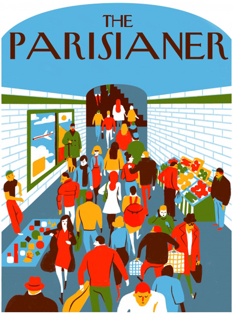
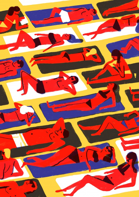
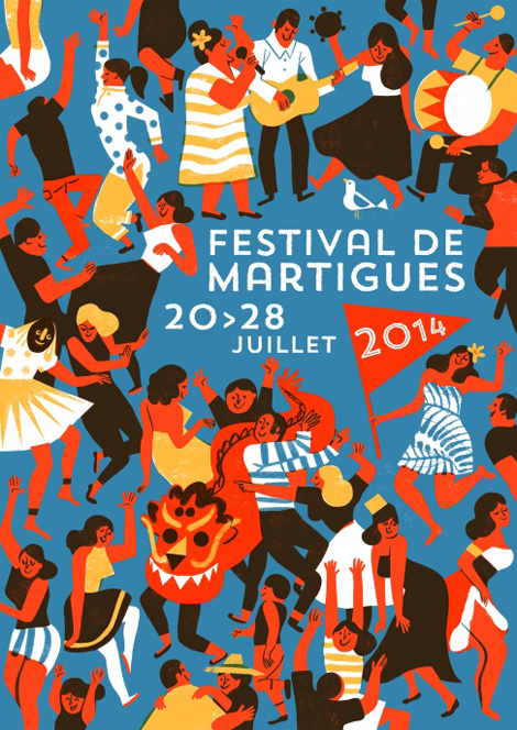
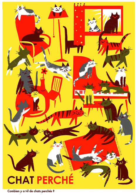
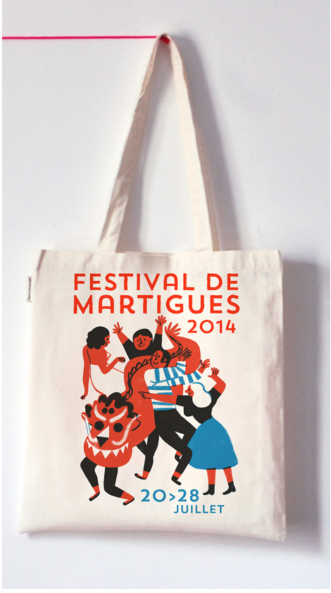
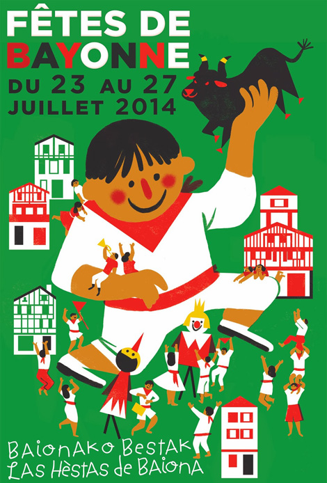
Virginie Morgand
Charming illustrations from French illustrator Virginie Morgand.
——————–
Also worth viewing:
Michela Picchi
Timothy Hunt
Tom haugomat
Follow us on RSS, Instagram, Pinterest, Wanelo, Luvocracy
——————–
Thanks to this week's Sponsor // ThemeIsle: WordPress themesBest-Selling Author Amanda Hocking Shares her Advice on How To Be Successful
Once upon a time in April 2010 a girl named Amanda Hocking was sitting sad and frustrated in her tiny apartment in Austin, Minnesota. She had tried for several years to get her books published through traditional publishers but all her attempts had gone in vain. She was penniless and had no idea where her life was going.
Then the Muppets came to her help.
She heard news that an exhibition about Jim Henson, the creator of the Muppets, was coming to Chicago later that year. She desperately wanted to visit it but she had no money to bear the travel expenses.
She wanted to earn $300, one way or the other and in the process did something that was set to change the publishing industry forever.
She took her novel My Blood Approves and self published it on Amazon. Then she self published a couple of her other novels which were all just sitting on her computer’s hard drive.
In less than two years, she sold more than one million copies of her novels and became one of the few self published authors to do so.
Fortunately for us, she runs a blog where she explains how she sells her books. Let’s see what lessons we can learn from her success. Unless otherwise stated, all of the quotes below are taken from her article – An epic tale on how it all happened.
1) Write a lot

But of course you should write a lot. What else do you expect to do? Want to become a runner, run a lot; want to become a singer, sing a lot; and similarly if you want to become a writer, write a lot.
So how much did Hocking write before becoming successful?
Here is what she says:
“People ask me, “When did you start writing?” And the truth is I never didn’t write. Before I could talk, I would tell stories. When I was younger, I couldn’t write fast enough to keep up with the ideas I had, so I had [to] talk and get them out. I was always writing. It never occurred to me until I was about 12 that I would do anything other than be a writer.”
2) Read a lot

Again this should be obvious. Most writers I’ve read about, enjoy reading. That’s why they take to this profession. So if you enjoy it, it shouldn’t come as a burden on you.
Secondly it’s very necessary to read good books in order to write good books. How else will you learn the craft?
Here is what Hocking suggests:
“Write a lot, and read more than you write. Learn to take criticism. Edit a lot, and find a good editor. Read On Writing by Stephen King and Joe Konrath’s blog A Newbie’s Guide to Publishing – all of it.”
3) Have a passion for your work

You need to have a passion for what you are doing. Don’t let anybody tell you otherwise. There are some bloggers who argue against this notion but don’t listen to them.
You see, in order to become successful you will have to work really hard. You will have to face difficult times and it will be your passion which will survive you when things will become really difficult.
Here’s what Hocking says:
“I decided that I really enjoyed writing paranormal romance. Really. So I knew I wanted to stay in that genre, even if it wasn’t popular. …
I write because I love it, not because I see readers as dollar signs. I am very, very passionate about my work, and I take it very seriously that people are inviting me to entertain them every time they buy a book.”
4) Work hard

Anyone who has achieved anything in life has done so through hard work.
In December 2008, she was making no money and was sad about it when she discovered something. The following quotes are from her post The Magic Hand.
My life feels like a dead end. I’m writing books. Nobody cares. And I say, why isn’t this working? What am I doing wrong?
If you’re me, and I am, you spend a lot of time thinking about how neat Mark Hoppus is and listening to a lot of blink 182 and Fall Out Boy. That led me to this YouTube video, which contains the single greatest piece of advice I’ve ever gotten from anybody about writing, and it wasn’t even about writing. So I watched this video late 2008, and it was a wake up call for me to quit whining and get off my ass.
The advice goes like this. The interviewer asked Hoppus what advice will he give to new bands and he says:
“You have to play music that you love, first of all. You have to play music for anybody that will listen to you. You have to work your ass off. You have to go out there and make it happen for your band.
Because I see all these young bands coming up and I talk to people. And so many times people are like – “How did you get your big break?”.
And it’s like people are sitting back. They write songs and they have a passion to do it but they don’t have the work ethic to do it a lot of time. They are sitting back and they are waiting for some magic hand to come down and pick up their band and make it happen for them. It doesn’t happen like that. You have to make it happen for yourself. You have to call clubs and flier for your shows and put stickers everywhere and talk to other bands.
–
Photos by Depositphotos.com
A Better Queue
A Better Queue lets you filter Netflix’s instantly streaming movies by Rotten Tomatoes’ Tomatometer, number of reviews, years, and genres. It also lets you add movies straight to your queue. Awesome!
(Thanks Jake)
Tolga Girgin
DMMap
Amen
Reviewed: New Look of the Games for Rio 2016 done In-house
Dangerous Curves Ahead


Now that Brazil has recovered from the World Cup — the organizing part not the getting-their-ass-whooped part — the country can focus its energy on caring about the upcoming Summer Olympic Games in 2016. Yesterday, marking the two-year countdown, the organizing committee unveiled the Look of the Games, designed by their in-house team.
Inspired by Brazil, Brazilians and Rio de Janeiro, the look is multicolored and vibrant as the harmonic diversity of our people. The look is organic, enveloping like an embrace, inspired by our lush nature and warmth. Bring fluids and energetic features, as well as our art, our identity.
Rio 2016 press release
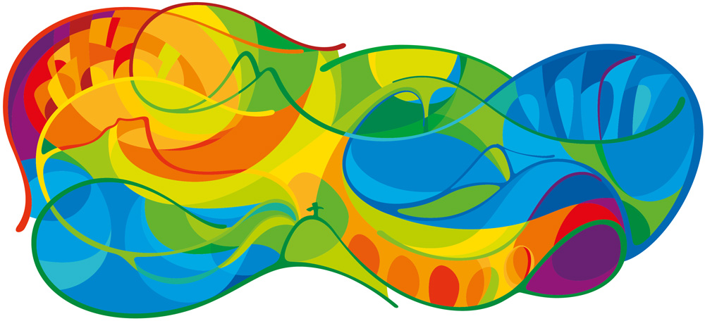 Main graphic. You can find icons weaved in such as the Christ the Redeemer statue, the Lapa Arches from the Carioca aqueduct, and the Pedra da Gávea mountain in Tijuca Forest.
Animated graphic.
 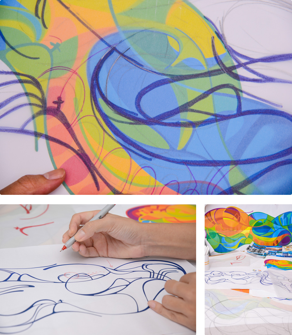 Process drawings.
 More than a "Look" or a kit of parts like we are used to seeing, this is almost a secondary, giant logo. It's fun to look at, it's colorful, it ties in to the more recognizable brand asset that is the Rio 2016 typeface, and it has some landmark references hidden in it, but… it's kind of very weird and ambiguous as well. As a single piece of design and illustration it's enjoyable but as a basis for what is usually one of the most complex identity programs in the history of things it seems like an odd place to start.
Developed by teams of design and management of the Rio 2016 brand, the project took about a year to complete. For its development, studies of historical-cultural and identity present in the Brazil Rio de Janeiro and a photographic immersion in the landscape aspects of the region were performed, in addition to four other cities Soccer - Belo Horizonte, Sao Paulo, Brasilia and Salvador.
According to the team responsible for the project, which was developed internally, Rio de Janeiro is present in the scenario through your icons, in which is recognized throughout Brazil and that inhabit the imagination of every tourist. The look is organic and immersive "like a hug", inspired by the exuberant nature and warmth.
Rio 2016 press release
The above icons show the positive potential of this language, though. They focus on a landmark and then apply this kind of stained-glass-meets-carnaval graphic filter to it that yields rather interesting compositions.
 Information panels.
  Rendering of the aquatic center.
  Rendering of the tennis center.
  Banners and indoor court.
 Where things start getting wobbly and not too exciting is in the larger applications, with what appear to be tight crops of the main graphic superimposed with the pictograms. Obviously these are early renderings and proof of concept — things tend to look far cooler in reality. Still, it feels flat. The Rio 2016 look reminds me slightly of the Vancouver 2010 Winter Olympic Games look but with warmer colors and less ambition (for the time being).
In case you missed it: The type of the games, designed by Dalton Maag. Hanging my hopes on the type over the graphic.It's too early to be so harsh on this, as there is more than a year to nail it down and make it applicable to the actual structures and allowing it to evolve but unlike other unveilings — I'm particularly thinking of the Sochi 2014 look— there isn't a "wow" moment yet for Rio 2016. My main hope is that they don't underuse the beautiful typeface which, so far, takes the gold in their brand efforts.

Trailer for The Green Prince
Pitching Like A Girl
“I don’t want to be afraid to say what I haven’t yet figured out or to give realistic projections of what we can deliver when. As a designer, I never promised a client anything I couldn’t deliver, and I won’t start now as a founder.”
Pitching Like a Girl, by Ellen Johnston
