The Grand Illusion
Sabine Finkenauer
Pushing On
Found this music video over on Booooooom. Well done.
Kodachrome
Noted: New Logo for Houston
We Have Liftoff. Sort of.


"The Greater Houston Partnership's mission is to make the Houston region the best place to live, work and build a business. Over the past 25 years, our membership, comprised of over 2,000 leading companies, has tackled the region's most important issues that impact our community. Houston has enjoyed incredible growth, and the Greater Houston Partnership has played an important role, working to create jobs and advocating for a positive business environment that is conducive to growth and prosperity."
Design by: MMI Agency (Houston, TX)
Avalanche Consulting (Austin, TX)
Opinion/Notes: So, as a complement to today's South Korea post, here is one of the smooth destination brands I'm talking about. It's cool and well executed but it could also stand for a number of other cities' whose initial letter would fit in a diamond shape. For Houston, it works particularly well as the shapes sort of resemble a rocket — NASA connection — going into the stars. The inline typography is decent and the logo variations are fine if a little useless at times. (Every page on their site has a different logo). The print ads are a whole other language and concept that have a limited charm to them.
Related Links: Houston: The City With No Limits microsite
Press release
Select Quote: The campaign, designed to span multiple years, will address numerous objectives, supplementing work already being done by GHP to attract trade and capital investment and facilitate business recruitment and retention. A primary focus of the campaign will be to strengthen Houston's ability to attract top young professional talent to the region.
 Logo detail.
  Logo variations.
  Print ads.
Linked: Venn Google Doodle
Link
A particularly good (interactive) Google Doodle today celebrating what would have been the the 180th birthday of John Venn, of Venn Diagrams fame. Great process stuff at the link.

Mathematically Correct Breakfast
Lights Out
Krystall
Sponsor // ThemeIsle
ThemeIsle is a WordPress theme shop. With a focus on clean responsive design and solid customer support they offer a variety of themes to meet your needs. Features include unlimited color options, custom theme widgets and regular updates. In addition the themes can be purchased individually or for a minimal fee you can receive unlimited access to the complete collection.
ThemeIsle has graciously offered grain edit readers a 20% discount off all their themes. Please use discount code grainedit20 durng checkout.
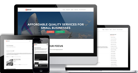
Featured Theme: Zerif – A responsive one page theme for creative agencies.
Features:
- Clean and validated code.
- Theme Support
- Theme options Panel
and more.
See all the features here.
——————–
Interested in sponsoring grain edit? Visit our sponsorship page for more info.
——————–
Also worth viewing:
Neue Grafik Re-release
Anymade Studio
Tom haugomat
Follow us on RSS, Instagram, Pinterest, Wanelo,
——————–
Thanks to this week's Sponsor // ThemeIsle: WordPress themes
Extracting audio from Visual Information
My Name is Wendy
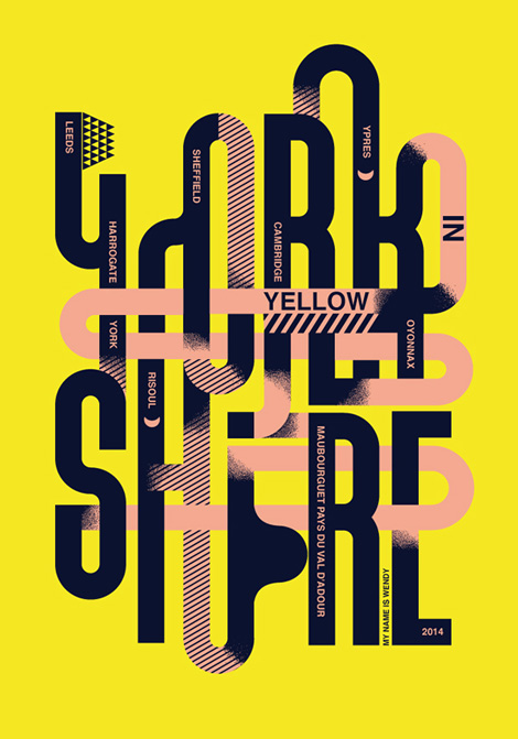
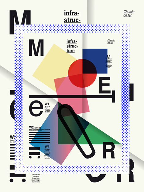
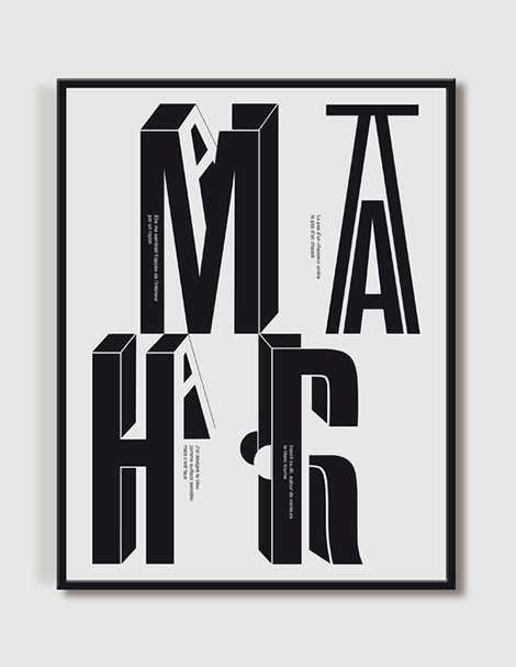
My Name is Wendy is a Paris-based design studio founded in 2006 by Carole Gautier and Eugénie Favre. Uniting their expertise in graphic and plastic art, they create highly expressive work that is bold and dynamic.
——————–
Also worth viewing:
Bunker
Timothy Hunt
Tom haugomat
Follow us on RSS, Instagram, Pinterest, Wanelo, Luvocracy
——————–
Thanks to this week's Sponsor // ThemeIsle: WordPress themes
Serenading the cattle with my trombone
Charlie Kim on Company Culture
I recently had the pleasure to meet Charlie Kim of a Manhattan based technology firm called Next Jump. He is a remarkable example of a founder and CEO that is all about seeing his employees grow, not only in skill but in character.
Charlie has developed multitude of internal company culture programs that range from an in-house mentor program, to fitness programs, as well an internal university.
He has also developed a staff inclusive hiring process that guarantees a new hire never to be fired. Charlie Kim sees a new hire similar to a family adopting a new family member. If your kid underperforms you nurture and help them, don’t kick them out.
Charlie’s work is nothing short of impressive and just like him, I want my employees to feel cared for and I want them to be proud to work for me.
Charlie is a huge role model to me when it comes to how he thinks about company culture. Watch his keynote at the Colorado Health Symposium and you’ll see why.
Simon Sinek mentions Charlie in his most recent TED talk.
Reviewed: New Name, Logo, and Identity for GO by Saffron
Green Means…


Launched mid-last year and rolling out approximately 50 stations since across Turkey, GO is a new brand of gas stations operated by Ipragaz, the second largest subsidiary of global company SHV Energy. Because Ipragaz has been specialized in liquefied petroleum gas since 1961 — which is a consumer product as common as water cooler jugs in some countries — its name would have proved difficult to enter the auto gas market. With the help of Saffron, who named the brand and designed the identity, they introduced GO.
Saffron created the name —GO—, the core concept, the visual style and the eventual design of the new stations: a place to escape the rigours of the road and possibly even enjoy filling up. To build the service station Saffron partnered with Malka+Portús. Together we designed a unique experience covering every aspect of people's interaction with GO — from the sign on the highway to the one on the restroom, and everything in between.
Saffron project page
 Logo detail.
  Logo sheet.
 The first thing I like about this wordmark is that it is not geometrically perfect. It would have been easy to just draw the stroke in Illustrator, fatten it, and let it handle the curves. Instead, the corners have been adjusted slightly to give it a more organic flow and avoided the heavy ink coverage that happens with straight-up Illustrator curved corners. The triangle on the outside is also well considered — while it bottom-aligns with the top curl of the "G", it dips slightly below to compensate visually. These are seemingly small moves but they help convert what would be an otherwise generic wordmark into something with more personality and visual presence, specially in such a simple identity system.

 Livery.
  Uniform detail.
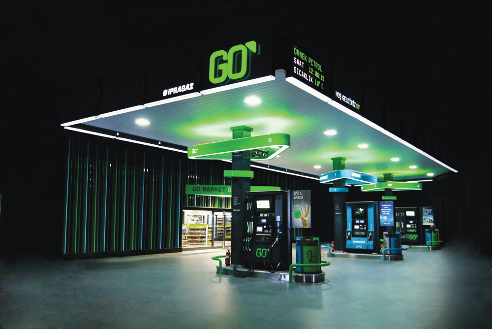

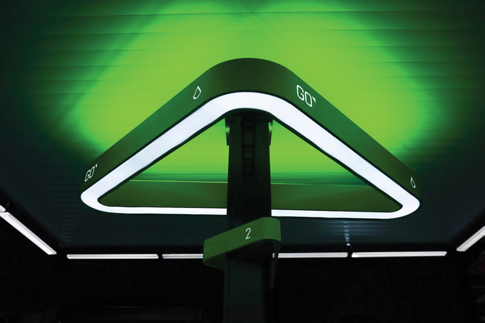 Gas stations.
 Using a relatively simple palette of elements — bright green and pitch black color palette, triangles, and sometimes the GOGOGOGO repetition — the identity and presence feels rich and elaborate. And, well, those gas stations look absolutely bad-ass and straight out of a science fiction movie. I love the balance of the use of green — usually an attempt to appear environmentally conscious — and the use of black — usually a sign of evil corporations and oil spills. Here, the stereotypes magically cancel each other out to deliver a color palette that simply looks great, regardless of entrenched associations.

Coffee Alarm Clock
Atlético
Tests for Colour-Blindness
Noted: New Logo for Eurovision Song Contest by Storytegic
Tune Fine-tuning


"The Eurovision Song Contest […] is an annual song competition held among the member countries of the European Broadcasting Union (EBU) since 1956. Each member country submits a song to be performed on live television and radio and then casts votes for the other countries' songs to determine the most popular song in the competition. The contest has been broadcast every year since its inauguration in 1956 and is one of the longest-running television programmes in the world. It is also one of the most watched non-sporting events in the world, with audience figures having been quoted in recent years as anything between 100 million and 600 million internationally." (Wikipedia)
Design by: Storytegic (Amsterdam)
Opinion/Notes: I had no idea this, Eurovision Song Contest, was a thing. I got over 12 tips about it, which is more than usual for any given redesign. With the basis being that the logo had to remain true to its original look and feel, the redesign is undeniably successful. It's a cleaner, smoother logo with a much better smaller reproduction. It's still not something to sing your heart out about but props for better execution.
Related Links: Eurovision press release
Eurovision blog post
Select Quote: When we started this process, we conducted extensive research into the current logo, to highlight its strengths and weaknesses. It was clear to us at a very early stage that this was going to be an evolution, not a revolution, representing the evolution the contest has seen over the past decade. The heart, the combination between the friendly handwritten 'Eurovision' word mark and a more contemporary sub-title — they had to stay. They reflect the 'modern classic' the Eurovision Song Contest essentially is. Also, the logo had some challenges; it's grungy edges, odd details and loss of detail when shown in small dimensions, particularly the city and year designation.
Every character of the handwritten word mark was carefully crafted from scratch. The more smooth lines make this logo much more pleasant to look at on HD television, but also in print. For the underscores we chose the Gotham font, which has a strong, timeless look and provides a subtle reference to the EBU's corporate identity. The heart, as symbol of bringing people together, was given particular attention. By popping out the right side of the heart, it leaves a stronger impression, also as iconic stand-alone element.
 Comparison of old and new logos. Animated.
  Logo detail.
  Understanding Eurovision. (Image source: Design Tagebuch).
  Some color options.
  Different flags in the heart. (Image source: Design Tagebuch).
Linked: Longhorn Logo Earned

Link
New University of Texas Longhorns coach, Charlie Strong, has removed the famed longhorn logo from the helmets, saying the team has to earn it back during training season. (Image source)


