↧
Organic Chemistry
↧
Strom & Jag
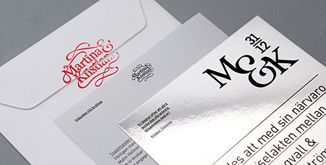
Ström & Jag is a new design studio founded by Hampus Jageland and Malin Holmström. After stints in Sydney and Paris, the two have decided to set up shop in Stockholm, where they will continue to craft unique and engaging work for their clients.


——————–
Also worth viewing:
Asuka Watanabe
Spin
Gracia Lam
Follow us on RSS, Instagram, Pinterest, Wanelo
——————–
Thanks to this week's Sponsor // Panton - a modern typeface that includes 34 different fonts, made up of 9 uprights, 9 italics and 16 icon sets.↧
↧
Reviewed: Friday Likes 133: From Malwin Béla Hürkey and Lennart Engelmann, The Plant, and Kevin Cantrell and Hint Creative
From Malwin Béla Hürkey and Lennart Engelmann, The Plant, and Kevin Cantrell and Hint Creative


From the bare minimum to the lush maximum we have what you crave this week with work from Berlin and Stockholm, London, and Utah.
Studio Majoran by Malwin Béla Hürkey and Lennart Engelmann

Studio Majoran is a catering service in Wiesbaden, Germany, with a zen-like approach to meals (based on the designers' description as there is no link). The identity part of the project was designed by Berlin-based Malwin Béla Hürkey and it mimics an Asian wax seal design with a beautiful typographic execution that certainly makes you do a double take and realize that it's set in Latin. The logo is very well done and has just the right amount of digital fuzz to convey the texture of a seal. The packaging part was designed by Stockholm, Sweden-based Lennart Engelmann and features some lovely cylindrical boxes (that I do have to wonder how the food goes in) with a very pretty red thread to close them and comes with a clever icon system to indicate the contents (see the project link). Overall, just very pretty and airy and sophisticated. Hard to tell if it's for reals but if you are going to do a faux project it better look as good as this one does. See full project
Jamie's Italian Deli Range by The Plant

To add a range of deli products to Jamie Oliver's Jamie's Italian restaurants, London-based The Plant went the full Italian with a bevy of packaging mannerisms from the country while adding a few contemporary touches. For the record: I don't care one bit about the restaurant's logo, which I assume existed before this project and was handed to The Plant for inclusion. A lot of this stuff we've seen (either in Italy, pictures of Italy, or more extravagantly done by Louise Fili) but the pared down approach works quite well across the line of products. The pasta bags are nice as are the tomato sauces and especially the balsamic vinegar tins (even with their scaled typography). Not entirely molto bene but bene enough. See full project
Fetcham Park by Kevin Cantrell and Hint Creative

Fetcham Park is a wedding and event venue housed in a 1705 mansion with more glitz than you can make a toast at. The venue's identity designed by Murray, UT-based Kevin Cantrell and Salt Lake City, UT-based Hint Creative brings a vintage aura with a crisp contemporary feel. Designed with Kevin's unmistakeable attention to detail, the identity is rich in variety and ornament and you know that everything will look even more stunning when foil stamped in gold on that sweet color palette. When I grow up I want to have Kevin's vector patience and perseverance. See full project

↧
Noted: New Logo for Quora by Commercial Type
Q&A

"Quora is a question-and-answer website where questions are asked, answered, edited and organized by its community of users. The company was founded in June 2009, and the website was made available to the public on June 21, 2010. Quora aggregates questions and answers to topics. Users can collaborate by editing questions and suggesting edits to other users' answers." (Wikipedia)
Design by: Commercial Type (New York)
Opinion/Notes: This is one of those logos where if no one had touched it for decades it would have been fine and the site would have kept going on just about the same but once someone points out its misgivings and offers up a perfectly calibrated alternative then you can't help but see its faults. The "Q" in the new logo is beautiful and bold, remaining as the quick identifier of the company in social media. The rest of the letters are just as nice and bookish, supporting the knowledge premise of the Quora brand. The tiny version of the logo is my favorite part of this. That's attention to detail.
Related Links: How is the new Quora logo different from the old one?
Quora blog post
Select Quote: Our aim was to increase design flexibility in order to create a larger range of ways to use Quora's logo in our design language, and to improve the craftsmanship of the word mark overall. We maintained consistency with our brand by keeping our unique 'Q' and Quora red color, while referencing the academic spirit of our original Baskerville logo.
↧
Linked: 2015 LogoLounge Trend Report

↧
↧
Pills
↧
The Best & Most Popular Free Google Fonts
Formally introduced to the world in 2010 at a time when web designers could almost never work safely with web-based fonts, these fantastic Google fonts are the perfect answer to all your font-based needs and can be used on the fly.
By giving developers the ability to access these fonts from anywhere on the web without the need to install them on your servers, these fonts are more than just good to look at as they add functionality and convenience to your type needs.
So, check out 20 of the best fonts that Google has to offer and start creating your own masterpiece today. And grab some inspiration from these awesome Google font combinations.

Thanks to TemplateNet for these Google fonts.
↧
Owl Cafe
Noted without comment, owl cafes in Tokyo.![]()
↧
Art of The Black Panthers
Emory Douglas and the art of The Black Panthers.![]()
↧
↧
2015 Logo Design Trends & Inspiration
Logo Lounge for the past twelve years, have posted annual logo design trend reports and they have just released the 2015 logo design trends report. I would love to hear your thoughts on the showcased trends.
Do these identity / branding trends affect you or your process? Do you agree with these suggestions? Have you noticed any other trends?
- Logo Lounge:
2014 | 2013 | 2012 | 2011 | 2010 | 2009 | 2008 | 2007 | 2006 | 2005 | 2004 | 2003 - Discussion on Just Creative: 2014 | 2013 | 2011 | 2010 | 2009
Disclaimer
On this topic of trends, one should not follow trends for the sake of following them. As Bill Gardner points out:
Every year, it’s worth noting that this is a report on trends, not a recipe book of styles. It is also not a finite list: There are other valid trends out there that are not mentioned here.
The report should serve you as an ongoing view of where logo design is headed. The word “trends” in itself can have a very negative cast, but in truth, trends aren’t bad. They reveal our growth. It’s our take on them that allows us to move even further forward.
Dot Point

Contours

Concentrak

Sparkle

Pick-Up Sticks

Coloring

Circle Break

Trixelate

Photo

10Rays

Naive

Coded

Chroma Coaster

Detail

Shaded

Do these identity / branding trends effect you or your process? Do you agree with these suggestions? Have you noticed any other trends?’
© Artwork shown is copyright of their respective owners. Designer’s names & clients are below each logo. Original compilation by Bill Gardner.
↧
Dark 'n' Stormy
So you know, there's only one way to make a Dark 'n' Stormy without breaking the law.![]()
↧
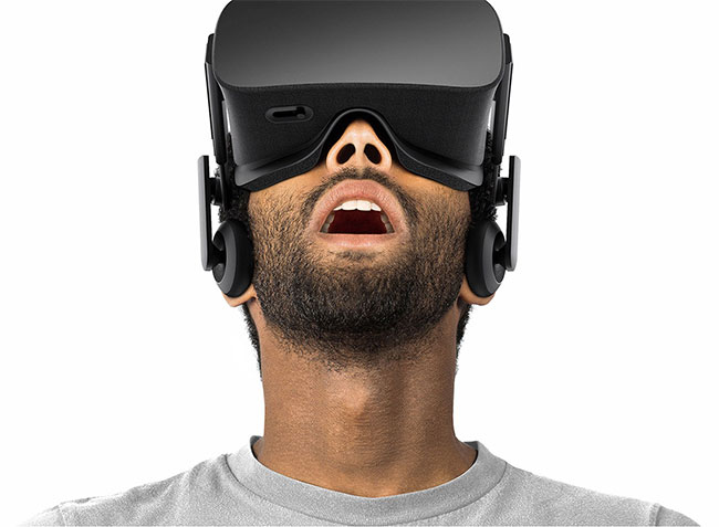
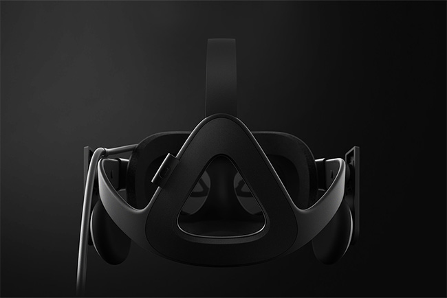
Oculus
For those who don’t know, Oculus is a technology company currently developing a virtual reality head-mounted display called the Rift. The company was acquired by Facebook in 2014 for $2B USD, and a consumer version of the Rift is due for launch in early 2016.
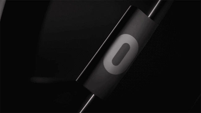
If I was asked to redesign the previous Oculus symbol, this is what I hope I’d come up with.

It’s as simple as they come, yet with a distinctive, appropriate idea — the stylised ‘o’ also working as a stylised headset.
The shape of the slider on the underside mimics the symbol

There’s a brief “reveal” video for the Oculus Rift embedded below.
Here’s the old Oculus logo lockup for comparison.
![]()
And the new.
![]()
The website and headset show both the symbol and the wordmark on their own — as they should (placing the ‘o’ alongside ‘oculus’ is unnecessary).
The design was a collaboration between Cory Schmitz, Mackey Saturday, Nicolaus Taylor, and Jon Malkemus.
Via Rick Banks.
↧
Denali
Denali. Dust storm warning.![]()
↧
↧
#108: School's out
|


↧
Reviewed: New Logo, Identity, and Packaging for Best of Nature by Moodley Brand Identity
Best is as Best does
Based in Frohnleiten, Austria, Best of Nature (BON) is a family-owned business that produces plant oils, spice mixtures and herbal essences "according to ancient, traditional recipes in their purest form". Their product line is divided in two — Yin-Yang oils and Brother Ignazius aromatic herb, spice, and fruit mixtures — and is sold and distributed across Europe. Recently, BON introduced a new identity designed by Graz, Austria-based Moodley Brand Identity.
 Old packaging.
  Old packaging, detail.
 Originally, I wasn't going to post this project based on the case study at Moodley's site but after they shared what the old packaging looked like I was convinced this made for a great before and after story.
The nature avoids unnecessary. Likewise, the new, of moodley brand identity created corporate design. The high-quality distillates and spice blends from BON now occur in a packaging which is a stand-alone face each and every product, yet leaves no doubt about their togetherness. Also available on the website after the re-branding the products at the center. And thus the purest essences of nature.
Moodley Brand Identity project page (Google-translated)
The old logo was quite amateurish and very un-natural looking — nothing serene or soothing about it. The new logo keeps the essence of the original but strips away all the unnecessary decoration to keep the acronym in a diamond shape and the name spelled out underneath. It's nothing groundbreaking and it's far from exciting but it starts to show how the packaging is more about the product than the design.
 Stationery.
  Business cards.
 The stationery is airy, pretty, and simple. I don't even want to imagine what the old one looked like.

 New packaging, bottles.
 The biggest change here is in the small bottle packaging for the Yin-Yang oils. Scroll back up to see the original and marvel at how much wrong it packed into a tiny label, from the rain droplets to the struck-out name to the red stroke around "Yin-Yang". The new bottles, again, are not the most amazing piece of packaging we've ever seen but they are highly competent and more in tune with the kind of product they contain.

 New packaging, bags.
 The other product, Bruder (Brother) Ignazius, comes in a clear bag with a large label and equally large serif typography for the different kinds of mixtures. Subtle changes in the color palette add some nice variety to the labels.
 Wrapping paper.
  Bonus: Chocolate.
 Overall, this is exactly the kind of design you would expect from a product like this but it's also so common for products like this to look like a car mechanic's shop selling you re-bottled motor oil (not that that's a thing but it seemed like a good analogy). Any company that chooses to improve its design presence and invest in good design gets a thumbs up from me.
↧
Noted:
The Stars Have Aligned
(Est. 2002) "EurekaKids is a company dedicated to designing, developing, and selling educational and developmental toys that aim to help children in their mental, motor, and emotional development. We are interested in games and toys that you can touch, feel and even smell. These toys have been created or have been selected by our team of experts to promote awareness of children for their educational, recreational, and aesthetic value. In addition, since 2005, we also sell via the Internet to all countries."
Design by: Marçal P. (Barcelona)
Commissioned by Igriega
Opinion/Notes: The old logo was a little frenetic with the bubbly letterforms bouncing all over the place, the heavy stroke around everything and the stars getting all up in the "A"'s face. The new logo is a much more tame, controlled, and infinitely better interpretation of the original. The wordmark still retains the quirky letterforms that now achieve a better bounciness without having to place them all over the baseline. (Bonus points for the two different "E"s). And the stars now help divide the EurekaKids word in two and fill in what would otherwise be an awkward space. The logo looks great big or small on the entrance logos or the packaging.
Related Links: N/A

 A couple of store façades.
 ↧
Linked:

Link
Unit Edition's latest book focuses on Tony Brook's Spin studio and it's 520 pages of excellent content that go above and beyond your typical monograph.
↧
↧
Magna Carta
So you know, 10 surprises about the Magna Carta on its 800th birthday.![]()
↧
1000 Sols
↧
Guy quits job to high five the world
↧