Stumbled on this from 8 years ago while looking for something else. The president we could have had, for America.![]()
↧
Merkin
↧
Prufrock
"Pray God it not be a single and unique success." Happy 100th birthday to The Love Song of J. Alfred Prufrock.![]()
↧
↧
By Golly
↧
Veerle
Detailed tutorial on building a cityscape in illustrator by Veerle. Super organized and full of "Sheesh I've been a fool for not doing it that way" moments.![]()
↧
Hamptons Houseshare Hell
Hamptons Houseshare Hell. Season 2. Epidode 3. It's so perfect I can't bring myself to pull a quote, plus it's even funnier if you read it out loud. Via Kottke.![]()
↧
↧
Best of Enemies
Trailer for the documentary Best of Enemies.![]()
↧
Reviewed: New Logo and Identity for Bembos by Infinito
Pop Goes the Hamburguesa

Established in 1988 with a single location in Lima, Peru, Bembos is a fast food hamburger restaurant that now has 55 locations across the country. Treating their hamburgers almost like pizzas, they offer different combinations with the appropriate names, like the Hawaiian that comes with ham and pineapple, the Mexican with guacamole and nachos, or the German with sauerkraut and dill. Another defining aspect of Bembos is their retail architecture which is totally cray-cray. Earlier this year, Bembos introduced a new identity designed by Lima-based Infinito.
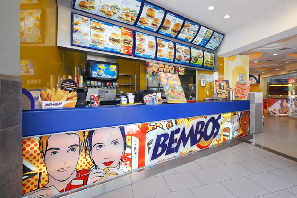 A sample of an old retail location.
 To Bembos renewal is a constant, their voice is always to keep looking young. And in that sense the client's request was to align the new brand idea and graphics with the new millennial consumer. As a result of the process we reclaimed their pop art heritage, their slogans, and activities they promotes to capitalize on their years of market presence. We developed pieces from patterns inspired by the brand's past that today acquire a new contemporary feel.
Infinito project page (Google-translated)
The previous logo was quite a mess, with some really unfortunate typography that must have gotten poorly digitized in the 1990s and never recovered. The new logo somehow miraculously manages to be a sophisticated interpretation of the original, even keeping the "EMB" ligature and extra tight letter-spacing. It strikes a great balance between being very designed and still keeping a vernacular aesthetic. So even though it has all the trappings that would make for a terrible wordmark this is one cool piece of typography. (I sense I will be in the minority here). The red and yellow lines help maintain the original color palette and look like servings of ketchup and mustard.
 Patterns and badges.
  Container system.
 The project then gets even more amazing with the introduction of a range of Pop Art-inspired patterns in primary colors that wrap around all possible containers. What makes this more special is that the patterns are used big and gives it a completely different and unexpected vibrancy. Meaning, look at the dots on the far left french fry box container, there is only 15 of them where it could have easily been dozens to look more like the "Pop Art" drawings Bembos already used. Instead, this is so striking and bold and full of awesome.

 Take-out box.

 French fries containers.
  Wrapper paper.
  Wrapper paper in use.
  Badges for the different burger combos.
 The identity comes with a full suite of cool stuff, from badges to typographic stylings to underlines and includes a shorthand "B" monogram with the stripes and a script version of the name. Although going in, like, seven different design directions it all comes together cohesively and festively.

 Retail presence.
 Compare the above retail images with the image at the beginning of the post and it's a complete 180-degree transformation in sophistication, yet the new look stays true to the fact that this is fast food and doesn't attempt to pass as a high-end, locavore enterprise. This is probably my favorite project of the year so far. It's full of energy, it's perfectly executed, and it elevates this chain's game above the growing presence of international giants like McDonald's, KFC, and Burger King.

↧
Noted: New Logo for Oculus by Cory Schmitz, Mackey Saturday, and Nicolaus Taylor
O Say can you See
Oculus VR is an American virtual reality technology company founded by Palmer Luckey and Brendan Iribe. Their first product, still in development, is the Oculus Rift, a head-mounted display for immersive virtual reality (VR). In March 2014, Facebook agreed to acquire Oculus VR for US$2 billion in cash and Facebook stock.
PS. There is a special live streaming event today at 1:00 pm Eastern time where something will happen.
Design by: Cory Schmitz
Mackey Saturday
Nicolaus Taylor
Opinion/Notes: The previous logo was already pretty good. Not utterly imaginative with a rendering of an eye but it was well done and the type was nice too. The new logo is quite good. It's very good. It reads as both an "O" and as the viewfinder (that they probably don't even call it that) of the Oculus. It's as simple as it gets and it's still highly distinctive. It's extremely elegant but also very bold: it's like snowboarding in a tuxedo. The wordmark, which looks like a customized version, of every sans serif of the past 5 years is quite well done too with perfect spacing and kerning. Overall, super slick for a product that is meant to take us into the future.
Related Links: Cory Schmitz project page
Mackey Saturday Dribbble shot
Select Quote: Simplicity was key. This mark must integrate into formats and technologies that have yet to be invented, yet it still needed to be appropriate to the current oculus brand and memorable. There's a lot more to the choices made, and the possible implications of the symbol, but I'll let Oculus reveal those themselves in their upcoming event and through the stories they tell.
 The inside of the Oculus Rift.
 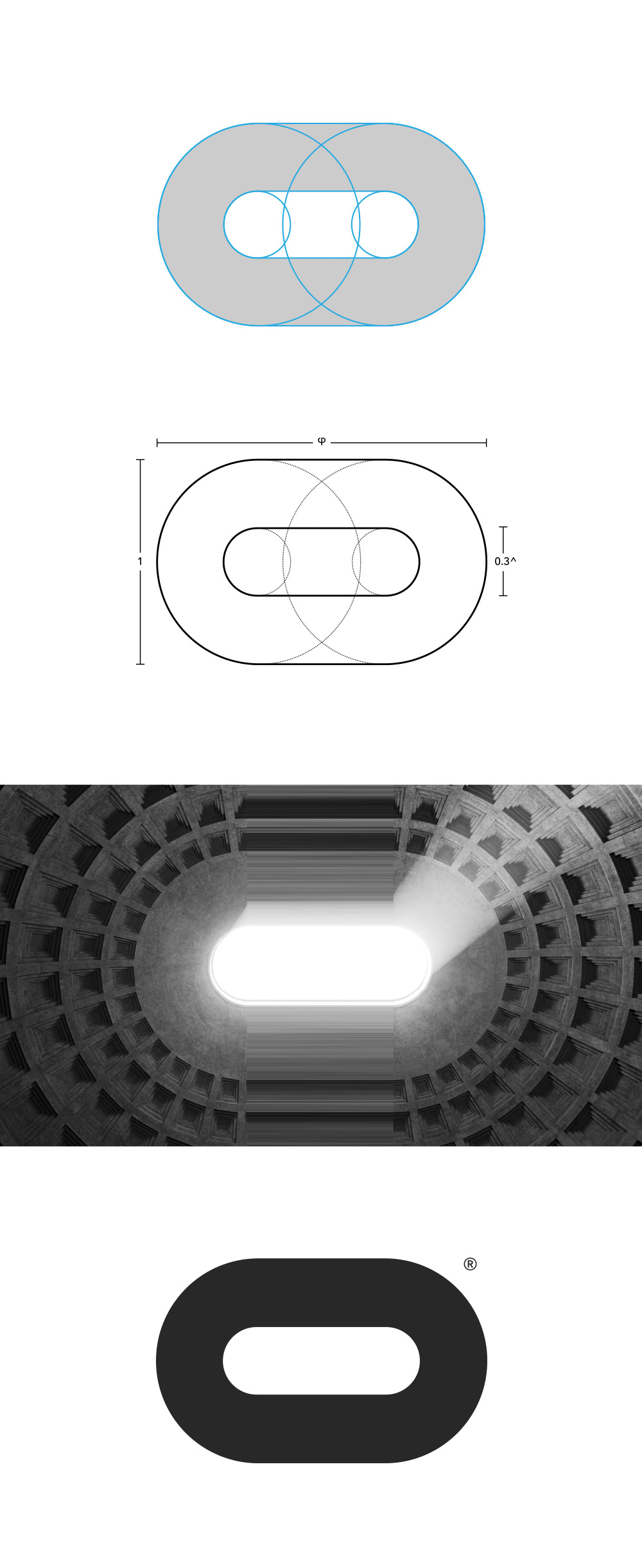 Icon detail and construction.
 ↧
Linked: Bloc Logos

Link
Currently on Kickstarter: Bloc Logos, a book cataloguing logos created within the Eastern Bloc's countries between 1950 and 1989 (after the fall of the Berlin Wall). The first volume will focus on Poland.
↧
↧
Foreign Movie Posters
↧
Making Fonts: Essonnes
Like a tiny seed growing into a giant tree or a butterfly emerging from a chrysalis — type design isn’t! Forward steps, missteps, steps retraced — that is type design. Sometimes the development is natural and organic; at others it is perhaps more akin to working for a typographic Dr. Moreau. During the long process, ideas germinate and perish, shapes contort and bend, new concepts are explored and ignored, and printers run out of toner.
Type design demands a goal; drawing pretty shapes isn’t enough. Pretty forms and post rationalization also isn’t enough. The function of the type needs to be in its DNA. When the type in question is destined for the retail type world, where there are no strict deadlines and clients to worry about, that goal is more elastic: it can mature and evolve along the way. In the case of Essonnes, the breadth of that goal grew quite dramatically over the years of its development.
Essonnes fonts [pronounced Essonay] began back in 2011 when I, on a whim, decided to spend what little money I had that wasn’t going towards college, on a book. The book was titled, “Specimen des Caractères de la Fonderie de P. Didot, L’Ainé et de son Fils Jules Didot” and it was to dominate the next four years of my life.
I bought the book because of one letter: the lowercase g. Earlier, I had stumbled across the serif g somewhere and it became a fixture in my brain. While at school, I tried to fit it into nearly every lettering project I did. I lamented when a brand or a headline didn’t have a g in it because I couldn’t get a chance to try out my favorite letter. Eventually it came time to give that letter a home. That home eventually grew into the typeface, Essonnes.

When I begin a new project, I know the first few rounds of drawing are going to get tossed out. A few bits and pieces will stick around and slowly, as I keep redrawing, I’ll end up with something I can work with. As I drew my beloved g for the first time, I knew it wouldn’t last, and, as it turned out, it didn’t. It was probably a day or so later, when I had the basic character set drawn and printed out, that I really got a sense of where I was going and I promptly changed everything.
So I had a few letters, a book, and some free time between classes and other jobs. As I took the time to pore over the book, I noticed something odd: Didones were used for text, and they looked good. How was this happening? Weren’t Didones solely display faces? What happened between 1819 and 2011 that lead to this seemingly pervasive (and completely wrong) idea? As I continued to draw, the text Didot kept coming back to me. Eventually, my goal became clear: no longer was I making a little two-weight display family. Essonnes was going to bring back what was lost from the original: the text Didot.
I started over.


Top: The original text Didot at 9 point.
Bottom: A smattering of characters with character. They were really into the listing S back then.
Type has an interesting way of directing its designer. In this case, the type decided it wanted different families for different sizes. It wanted a separate text family and a separate display family. This meant optical families, and optical families (usually) mean interpolation. Interpolation is like an American mass transit system; it gets you most of the way to your destination but it’s often messy and has a few awkward characters.

The similarities—and differences—between Essonnes Text (blue) and Display (red).
In keeping with my stubborn practices, I decided early on that this wouldn’t be a study in interpolation. There wouldn’t be any sliding of sliders or typing of values to get my text family or my regular weight. Everything would be built from scratch. To be clear, this doesn’t mean the type is better (interpolating and fixing is my usual M.O. ), it just means I am a stubborn jerk when it comes to optical weights. It also means that the Display and Text families are two different creatures that share a common ancestor. Much like various Great Ape subspecies, there is a difference between them; most people won’t be quite able to tell what that difference is if they were to spot them in the wild, but they know they are different. Forgoing interpolation allowed me the freedom to really push the two versions into their respective roles.

Not worrying about compatible type allowed me to do things like this. Essonnes Text (blue) and Display (red).
It was around this time the type told me that if I was going to make two separate optical families, I may as well make a higher-contrast “headline” family. Again, being stubborn, I ignored the possibility of interpolation and dove in.
At this stage, I decided to really push the designs. If I wasn’t making type that was interpolation-compatible (the points between the various fonts didn’t match up in number or places), I should really see where the different families would take me. After looking closely at the text weight in the book, and various other books I had added to my collection, I noticed something unusual: there was a little kink in the area where the curves would meet the stems in letters like n, m ,h, b, d, etc. This little kink lead to an idea: what if I used it to increase the counter sizes? As the contrast rose, the counters shrunk. Increasing the x-height or making the characters wider can only do so much, especially in the bolder weights; this little kink might allow me to keep the counters nice and open and give a bit of personality and bite to the text family.

A closeup of Essonnes Text Bold. Kinks are circled.
With the text weight mostly sorted, or at least temporarily sorted, I turned to the headline. Like most Didones, it made sense to forgo any serif bracketing here. The capitals also narrowed a bit. From there I started to add a little more outside influence—from Victorian England. Mid- to late-nineteenth-century type was an exercise in pushing the limits, especially in high-contrast display types. I wanted to channel some of this into the headline, and a little less of it into the display families of Essonnes.

From left to right: Essonnes Headline, Display, and Text.
After choosing to include more Victorian Scotch-Roman elements, I decided it was alright to allow myself larger deviations from my original muse. My goal with Essonnes wasn’t to make a revival but a reinterpretation–the Didone I would want to use. One that fits the requirements of today and not of 1819. This meant that features such as the “spiky horn” serifs became spiky horns and not nubby traditional serifs.
From here, it was time to close the books. From mid-2012 until I released Essonnes, I wanted to have as little influence from anywhere as possible. As I continued to work on it, I ended up redrawing pretty much every aspect of the typeface; proportions changed, serif brackets increased in size, then they got smaller, then they got larger again; x-heights went up and down, italics contorted in pretty much every way imaginable. At this stage, I also took one last long look at my favorite g before relegating it and its uncommon brethren to OpenType-accessable stylistic alternates. Once all of these choices were made—and drawn—I had something I could finish.

The alternates in Essonnes Headline Bold
Because I work like a weird-o, I often do my hinting as I draw. I like to tell myself this allows me to better evaluate the type as I draw it but what it really does is drive me insane when I decide to change a design. I also had all of the OpenType features ready to go; all that was left was the adjustment of some accents and a few odds and ends.

Finishing a typeface is perhaps the strangest part of the whole process. Years of work go into making it and, quite abruptly, it’s all finished. The accents are all in place, the small caps are all coded to their respective alternates, and that stubborn s looks good. It’s like jumping out of a plane with a blindfold on and landing on a giant pillow: you have no idea where the journey is taking you and then, all of the sudden, it’s over.
More about Essonnes fonts.

Sponsored by Hoefler & Co.
Making Fonts: Essonnes
↧
Birka Jazz
Birka Jazz is a company located in Stockholm that sells vinyl jazz records. They have a lovely collection of vintage covers for viewing here![]()
↧
Blade Runner
A 45-minute edit of Blade Runner, assembled from B-roll and unused audio.![]()
↧
↧
Mystery Show
If you haven't been listening to Starlee Kine's new podcast, Mystery Show, you really should be. Of the three episodes so far, it goes from good to great to amazing, in that order.![]()
↧
Logo Evolution
The evolution of 12 iconic logos.![]()
↧
8 Bit Jurassic Park
↧
2016 BMW 7 Series
Watching the assembly of the 2016 BMW 7 Series is sorta boring and hypnotizing at the same time.![]()
↧
↧
What is Code?
I've been reading Paul Ford's "What is Code?" for two hours and I'm only a third of the way in. I'm still not sure what "Rails" is, but I feel a little smarter. (Thx, Jay-Di)![]()
↧
Cool Chicago
↧
Museum of Holography
From 1974-2009 the Museum of Holography stood just a few blocks south of CP HQ. The collection has just been saved and is on the hunt for a new home.![]()
↧