Quantcast
Channel: Positive Influences
Viewing all 13789 articles
Browse latest View live

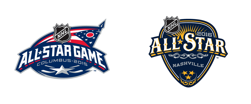
Noted: New Logo for 2016 NHL All-Star Game by Fanbrandz

$
0
0

Sing it!

New Logo for 2016 NHL All-Star Game by Fanbrandz

"The 61st National Hockey League All-Star Game is an exhibition ice hockey game scheduled for January 31, 2016. The game is set to be held in Nashville, Tennessee, at Bridgestone Arena, home of the Nashville Predators. This will be Nashville's first time hosting the NHL All-Star Game."

Design by: Fanbrandz (Montclair, NJ)

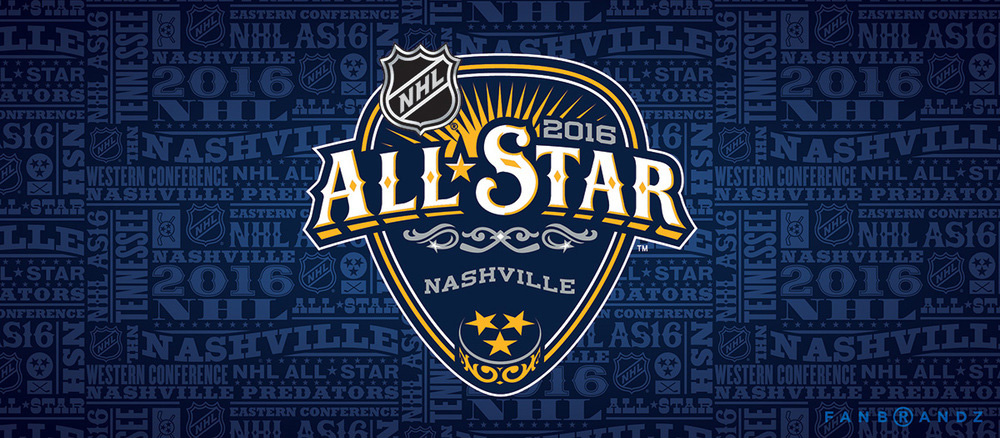
Opinion/Notes: This year's logo is shown not so much for an apples-to-apples comparison as each All-Star game has to represent the host city and host team but it helps to know what came before and it actually happens to show some continuity in structure and approach. The 2016 logo is unapologetically Nashvillicious, grabbing references from the music industry and country aesthetics. The logo is in the shape of a guitar pick, the lettering is straight out of a country album cover, and the puck has the state flag's three stars in it. It's exactly what you would expect it to be without being too garish. The typographic pattern is attractive and very Hatch-Show-Print-esque, which is not a bad thing to bring to the masses. The project page linked above has some cool process and field study images.

Related Links: Fanbrandz project page
NHL logo reveal announcement

Select Quote: Music is ubiquitous and even inspired the Predators to incorporate a guitar pick in their secondary logo worn on their shoulders, which went on to inspire the overall shape of this All-Star identity. The cultural influence of music is inescapable and with that comes all of the trappings of musical performing; guitars, intricate mother of pearl inlays in the headstocks, cowboy style shirts and suit jackets with decorative embroidery. Every detail of the mark, from the guitar inlines down to the three-starred puck, was inspired by the rich culture and history of Nashville and its music scene.

New Logo for 2016 NHL All-Star Game by Fanbrandz Logo detail. New Logo for 2016 NHL All-Star Game by Fanbrandz Logo with type pattern. New Logo for 2016 NHL All-Star Game by Fanbrandz Type with type pattern. Many thanks to our ADVx3 Partners

Linked: Yelp Student Proposal

$
0
0

Yelp Student Proposal
Link
Alexandra Camacho proposes a new logo and identity for Yelp as part of a school assignment. That "y" icon is pretty good. Not sure if it was intended but I see a cartoon depiction of someone screaming and you see their tonsils be all like "aaaaaaah", which is a good metaphor for yelping.Many thanks to our ADVx3 Partners

Manet's Le Bar aux Folies-Bergere

Workshop

Reviewed: New Logo and Identity for the 2019 Pan American Games

$
0
0

Withered Flower

New Logo and Identity for the 2019 Pan American Games

Currently in in its 17th edition and celebrated since 1951, the Pan American Games is a major sporting competition specifically for countries in the American continents. Taking place every four years in the year before the Summer Olympic Games, the Pan American Games have grown to attract over 6,000 athletes from 41 nations competing in 36 sports. While the 2015 Pan American Games in Toronto have yet to take place this July, the 2019 host city of the XVIII Pan American Games — Lima, Peru — has already announced its logo (late last year) designed through a national contest that not only asked for the design of the logo but a set of 28 pictograms as well. The winning designers were Juan Diego Sanz Salas and Jorge Luis Zárate.

New Logo and Identity for the 2019 Pan American Games Comparison with bid logo (on left).
We chose the amancaes flower as a symbol of life, that flourishes despite the wildness that can be the surrounding environment. The flower grows in the winter, which will be just the time when the games are held in the city of Lima.

From the center of the flower come out three ribbons representing the three Americas. Lima becomes, just as it was in his time Caral, a gathering place but this time it will be for all athletes of the continent. In turn these ribbons are projected to expand, because the best athletes in various disciplines will qualify to go to the Olympic Games in Tokyo 2020.

These three ribbons representing three athletes. When we see them together in pairs athletes in diving and gymnastics postures. The elements representing their heads are trapezoid shapes to associate with the profile of the Temples present in the city.

Diego Sanz Salas on Diseño Peru (Google-translated)

New Logo and Identity for the 2019 Pan American Games Logo detail. New Logo and Identity for the 2019 Pan American Games References in the logo: The amancaes flower and the "huacas" (small adobe pyramids). New Logo and Identity for the 2019 Pan American Games Logo explanation that justifies the above references. New Logo and Identity for the 2019 Pan American Games Underlying grid. New Logo and Identity for the 2019 Pan American Games Color variations. Yeesh.
News video about the Games but presented here to show the logo animation at the very beginning.

The identity for the 2015 Toronto Games was also the result of a contest so this is clearly the Pan American Sports Organization's modus operandi and they are getting the result they deserve. Most of this year we've had either really good identities Reviewed on Brand New or some that are not that well received but this is the first truly BAD logo. The only thing worse than the new logo is the bid logo, which is a shame because Lima has some amazing designers that could so easily elevate the standards of the Pan American Games.

Everything about this logo is so not right. The exaggerated "human" shapes that are both ribbons and parts of the flower, the trippy flower shape behind, the completely incoherent color palette, the unicase typography, and the amateurish shading and highlighting found throughout. Even the concept is weak: flowers as major sporting event? Pyramid heads? Sigh.

With the same ribbon idea the typography was designed for Lima 2019. The ribbons with movement take the form of letters and numbers. The chosen colors are yellow, which represents life; green for nature; violet for devotion, red for passion and blue for the sea.

Diego Sanz Salas on Diseño Peru (Google-translated)

New Logo and Identity for the 2019 Pan American Games Wordmark variations.

No, no, no, and maybe yes if I had just won the lottery and I were in a who-gives-a-shit-anymore mood.

For the 28 pictograms we decided to use the flower as the basis to contain the silhouettes representing them with ribbons emblem. The figures are pretty dynamic and in the case of triathlon and pentathlon has sought merge representations using a single tape as far as possible.

Diego Sanz Salas on Diseño Peru (Google-translated)

New Logo and Identity for the 2019 Pan American Games Pictograms. New Logo and Identity for the 2019 Pan American Games More pictograms.

The pictograms show a little more competence and manage to translate the idea of a ribbon with movement. Even the flower container shape sort of works (not on the triathlon, though, that's just weird). But, still, these would all need to be handled by a better illustrator.

Following the election of this proposal as the winner in July, we explored how to create a visual identity based on forms of flowers, ribbons and the color palette along with pictograms and photos with sports theme. Along with Jorge we hope to remain part of the project during its entire development for the event to be held in four years.

Diego Sanz Salas on Diseño Peru (Google-translated)

New Logo and Identity for the 2019 Pan American Games Exploring the visual language.

And perhaps the sole glimmer of hope is in the above image where the flower shapes and ribbons come together to make some abstract patterns. The ribbon shapes kind of ruin it though as it looks like Gumby is photo-bombing the layouts. But the problem is that the colors are all wrong, the typography — the free Exo 2.0— has nothing to do with anything, and because it's the result of a contest this clearly lacks the rigor or commitment from both client and designer to create anything of value. Here's to hoping that the 2023 Pan American Games do things right and create something that truly represents the visual richness and sophistication of the continents.

Many thanks to our ADVx3 Partners

Noted: New Logo for Kyivstar

$
0
0

Star*

New Logo for Kyivstar

Kyivstar is the leading wireless carrier in Ukraine. Founded in 1994, the company has been providing mobile services since 1997. Operator's services are used by more than 25 million of mobile subscribers and by more than 800 thousand of fixed-line internet. Kyivstar mobile network is one of the best in Europe and covers all the cities and towns of Ukraine, as well as more than 28 thousand rural settlements, all main national and regional roads, most of the sea and river shores. Kyivstar's personnel amounts to 4000 professional specialists working all over Ukraine. For several years running, Kyivstar is considered the best employer in the Ukrainian market.

Design by: N/A

Opinion/Notes: There isn't any information about the redesign but I received a couple of tips from our Ukrainian readers about it, and both mentioned that this was a fairly big deal, so this one is for you, Ukraine! The previous logo was quite something, with its bevels and shines and gradients and stuff within stuff. It also felt more like a charter bus company than a telecom and was very cold and unwelcoming. The new logo is what would happen if Walmart and IKEA had a baby logo, which by no means implies that they copied Walmart but that was my first impression. The new asterisk icon is a decent evolution-by-abstraction of the previous star; it's much friendlier and acts more like a spark. The new wordmark is an improvement only because they old one was so harsh. The rounded sans is fine and the oversize umlaut is fun but the kerning is a mess and the spacing too tight for it to function at smaller sizes. The best part about it is the animation and sound that goes with it (see video below), behaving in a very consumer-friendly manner.

Related Links: N/A

New Logo for Kyivstar Logo detail.
TV spot. Logo animation and mnemonic at the end. Many thanks to our ADVx3 Partners

50 years of spacewalks

Linked: MLB Logo Designer Passes Away

$
0
0

MLB Logo Designer Passes Away
Link
Jerry Dior designed the Major League Baseball logo in 1968 while employed at Sandgren & Murtha but it wasn't until 2009 that MLB officially recognized his contribution to sports identity as the original designer. Dior passed away on May 10.Many thanks to our ADVx3 Partners

The Third Man

$
0
0
Gorgeous trailer for the 4k restoration of the iconic film The Third Man. Want to see it in a theater? Check the schedule here.

Design mockup resources

$
0
0

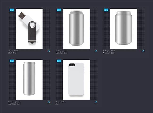
Showing your designs in context — in other words, as they’re more likely to be seen by others — is key to helping your client visualise the outcome of a project. It’s like buying a car. The car might look amazing in the showroom, but you’ll still want a test drive. That’s why showing an identity in context can be what finally gains consensus with your client.

For the most unique mockups it’s hard to beat applying artwork to your own photo collection, but when that’s not possible or when the project deadline’s particularly tight, here’s where to find free and premium PSD mockup templates.

GraphicBurger

GraphicBurger

Pixeden

Pixeden

Medialoot

Medialoot

Premium Pixels

Premium Pixels

Freebiesbug

Freebiesbug

GraphicsFuel

GraphicsFuel

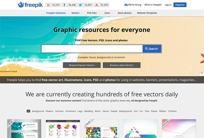
Freepik

Freepik

GraphicRiver

GraphicRiver

There’s LiveSurface Context, too, featured earlier on www.davidairey.com.

LiveSurface

And you’ll find more options by searching Behance for “mockup.”

Not all the mockups on these websites are good, with some looking a lot less realistic than others, but you’ll know which work best after some searching.

Are there other resources you’ve used?

Species Pieces

Cartel Land

Video Game Photographers

$
0
0
"Karl 'Illsnapmatix' Smith was walking through a homeless community underneath the light rail tracks in a place called Strawberry when he spotted something. Lit in silhouette by the dying light, just barely visible, a man sat alone against a wall with a bottle in his hand. Smith pulled out his camera and, in his words, 'caught this gentleman having a quiet drink.' It's a snapshot of life on the edge, but it's not real. All of it happened in a video game."

How the Red Cross Raised Half a Billion Dollars for Haiti and Built Six Homes

Dream Koala - Earth


Kindred Studio

$
0
0

Kindred Studio

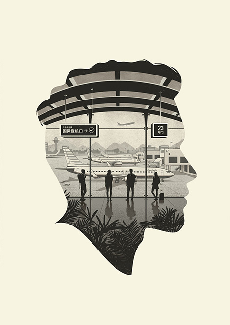
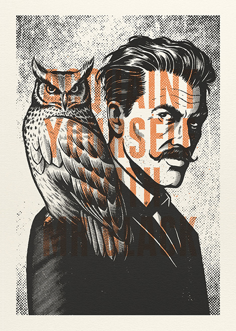
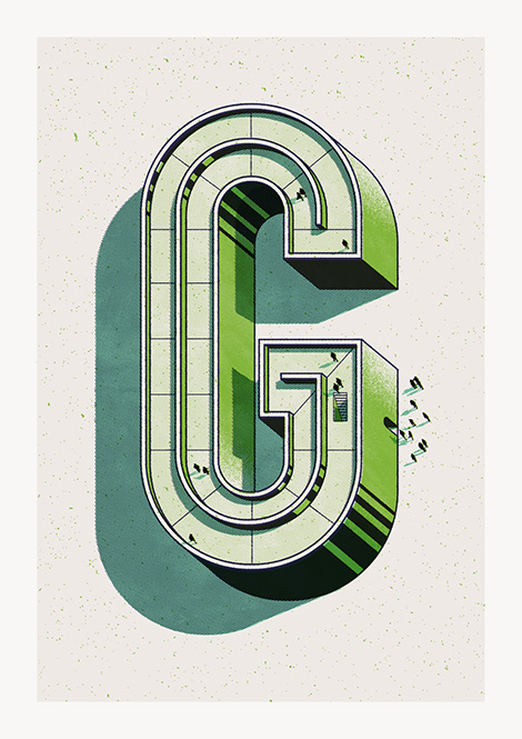
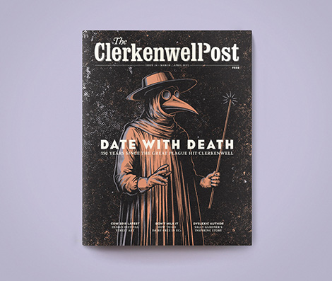
Kindred Studio is the online moniker and artistic alter ego of Designer and Art Director Andrew Fairclough. Working with a minimal yet refined color palette, he crafts highly detailed imagery that pays homage to spot illustrations of the past and the textural wonders of degraded print. Based in Sydney his client list includes: Penguin, American Express, GQ, Random House, Jack Daniels The Globe & Mail, ESPN, Little White Lies and more.


Kindred Studio

Kindred Studio

Kindred Studio

——————–

Also worth viewing:
Asuka Watanabe
Spin
Gracia Lam

Follow us on RSSInstagramPinterestWanelo

——————–

Thanks to this week's Sponsor // Squarespace - a website publishing platform that makes it easy to create beautiful websites, portfolios, blogs, and online stores without touching a line of code.


Chum

XOXO

North Korean Mass Dance Instructional Video

"You Can Color Outside the Lines"

Viewing all 13789 articles
Browse latest View live


<script src="https://jsc.adskeeper.com/r/s/rssing.com.1596347.js" async> </script>