lolol, lmao, lololol, lolz, lmfao. Emojineering Part 1: Machine Learning for Emoji Trend.![]()
↧
Emojineering
↧
John Oliver's FIFA
John Oliver's second take on FIFA![]()
↧
↧
Announced: Goods So Good
New Blog from UCllc
Our latest blog, Goods So Good, hand-picks the design stuff you didn't know you wanted, presenting a wide variety of items from the cheap to the expensive, from the low-brow to the high-brow, from the limited-edition to the mass-produced for you to buy, window-shop, or earmark. As usual, we aim to bring the relavant and high-standard level of editing and curation you've come to expect from us — which is why this Emoji Poop pillow is one of our favorite items listed.

↧
Good so Good
Smart new site from Underconsideration, Goods so Good, hand-selected design stuff "you didn't know you wanted."![]()
↧
Martian
If you like space-suits, you'll like the first images from Ridley Scott's The Martian.![]()
↧
↧
Risk
Risk is too much maligned in western culture these days and that has begun to seriously piss me off. It wasn’t always so. The west, the US in particular, used to be a place where risktaking was understood to be a fundamental component to successful life…
↧
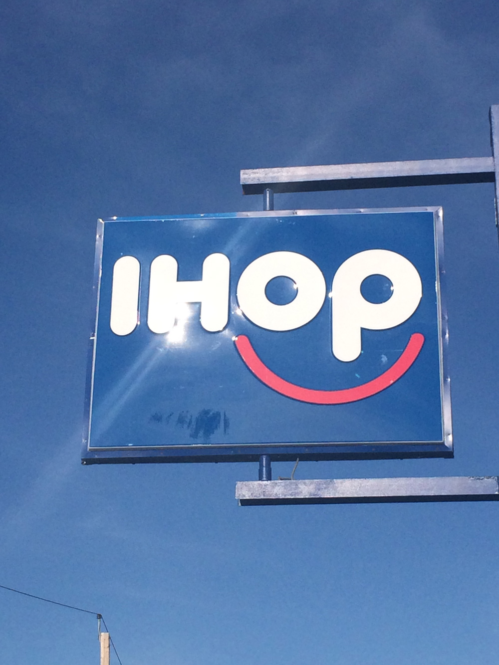
Reviewed: New Logo for IHOP by Studio Tilt
Turn that Frown Upside Down

Established in 1958 with the opening of its first location in the Toluca Lake neighborhood of Los Angeles, CA, IHOP (International House of Pancakes) is a chain of family dining restaurants serving all meals from breakfast to dinner. As of March, 2015, there are 1,650 locations worldwide — 70 of them outside the U.S. in places like Bahrain, Guatemala, Mexico, and the Philippines — of which 99% are owned by independent franchise operators and it employs more than 70,000 people. I have had breakfast at an IHOP maybe twice out of necessity and while clean and not horribly-tasting it's not the pinnacle of the American culinary experience. (Or perhaps it is). It also has an unfortunate history of attracting fights. I once showed a client a first round of logos at an IHOP in Waco, TX, which I should have taken as foreshadowing that he would bail on paying the remaining 50% of the project fee. Despite these misgivings, IHOP is a fruitful business, raking in over $3 million in sales in 2014 and that's reason enough for them to smile and introduce a new logo and identity designed by Kansas City, MO-based Studio Tilt.
(Check back later in the day as we might be getting more visuals from Tilt, but I did want to get this post running first thing in the morning.)
Update: New images from Tilt added at the end of the post.
For nearly 57 years, IHOP restaurants have helped millions of guests each week start their day with a smile. Today, with the launch of a new logo that prominently features just that, the brand will bring those smiles to life.
IHOP press release
Cute logo change pancake video.The logo change is the first in more than 20 years for the brand that was founded in 1958 in Toluca Lake, California. It exemplifies the iconic family-friendly restaurant's commitment to continually evolve its look, feel and offerings to maintain its position as the leading restaurant brand in its category and stay ahead of trends to meet and exceed current guest expectations. Featuring elements consistent with the heritage of the brand--including the recognizable blue and red color scheme--combined with a more modern look and the prominent smile, the logo is representative of the brand's mission.
IHOP press release
Although the previous logo wasn't an amazing piece of design, it was (it is) remarkably recognizable when you are on the road, be it in a city or highway. IHOPs are very easy to spot from miles away because of the short name and large footprint that the wordmark occupies. One thing I had never noticed — that IHOP's VP of Marketing, Kirk Thompson, told BuzzFeed News— is that the "RESTAURANT" descriptor in the logo looks like a sad face and once you see that you can't really unsee it. In honor of BuzzFeed's investigative reporting I've put together this alternate review of the logo change:
 Signage of a location near Cambridge, MA, photographed by BN reader Ian Lee.
 But back to the serious critique and grown-up analysis… The new logo is basically the same typography as before, liberated from its holding shape and the frown has literally been turned upside down to create a smile. It's a cute idea but it starts to look too much like a kids-only restaurant or a children's TV channel. While, yes, it is a family restaurant it now feels even less upscale than before. I appreciate smiles in logos but I don't think this was the best case for it. Part of the problem is the execution, where the "op" are too thick in contrast to the smile, making the eyes look like they are bulging out of their sockets as if someone sniffed the powdered sugar off their pancakes. Nonetheless, the logo does benefit from being outside of the rectangle and happens to look quite decent on a coffee mug.
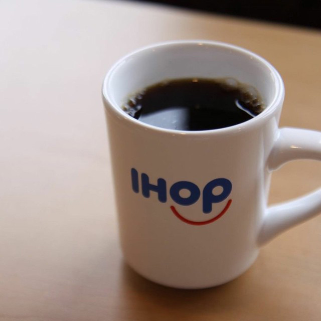 New mug. More photos of it here.
"Summer Stacks" TV spot. Logo animation at the end. (Spoiler: not very inspired). You can also just see the animated GIF below. (Spoiler: it doesn't get any better).
New mug. More photos of it here.
"Summer Stacks" TV spot. Logo animation at the end. (Spoiler: not very inspired). You can also just see the animated GIF below. (Spoiler: it doesn't get any better).  A very small sneak peek at some other graphic work, based on this one Instagram.
 Not much to see in application yet. The mugs are nice and their website looks peppy and fresh. Despite my own lack of enthusiasm for the logo I do think this is a positive change for IHOP, even if it's just to stay relevant and not feel like a 60-year-old brand, which might have more to do with the look of some of its locations than the logo — at least the buildings won't look sad anymore.
The following are new images provided after the post was originally published/written.
 Stationery.
  Wall decor, type.
  Wall decore, smile pattern. This might be the best part of the identity.
  Other graphics.
 ↧
Dawn of the Planet of the Zombies and the Giant Killer Plants on Some Serious Acid
"Mankind lost f*cking everything* (*Even Facebook)." Fictive trailer for Dawn of the Planet of the Zombies and the Giant Killer Plants on Some Serious Acid![]()
↧
Noted: New Name and Logo for Les Republicains
Les Who?
(Est. 2015) "The Republicans (French: Les Républicains; LR) is a right political party in France, and is one of the two major contemporary political parties in the country along with its centre-left rival the Socialist Party (PS). The Republicans was formed on 30 May 2015 as a rebranding of the Union for a Popular Movement (UMP) of the French centre-right founded under former President Jacques Chirac." (Wikipedia)
Design by: N/A
Opinion/Notes: I imagine this would be the equivalent of McDonald's changing its name to The Hamburgers. But more political. I'm quite sure I will miss a lot of nuances about the old and new logos since French political parties are not my area of expertise. The previous logo was fine, I guess, with some good foliage, a stately serif, and the blue-white-red palette of the flag. But it definitely looked dated and old. The new logo is more logo-ish with an abstraction of the flag giving way to an "R" marching forward. I kind of like it. It's simple, minimal, asymmetric, well balanced. Unfortunately the choice of Rotis semi-sans-almost-maybe-a-serif-but-not is not a good one. I love me some Otl Aicher but Rotis was never his crowning achievement and this shows why. It looks old and boring and just plain weird in that configuration — not even "Les Hamburgers" would look good.
Related Links: Nicolas Sarkozy appeal to Republicans
BBC story
Select Quote: The move has sparked widespread debate in France, with critics arguing that all French people are Republicans.
According to one opinion poll, almost 70% of the public - and 40% of UMP supporters - said that no political party had the right to use the Republican label.
In an editorial in Le Monde (in French), a group of three writers and politicians said: "For Nicolas Sarkozy to name his party in such a way that claims to represent all Republicans, as though there is no-one else apart from him, is insulting and irresponsible."
↧
↧
Linked: Best Minor League Baseball Logo

Link
And the winner of the Baseball America's Logomania competition to determine the best logo
↧
Logos for the jilted generation
I was reminiscing about when I became a teenager back in the early 90s, and thought I’d share just a few of the logos that bring the memories back.

If there was a soundtrack, The Prodigy probably headlined.

Mario Kart and Super Tennis on the SNES. I always thought that four button symbol was a bit weird.

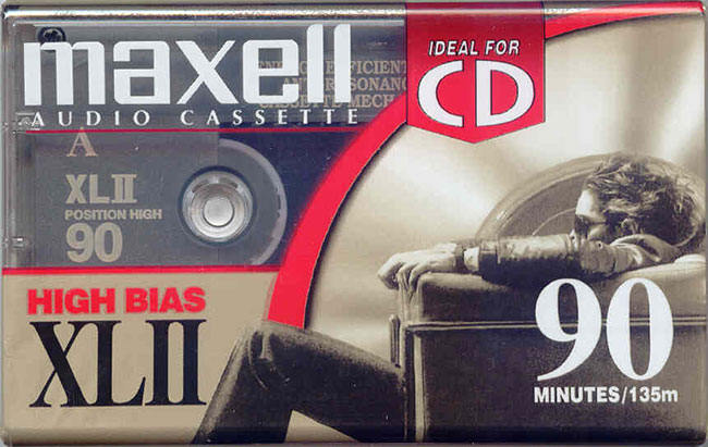
Maxell cassette tape photo: Ron Kane
Tape to tape recording on twin cassette decks.


Photo by Northern Ireland Railfan
Riding the buffers on NIR (Northern Ireland Railways). That NIR monogram isn’t used anymore. Not a bad mark, though.
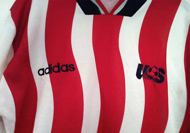
Photo via WaywardEffort
Footy on the Glencraig Primary pitch until it was too dark to see the ball. I wore the USA shirt for a good while. People thought I was a Sunderland fan.
![]()
Photo by Alex Segre
I failed the acid test.
↧
Warmest Regards
"So if not best, then what? Nothing. Don't sign off at all." Cheers.![]()
↧
9 iPhone Travel Apps I Can’t Live Without
When traveling extensively, you get to know what makes your life easier and of course, what saves you money and a lot of this comes down to using the right tools!
With this said, if I could only live with 9 travel apps these would be them. Read below to see why you should download & use them too! All these apps are free, unless otherwise noted.
As a side note, I’m in no way affiliated with any of these businesses / apps, I just want to pass on the recommendation.
1. Sky Scanner

A true money saver when it comes to finding & booking flights. SkyScanner scans all the airlines for their rates and tells you the best possible rate. Not only this but there is a feature that allows you to see a graph of other dates and times to travel on, so you can choose to fly an hour or day later and save lots of cash. You can also easily set up price alert changes which are very handy if know approx locations & dates you want to travel on. A similar service is HipMunk that has an “agony” feature that ranks flights based on agony caused (eg. red eye, stops, etc).
2. TripIt

If your trip consists of more than a few hotels & flights this app will be your new best friend. TripIt organizes all your travel itineraries into an easy to use interface. All you have to do is email your booking / flight confirmations to their email address and they do the rest. You can also share and sync your itineraries too.
3. Stay.com

This app is like a massive travel guide book in your pocket and you can download entire cities of info (including maps) so you’re never lost or with out a place to visit when traveling. I prefer this over app over the TripAdvisor Guides app as it features local picks and lots of customization for making your own itineraries, all without access to wifi or data. I also use the CitiMaps 2Go app as a backup because they have maps for smaller country towns.
4. Trip Advisor

This is my preferred app to use when looking for accommodation as it aggregates many different travel booking sites into one easy to use interface, while having a huge community of reviews to make use of. This said, I always check out other sites to ensure the final booking is the best rate, but for initial research this is the site to use. It’s also great for booking tours and finding out activities to do, wherever you are.
5. AirBnB

If you’re after a more local and authentic accommodation experience, AirBnB is for you. By using the app or website and its filters, you can easily find the right accommodation for your budget and requirements, often for much cheaper than a hotel. It’s also handy to use to find out which area of a city to stay in with their neighborhood guides.
You can get $25 free if you’re a new user by signing up using my affiliate link.
6. WiFi Map Pro (Free / $5 for offline)

A great way to find free wifi connections and passwords around the world. A true money & time saver! Works best if you have some data though.
7. XE Currency

This app shows current exchange rates and conversions. Very useful to see how much exchanges services are ripping you off. Tip: Always use an ATM to withdrawal money as banks give you the best exchange rates and never change money at the airport, as they have the worst rates. More tips on how to maximize your cash overseas.
8. Google Translate

This is the perfect app for language translation when you have wifi/data available. As a bonus, this app features a “camera translator” which translates words on the fly. Simply hold your phone over the foreign language and it automatically displays the translation on your screen. Great for reading signs and food menus.
9. Lonely Planet Fast Talk (Free/$2.99/$4.99)

A super handy app for quick translations when wifi or data is unavailable. They have a great search feature, which is perfect for any type of communication; directions, food, etc. As an example, you could type in “where” and it will give you all common phrases that include the word “where”. Where is the nearest ATM, where is the nearest gas station, etc.
Do you have any other recommended travel apps to share? Please do!
For more travel tips & stories, follow my travel blog Just Globetrotting.
↧
↧
jack burton questions
Kurt Russell as Jack Burton has so many questions.![]()
↧
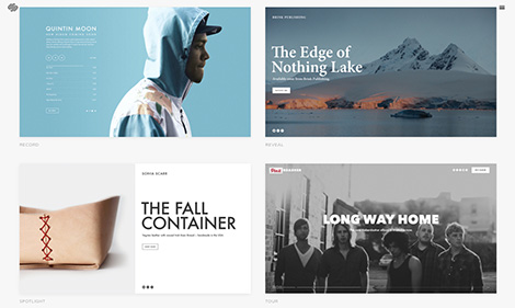
Squarespace Cover Pages
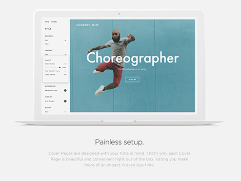
First impressions are everything, and with Squarespace’s new Cover Page tool, you can craft a bold, yet elegant standalone landing page in a manner of minutes! The twelve themes to choose from can be used in powerful ways for a variety of applications. Create pages to collect email addresses, promote your brand or even announce upcoming events. In addition, Cover Pages work independently of your core theme, so you can easily add them to an existing website. Combined with Squarespace’s robust e-commerce functionally, they can be used in unique and meaningful ways of connecting with your biggest fans and loyal customers.
Included with each Squarespace account are real-time analytics, a free domain, cloud hosting and award-winning 24/7 support.
Save 10%
Squarespace is graciously offering grain edit readers a 10% discount off all plans for a limited time. Type in GRAINEDIT during checkout to activate the discount and launch your Squarespace experience.
![]()
This post is brought to you by Squarespace – a website publishing platform that makes it easy to create beautiful websites, portfolios, blogs, and online stores without touching a line of code.
——————–
Also worth viewing:
David Doran
Heng Chun Liow
Roberto Montani
Follow us on RSS, Instagram, Pinterest, Wanelo
——————–
Thanks to this week's Sponsor // 100% Free Assets for Every Designer
↧
Recently Received
We’ve received some wonderful titles this week and i’m excited to share them. Included are entries from Nobrow, Laurence King, Princeton Architectural Press, D.A.P, Fshnunlimited and Chronicle Books. See all the books and images after the jump.
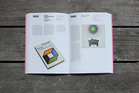

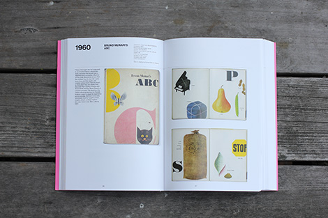
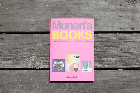
Munari’s Books
By Giorgio Maffei / Published by Princeton Architectural Press
288 Pages
One of the greatest graphic designers of the twentieth century–called by Picasso “the Leonardo of our time”–Italian artist and designer Bruno Munari (1907-1998) considered the book the best medium to communicate his visual ideas, showcase his art, and convey his creative spirit. Primarily produced in large quantities for the general public, his more-than-sixty publications, from design manuals and manifestos to visionary tactile children’s books, displayed all the beauty and technical ingenuity of works of art. Munari’s Books, the definitive collection of his book designs, examines in detail his seventy–year legacy in print, from his pioneering work as a graphic designer and collaborations with major publishers to his experimental visual projects and innovative contributions to the fields of painting, sculpture, design, photography, and teaching.
Pre-order a copy at Amazon, PA Press and your local book shop.
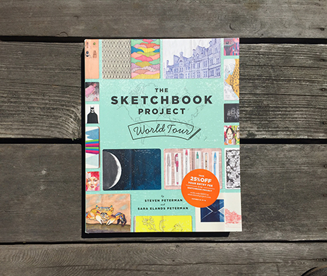
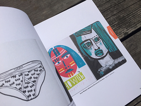
The Sketchbook Project: World Tour
By Steven Peterman and Shane Zucker / Published by Princeton Architectural Press
224 Pages
Destined to go down as one of the era’s most astonishing global art projects, the Brooklyn Art Library’s Sketchbook Project has, in less than a decade, amassed more than thirty thousand sketchbooks submitted by people of all ages and artistic abilities from more than 130 countries. Bursting with color, vivid imagery, and bouts of whimsy mixed with deeply intimate insights, the sketchbooks capture the texture of personal experience in a dizzying variety of illustrative styles and layouts that run the gamut from street portraits to stream-of-consciousness doodles, comics, and pop-ups. The Sketchbook Project World Tour presents the most compelling, surprising, and visually stunning examples from this one-of-a-kind artistic treasury.
Available at Amazon, Chronicle Books and your local book shop.
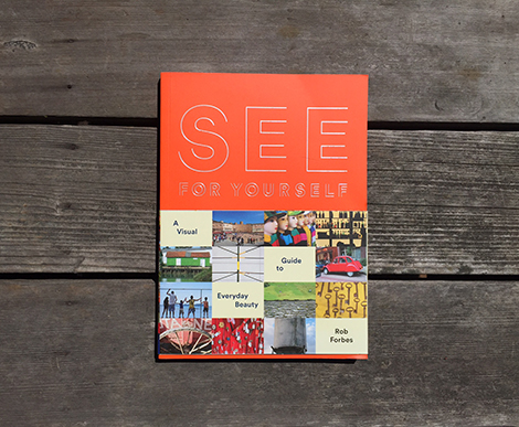
See For Yourself: A Visual Guide to Everyday Beauty
By Rob Forbes / Published by Chronicle Books
176 Pages
This accessible handbook from design guru Rob Forbes uncovers the beauty in the commonplace and reveals how visual thinking can enrich our lives. In friendly text complemented by photographs taken on his travels around the world, Forbes explains how to appreciate the design elements that surround us in the built environment. Linking broad concepts such as composition and materiality to quotidian details such as the play of color in hanging laundry or the repeated forms in a row of ice cream scoops, Forbes reveals how an appreciation of the hues, patterns, and textures that surround us can enhance a life well lived.
Available at Amazon, Chronicle Books and your local book shop.
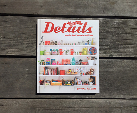
Swedish Details
Forword by Annika Huett and Ulf Huett Nilsson / Published by Max Strom
192 Pages
With a range of photos, from large landscapes capturing entire rooms, to small close-ups of the little knickknacks one might normally overlook, the volume establishes an aesthetic uniquely Swedish and welcoming in its personality and warmth. The details captured are neither new nor expensive, nor are they the fashion-inspired, cutting-edge design that has come to characterize some corners of Scandinavia. Instead, they are personal, homey and almost impossible to replicate—and it is these qualities that make this compilation such a quirky delight.
Available at Amazon, Artbook.com and your local book shop.
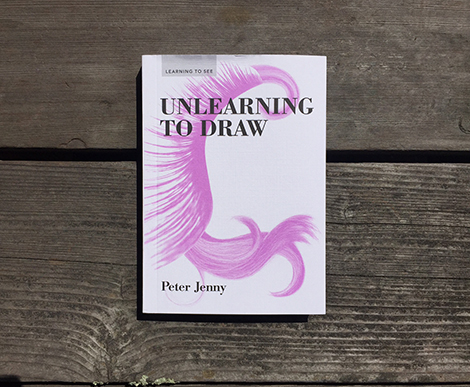
Unlearning to Draw
By Peter Jenny / Published by Princeton Architectural Press
216 Pages
Unlearning to Draw looks to the art of children and outsider artists for inspiration, advocating a return to carefree, untrained drawing and a renewed focus on the joys of making rather than on the end result.
Available at Amazon, PA Press, and your local book shop.

FSHN Unlimited
Fshnunlimited (FU) acts as a collective archive of profound Canadian creativity in fashion, art, design, and media. Produced seasonally in the spirit of collaboration and community, FU’s brash aesthetic and powerful visual narrative are a direct reflection of the very artists – photographers, writers, designers, illustrators, painters, and entire creative teams – that join together to build it. With a defined mandate to support, nurture, and celebrate local talent, FU aspires to provide a lasting and endearing portrait of the creative Canadian landscape and the incredible individuals therein.
Available at fshnunlimited.com

Lost Property
By Andy Poyiadgi / Published by Nobrow
24 Pages
What if all the things you ever lost, each valuable possession you vowed to treasure but could not keep safe, all the misplaced items you never found, were all to re-appear?
Gerald is a postman, much like many other postmen. One day, having lost a precious and personal item, he visits his local lost and found. Only to find far more than he bargained for, because in this “self storage”, each and every one of Gerald’s lost possessions has been kept and contained. How each item got there and why they were under one roof was a mystery. But they were all there…
Faced with this new trove of personal riches, Gerald discovers their ability to trigger powerful memories, resurrecting the ghosts of his past, igniting long lost passions and helping him change the course of his future.
Available at Amazon, Nobrow and your local book shop
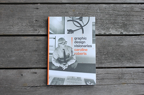
Graphic Design Visionaries
By Caroline Roberts / Published by Laurence King
312 Pages
Featuring 75 of the world’s most influential designers, this book presents the story of graphic design through the fascinating personal stories and significant works that have shaped the field.
Arranged in chronological order, the book shows the development of design, from early innovators such as Edward McKnight Kauffer and Alexey Brodovitch to key figures of mid-century Swiss Design and corporate American branding. The book profiles masters of typography, such as Wim Crouwel and Neville Brody; visionary magazine designers, such as Leo Lionni and Cipe Pineles; designers who influenced the world of film, such as Saul Bass and Robert Brownjohn; and the creators of iconic poster work, such as Armin Hofmann, Rogério Duarte and Yusaku Kamekura.
Pre-order a copy at Amazon or your local book shop.
Disclosure: Some of the links in the post above are “affiliate links.” This means if you click on the link and purchase the item, we will receive an affiliate commission. Regardless, we only recommend products or services we use personally and believe will add value to our readers.
——————–
Also worth viewing…
Recently Received Books: Oct
Recently Received Books: Sept
Recently Received Books: Feb
Follow us on RSS, Instagram, Pinterest, Wanelo,
——————–
Thanks to this week's Sponsor // 100% Free Assets for Every Designer
↧
15 Professional Quality, Hugely Versatile Font Families (Plus Web Fonts)
Hey guys, here’s a super versatile font bundle that you should get your hands on. For just $15 you can get a pack of 15 professional font families that have been hand picked by the team at DesignCuts, a community who’ve I’ve come to love for their awesome high quality design bundle deals.
In this pack, they focus on quality and usefulness, with zero filler fonts. There’s fantastic variety and versatility… from brush fonts to corporate and everything in between.
Normally this outstanding collection of professional fonts would cost $1720 so for just $15 (99% off) or $1 a font, it’s a real no brainer. Expand your font library with some of the most popular premium fonts, including extended licensing and web fonts.
This deal is only available for the next 2 weeks, so be sure to grab this epic bundle while you still can. I highly recommend ‘em!

↧
↧
1 month with the Apple Watch

Yesterday afternoon, I realised that I wasn’t wearing my Apple Watch. In fact, it occurred to me that I hadn’t been wearing it for the entire day. It was back in my bedroom, still attached to its charger and very much not on my wrist.
This is not an isolated event. This sudden realisation late in the day has happened now a good six or seven times in the month that I’ve owned the Watch. And the prompt for this realisation? I had lifted my wrist to see what time it was.
That’s right: I didn’t miss checking my email on the Watch; I didn’t miss one of the many notifications on the Watch; I didn’t miss any form of interaction with any of the various apps on the Watch; I missed telling the time.
Over the last few days, I’ve attempted to collate my thoughts about the Watch, but nothing I could write about this device could really compete with the simple truth that I’ve frequently forgotten to put on the Watch and only missed it when wanting to know the time. You’re welcome to stop reading here and take that as the conclusion of my review.
However…
… it would be remiss of me to not go into at least a little more depth about the Watch. In particular, a month’s use has lead me to believe that there are essentially three types of Watch apps:
The first kind of app is essentially a glorified notification. The Slack app only lets you read DMs or mentions, but not the main timeline. The in-built Mail app is another: yes, you can read your email, but it’s not something you’d want to compose with beyond very quick replies. The same applies to the Messages app. Somewhat confusingly, many notifications that appear on the Watch don’t (yet) have a corresponding Watch app — they’re merely throwing notifications from your iPhone. As I mentioned in my last post, although I expect this to change over time, I find this creates a particularly jarring disconnect, because some notifications can be acted upon and others can’t.
The second kind of app exists on the other end of the spectrum: a truly native app that allows the user to perform tasks more conveniently than they could on the iPhone (or more conveniently than having to pull out your iPhone, at least). Examples here are hard to come by, but might include Clear, or the built-in Activity and Workout apps. (I was originally going to include AeroPress Timer here, too, but after praising it initially, it’s actually much harder to use than its iPhone equivalent: keeping the screen active requires you to keep your arm raised, which is physically impossible while preparing an AeroPress.)
The last kind of app is the one that sits somewhere in the middle of these two extremes: an app that can be used, but is really more about ambient use.Swarm is a good example: it takes one function from the iPhone app (checking in) and does it well. “Looks like you’re at Small Bar. Check in?” When it’s accurate, it works wonderfully.
These ambient use apps are where the Watch will really show its strength, but they’re few and far between, at least for the moment. I’m even struggling to think of another example.
And herein lies the problem. At the moment, there’s simply very little point to the Apple Watch. Notifications are handy — I feel like I’m seeing more text / Facebook Messenger / WhatsApp messages when they arrive — but I’m not sure that’s a particularly interesting selling point. Remove notifications and there’s very little functionality you’ll find on the Watch. Even the Fitness and Activity apps seem hard to invest time in, since the sensors seem (to me, at least) to be inaccurate. I quickly turned off the ‘stand’ reminders, because it was clear the Watch was totally unaware that I’d just been standing with my baby daughter for the previous hour.
When discussing the Watch with friends, it seems that many people are shocked that having an iPhone in Bluetooth range is a necessity. And here’s the real issue: there’s almost nothing you can do on the Watch that you can’t do with greater ease and greater depth on your iPhone, and — because your iPhone is necessarily nearby — it’s almost always preferable to whip your phone out instead.
In conclusion
I like the Apple Watch. It’s a beautiful bit of hardware that integrates well with my life and (obviously) the Apple ecosystem in which I’m so deeply (helplessly?) invested. I don’t regret buying it, because I’m always keen to immerse myself in new user interfaces and models of interaction, and I’m considering the possibility of making a new version of my abandoned Countdone app, which I think could be genuinely useful on the Watch. It was a tax-deductible business expense, so buying one didn’t feel too extravagant.
But I can’t recommend the Apple Watch, because it’s almost useless. Take away my Macs, my iPhone, or even my iPod, and I’d be stuck. Powerless. Lost! But take away my Watch and… I probably won’t even notice. Unless, of course, I need to tell the time.
And that’s not a reason to buy an Apple Watch. That’s a reason to buy a watch without a capitalised ‘W’.
(Sorry I didn’t manage the ‘one week…’ post that I’d promised. Apparently having a newborn leaves you with very little blogging time — who knew?)
↧
Reviewed: New Logo and Identity for BQ by Saffron
Hands On
Established in 2005 as MemoriasUSB (USBMemory) by six engineering students of Universidad Politécnica de Madrid, BQ (as it was renamed in 2010) started by importing and selling USB memory sticks, later an e-reader called booq, and now also offers smartphones, tablets, 3D printers, and their accompanying accessories. Looking to expand beyond their market in Spain and compete with the larger electronic companies, BQ recently introduced a new identity designed by Madrid-based Saffron.
Based on its already inherent DNA, we defined BQ's brand purpose, which is "to help people understand technology, encourage them to use it and inspire them to develop it". We also spelled out the key features of their personality as honest, challenging, dynamic, reliable and didactic.
All these aspects of BQ's DNA led us to create a lively and unique visual identity that inspires people to make the most of their ideas through using and understanding technology. It all starts with a digital imprint -- in both senses of the word -- that ignites the creation process. This symbol, along with a white window that interacts with changing backgrounds, brings BQ's brand purpose to life.
Saffron project page
The previous logo was really bad with a terrible selection of rounded sans serif and an unflattering monogram of the "b" and "q" kissing. It looked like like a logo for cheap knock-offs. The new logo is far more conceptual and sophisticated. At first I just thought, "Oh, great, another tech logo with dots signifying connectivity" but the purple dot indicated something else. It wasn't until I saw the movie above that I got it. Five dots, five thumbprints. It's a lovely idea. I wonder how many people will get it without an explanation? Nonetheless, a smart idea with an understated execution. The "bq" typography… someone at Saffron really likes these tight, chopped up stems — see Panda and Apollo. I'm not particularly a fan but some people really liked the typography in Panda so we'll let the polls decide.
 Identity elements.
  Business card.
  Brochure.
  Posters.
  Packaging.
  T-shirt.
  Bringing the concept of the logo to life.
 In application, there is a number of things going on: There is the squiggly shapes that emanate from the dots; there is the white X-ray box that reveals working mechanisms and contrasting concepts in photos, and there are additional line-art illustrations. The latter is the only that seems extraneous, they could probably do without it. The X-ray box is a cool device and makes for some interesting layouts (best seen in the posters) and ideas (as in the brochure's flap) with the five-dot icon placed on the lower corners. Akkurat (Regular and Mono) are always a crowd pleaser and both work well in this identity. The squiggles… I like visually but maybe they clash with the cleanliness of everything else; as shown in the prototype of the packaging, it would be cool if they swelled around on the lock screen of the phone. Overall, this is a groovy update that definitely raises BQ's visual presence.
↧
Kahuku Class of 2015
Congrats to the Kahuku Class of 2015. Nice moves.![]()
↧