"It is one thing to say that a computer cannot appreciate the beauty of chess moves. It is quite another to use that inability to defeat it." The Departed Queen, by Dana Mackenzie. Via Mike Brown.![]()
↧
Departed Queen
↧
Reviewed: New Logo and Identity for Ampans by Morillas
All for One

Established in 1965, Ampans is an organization in Manresa, Spain, near Barcelona, whose mission is to help children and adults with learning and intellectual disabilities. In 1975 it established a school that is at its core of services and also offers multiple care, training and occupational services, through a team of more than 300 people to help over 1,500 people. Earlier this month, Ampans introduced a new identity designed by Barcelona-based Morillas.
By mutual agreement, we established a co-creation scenario that resulted in the entire Morillas team working on 8 proposals that would later permit 30 monitors/educators from Ampans, and 150 users to collaborate in the process.
The result was a choral activity channelled through three experimental workshops — shapes, alphabets and free expression — which brought an explosion of proposals that formed the ideal base from which to develop our graphic work.
Morillas project page
Process video. Good to watch before scrolling.The final proposal, which delighted us all, was to orchestrate a typographic brand with a collection of interchangeable letters for each application. We had never before seen a brand that harnessed such spontaneity and creativity, or one that reflected, with such precision, the values of Ampans' daily existence.
The new identity embraces randomness and craftsmanship to transmit the richness of the proposal and the boldness that Ampans, as an institution, carries forward in its mission.
Morillas project page
 Part of the alphabet.
 The previous logo wasn't much to look at but as far as simplicity goes, it didn't get any more basic. The new logo is still a fairly simple approach but loaded with great meaning and relevance. Based on a collaborative alphabet created by the students and people that Ampans helps, the logo is an ever-changing wordmark that works constantly to represent the people that benefit the most from this organization. The logo is not necessarily the most striking or balanced piece of design but it makes up for it in charm. Perhaps it would have been necessary to create a holding shape that would help make all the different combinations appear more as a unit and you can see in the sub-brands that anchoring the logos with some kind of system gives them more strength as an identity.
 Stationery.
  Business cards.
  Brochures.
 New sign.
  T-shirts.
  T-shirt detail.
 In application, the logo is treated just like a corporate identity, which is a good way to make sure this is still an identity that can operate with other organizations and individuals, from vendors to donors. The brochure covers are probably the best use, by combining photography with a white label-like container, the logo, and a nicely typeset sans serif. Perhaps a dash of color would help in the stationery (even if it looks like the backs have color) as the fronts start to feel a tad dry. Overall, this is a heart-warming identity with a great process behind it that should make people proud to use it.

↧
↧
Every Hitchcock Cameo Ever
↧
Pawn Sacrifice
Trailer for the Bobby Fischer biopic Pawn Sacrifice.![]()
↧
Noted: New Logo and Identity for Build-a-Bear by Idea is Everything
A Bear Market
(Est. 1997) "Build-A-Bear Workshop, Inc. is an American retailer headquartered in Overland, Missouri, that sells teddy bears and other stuffed animals. Customers go through an interactive process in which the stuffed animal of their choice is assembled and customized during their visit to the store. Build-A-Bear Workshop is the largest chain that operates in this style. The company has been acclaimed for the quality of its working environment, especially as a workplace for teenagers." (Wikipedia)
Design by: Idea is Everything (London)
Opinion/Notes: Despite the lack of relative sophistication in the old logo I've always found it kind of endearing, with its novelty font and Gulliver-esque bears. The new logo comes in two flavors, one that is more "corporate" and only goes by Build-a-Bear and the other is the more retail oriented with the fun "WORKSHOP" lettering. It looks like a good strategy to create the division between the two entities and the Workshop stuff looks particularly fun with the squiggly patterns on top of the new condensed sans serif. It looks even better as a single color as glimpsed on the box. The main logo is definitely more tame compared to the previous and perhaps loses some of its appeal but it definitely looks more grown up.
Related Links: Idea is Everything project page
Select Quote: With an in depth understanding of the business and in close collaboration with their teams, we proposed a renewed brand strategy. With plans to diversify through wholesale and licensing, it was critical for the company to become two brands: Build-A-Bear, the masterbrand and Build-A-Bear Workshop, the retail brand. We developed corresponding visual elements for each brand, including two fresh complementary logos, a bespoke typeface inspired by the creative 'building' process, new colour palettes, and the introduction of lifestyle photography shot by the acclaimed photographer Sam Robinson.
 Custom type.
  Typography styling.
  A few applications.
  Take-out box and business card.
 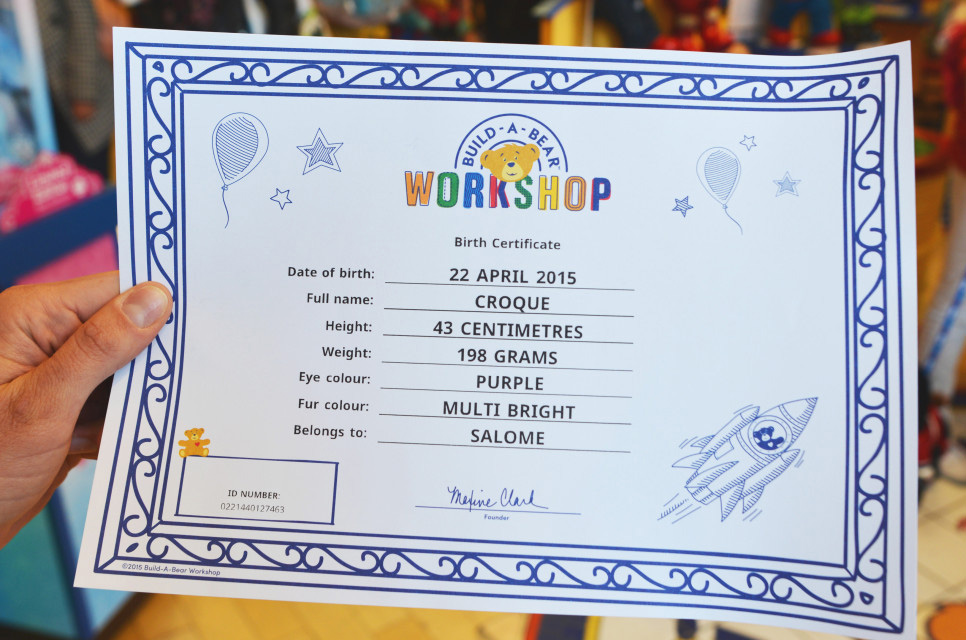 Certificate.
 ↧
↧
Linked: NBA Toons

↧
Amis on Madness
↧
Schadenfreude
"And so Americans may joke at the expense of the fallen, but we keep electing them to public office. We keep paying to see their movies and download their music. It's the intensely American desire, or arrogance, that celebrates a success story, even if it's someone else's." Christine Grimaldi is Glad She's Not You.![]()
↧
Off Diamond Head
To be thirteen, with a surfboard, in Hawaii. Off Diamond Head.![]()
↧
↧
Dawn Patrol
Related to below, Don Winslow's fabulous Dawn Patrol.![]()
↧
Free Hand-Picked Resources for Designers and Developers – May Edition
Hey, people! We hope you’re having a nice day, because it’s about to get better. We’ve been looking far and wide for some of the best new resources the ever-changing communities of the Internet have to offer, and we’ve stumbled upon a great amount of goodies that we will share right here, right now. Prepare for amazing design and web development resources and share us your thoughts in the comments section. Take care!
View the January, March, April free resources here.
–
Apple Watch GUI for Sketch
With the Apple Watch release approaching, it’s vital to have all your design assets ready. This impressively detailed GUI for Sketch will put you one step ahead of the competition.

The Coolest Phone Ever Just Got Its Own Set of Mockups
A very particular set of mockup designs for one the most memorable phones of the past few decades, editable right in Photoshop.

Huge Hipster Vector Design Pack
A really big pack with 100 vectorial posters, badges and icons featuring, yeah, you got it… the hipster. Grab Illustrator and modify that pretentious little fella into something that’s actually cool.

Creative Poster Template
A neat template for creative people and agencies that want to showcase their talent. It comes with Illustrator, InDesign and Photoshop files so you can edit it the way you feel most comfortable.

7 Things Every Designer Needs to Know About Accessibility
Accessibility is what gives users with disabilities the opportunity to enjoy your content. Read this text to know how to create experiences that any human being can take advantage of.

High Performance HTML
CSS, JavaScript, images and many other aspects of a website are modified in order to improve their speed, but HTML is often overlooked. This article talks about how to write proper HTML in order to make your site that bit quicker.

The Details Behind 10 Type-driven Sites
This article is part of a monthly series were 10 beautiful websites are analyzed in order to dissect their typeface work.

SkyBlue CSS Framework
This CSS framework is by no means competition for Bootstrap, but it does offer a much simpler platform on which you can start your projects.

PHP Frameworks Bundle
A considerable list with over a dozen PHP frameworks that will allow you to choose the perfect tool depending on your project’s needs.

RazorFlow
This framework will allow you to build your very own mobile-friendly dashboards using PHP and JavaScript.

Is.js: Micro Check Library
A tiny library to validate types, regexps, presence, time and more.

Gumby: Responsive CSS Framework
This CSS framework was built with Sass and offers a very flexible approach while still managing to be simple and straightforward in its usage.

Simple.Timer
A minimal jQuery plugin that will allow you to set up timers on your projects. You can loop these timers or modify them in a few other ways.

Lotus: A Complete Web Framework for Ruby
Lotus is a modular Ruby framework with a focus on simplicity. It is made out of standalone frameworks that are integrated independently depending on your needs.

Burger
A typical hamburger menu with support for fullscreen navigation and a subtle animation.

Svidget.js: SVG Widgets JavaScript Framework
This JavaScript framework will allow you to create awesome SVG widgets where you can place data and embed them in your projects, while keeping both SVG and HTML clean and separated.

Colorful Media Icons for Sketch
A set of icons set for multimedia and entertainment activities such as music, movies, electronic devices and more. They come in a colorful flat style and can be edited with Sketch.
![]()
Multipurpose Icons
Over 100 icons for various situations offered entirely for free in EPS, SVG and AI formats.
![]()
Epic Outlines Font
This gigantic icon set contains elements for pretty much all of the projects you could need. Download the freebie to get a nice taste of their quality.

Flat Web Design Icons
A collection of icons with elements relating to web design including networks, errors, file formats and many, many more.
![]()
Google Web Fonts Typographic Project
This project shows you some neat two-font combinations taken from Google fonts so you can make better choices in your next website design.

INeedAResume
A quick, clean resume generator for those who go for simplicity or simply let all their paperwork back at home.

Papa Parse
A quick and powerful CSV parser that has no trouble dealing with huge files and malformed input.

Dogtown Letterpress Textured Font Experiment
An amazing font that, as the creator says, features a lot (if not too much) detail. Perfect for big sized texts such as titles and headlines.

Smaq Typeface
A decorative all-caps typeface with eight different styles from outline to fully colored. It’s better suited for posters, logos and big sized designs.

Katahdin Round Font
Katahdin is a commercial font that has been noticed quite a bit over the last few months, which inspired its author to make a new version and offer it for free, featuring a subtle change: rounded corners.

↧
Lego Gummy Candy
Weekend project, LEGO gummy candy.![]()
↧
Selectric
The IBM Selectric Typewriter and its digital to analogue converter. Great, nerdy, fun film about an all-time fave product design.![]()
↧
↧
Selectric Noyes
Related to the last. From the pebbly matte steel skin to the zippery feel of the margin controls and the interchangeable "golfball" element, the Selectric stands as an icon of industrial design and a shape that still defines an era of modern business. Check how it fits in the timeline history of the IBM Typewriter. The man responsible for the Selectric, and in many ways for corporate America embracing Modernism and design driven communications, is Eliot Noyes.![]()
↧
Picture Phone
PicturePhone: How Bell Telephone lost a half billion, but nearly created the internet. From EngineerGuy.![]()
↧
Last Photo Chicago
↧
Headline of the Day
Headline of the day.![]()
↧
↧
Jaws 40th Anniversary Screening
Quint! On the big screen! Jaws is coming back to theaters.![]()
↧
Reviewed: Friday Likes 131: From ACRE, The McQuades, and Eszter Laki
From ACRE, The McQuades, and Eszter Laki


From techno vibes and neon colors to soothing vibes and earthy colors, we have something for whatever mood you are in with work from Singapore, Chicago, and Budapest.
7Cycle by ACRE

7Cycle is a 4,000-square-foot cycling studio in Singapore with a "pulsating soundtrack and party-like atmosphere" in a traditional shophouse. The identity by local form ACRE is so vibrant it basically has a pulsating soundtrack of its own. There is a bunch of reasons why I shouldn't like this, yet I find it mesmerizing and it's also perfectly appropriate for the client and audience. The 7-spoke icon is quite nice and I like how it animates as an expression of cycling. The main hook on the application is that some of the items are printed in neon ink that glows in ultraviolet light. Sure, it's a gimmick, but it's a cool gimmick. See full project
Oliver Dogwood Floral by The McQaudes

Oliver Dogwood Floral is a floral studio in Chicago, IL, creating fresh floral and botanical arrangements for all kinds of events. The identity by local firm The McQuades is pretty much everything you would expect a high-end floral studio to look like but it's done so well and so… botanically that it's not easy to dismiss. The "O" monogram comes in very realistic and more abstract renderings, both working nicely in tandem to convey the freshness and rustic-ness of the company. The logo placed on the slabs of wood with the scattered green leaves is like the ultimate Pinterest-bait. Just all around enjoyable without too much overthinking or over-designing. See full project
Chez Dodo by Eszter Laki

Chez Dodo is a small purveyor of macarons in Budapest run by Dóri Szalai, who happens to own a blouse with a pattern of hummingbirds that served as the inspiration for this identity by local designer Eszter Laki, who recreated the pattern in watercolor. While the typography and layouts are fine — there is a macaron CD monogram not pictured above that's a delight — what I love the most about this is the unrelenting use of the hummingbird pattern. It's everywhere. It's on the business cards, outside the boxes, inside the boxes, on carry-out bags, and even on the wall. Unexpected and charming. See full project
↧
Noted: New Name and Logo for Upwork
Up, Up, and Around
(Est. 2015, formerly Elance-oDesk) "Upwork is the world's largest freelance talent marketplace. As an increasingly connected and independent workforce goes online, knowledge work --like software, shopping and content before it-- is shifting online as well. This shift is making it faster and easier for clients to connect and work with talent in near real-time and is freeing professionals everywhere from having to work at a set time and place. Freelancers are earning more than $1 billion annually via Upwork. Upwork is headquartered in Mountain View, California, with offices in San Francisco, California, and Oslo, Norway."
Design by: N/A
Opinion/Notes: Comparing the old and new logos isn't apples to apples but what they do have in common — despite the previous one being one of those annoying interim merger double logos — is a modest simplicity. Both Elance and oDesk had very clean logos and the new Upwork logo follows suit with the biggest flair being the "Up" ligature loop and the curved arm of the "k". I like the individual elements ("Up" and "work") but separating them through color makes it impossible to appreciate as a unit, a wordmark for a company called Upwork, not Up work. I get that then they can use "Up" as a shorthand for social media and it does work for that approach. Aesthetically… I like it, it's nicely done and feels very Web 3.0 or whatever version of Web we are in. Perhaps it would have benefited from some ink traps so that it reduced better and not have the "p" look so bold.
Related Links: Press release (about new name and platform)
Select Quote: The Upwork logo represents the aspiration, energy and optimism of redefining the future of work.
 Illustrated "Up".
 ↧