New trailer for Black Mass. Looks great.![]()
↧
Black Mass
↧
David Doran
David Doran is a freelance illustrator based in the UK. A recent graduate of Falmouth University, he creates rich and layered work with a strong sense of narrative and visual emotion. His clients include The New York Times, WIRED, Nobrow and the San Francisco Chronicle.
——————–
Also worth viewing:
Asuka Watanabe
Spin
Gracia Lam
Follow us on RSS, Instagram, Pinterest, Wanelo
——————–
Thanks to this week's Sponsor // 100% Free Assets for Every Designer↧
↧
Barney Bubbles
"So, why isn't he remembered in the same way as Saville, Garrett, and Hipgnosis? Bubbles signed almost none of his work - and, when he did, he utilized an arsenal of assumed identities, each equally absurd and non-sensical." Ian Lynam on iconic UK album designer Barney Bubbles.![]()
↧
Metabunk
Metabunk, why the crazy stuff you know is ridiculous, is ridiculous. See "Chemtrails".![]()
↧
The International Flag of Planet Earth
A nicely crafted insight (below) into the construction of Oskar Pernefeldt’s International Flag of Planet Earth.
Animated by Johan Fredriksson, a designer at Forsman & Bodenfors, the flag design was part of Oskar’s graduation project while studying at Beckmans College of Design in Stockholm, Sweden.
“Centred in the flag, seven rings form a flower — a symbol of life on Earth. The rings are linked to represent how everything on our planet, directly or indirectly, is linked. The blue field represents water, essential for life, and as the oceans cover most of our planet’s surface.”
Quoted from the project website.
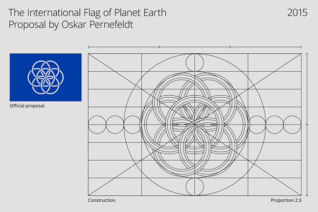
The photo mockups were honed by a few folk from bsmart.
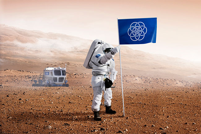


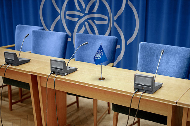

See more of Oskar’s work at www.oskarpernefeldt.com.
Via Khoi.
↧
↧
My White Trash Family
"The White Trash Series was developed while living in the South out of frustration with some of the prevailing ideologies, in particular, class distinction. This ideology seems to be based on a combination of myth, biased history and a bizarre sentimentality about old wars and social structures. With the juxtaposition of the portraits from museums, once painted on ivory, now on flattened trash like beer cans and fast food containers, the artist sets out to even the playing field, challenging the perception of the social elite in today's society."![]()
↧
Reviewed: New Logo and Identity for LA 2024 Olympic Bid City by RE:
We Bid you Farewell

In a process that started in early 2013, the United States Olympic Committee selected Boston this January as the Olympic Bid City of the U.S. for the 2024 Olympic Games, beating other applicant cities San Francisco, CA; Washington D.C.; and Los Angeles, CA. Boston's logo was Noted here at the time of the announcement and it wasn't very well received. Along with losing the U.S. bid, Los Angeles also lost the opportunity to implement a rather cool identity. (Although a couple of rumors hint that Boston's bid may crumble in time for the official submission of a bid city to the International Olympic Committee in September and LA is more than ready to pick up the bid.) Headed by the Southern California Committee for the Olympic Games, who successfully hosted the Summer Games in 1932 and 1984, the bid team worked with M&C Saatchi LA, who in turn worked with Sydney-based RE: to design the identity.
As noted in their project page, all work shown are concepts and prototypes, except for the logo which was approved and used in the bid process.
Conceptually the lines are representative of a few aspects: The stretching shadows cast by the LA sun rising and setting along the Palm filled city; the tracks and lanes in which the athletes compete; the movement which is created by the athletes and the stripes on the american flag. The number of lines references the 5 olympic rings. The colours reference the 1986 LA Olympics as an incredible heritage and pride point.
RE: project page on Behance
As an added bonus the logo can be seen as a representation of the stars and stripes as the "A" letterform alludes to the shape of a star.
RE: project page on Behance
Although the logo dates back to early 2014 and the Applicant City competition is a bit of an old story, RE: just put up this case study, as I'm assuming the embargo on showing any of that work has been lifted, which is great because this work is quite good. One important thing to remember here is that Bid City logos can NOT show any Olympics-related graphics like the torch or the rings and they can NOT be used as the event logo.
The striped, extruded LA monogram is so great. It's as unexpected as London 2012's logo wanted to be but less shocking and jarring in its execution. The star shape of the "A" feels very LA-ish and, in its black and white version, the lines look like crosswalk lines, giving it a very urban feel. The logo works best in single color or with the gradient going from the "L" to the "A" instead of the gradation that goes from front to back (as I think that breaks the unity of the logo, which is what makes it interesting). It makes for a surprisingly appealing and effective logo.
 Poster-kind-of-things.
  Banners.
  Billboard.
 In application, the identity goes ribbon-happy with abstract interpretations of different sports: a velodrome for cycling, a waving flag for sailing, a loopy loop for gymnastics, etc. All of them beautiful-looking backgrounds offset by a deadpan sans serif and some really long hyphens, punctuated by the logo — looking great small. One of the goals of the identity for a bid city is to communicate excitement and possibilities and this one excels at it with its undulating backdrops and bold typography that hint at the balance of the business implications of being a bid city and the entertainment potential of hosting the Games.

↧
Noted:
Covington is where it's at

(Est. 2000) "Renaissance Covington, Inc. is a 501(c) 3 non-profit organization which was created for the purpose of revitalizing downtown Covington. The goal is to make downtown economically viable by capitalizing on our rich stock of historic buildings while identifying ways to meet the needs of our contemporary society. Renaissance Covington is a part of the State of Kentucky's 'Renaissance on Main' program and is guided by the principles of the National Main Street Program. Our organization will meet its goals by following the Main Street four point approach which includes design, organization, economic restructuring and promotion."
Design by: Durham Brand & Co. (Covington, KY)
Opinion/Notes: Looks like Covington is the place to be for solid design this year. First we had the city itself with a waving "C" by Landor and now it's a cool typographic set-up for the downtown improvement organization. The previous logo took the "Renaissance" part too much to heart with a very unfortunate set of swashes coming out of a serif wordmark paired with some Gill Sans at its worst. The new logo is a fun jumble of what looks like Hoefler & Co.'s Knockout (plus a geometric "O"). The "V" for "COV" is a little heard to read since it's the only flipped letter but what I enjoy about it is that it looks like a Greater Than symbol. In application, the identity is very playful and energetic flipping the logo on its side, full-bleeding it, and complementing it with more geometric shapes. Overall, a great effort for something — a neighborhood improvement initiative — that usually goes either unnoticed by people or uncared for by those in charge.
Related Links: Durham Brand & Co. project page
River City News story
New Logo and Identity for City of Covington by Landor Review on Brand New
Select Quote: The organization's new look, tone and feel better represents the diverse work they do downtown: Madlot, pop-up shops, festivals, the farmers market, Art Off Pike and various other community-engaging events. The strategic goal was to develop a holistic branded solution and not just update a dated logo. This project became a tremendous opportunity to capture the great things happening in the city and elevate the brand to a place that's reflective of Covington's fun, vibrant and diverse culture. The rebrand included a new logo, tone of voice, branding applications, website, permanent way finding and various other collateral.
 Pattern.
  Business cards.
  Banners.
  Posters.
  Stuff.
 ↧
Linked: Duck Migration

Link
Todd Radom goes in-depth into the 2007 transition that turned the NHL's Mighty Ducks — owned by The Walt Disney Company and sold to Henry Samueli — into the Anaheim Ducks with an identity by Frederick & Froberg Design Office (now Fanbrandz).
↧
↧
VW Font
I always get my typographic news from Car & Driver. New custom typeface for Volkswagen by MetaDesign.![]()
↧
Koenigsegg Trevita CCXR
Leno takes a long look at one of three hand-built Koenigsegg Trevita CCXR supercars.![]()
↧
Xavier Chassaing
"When working through an idea, it is like trying to sleep when you have a fever: the same dream or nightmare repeats again and again..." A hypnotic, experimental film by Xavier Chassaing, Dry Lights.![]()
↧
Hat-Trick
So you know, the origins of the "hat-trick."![]()
↧
↧
Bookerly
Bookerly and a new layout engine, the Kindle finally gets typography that doesn't suck, by John Brownlee.![]()
↧
The End of the Tour
Interesting trailer for the David Foster Wallace biopic The End of the Tour.![]()
↧
Pac Man Turns 35
A certain segment of our readers will agree with me, feel old yet?![]()
↧
Inn at the Presidio
Looking into flights right now.![]()
↧
↧
U.S. Government Color System
↧
Government Hues
Related to the last, what color is that mailbox?![]()
↧
Clean Streets
"Sanitation workers Angelo Bruno and Eddie Nieves worked together for nearly ten years on the same garbage route in Manhattan's West Village and became fixtures in the community. After 31 years on the job, Angelo retired. At StoryCorps, he talked with Eddie about the unexpected lessons he learned along the way and what he still misses about the job.![]()
↧