4 Famous faces get 20 years older in these 20th anniversary ads for Getty.![]()
↧
4 Famous Faces Get 20 Years Older
↧
Juvet Hotel
↧
↧
30 of the World's Best Hotel Bars
One down, 29 to go.![]()
↧
B.B. King
↧
Cooking Tarantulas
"They taste very similar to soft-shell crab." A nightmare dish for MS.![]()
↧
↧
A Pigeon Sat on a Branch Reflecting on Existence
Trailer for A Pigeon Sat on a Branch Reflecting on Existence.![]()
↧
Women Making Whiskey: An 800-Year History
Women Making Whiskey: An 800-Year History.![]()
↧
In Flight
"As if we are only pulling out of a driveway, I turn right, toward Tokyo. We are underway. Via MeFi.![]()
↧
CN logo evolution
More than half a century after it was designed, Allan Fleming’s CN monogram still looks like it could’ve been created today. Designers around the world often choose it amongst their favourite marks. Here are the lesser known logos that preceded it.
Much of the following information is courtesy of CN.
1852: Grand Trunk Railway
CN’s logo dates back to the birth of Canada’s first major railroad, the Grand Trunk Railway (GTR), a line that eventually joined others to form CN.
![]()
Built originally to link Montreal and Toronto in the 1850s, GTR saw its future as an international railroad serving markets on both sides of the Canada-U.S. border — a feat that it accomplished within a decade.

Grand Trunk Railway map, via Victorian Wars Forum
1883: Intercolonial Railway
Built during the 1870s, the Intercolonial Railway (ICR) was another railroad that eventually joined others as part of CN. It linked Nova Scotia and New Brunswick with Quebec.
![]()
Its logo proudly dubbed the line the “People’s Railway” and adopted the moose as its trademark due to its superiority in the animal kingdom and, in turn, its ability to hold its own against all rivals in its domain.
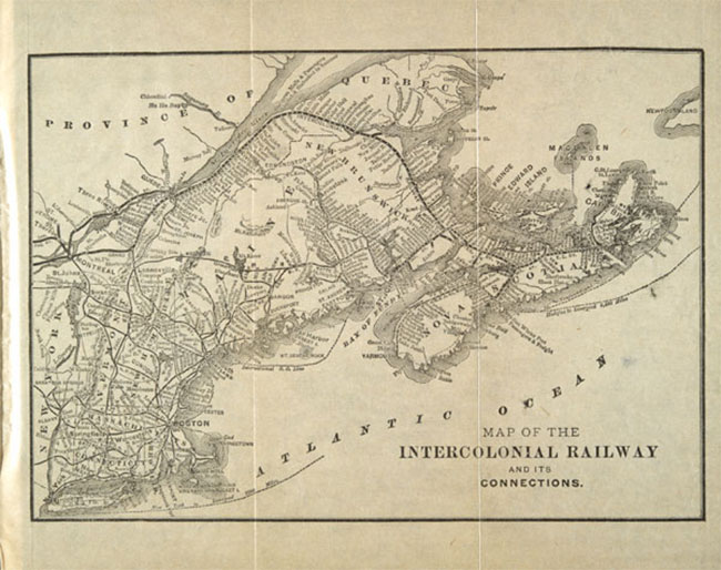
Intercolonial Railway map, via Library and Archives Canada
1896: Grand Trunk Railway System
Under new general manager Charles Melville Hays (a victim of the Titanic), the Grand Trunk Railway adopted a more aggressive management style — and a new logo to express the change.
![]()
Hays set about modernising and expanding the British-owned railroad, renaming it “Grand Trunk Railway System” to reflect its far-flung interests.
A version of the logo was the so-called “tilted wafer” — the company name on a square tilted nine degrees downward to the left, presumably an eye-catching device to convey motion. However, the logo’s simple lines didn’t please everyone. One observer thought it was “the most prosaic” of the major Canadian railroad logos.

Grand Trunk Railway System timetables 1898, via railroads.uni.edu
1899: Canadian Northern Railway
The Canadian Northern Railway resulted from the ambitions of two energetic, small-town-Ontario rail promoters, William Mackenzie and Donald Mann.
![]()
After acquiring a couple of small Manitoba lines in the mid-1890s, Mackenzie and Mann incorporated the Canadian Northern in 1899 and began expanding rapidly both east and west.

Canadian Northern reduced rates 1904, via Library and Archives Canada
By October 1918, Canadian Northern had fallen victim to its own ambitions and economic forces beyond its control. Beset by declining revenue, rising costs, and lack of capital during World War I, it teetered for a time on the brink of bankruptcy. The railway was taken over by the Canadian Government in August 1917 — only to become one of CN’s constituent lines in 1919.
The logo of Canadian Northern Railway would serve as a prototype for CN’s logo during the first few years of its existence. Essentially, CN took the easy way out and simply replaced the “Northern” in the Canadian Northern logo with the word “National.”
1905: Grand Trunk Pacific
At the turn of the century, Canada was riding high on an economic boom. Confined to eastern Canada, the Grand Trunk Railway under expansion-minded Charles Hays felt boxed in and longed for a piece of the action.
Meanwhile, the Government was convinced that Canada needed and could easily support at least one more transcontinental rail line. A second coast-to-coast railroad would also break Canadian Pacific’s monopoly in the west.
![]()
So Grand Trunk and the Government got together to construct a third east-west line. GTR incorporated a subsidiary, the Grand Trunk Pacific Railway (GTP), in 1903, which would run between Winnipeg and Prince Rupert. The Government, meanwhile, would build the eastern portion, known as the National Transcontinental Railway (NTR), from Winnipeg to Moncton.
Grand Trunk Pacific’s logo was derived from its parent’s logo, featuring the “tilted wafer.” It bore the words “The Only All-Canadian Transcontinental Route” — perhaps an act of one-upmanship over rival Canadian Pacific, which reached its eastern terminus via the state of Maine.

Grand Trunk Pacific farmland ad 1913, via Ben Bradley
A similar tilted wafer with the slogan “The Transcontinental Line” was also used to identify the GTP/NTR system. But like Canadian Northern, GTP came to grief during the economic turmoil of World War I. The Canadian Government nationalised the property in 1919.
1915: Canadian Government Railways
The term Canadian Government Railways (CGR) was a catch-all phrase used to describe a group of railroads owned by the government of Canada in the early part of the 20th century.
Each of the railroads making up CGR was managed independently. In 1915 the group included:
- The Intercolonial Railway (Government-owned since its inception in 1867)
- The National Transcontinental Railway (also Government-owned from its start in the early 1900s)
- The Prince Edward Island Railway (taken over soon after Prince Edward Island joined Confederation in 1873)
- The yet-to-be-completed Hudson Bay Railway (a Government-propelled project all along)
- To these ranks the Canadian Northern Railway was added in September 1917, shortly after a Government takeover
![]()
Canadian Government Railways had a simple logo, but apart from that unifying device, the line had a shadowy existence with very little real substance or organisation.
1919: Canadian National Railways
The name “Canadian National Railways” first appeared officially on December 20, 1918, when the Government authorised that term as a descriptive name for the various properties that made up Canadian Government Railways — principally, Canadian Northern, National Transcontinental and Intercolonial.
Six months later, on June 6, 1919, Parliament passed legislation to incorporate the Canadian National Railway Company Limited — and CN was born. The following year, the Grand Trunk Pacific was added to the line-up, giving the new railroad two transcontinental networks.
![]()
With so many component parts, each with its own strong identity, CN struggled to craft a single, recognisable face to show the world. During the first few years, it took the easy way out and used two different logos, each one mimicking the trademark of a predecessor railroad. Equipment and sign painters simply replaced the “Northern” in the Canadian Northern logo and the “Government” in the Canadian Government Railways logo with the word “National.” A practical and economical solution, perhaps, but it did little to foster a clear conception of the new railroad in the public’s mind.
The two logos CN used during this period were usually printed in black or white according to the desired contrast with the background.
1923: Canadian National Railways
The finishing touch to the creation of Canadian National Railways came early in 1923 when the Grand Trunk Railway joined the system after a Government takeover some three years earlier. That event quickly led to a unified corporate image for the new railroad, one it would display with few major alterations for 38 years.
![]()
CN abandoned the stop-gap solutions of its first few years and introduced a single design to represent the entire company. But like the two earlier versions, the new logo reflected CN’s parentage — this time, the Grand Trunk and its familiar “tilted wafer.”
At first, CN used a square-shaped wafer, just as GTR did. Then, in 1927, the square became a rectangle, presumably to accommodate longer yet fewer words.
The red used in the logo was CN No. 10, which is close to Pantone 200c. The lettering was gold on equipment, for which there is no good Pantone equivalent. In print, however, the yellow employed to represent gold was close to Pantone 115c.
1943: Canadian National Railways
During much of the first decade, President Sir Henry Thornton had led the company with great panache, expanding into fields as diverse as radio broadcasting, resort hotels and ocean liners. Then came the Crash of 1929. While business plummeted and hostile politicians clamoured for an end to the publicly owned system and its “extravagance,” CN stumbled through much of the Dirty Thirties.
But when World War II broke out in 1939, CN seized the opportunity to demonstrate its value to the nation. It performed prodigiously in the war effort, turning handsome profits as well.
![]()
The first significant change to CN’s logo came in 1943, 20 years after it had been adopted. In a sense, the modified logo symbolised the railroad truly coming into its own and hitting stride after two decades of struggling to define its role.
Buoyed by patriotism and a new sense of mission, CN superimposed the tilted wafer on a maple leaf, creating a new logo with built-in flexibility. First applied to a new batch of boxcars in 1943, the logo featured “CNR” above the wafer, while the slogan “Serves All Canada” replaced “Canadian National” on the wafer.
Variations on the theme would appear in later years — different colour schemes and alternate slogans, such as “Canada’s Largest Railway.” CN continued to use an unadorned wafer for some applications, but for the most part, the instantly recognisable maple leaf and the nearly ubiquitous slogan “Serves All Canada” became synonymous with Canadian National.
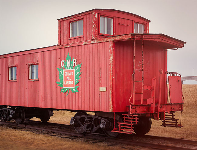
CNR emblem, via Gary DB
The maple leaf was Green No. 12, for which Pantone 363c is a good match. The rest of the logo usually appeared in white against whatever the background colour was: brown on boxcars (Pantone 174c) or orange on cabooses (Pantone 166c).
1954: Canadian National Railways
Emerging exhausted from the extreme demands of World War II, CN badly needed modernising and energising if it was to hold its own against growing car and truck competition. Donald Gordon, who became President in 1950, was just the man for the job.
Gordon transformed the railroad from the ground up, replacing steam with diesel power, introducing computer technology, restoring the worn-out freight car fleet, and recruiting and training a highly skilled management team.
![]()
CN was changing rapidly — but the changes were happening largely beneath the surface, virtually invisible to the public eye. Yet CN initiated just one relatively minor modification to its corporate symbol during the 1950s, barely reflecting the immense progress underway.
In 1954, to mark the arrival of new passenger cars equipped with unprecedented amenities, CN eliminated the wafer’s tilt and redrew it as a straight square on the maple leaf. As changes go, it was hardly dramatic — but it did have the virtue of being easier to apply to CN’s mammoth locomotives and railcars.

Canadian National Railways locomotive, via Mike Robbins
The maple leaf was CN Red No. 10 (Pantone 200c), the wafer was black, and the lettering simulated gold (Pantone 115c).
1960: CN
The story begins in 1959 when a revitalised and confident CN surveyed Canadians’ attitudes to see how it measured up in the public mind. The findings came as a great shock: when people thought of CN, they pictured an “old-fashioned,” “backward” organisation, hostile to innovation — the very opposite of what the company was trying to achieve.
Dick Wright, head of public relations at the time, firmly believed that “seeing is believing.” If CN had a fresh new trademark, he reasoned, people would be more likely to think of it as the customer-friendly, technologically advanced railroad it was rapidly becoming. Wright commissioned New York designer James Valkus to study the problem. Valkus became convinced that what CN needed was not just a new trademark but a complete overhaul of its visual image — from locomotive paint schemes and building exteriors right down to the sugar packets used on passenger trains.
A new logo would be the heart of the redesign program. It had to be perfect from both an aesthetic and a practical point of view. It had to communicate the essence of the new CN: powerful, progressive, dynamic. Valkus assigned the challenge to Allan Fleming a young and highly regarded Canadian graphic designer. After experimenting with countless possibilities, Fleming hit on a particularly inspired design while sitting on a New York-bound airplane. He quickly sketched the idea on a cocktail napkin — and CN’s logo was conceived.
![]()
CN logo sketches via designKULTUR
![]()
![]()
![]()
![]()
Handwritten note from James Valkus
It was a dramatic contrast to the existing image. Out went the maple leaf, out went the time-worn wafer. Indeed, out went the “CNR.” Fleming had come up with a way of combining the “C” and the “N” in a harmonious, evocative manner. Abolishing the “R” made the logo bilingual (“Canadien national” as well as “Canadian National”). Without the “R” for “Railways”, the logo could be used as a unifying mark that would also serve the many non-rail businesses CN ran at the time — hotels, telecommunications and ferry services, to name a few.
![]()
Fleming avoided literal symbols — no animals or vegetables allowed — because they tend to show their age very quickly. As Fleming put it: “A literal drawing in 1944 of an object — even a plant leaf — looks in 1954 as if it was drawn in 1944. After five, 10 or 15 years, that symbol would have to be revised. In fact, CN itself has had that history up to now — of constantly revising its trademark bit by bit — and every time it has been revised the one before it is out of date, and it costs a lot of money and a lot of hard work to keep ahead of the game.”
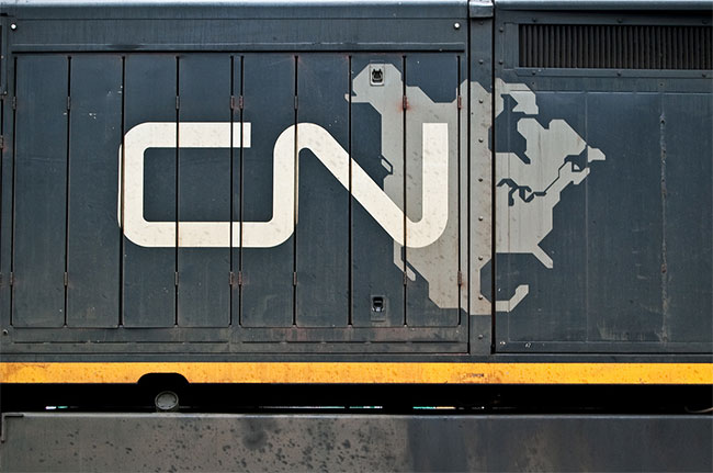
Photo via everkamp
While conceptualising the future, Fleming drew on the past for the kind of image that would convey timelessness. Studying the Christian cross and the Egyptian symbol for life, he borrowed the idea of using a line of single thickness. “The single thickness stroke is what makes the symbol live,” Fleming later said. “Anything else would lack the immediacy and vigor.”

Allan Robb Fleming, via
The continuous flowing line symbolised “the movement of people, materials, and messages from one point to another,” Fleming said. As the eye moves from “C” to “N,” the image suggests fluidity and motion. “It’s a route line that incidentally spells CN,” Fleming explained.
Photo by Tim Stevens
More about Fleming’s mark in the CN visual identity guidelines (PDF).
↧
↧
#104: Seeing mountains
|


↧
Reviewed: New Logo and Identity for Ultra Fibre Optic by venturethree
Take me to your Fibre

Launched today, Ultra Fibre Optic (UFO) is a joint venture by Sky and TalkTalk to bring 1000Mb ultrafast fibre broadband to the UK, debuting in the city of York. (This is the equivalent and as big a deal as Google Fiber setting up for the first time in Kansas City, KS, in 2011). Part of what's interesting about this is that Sky and TalkTalk are telecom competitors but they both have to buy access to the pipes from a third competitor, BT, and now they are skipping it. The identity for UFO has been designed by London-based venturethree
Our task was to create a stand-alone brand that's neutral from the two brands behind it, but powered by them for credibility. Introducing... UltraFibreOptic. UFO. Something so fast it can keep up with 1000Mb of fibre power.
The UltraFibreOptic proposition is simple -- 'do more of what you love doing online, together'. And because the joint venture is such a modern way of operating collaboratively, we positioned it as 'a Sky + TalkTalk idea'. In a crowded marketplace the 'idea' element helps differentiate the two businesses as creative thinkers, doers and leaders.
The creative concept comes straight from the name -- UFO. The actual product is light so it follows that everything UFO says and does is powered by light. It's a refreshing look for a completely new category full of possibilities.
venturethree project page
I usually have a sense of how most projects are going to be received by our readers but this one… I don't know if it's going to be hated or appreciated. I have mixed reactions myself. I like the name and how it shortens to UFO but I also think naming something UFO is kind of silly and even more so when the logo is just a UFO. There is no leap in concept from name to visual. It's not like a good logo can't be a literal interpretation of its name, but here there is nothing furthering the notion of what the service is. However, I'm a big fan of shiny things and I really like the shiny, glossy, bulbous UFO chosen as the visual representation to be taken to our leader. It's like the start-up version of Big Hero 6's Baymax. The wordmark is set in Miles Newlyn's TP Rubrik and it works as a great visual bridge between the Sky and TalkTalk logos. I'm not a big fan of the bolded initials but I can understand they wanted to play up the acronym.
Motion spot.The logo is at its best when animated, slowly rotating and toying with reflection, along with a cool sound signature that gives the logo a nice boost of speed.

 Billboards.
  Bus stop ad.
Animated bus stop.
Bus stop ad.
Animated bus stop.  Posters.
  Balloon.
 In application, there isn't much and what's there is not stellar. The bright lights shining from behind the letters in the bus ad start to feel cheesy and like a bad sci-fi movie and the service's website adds to the cheapened look with all its beveled buttons, gradients, and lens flares. The mock-up of the wheat paste posters is kind of cool but, as mock-ups to show potential, it would have been cool to see the UFO going from top to bottom as the posters progressed so that, in theory, as you drive or walk by the UFO is landing. The ballon UFO fits in the "ooooh shiny" category but also on the "why?" question pile. Overall, bonus points for a fun logo but the system crashed on entering the atmosphere — or to put it in less metaphorical terms, the brand's debut needed to be handled in a much more streamlined, elegant, and cohesive way.

↧
Superdawg
Local note, RIP Mr. Berman.![]()
↧
Noted:
Back to the Cock

"The French Olympic Committee (French: Comité National Olympique et Sportif Français, CNOSF) is responsible for France's participation in the Olympic Games. It was formed in 1894 in Paris. It is responsible in addition for all of France's overseas departments and territories except French Polynesia." (Wikipedia)
Design by: Leroy Tremblot (Courbevoie, France)
Opinion/Notes: This is a clearly positive evolution, going from a nondescript governmental-looking logo to a much more marketable identity. The new logo isn't perfect and the choice of a Gallic rooster may be cliché by now when it comes to France-related logos but at the very least the drawing is a very nice, energetic rendition. The typography is very ho-hum and trying to look sporty with the cut angles on some of the horizontal strokes — it's like a weird mash-up of Antique Olive and Gill Sans. Nonetheless, an improvement overall.
Related Links: "A Cock Shared" (or other national sports emblems that have a rooster on them)
CNOSF logo pages (various)
Select Quote: The return of the cock, out since last logotype adopted in 1998, was favored. Symbol of France, the cock now looks forward, in a direction from left to right reading. His line graph approach allows to discover it is emerging as the coil of a dance track ice or a rhythmic gymnastics ribbon. It can be read like the wake of a dinghy at a regatta, the course of an event or moving sports on land.
The blue line is a write aspiring freedom, elegance and pride. For the sake of balance, the line thickness of the cock is the same as the Olympic rings. Similarly, the rooster remains a single blue. He embodies the unity in difference. While both institutional and timeless, it is nonetheless terribly modern and innovative.
This cock is deeply identifier. His most contemporary artistic dimension offers a modern and positive representation of this national symbol, able to reach a large number of French. It aims to represent the commitment of France Olympique, solid and sustainable, while remaining lightweight. Just like an haute couture embroidery, it refers to French excellence and works perfectly in all contexts.
 Previous logos.
  Custom font.
  Céline Goberville, French sport shooter, with new logo.
About 1 minute of words and then logo animation at the end.
Céline Goberville, French sport shooter, with new logo.
About 1 minute of words and then logo animation at the end. ↧
↧
Linked: TWD Logo Decay
Link
The logo for The Walking Dead has been decaying through 5 seasons. I wish this were more on purpose and the decay was consistent and evident. (The first few changes it just looks like they increased the saturation in Photoshop).
↧
5 Things from Space
↧
Pocket Calculating Devices
Calculating how long it will take to check out all 4007 entries in the Museum of Pocket Calculating Devices. A beautiful collection and a staple of the Museum of Online Museums for years. Tweeted by Present and Correct, who also reminds us to check Datamath.![]()
↧
100,000 Stars
100,000 Stars, a gorgeous interactive tour of the Milky Way.![]()
↧
↧
Peter Hook
For BB, Sound Opinions has a great interview with Peter Hook from Joy Division and New Order.![]()
↧
Jet-powered Go Kart
Trying to figure out how to present this to JC as an office necessity. Shouldn't be too hard......![]()
↧
Best in Show
↧