Think Big, Act Micro


(Est. 1979) "Ingram Micro is an American electronics company and information technology distributor. It is the world's largest wholesale technology products distributor. Ingram Micro distributes and markets a large variety of electronics which it sources from manufacturers such as Acer Inc., Apple, Cisco, Hewlett-Packard, IBM, Lenovo, Microsoft, Samsung and others. The company ranks 76th in the 2013 Fortune 500. It is headquartered in Santa Ana, California." (Source: Wikipedia)
Design by: N/A
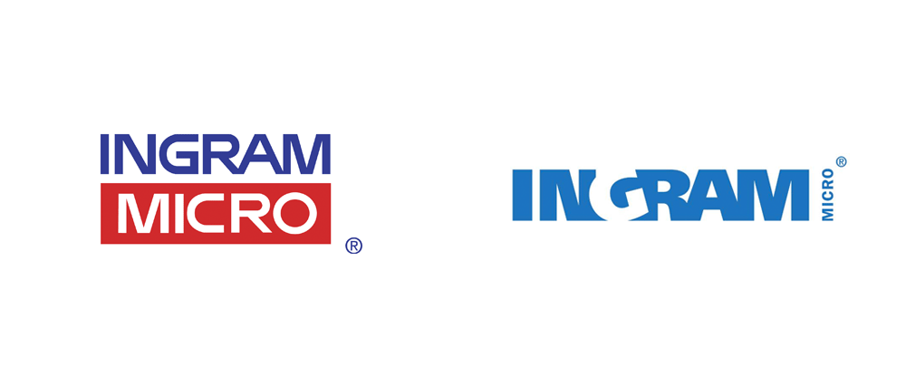
Opinion/Notes: It's been a while since we've had a good, old-fashioned ugly corporate logo redesign. Here we have Fortune 500 company number 69 acting like a mom and pop electronics store selling IBM Selectrics. Seriously, this logo can not be the representation of any company that's a leader at something. The typography is abysmal, the tilted "G" is a trite attempt at creativity and the "MICRO" part they took quite literally by making it micro. To make matters worse, the press release rationalization is as laughable as it gets.
Related Links: Ingram Micro press release
Select Quote: The bold new look incorporates a blue that is both eye-catching and pleasing, while the letters convey the strength and dependability of a true, world-class leader. The tilt of the G signals acceleration and agility, while its virtual absence reinforces transparency and the company's unique insights. Agility, insight and dependability, these are all qualities valued by Ingram Micro's partners.
 Logo detail.
"The Promise of Technology" brand video. Semi logo animation at the end.