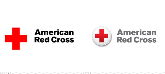
Established in 1881, the American Red Cross is one of the most well-known emergency response organizations in the world aiding victims of natural disasters and other emergencies. It counts with more than half a million volunteers and 35,000 employees across 700 national chapters. Recently, a new logo and design standards designed by Turner Duckworth have been quietly implemented. The Brand Standards manual can be seen here [PDF] and covers more than is represented in this post, in case you are interested.
The pin is a symbol of enthusiastic participation. It is a personal, grassroots and unique expression for the American Red Cross.
— Brand Standards [PDF]

Source of inspiration (shown cropped). Mid-century poster by Emmet Oldson.

There is three versions of the logo: The "Button" logo, above, for marketing purposes; and the "Classic" logo and wordmarks, below, for use "in disaster situations, as well as times when a marketing-oriented button logo is not appropriate."

As one of the most recognizable icons in the world there really isn't much that can be done to it. As it was, the cross icon and typography were working pretty good. Turner Duckworth has taken the same elements and simply tightened them a little bit for better and more consistent use. The main change is obviously the "button" approach for use in marketing and more "consumer"-oriented applications. The button execution is as subtle and sophisticated as it can get, giving the button a nice, friendly texture with a soft shadow. The typography has been scaled back to a less jarring gray and the relationship between the cross and the type is much more balanced than the previous version. The same lock-up and color palette extends to the "classic" logos, keeping things simpler than before.
The rest of the identity doesn't represent anything groundbreaking or exciting, because it doesn't need to. For the most part the applications shown here and in the standards are an exercise in establishing basic and very simple principles that one hopes don't get too brutalized once those 700 chapters and 35,000 employees start churning out materials. Overall, the identity is as straightforward as possible and the button icon adds a touch of approachability.

Color proportion image. This is one of the hardest things to nail down in guidelines. Nicely done here.

The Cross Pattern.

Concept image. Blanket not yet available.


Don't forget to cast your vote about this post online
