No Hard Hats Required

Established in 1994 in Columbus, OH, as one the ten inaugural Major League Soccer (MLS) teams, the Columbus Crew is one of the more successful teams of the league, having won the MLS Champion cup in 2008 and multiple MLS Supporter Shields, awarded to the team with the best regular season record, based on the MLS points system. The team plays in the Crew Stadium, the first one built specifically for a professional soccer team in the U.S., with a capacity of 20,000-plus. Last week, the Crew introduced a new logo designed in-house.
New Logo introduction.The previous logo was probably one of the worst of any MLS team. Nothing about it was interesting, exciting, or sophisticated. From the crappy illustration of men in hard hats that looked like a Photoshop Posterize effect to the Copperplate Gothic typography, it was remarkably lame. The new logo smartly does away with all of that in exchange for a very nice looking badge that has been very carefully explained and rationalized without sounding like complete bullshit. Everything makes sense and all the elements are very competently calibrated within the badge so that, together, they make a whole.
One complaint I've read a couple of times is that this could be a badge for any team and that it doesn't scream COLUMBUS — btw, happy Columbus Day (unrelated) — in a rather obvious way. Well, it doesn't have to, and most teams that try end up with something that looks like either the before or after of Louisville City FC: not good.
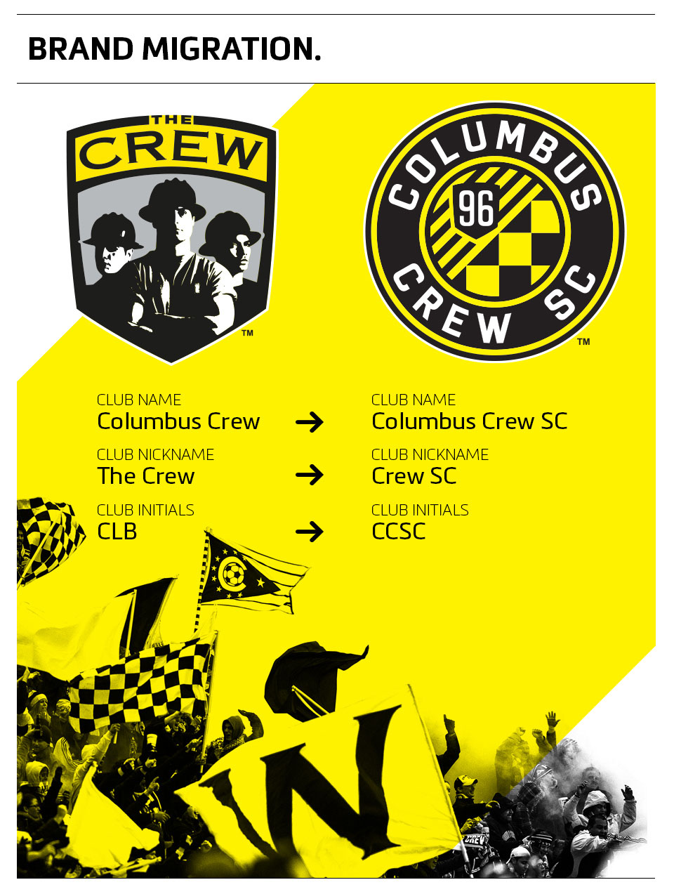 Overall brand changes.
  Standalone wordmark.
  T-shirts.
  Cap.
Cap.  Modeling the new scarf. More photos of the launch party here.
 An added benefit of the new badge is that it provides multiple visual devices to build merchandise and communications. The scarf pulls out the diagonal stripes and checkerboard for a cool-looking piece of merch. The Crew's badge may not be the best in the world but it's a very solid update that should help keep the growing momentum of the sport going on with the solid fan base of Columbus.
