Crafted and Canned: The Best Fall Beers
The Dark Knight Trilogy
Insanity Burger
Happy Friday
Professor Astro Cat's Frontiers of Space
Trailer or The Babadook
#2
Noted:
Beckoning Away

(Est. 1955) Beko is a Turkish domestic appliance and consumer electronics brand of Arcelik A.S. controlled by Koc Holding. Beko is a budget brand name and continues to be in use for a number of Arcelik Group products such as television sets, refrigerators, washing machines and dishwashers, in several countries. Beko has 25,000 employees and sells it products in more than 130 countries to over 440 million customers.
Design by: Chermayeff & Geismar & Haviv (New York, NY)
Opinion/Notes: If you Google-image Beko you'll still get a lot of the old identity in play and, well, it looks a lot better than the new one. I wasn't familiar with this brand and was pleasantly surprised by the old logo, with its Saul Bass-esque shapes and attitude. I think this is one of those logos/identites that would have benefitted from an evolution instead of a revolution and by reinvigorating the application instead of shoehorning a new logo that, unfortunately, is not exactly "youthful" as promoted above. I like the "eko" part but that "b" is just impossible to like. The diagonal is sort of interesting but doesn't feel convincingly integrated with the wordmark.
Related Links: Beko "Change for the better" page
Chermayeff & Geismar & Haviv project page
Select Quote: The new Beko logotype is youthful and approachable, with an angled underscore that suggests energy and optimism. The blue color in the logo is a brighter shade of the navy blue that Beko has traditionally used.
 Logo detail.
  Color variations.
  Mock-up applications.
  New Beko sponsorship of FC Barcelona. Story here. Photo by Germán Parga-FCB.
"Change for the better" brand video.
Linked:
Link
Love it or hate it, here is my yearly review of what has happened on Brand New between the 2013 and 2014 Brand New Conferences.

Golden Era of Hip-Hop
Ghostsigns
30 Years of Coens
Shaping Clouds
Josh Brill Interview
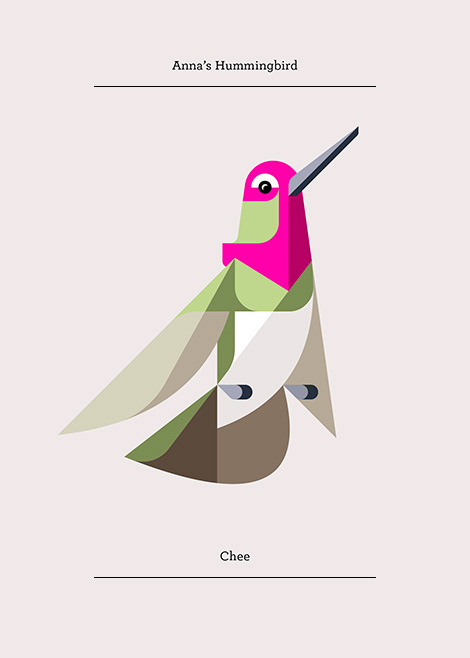
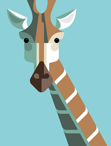
I was first introduced to Josh Brill and his work though through his Flora Fauna collection. With nature serving both as a catalyst and a muse, the ongoing series explores and catalogs the identities of plants and animals from around the world. To illustrate these explorations Josh chose to eschew conventional realism in favor of a style that echoes cubist techniques. The end result is vibrant, bold and visually intoxicating.
In addition to sharing the same passion for illustration and design, I was excited to discover that Josh and I shared a similar upbringing. We unknowingly haunted the same swimming holes and drank from the same slush puppy wells while growing up. This served as fodder to fuel our friendship and with this in mind, i’m delighted to present today’s interview with him.
Lets start off with a little bit about your background. Where are you from originally?
I was born in Norway, Maine and raised in the Lake Region area nearby.
When and how did you become interested in illustration and design?
When I was a kid, I became interested in art through pop culture including animation, comic books, skateboard graphics and video games. Though I did not know it as a profession, just for what it was, something fun to me. It wasn’t until high school that I learned that people do this for a living. A friend gave me some comic books to read and I loved the artwork. As I learned more about the artists behind these books I grew excited. It was hard to believe that people could make a living from drawing fun pictures. I told my mom I wanted to be a comic book artist and she was generally supportive. I think she was just happy to see I had a possible career direction. From here I took the closest course in desktop publishing and to be honest, I did not enjoy it. It was the early 90′s and they were still teaching the old paste up methods and the design examples were formulaic at best. This led me to take classes at the Kubert school for cartooning and animation before enrolling in Maine college of Art. It was here that I gained a renewed appreciation for the art.
When did “Lumadessa” come into being and what is the story behind the name?
“Lumadessa” took shape in the summer of 2003. At the time, I was still new to field and I didn’t have much client work to show. I was making short experimental interactive narrative art pieces in Flash, and I needed a portfolio site to showcase my skills. After completing the website I decided I wanted to create an identity that would compliment my work but also allow me to grow with it. I liked the word luminosity, because it worked for the literal side of art and the interpretation of light for creativity. The word “odyssey” struck a chord for me as well, as it implies the journey that art takes you on. From there, I combined the two words to form Lumadessa.
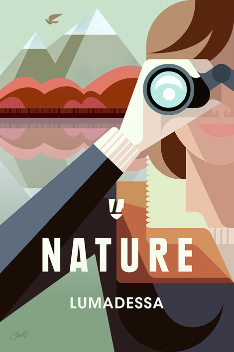
We would love to highlight one of your projects. Could you walk us through the Nature Explorer poster? Please include the tools you used to create this project.
I used Flash and Illustrator to create the vector art, then brought it into Photoshop and used RetroSupply Co.’s Blacksmith filter actions and brushes to create a subtle press printing with an ink bleed effect. Next, I added some light textures using a Wacom tablet.
What were some of the thoughts that fueled the direction of the design?
I have been working on animal art for seven years and while i’ve enjoyed making the work, it’s a challenge to stay focused on one thing. Overtime, it’s caused creative fatigue and for this poster I wanted to head in a different direction. I wanted to logically bridge my existing animal work with my new found love of travel posters. I am planning to create a complete series of posters, but for this initial attempt I chose to create something that encourages others to embrace and explore nature.
In what ways did the initial concepts differ from the finished work?
When I started the project, my intentions were to create a Maine travel poster. Unfortunately, I became busy with other projects and reached a creative stopping point. When I came back to the poster, I toyed with other locations, like Patagonia and Acadia that might work better for such an iconic theme as nature, but each time my explorations felt visually forced. I then realized that this project was more about nature as a visual symbol, rather then a place.
What are your passions outside of design?
Wait a minute, there is a life outside of design? When did this happen? (laughter) All kidding aside, my job takes up much of my time. When possible, I love to travel. The next trip i’m planning is to Acadia National Park in Maine to do some hiking and exploring. In addition, I’ll be taking reference photos for a travel poster based on the park.
——
We would like to thank Josh Brill for taking time to share with us. You can see more of his work at Lumadessa.com. For a limited time Josh is offering $10 off his Nature Explorer poster. Please use the coupon code “GrainEdit1012″ at checkout. The offer is good till 10/12/14 at midnight.
——

This interview is brought to you by RetroSupply Co. Working with authentic materials (including real paint, ink, paper and screen textures from screen printing shops) they have crafted a vast library of vintage inspired design resources for Photoshop and Illustrator.
Free Brushes + Textures!
If you sign up for the RetroSupply newsletter you will receive an amazing collection of brushes, textures and templates.
Sign up here to receive all the goodies.
Save 20%
RetroSupply Co. is graciously offering grain edit readers a discount on all products for a limited time. Type in GRAINEDIT20 at checkout to save 20% off all purchases.
——
Also worth viewing…
Brad Woodard Interview
Brent Couchman/ Moniker SF Interview
Ty Mattson Interview
Thanks to this week's Sponsor // RetroSupply Co.: A library of vintage inspired design resources for Photoshop and Illustrator.
Aspirational
Mars Global View
Hippo Po'Thames
Madwell
Reviewed: New Logo and Identity for Blloon by EdenSpiekermann
Full of Hot Air and Awesomeness


Launched this August, Blloon is a new ebook service for tablets and smartphones (only iOS for now) offering over one million book titles available for consuming; starting with a free plan to hook you in with 1,000 free pages building up to paid plans measured in page count: 500 pages a month or 1,000 pages a month for £3.99 and £6.99, respectively. Based in Germany, the company just launched the app in the UK but will expand to other parts of Europe and eventually the U.S.. Blloon's identity has been designed by Berlin-based EdenSpiekermann.
Once the discovery phase was complete, we set about defining the three brand pillars: Easy (removing the barriers between people and stories), Honest (subscribe to great stories, not fine print) and, most importantly, Magical. We boiled this down into a single brand core statement: "Blloon is my smart escape to all the great stories".
The next step was to visualise this value proposition. How? Well, in order to escape the real world, we needed to create a way to take our users there. A way that would take them to places they've never seen before.
In short, a magical way to escape — Blloon.
EdenSpiekermann project page
 Sketches of various machines.
 We imagined Blloon as a vehicle to this world of stories, and started out by researching the most spectacular (and often impossible) vehicles and flying machines in both history and fiction. Our project room soon started to resemble a mad inventor's laboratory with the walls covered in images of Leonardo flying machine drawings, illustrations from Jules Verne, zeppelins, Victorian air balloons, submarines and pretty much everything in between. After narrowing down our selection to a flying chair, a submarine and a spaceship we landed upon a strange looking balloon with a odd propellor at the front — there was no doubt this would be the logo. Interestingly the brand mark came a long time before we had the name. Working with a colleague in the Netherlands, we created a name that felt strange, and familiar at the same time. When pitching the name to the client the rationale was simple: "It's a balloon without the 'A'".
Paul Woods, EdenSpiekermann Design Director
 Logo detail.
  Different configurations and color variations.
 Although I'm not a fan of the Flickr naming convention where vowels are removed gratuitously (while allowing for extra trademark-ability) there is something very charming about Blloon, sounding almost like a toddler would say it, happy as a puppy (until, that is, the blloon slips from his or her hand, flies into the sky, and damage control begins). It also helps that the wordmark is not set in a rounded sans serif in neon colors but a generously tracked serif that gives it an appropriate literary aesthetic. But the main attraction is the quirky blloon itself that has been chosen as the icon: it's like an ice cream cart with a propeller and a Charlie-Brown-decaled balloon envelope (the official name of the balloon-ey part).
The resulting logo is charming, unexpected, and distinctive. Plus, it has some cool balloon friends:
 Secondary range of "magic vehicles".
  Typography. Both available from Klim Type Foundry.
  A few applications.
 User interface samples.
 In application, Blloon is presented boldly with vibrant colors and a loud sans serif that provides messaging and other cues for attention. At times, the super bold, super big use feels like part of another identity altogether, but is still nice to look at. Judging from the UI samples available, the app looks smooth and crisp, with an overall sense of playfulness worth taking for a ride.

Noted: New Logo and Identity for Index Ventures by Pentagram
Pull my Finger

"In 1976, Gerald Rimer founded the firm's forerunner, Index Securities. When his son, Neil, joined him in 1992 and the pair moved from bond trading to technology investing, Index Ventures was born. Our pilot fund was raised in 1996 and, that year, Neil, with his brother, David, and Giuseppe Zocco founded Index Ventures in Geneva. We opened offices in London in 2002, and in San Francisco ten years later.
We are a multi-stage international venture capital firm with deep sector expertise based in London, San Francisco and Geneva. Since 1996, we've teamed up with exceptional entrepreneurs in more than 30 countries who are using technology to reshape the world around us. The companies they've started include Aegerion, asos, Climate Corp, Criteo, Dropbox, Etsy, Genmab, Just Eat, King, Hortonworks, MySQL, Nasty Gal, Pure Storage, Skype, SoundCloud, Sonos and Supercell — among many others."
Design by: Pentagram (London; Partner: John Rushworth)
Opinion/Notes: This is quite a nice identity, starting with the icon. Hands are notoriously tricky to use as logos and in this absolute abstraction it becomes a lovely and minimalist rendition that at first is almost amorphous but then the hand comes into focus. I wish there were a few more of the illustrative hands built under and around the main icon, because those are really cool. The slab serif typography on the logo and applications is nice and the red, black, white, and tan color palette brings everything together in a bold and classy way.
Related Links: Pentagram project page
Select Quote: The new identity conveys Index Ventures' understated approach and distinct character. A striking, graphic symbol has been introduced that reflects the firm's strong, single-minded culture and style. The 'hand' serves as a visual metaphor of Index Ventures' qualities – subtle, supportive, and sensitive, but also inspiring, vital and versatile. The 'hand' is also playful, referencing our most technologically active body part and the firm's connection to the consumer world.
 Stationery.
  Promo items.
  Brochure and t-shirt.
  Office sculpture.

