Korengal
New Nomiku Sous Vide
The new Nomiku Sous Vide immersion circulator looks fantastic. If you like to be a nerd, even in the kitchen, Nomiku is for you.
This Fox Likes Tattoos
Team Tattly partnered with North American Bear on tattoable dolls, called Cutie Tattootie. This fox is one of their latest releases. It’s all kind of adorable. (Not to mention the girl!) The fox comes with 12 Tattly tattoos that the kid can either apply on themselves or on the doll. Put the doll in the washer and the tattoos disappear. Fun, right?
Reviewed:
Lightning in a Beaker


Founded in 1943, the Instituto Tecnológico y de Estudios Superiores de Monterrey ("Monterrey Institute of Technology and Higher Education" in English and shortened usually as Tecnológico de Monterrey or, simply, El Tec) is one of the largest private multi-campus universities in Latin America offering high school, undergraduate, and postgraduate education to over 90,000 students. (It's not the 200,000+ students of University of California but for Mexico it is quite huge). Based in Monterrey, it has over 30 campuses in 25 cities and hosts a very well-recognized MBA program. This week, the institution introduced a new logo designed by Chermayeff & Geismar & Haviv.
 IMPORTANT: This remains as the school's shield. It does not go away. (Sadly).
 Following the tradition of many U.S. universities, the Tec will now have a shield for formal usage and a logo for promotional and communications usage. The main challenge here is that the Tec has been using what is now the shield as its main logo since 1944. Similar to the University of California debacle last year, the media and students have latched on to the idea that the shield is going away — they would be so lucky, really — and replaced by this more heavily-corporate mark. You know the drill.
As you can see, the shield is a real nasty piece of design, even for shield and crest standards which tend to be unreadable hot messes of books and torches and leaves and words on a curve. Complaining about its loss or about its shift to a less prominent position is just for the sake of complaining and the inability of most people to accept change. Along with the new logo, it would have been nice to at least redraw the shield to look more regal and put together than that lightning bolt beaker purports to be.
The new logo consists of two elements: the torch, taken from our shield, representing the light of knowledge, obtaining achievements, leadership and entrepreneurship; five flames represent our values: Innovation, Global Vision, Teamwork, Human Sense and Integrity.
The circle refers to the world, refers to globalization and communicates the international reputation of our institution. A conjunction of the torch and the circle is known within the pieces of the logo, as a "symbol".
These elements are complemented by the name of our institution, "Tecnológico de Monterrey", shown in a special typeface and written in mixed case to give a better reading.
Identity standards
 Logo detail.
 As far as the new logo goes, it's about par for the course from the logos we've seen recently from Chermayeff & Geismar & Haviv. Simple. And perhaps that's what's been catching the most flack, that it lacks the ornate approach of the old-one-now-shield. While I enjoy the simplicity, there is something awkward about the icon. The torch-holding-thing is too wide and looks like a really large cauldron. The five flames don't seem to catch a proper rhythm nor have the — how to put it? — urgency and fierceness of fire. It's the less successful version of Chermayeff & Geismar's own NYU logo.
 Color options.
  Business card.
  Promotional mark and swag.
 One of the better showcases for the new icon and identity is the alternate promotional mark with the type around it, creating a nicely contained graphic that looks quite nice on promo items (and on a t-shirt as you will see in the video below at the end).
 The internet. Some other examples of its reaction here.
 The student and alumni reaction has been swift and prompt. It's like Mexico had been waiting for its turn to tap into some logo humor for some years.
The institution's President presents the new identity (in Spanish) with clips from a presentation by Sagi Haviv. Worth watching with a little fast-forwarding here and there.Ultimately, this is a strategically good move for the identity of the institution and the adoption of a very simple icon lends itself to much better and proper communication than the old logo. The new logo is not the most exciting but it is without a doubt a more appropriate representation of a well-regarded educational organization.

Blade Runner Ambient Deckard's apartment sound
DEA's Drug Enforcement Patches
Leica T
Battle of the Five Armies
Noted: New Logo for Dragon Con
Dragon Corp


(Est. 1987) "Dragon Con is the largest multi-media, popular culture convention focusing on science fiction and fantasy, gaming, comics, literature, art, music, and film in the universe! Dragon Con is a 4-day event comprising approximately 3500 hours of panels, seminars, demonstrations, and workshops." Over 57,000 people attended last year.
Design by: N/A
Opinion/Notes: I had no idea Dragon Con existed. Once I accepted that it existed I never expected it to attract 57,000 people. The old logo had a fun, home-cooked quality to it that made it feel more fan-made — I mean, the dragon had an earring, how much more fancore can you get? The new logo looks like what might appear on the front of a video game box. It's a relatively nice drawing of a dragon made to fit into a circle but it feels far too generic now. It's understandable when an event like this grows up and tries to behave a little more adult-like but I think they lost some bravado in the redesign.
Related Links: Dragon Con blog post
Select Quote: We really loved our old logo, but felt it was time to freshen it up a bit for a more modern look. We wanted something reflective of who we are now and where we are headed in the future, something that is more welcoming to the diverse fans we have built under the old banner, and something that pays homage to our history. That was definitely no small task!!
 Logo detail.
Kill My Mother
Linked: The SEC's Old School Look

Link
James I. Bowie takes a thorough look at the retro approach of the SEC conference's logo and the recurring design of monograms in a circle.

Starship Trooper
Kern You Enthusiasm
Cosmic Flower Unfolding
Country Fictions
Muppets tribute to BeastieBoys
"Um" vesus "Uh"
Regards Mr. Bingo
How to Be Polite
Sponsor // Free Bitrix24 Account with 10 GB Extra Online Storage
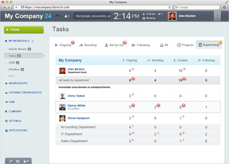
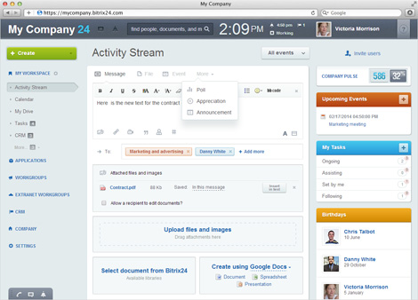
Bitrix24 is currently offering a free account with 10 GB of extra online storage. If you are not familiar with it, Bitrix24 is a unified collaboration and communication platform. In plain English, this means that all the tools that you typically use to collaborate with co-workers and communicate with clients and partners are available in one place.
Bitrix24 features:
- Company intranet
- Group chat and videoconferencing
- Tasks and project management
- CRM and sales management
- Virtual telephony
- Company email server
- Document management
- File sharing and synchronization
- HR management
- Calendars
- 25+ other tools
Bitrix24 is 100% free for up to 12 users and is available in cloud or as a self-hosted software you can put on your server. Here’s how to get extra 10GB for your cloud account. Go to Bitrix24.com and enter your e-mail. When you confirm your e-mail address, you’ll be forwarded to a registration form. You’ll see «I Have Promocode» link in the lower right corner. Enter GRAIN10 there and after refreshing your browser, you’ll see your available storage space expand to 15 GB (this may take 5 to 15 minutes, so don’t sweat if you don’t see it right away).
This giveaway ends in two weeks, so don’t procrastinate.
——————–
Interested in sponsoring grain edit? Visit our sponsorship page for more info.
——————–
Also worth viewing:
Neue Grafik Re-release
Anymade Studio
Tom haugomat
Follow us on RSS, Instagram, Pinterest, Wanelo,
——————–
Thanks to this week's Sponsor // ThemeIsle: WordPress themes


