I love boxes. And I love seeing how other people organize their stuff. Knowing that, you will understand why I love this short video by filmmaker Casey Neistat in which he explains a clever organizational system, consisting of 39 little red boxes.
Workspace Organization System of Little Red Boxes
Reviewed: New Name, Logo, and Identity for NOS by Wolff Olins
To: Us. From: We
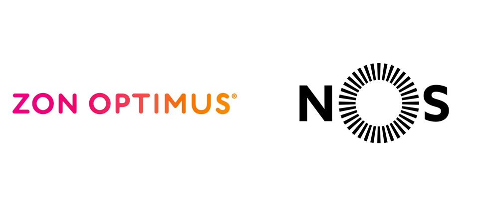

The result of the 2013 merger between two already significant Portuguese companies, ZON and Optimus, NOS, established this May, is a telecommunications and entertainment mega group offering cable television, mobile phone service, internet, and, oh, by the way, it happens to have 30 movie theaters and is the distributor of Walt Disney Pictures, Warner Bros., DreamWorks and Paramount Pictures. With 3.5 million mobile phone, around 1.5 million television, 1.5 fixed telephone and 922 thousand fixed broadband Internet customers, NOS has a giant presence in Portugal. The new name means "We" and "Us" and its new tagline, Há mais em nós, means "There's more to us". The new identity was designed by Wolff Olins.
 Old consumer brand logos. The opening image at the very top shows the interim logo between merger and launch of new name.
 The new name signals this idea; NOS means 'we' in Portuguese. The visual identity is a wheel formed of multicoloured individual spokes, which expresses the concept of unifying people; we are stronger together. Future products will make it easy for groups to connect and share.
Wolff Olins news page
 Logo detail.
 I am in no way familiar with the old consumer brands of ZON and Optimus so if they had any significant equity perhaps our Portuguese readers can help us out in the comments. What I do know is that they would be perfect as logos for a rave. They were a tad too expressive but more power to them for going all out.
The new logo seems far more appropriate for a company this size and certainly commands with more seriousness. The radial motif may not seem like the most original idea but I appreciate that it relates to the concept stated in the quote above even if, as usual, it's a little too poetic to be taken overly seriously. More than spokes unifying people I like how it has a burst-like appearance, as if every time you interact with a NOS product or service it's a spark of entertainment (or a bill, too, I guess). The logo looks nice small and big, it's readable, and it's simple. The animations below add a great level of playfulness to the logo and the colored wheel that becomes the driving element of the identity.
One of many engaging logo animations. See them all here. Business cards.
  SIM card.
  Packaging.
 The applications literally revolve around the cropped, colored wheel used big and bleeding off of every canvas. It's a relatively interesting device and, at this point, with the launch of the new brand, its endless repetition is a good way of making sure people associate it with NOS and start to recognize its visual language whether it's an ad for cable TV or on the side of a movie theater. And, agreed: it gets repetitive. As Fonts in Use points out the sole brand font used through the identity is Azo Sans by — quite appropriately! — Portuguese type designer Rui Abreu, which feels like a pleasant cross of Gotham and Gill Sans with some extra European flair.

 Building signage. Photos by Rui Abreu via Fonts in Use.
 Outdoor ads. Photos by Rui Abreu via Fonts in Use.
 Filmed in three cities — Bucharest, London and Lisbon — the campaign was designed by the advertising agency Havas, produced by the Ministry of Films and with media planning by Arena. The spot takes us on a journey through the imaginary world of television and cinema, bringing together various scenarios of this and other worlds. The journey ends at the mythical Queen concert at Wembley Stadium at which the main character of the campaign joins Freddy Mercury at the 1986 concert that was part of the Queen's Magic Tour.
NOS press release (PDF)
2-minute brand video to the probably very costly licensed tune of Queen's "Don't stop me now".Overall, the logo and identity lack the typical graphic fireworks of Wolff Olins but I think in its more tempered approach and restraint the company is better served by this solid identity that has to stand for a lot of different services and offerings and, at this point, it's about making sure people know these are all connected. Plus, Queen. Always a winning approach.

Noted: New Logo and Identity for Tapit by Moving Brands
I'd Tap That


On 1 July 2014, Tapit [became] the first smartphone app on the Swiss market that allows users to make payments, collect loyalty points and open doors in a single, neutral ecosystem. Tapit will initially enable cashless payments in shops in Switzerland and abroad using Visa credit cards and prepaid cards issued by Cornèrcard, with MasterCard credit cards issued by the Aduno Group/Viseca to follow in the near future. Tapit is a shared platform for the three mobile providers in Switzerland: Swisscom customers will be the first to benefit from Tapit; the service will be available to Orange and Sunrise customers at a later point this year."
Design by: Moving Brands
Opinion/Notes: On its own, the wordmark is a little wonky and off balance but when it gets surrounded by the minty-fresh sparks it works better. The animation work is really nice and subtle and cropping on the explosion of sparks for static applications works quite well.
Related Links: Moving Brands project page
Swisscom press release
Select Quote: The characteristic 'Tapit sparks' were created to suggest this sense of physical to digital 'contact.' At key interaction points, the sparks inform the user of progress, and through considered animation, colour and behaviour shifts, they constantly ensure confidence in the security and functionality of the app.
Outside of the app, the sparks' application can be energetic, helpful or informative, allowing communications to attract, guide or inform the user. Created in Processing, the sparks are carried through both the expressive and structural textures, as well as the pictograms. The result is a simple to apply yet powerful digital-first identity.
 Logo detail.
Logo and system presentation.
  App/smartphone usage.
  App screen.
Linked: Dayton Flyers Angst
Jinxy Jenkins, Lucky Lou
Mary Vaux Walcott
Acorn Speaker
The Adobe Illustrator Story
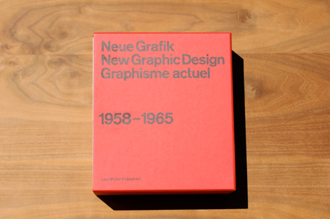
Neue Grafik Re-Release
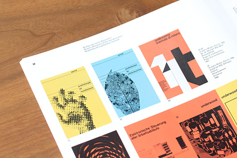
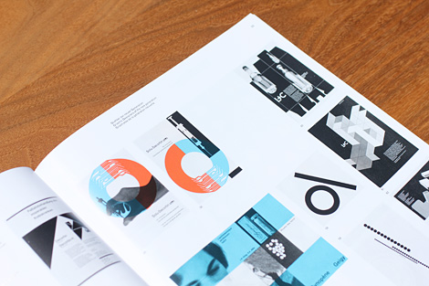
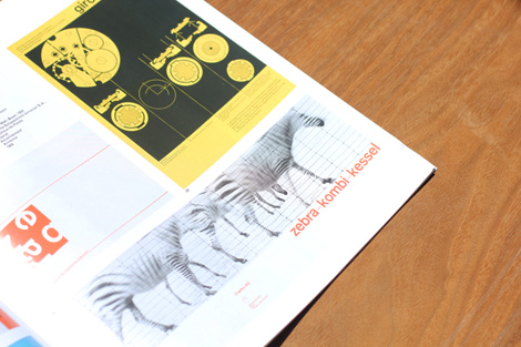
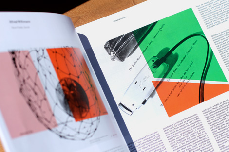
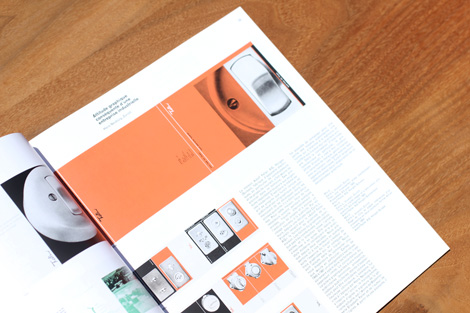
In 1958, the inaugural issue of the Neue Grafik – The International Review of graphic design and related subjects – was launched by four Zürich-based designers. Led by Josef Müller-Brockmann, Richard Paul Lohse, Hans Neuburg and Carlo Vivarelli (LMNV), the journal became a catalyst for an emerging movement in design known as the Swiss School or International Typographic Style. Marked by its asymmetrical layouts, sans-serif typeface and strong use of grids, the International Typographic Style placed heavy emphasis on clarity and precision. Throughout the journal’s history, this rigid yet versatile approach to design was employed and readily adopted by the design community at large.
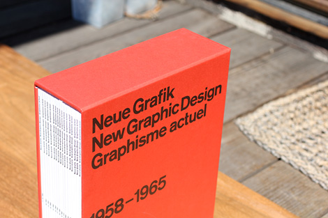
Original copies of Neue Grafik are scarce and rarely surface on the open market with single issues fetching three hundred dollars or more. With this in mind, I’m excited to announce the re-release by Lars Muller of this significant and sought-after periodical, with all eighteen issues now available as a facsimile reprint. Contained within a stunning red slipcase, the set also includes a 64 page booklet with commentary by Steven Heller, Lars Muller and Richard Hollis.
Copies are available at Lars Muller.
——————–
Also worth viewing:
Bunker
Timothy Hunt
Tom haugomat
Follow us on RSS, Instagram, Pinterest, Wanelo, Luvocracy
——————–
Thanks to this week's Sponsor // Iconic: A Photographic Tribute to Apple Innovation
Geckos In Space
The drone you should buy right now
Postcard Club
♥ / Readymag
A big thank you to Readymag for sponsoring this week’s RSS Feed.
Great tools always inspire to create better content and express oneself.
Readymag is a simple and elegant publishing platform that helps you to create microsites, digital magazines, presentations and photo stories. Don’t think about the code, with Readymag you just click, drag, drop, scroll, swipe and have fun!
Try R/m today for free — readymag.com
(Interested in sponsoring a week of my RSS feed, learn more here.)
Reviewed: Friday Likes 95: From Graphical House, Andrés Guerrero, and Danny Demers
From Graphical House, Andrés Guerrero, and Danny Demers


Plenty of beautiful and playful projects this week, with work from Glasgow, Murcia, and Montreal.
Scotland Can Make It! by Graphical House

Scotland Can Make It! is a part of the Glasgow 2014 Cultural Programme which in turn is part of the 2014 Commonwealth Games to be played in Glasgow, Scotland. It's a collection of limited edition souvenirs created by leading Scottish designers and artists collaborating with local producers and crafters. The identity has been designed by local firm Graphical House and features one of the loveliest weave logos I have seen in a while. It's delicate, it looks crafted, it has a great hand-made feel to it, and it looks fantastic in gold. Paired with the thin-stroked hexagon shape with its medal-like type, gives the two badges a great "official" look. There is also a lot go black-and-white applications that lose the elegance of the gold on tan color palette but, still, that weave icon is to swoon for. See full project
La Trócola by Andrés Guerrero

Consisting of four members, La Trócola is an alternative circus act performing in Spain with a dose of humor and unconventional methods. There isn't much to the identity but, BUT, the logo is doing a flip. And it's awesome. It does suffer from some readability, specially if you are not used to the "La"s and "El"s of Spanish but this captures the idea and spirit of the company quite well. Its deadpan use of a sans serif rotated in increments of 45 degrees is what makes it work — the upside down "Ó" is just downright hilarious (if you are into accent and typography humor). See full project here.
Kinfolk Gathering by Danny Demers

Portland, OR-based Kinfolk magazine organizes workshops and dinners, Gatherings, hosted by different community members from around the world based on a specific theme. For the Art of Camping in Montreal, Danny Demers helped host Diane Garcia with an outdoorsy, hipstery, greatly typographic identity that many restaurants wish they had, from branded cloth napkins, notebooks, and three or four logos all delightfully executed. If only camping were this sophisticated. See full project.

Tetons and Snake River, Planet Earth
Noted: New Logo for ThinkGeek
Think Again


(Est. 1999) "ThinkGeek is an American online retailer that caters to computer enthusiasts and other 'geeky' social groups. Their merchandise includes clothing, electronic and scientific gadgets, unusual computer peripherals, office toys, pet toys, child toys, and caffeinated drinks and candy. ThinkGeek was founded in 1999, is based in Fairfax, Virginia, and is owned by Geeknet." (Wikipedia)
Design by: N/A
Opinion/Notes: Not a lot of info or stuff to see but it doesn't take a genius, dork, or geek to realize this wasn't the best update. The old logo wasn't great-great but it definitely had a dorky look with the unpleasant brain and typewriter font. The new one is sort of a good idea with the two "K"s clashing in the center but there is no real point to it, nothing geeky — although I guess having "geek" mirrored is geeky. I would qualify it more as spazy. For an accurate understanding of the difference between these terms please refer to this important SNL sketch. Also, the rounding of half the corners of the letterforms… that's straight-up loser behavior without the saving charm of a geek.
Related Links: ThinkGeek blog post about new look (no mention of logo though)

Linked: Turnpike Vs. Pizza

Link
The New Jersey Turnpike Authority is suing Jersey Boardwalk Pizza in Florida for "trying to trade upon the fame of the Garden State Parkway logo to attract customers and potential franchisees".

Comeuppance
You Are Not A Storyteller
(via David)

