
I find this Dot Desk over on the Land of Nod quite charming. Perfect for a small corner desk in a small apartment.
I find this Dot Desk over on the Land of Nod quite charming. Perfect for a small corner desk in a small apartment.

My studiomate Carly put together this Pinterest board titled “This Makes Me Uncomfortable“. It’s so bad it’s good. Just what I needed after a day of looking at Excel spreadsheets.
Thanks College Humor for breaking down NetNeutrality. Also, go to dearfcc.org to make your voice heard!

The talented and delightful Gael Towey recently started a short film series called Portraits in Creativity in which she documents artists and their inspirations, revealing the courage and curiosity that propel the creative act.
Last night she launched her latest short film on illustrator Maira Kalman. It’s a deep yet humorous glimpse into Maira’s world, a woman I hugely admire. Watch it.
(In 2012 Maira gave a beautiful Maira’s CreativeMornings talk)
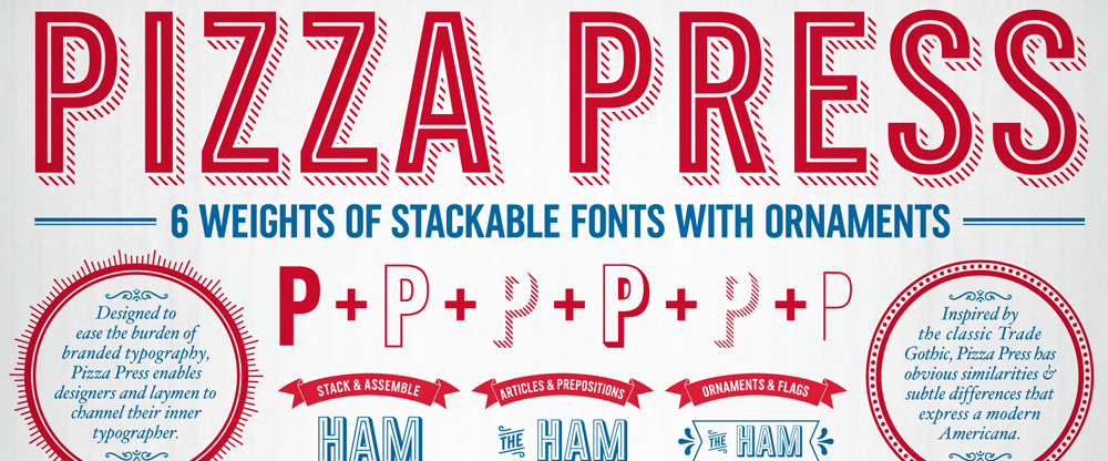
Established in 1960, Domino's Pizza is one of the most recognized pizza delivery companies in the world with a network of nearly 11,000 company-owned and franchise-owned stores in the United States (hosting 4,986 of them) and 70 other countries, delivering more than 1 million pizzas a day worldwide. Over the past few years, those pizzas have been delivered in increasingly better-looking boxes with elaborate illustration and typographic schemes that have gone beyond the early days when the boxes sported nothing more than the Domino's Pizza logo. Since 2008, Crispin Porter + Bogusky (CP+B) has been their agency of record and have shepherded Domino's through an evolution in good design — you might remember 2012's sexy, black Handmade Pan Pizza box— bringing us to the project at hand: Pizza Press™, a custom type family commissioned by CP+B and designed by Monotype Studio.
— Function as a series of modular fonts that could be layered in various ways to add flexibility, variety and excitement to Domino's brand voice
— Latin character set that used capitals only
— Function across a range of sizes and environments including packaging, web and broadcast
— Weights that could be used reasonably for smaller headlines and text
— Pair well with the existing Trade Gothic typeface family in use
Collaborating closely with the CPB team, Terrance Weinzierl of the Monotype Studio designed the Pizza Press™ typeface.
Based on a 19th century model, in the American Gothic tradition, the condensed typeface was spaced loosely so the shadow weights would not overlap.
Weinzierl designed optical variants of the 'Antique' stripped weights — a regular and a display--to function well in a range of sizes and environments.
The typeface is currently in use across Domino's packaging, advertisements, broadcast, websites, apps, and POS across North America and Europe.
This is not our typical before/after post or even a new identity post. The logo hasn't changed and even the identity itself isn't much different from what we've been seeing out of Domino's in the past couple of years. This type family, however, represents a fantastic new tool to help Domino's deliver (pun!) its brand and visual identity in a consistent and easy-to-use manner across the world. By taking the guesswork out of how many lines in the shadow or what kind of ornaments to use or how thick should the inline be, it's all baked (pun!) into a single, stackable type family that any franchiser, employee, or vendor can easily use. It also helps that the resulting letterforms are quite handsome and exude a tasty Americana feel that makes those million of boxes look more appetizing.
Creation and utilization of the Pizza Press font has permitted Domino's to simplify and reduce branding and marketing costs for its franchisees and international markets.
CPB is very pleased with the font. It changed what was a very time and labor intensive process--manually copying and pasting outlined vector art to layout--into a task as simple as typing on a keyboard, literally!
We don't tend to think of Domino's as purveyors of high-end design (or pizza for that matter) but their recent efforts, and this type family in particular, are remarkably outstanding for a company of this size, specially considering that it's 96% franchise-owned, and each owner has to be empowered and is independently responsible to keep the brand on track. We also have to consider that ad agencies have never been well regarded among the graphic design industry for their typographic abilities — to spell it between the lines: they suck at it — so having this comprehensive and really nice type system in place helps Domino's at every step of the way to have a consistent application that is above and beyond what's expected from them. Now, somebody please tell me that there is a secret glyph with the Noid on it.
(Est. 1927) "The LCBO (Liquor Control Board of Ontario) is an Ontario government enterprise and one of the world's largest buyers and retailers of beverage alcohol. Through 639 retail stores, catalogues, special order services and over 217 agency stores which provide cost effective, convenient and socially responsible access for rural consumers, the LCBO offers nearly 24,000 products annually to consumers and licensed establishments from more than 80 countries."
Design by: Leo Burnett
Opinion/Notes: The old logo wasn't terrible but it wasn't good either. It looked more like a winery- or brewery-specific logo as opposed to a retail store carrying a broad number of products. The new logo is much more fashionable… perhaps too fashionable, feeling more like something you would see at a shopping mall with techno music coming from inside. I like it as a wordmark but I just don't see the relationship between it and the business.
Related Links: Marketing Mag story
blogTO story
Select Quote: The brand refresh rolled out rather quietly — the new logo made its public debut in May, appearing in the LCBO's newspaper insert and some in-store collateral — in part because the company wasn't out to make a dramatic overhaul to its brand and stores all at once. "We're a government agency and don't have the budget to do that, so it's not a big, splashy launch like some retailers might do," said Kerri Dawson, vice-president of marketing at the LCBO. […]
The LCBO's new corporate logo has a more simplified look; gone is the grapevine in the background. "It was time to make it more clean and defined and contemporary," she said. There are also new letterforms, including a loop in the ‘b.' Dawson sees the new logo as more approachable, fun and casual.
Supernew Supergraphics by Unit Editions
This week we’re excited to feature titles from Chronicle Books, Nobrow, Flying Eye Books and Occasional Papers. See all the books after the jump.
Supernew Supergraphics
Edited by: Tony Brook, Adrian Shaughnessy and Sarah Schrauwen / Design by Spin / Published by Unit Editions
320 Pages / Softcover with slipcase
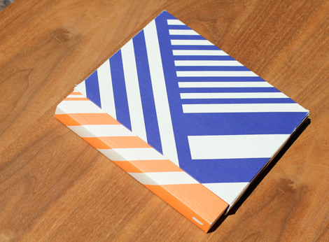
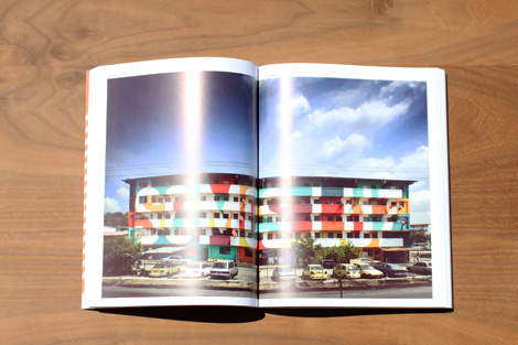
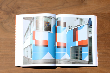
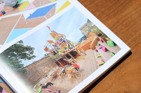
Supernew Supergraphics is a collection of the best architectural, environmental and interior graphic design. This all-new book shows how the current generation of designers and architects are blasting typography and graphic forms across walls – even landscapes. It shows how they are distorting space and warping entire buildings with colour, typographic messages and abstract shapes.
Available at Unit Editions
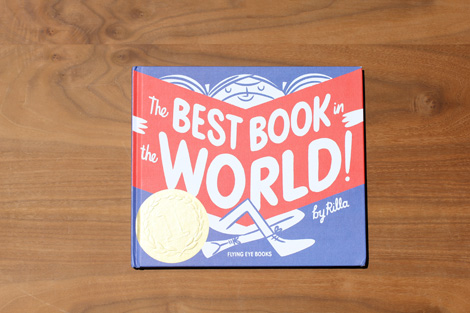

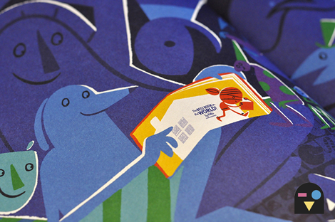
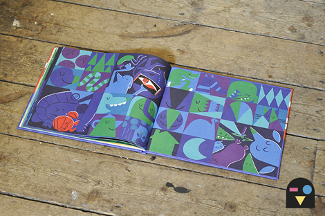
The Best Book in the World
By Rilla Alexander / Published by Flying Eye Books
If you found the best book in the world, would you stop reading? Could you stop reading? If you had homework to do, or dinner to get through, could you put the book down? On a train to the zoo or on a flight to Kalamazoo, would that break the spell? If in a forest you walked, while scary monsters stalked… would that be enough? If every animal in the land were to be led by a big band, in a grand parade in your honour made… would you put the book down?
Join Rilla Alexander for an unforgettable and magical tale that encourages children to read.
Available at Amazon, Flying Eye Books and your local book shop.
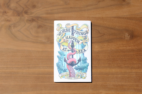
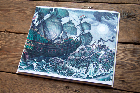
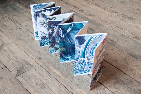
Worse Things Happen at Sea
By Kellie Strom / Published by Nobrow
20 pages / 5.6″x9.1″
Inspired by tales of mythical sea creatures and the tall stories of doomed voyages passed down from sailor to son, Strøm brings us a rich tapestry of wonderment. Historical ships are attacked, enveloped and engorged by monstrous creatures surfacing from the deepest depths of the darkest oceans. Covering 20 panels each measuring 13.8cm x 23.5cm the image unfolds in front of you like a foreboding fable from the cracked lips of an old sea captain.
Taking over two years to create, the faux engraved colour separation style used for this project has been a departure from his two previous picture books, both illustrated with full colour acrylic paintings. In both techniques Strøm wrestled with creating detailed immersive worlds while also trying to preserve some of the immediacy of the original physical art.
Available at Amazon, Nobrow and your local book shop.

Please Come to the Show
Edited by David Senior / Published by Occasional Papers
160 pages
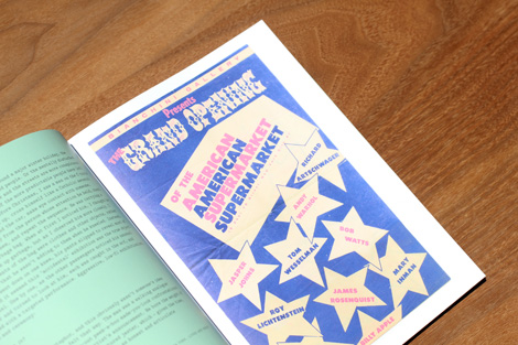
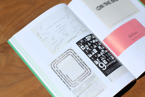
David Senior, bibliographer at the Museum of Modern Art Library in New York, selected a wide range of exhibition-related ephemera – invitations, flyers and posters from the 1960s to the present – and presents them here as an historically overlooked but integral aspect of exhibitions. Often the first point of contact between the audience and artist, such items form part of an essential lexicon for graphic designers, curators, art historians and anyone interested in the event-based nature of showing art. Filled with full-colour reproductions of numerous examples from the MoMA collection, the book includes new essays by Gustavo Grandal Montero, Will Holder, Antony Hudek, Angie Keefer, Clive Phillpot, David Senior and Suzanne Stanton.
Available at Occasional Papers
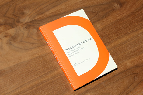
Design School Wisdom: Make First, Stay Awake, and Other Essential Lessons for Work and Life
Edited by Brooke Johnson and Jennifer Tolo Pierce / Published by Chronicle Books
128 pages / 7 1/4″ x 10″
This treasure trove of pithy aphorisms, longer-form essays, and first-person interviews compiles years of design school education into one comprehensive yet compact book. Here are lessons in life and work, learned both in the classroom and on the job, from design teachers, students, and gurus, covering everything from practical know-how to big-picture brilliance.
Available at Amazon, Chronicle Books and your local book shop.
Disclosure: Some of the links in the post above are “affiliate links.” This means if you click on the link and purchase the item, we will receive an affiliate commission. Regardless, we only recommend products or services we use personally and believe will add value to our readers.
——————–
Also worth viewing…
2013 Book Gift Guide
Recently Received Books: April
Recently Received Books: May
Follow us on RSS, Instagram, Pinterest, Wanelo, Luvocracy
Thanks to this week's Sponsor // Tesla Themes - Insanely customizable and mobile-friendly, thanks to their responsive design!

Social Good Ipsum is Hyperakt’s spin on the Lorem Ipsum generator, pulling words and phrases from the humanitarian, do-gooder world they are immersed in. Because wouldn’t you rather “Equal opportunity mobilize; Global, accessibility, fairness NGO support; technology. Invest billionaire philanthropy humanitarian relief natural resources outcomes. Peaceful overcome injustice collaborative cities, gender rights youth change-makers save the world” than a string of Latin?
Go ahead, try adding a little compassion to your comps: socialgoodipsum.com

 Intro to Pizza Press™.
 The type family available in Regular, Inline, Fill, Outline, Shadow, Antique, Antique display, and ornaments.
  Keyboard map for ornaments.
  Praise as type specimen.

 Type specimens.

 Pizza boxes.

 Sample of existing stores. Not bad.
 New store design by