Linked: Football Religion Kits
Shark Lake
The 1979 Moto Guzzi LeMans
Reviewed: New Logo and Identity for MapQuest by Futurebrand
Wrong Way
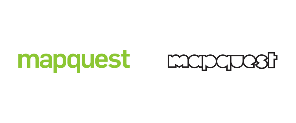

First launched in 1996, MapQuest was the first mapping service that most of us used within the confines of our desktop computer to figure out how to get places. How things have changed. Now, Google Maps and Apple's iOS Maps (and even Uber's own mapping system) are the de facto applications we use on desktop and mobile, leaving Mapquest far behind. Owned by AOL since 2000, Mapquest has yet to make its way back into the mainstream consciousness, even after a drastic redesign in 2010 by Wolff Olins. That weird being in the logo has slowly disappeared since then and a new wordmark silently replaced it at some point. Now, making another go at gaining relevance, Mapquest has introduced a new strategy and identity designed by the New York office of Futurebrand.
There was a time when MapQuest was synonymous with mobility and mapping. But in recent years, the company has suffered from declining market share and dated associations. In addition to being essentially non-competitive with similar services from Apple, Waze, and Google Maps, the brand lacked resonance with consumers. With all this in mind, MapQuest came to FutureBrand with a big ask: rebuild trust and excitement for the brand--and push consumers to rethink the internet's original discovery engine.
Futurebrand provided text
 New messaging.
 That meant positioning MapQuest as not-another-tech-company, balancing boldness and humanity to bring the company closer to consumers' lives. FutureBrand worked with the company to carve out an ownable brand idea: everyday heroism. The new logo is inspired by the fact that every map is the start of something that could change the day. It represents the intersection of two paths and symbolizes the countless routes and infinite connections MapQuest has made possible for years. It's also the starting place for every part of a dynamic graphic tools kit that sets MapQuest up to announce itself in a new age.
Futurebrand provided text
 Logo detail.
 It's no surprise that the animal-m-q logo disappeared and I find it hard to cope with that I was somewhat positive in its execution at the time of my review. As that logo disappeared, an unassuming wordmark appeared and there is absolutely nothing to it other than it's green. The new logo draws a line in the sand and starts over from scratch. The new wordmark is… interesting. Part of me wants to like and embrace its bluntness and awkwardness but the other part of me if is all, like, "I've been to MySpace and I don't need to go there again." The visual direction taken feels demographically off-target or confused: I don't see my parents being attracted to it, I don't find myself attracted to it (and I'm not that old), so that leaves 20-year-olds and I doubt they will embrace this. Going with a youthful and relatively edgy approach is admirable — and, hey, it's not a geometric-slash-humanist sans! — but I do question if it's the right approach.
Execution-wise, the wordmark is hard to digest. These are not pleasant shapes to look at. The "m" in particular is off-putting in its imbalance — why is the left stem almost double the width of the right stem? The "e" and "s" feel diminutive compared to the rest of the letters. The only nice thing I can find is that the strokes of the letters are shared. Perhaps others will find some genius in this — paging Mark Kingsley — but I doubt it.
Logo animation. Logo variations.
 Logo variations on photography.
 The logo's hook is that "map" and "quest" can be separated and different kinds of icons can be inserted in between the mirrored "p" and "q" shapes. In theory this is cool but all the icons and drawings feel cheap or as if they were done in a rush.
 Digital presence.
  Social media presence.
Brand video.
 What makes the logo stand out in a strange way is that it has a completely different vibe from the rest of the identity, that uses moody, hipster-y black and white photography and an otherwise nice supporting sans serif (best seen on MapQuest's website). There is a contrast between the logo and the rest of the things that isn't well bridged or justified. The new identity is definitely different from anything that Google Maps or Apple's Maps is doing or will ever do but that's because they own the market and don't have to try as hard as MapQuest is right now.

Noted: New Logo and Identity for Puerto Rico FC by Diego Guevara
Rico Suave


(Est. 2015) Puerto Rico FC is a Puerto Rican football club based in Bayamón, Puerto Rico and owned by New York Knicks NBA Star Carmelo Anthony that is scheduled to join the North American Soccer League (NASL) in time for the 2016 season.
Design by: Diego Guevara (Miami, FL)
Opinion/Notes: It's hard to argue against Hoefler & Co.'s Vitesse and this logo/identity is all Vitesse all the time. As a typographic exercise it's all good: the arched type, the type on a curve, the type straight up… it's all nicely executed. The main issue I have with the logo is that it could say Los Angeles FC, Bahamas FC, Mexico City FC, whatever, and it would still work. There is nothing inherently Puerto Rican or not Puerto Rican about it, so it's fairly exchangeable. This is not a terrible crime and I'm happy for my friend (and 6-time BNConf attendee) to get such a cool project but even one visual nudge — in the logo or identity system — that would point to something specific about Puerto Rico would be a boost.
Related Links: Diego Guevara blog post
Puerto Rico FC press release
Select Quote: The circle shield combines unity and team spirit, while the football represents the love for the game and connection to the NASL. The circle shield follows european tradition, connecting old football with the new game, making the logo effective. The logo distances itself from other league team logos by featuring a modern and clean monochromatic timeless design able to work on print, web, social media, and merchandise without significant modifications.
The typography is bold, modern and features a variety of weights that will help communicate and establish a brand voice. It is part of a stylized banner that wraps the shield, which also serves as an independent badge, branding tool, or stylized monogram.
 Logo detail with sexy orange smoke.
  Color versions.
  Typography.
  Message from Carmelo.
 Ads.
Ads. 

 Merch and swag.
  T-shirt.
  Press conference.

 Sketches and process.
Linked: The Daily Show with Trevor Noah
Link
Troika has designed the logo and new opening for Comedy Central's The Daily Show with Trevor Noah.

Punny Names
Ulysses Origins
Eclipse of Rainbow
Horseshit Detector
Channel 4 rebrand
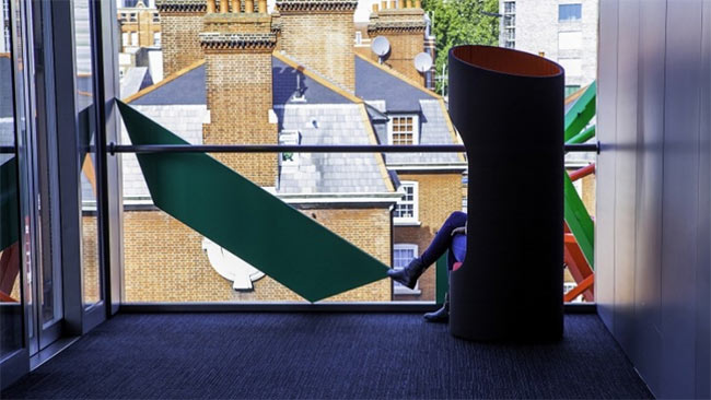
UK broadcaster Channel 4 unveiled a new identity yesterday, designed through a collaboration between DBLG, Steven Qua, Brody Associates, and the in-house 4creative.
There’s scope to for the identity to grow and stay fresh, and despite not actually being shown in the idents, the design idea from Lambie-Nairn’s classic Channel 4 logo is an integral part, so there’s a familiar sense of continuation that makes sense given the success of the original.

Lambie-Nairn’s 1982 design

And updated for the rebrand
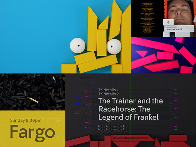
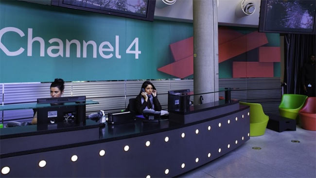

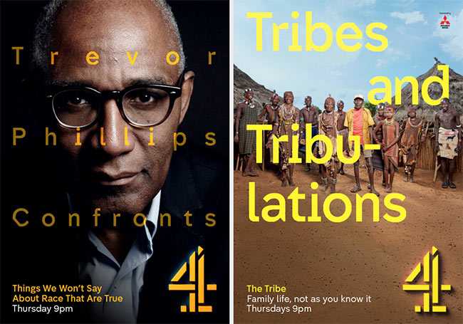
Neville Brody and his team were commissioned to design two new typefaces — Horseferry (for display) and Chadwick (for information).
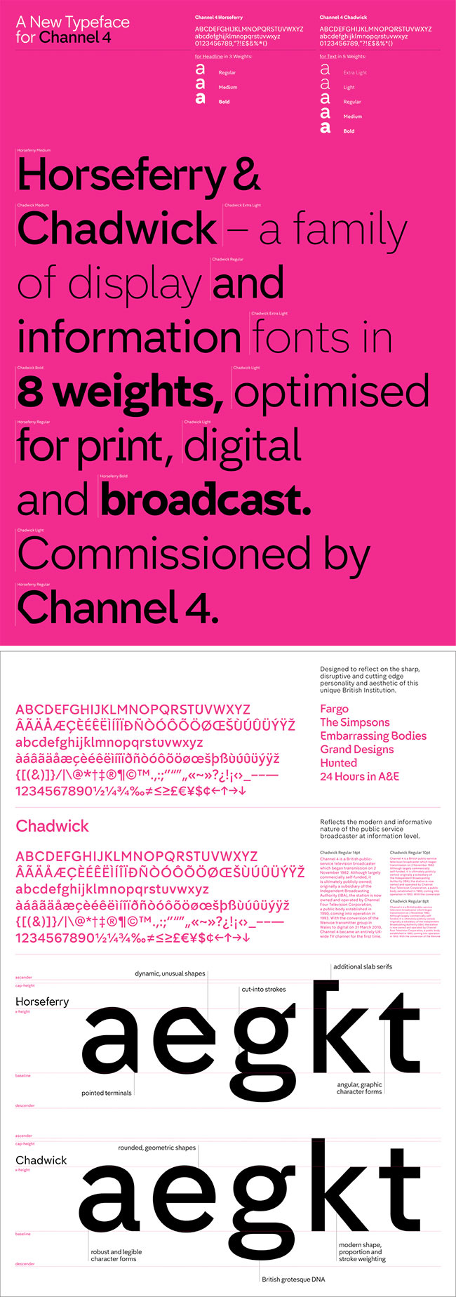
Channel 4 type design
“Horseferry is designed to reflect on Channel 4’s sharp, disruptive, cutting edge personality and aesthetic as a unique British Institution. Chadwick reflects the modern and informative nature of the public service broadcaster at information level.”

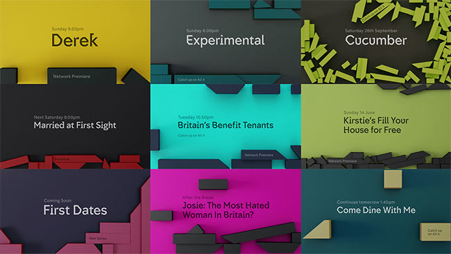
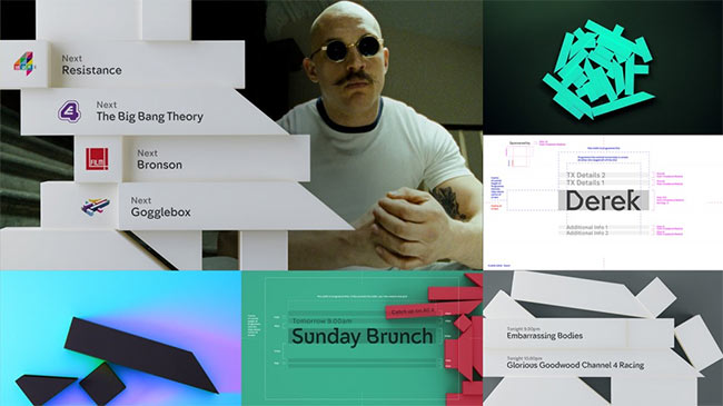
A “four-part narrative” was produced by Academy Films, shown in the compilation below. They’re the biggest risk, because other than the abstract relationship between the Kryptonite blocks and the deconstructed logo (around the 1 minute 10 seconds mark) it’s unclear how they tie in.
They’re to be continued.
Read more about the project on:
Channel 4 (includes credits for everyone involved)
Creative Review
The Branding Source
According to Creative Review, the project lasted three years.
Mother of our Towns
Local Color
The UnTold Story of the Texas Biker Gang Shoot-out
Sensible Data
Color Hunt
Evolution of a Software Engineer
Linked: Opening at Illustria
Edward Hopper
Vintage Tribune
Reviewed: New Identity and Packaging for KFC by Grand Army
Colonel's Second Tour


Established in 1952 with its first franchise location in Salt Lake City, UT, Kentucky Fried Chicken (KFC) — headquartered in Louisville, KY — is a fast food restaurant specializing in fried chicken. Buckets of it (since 1957 when the concept was first introduced). Today, KFC has more than 18,000 outlets in 115 countries around the world. Earlier this year, KFC brought back its founder, Colonel Sanders, as the centerpiece of its brand and marketing efforts. After an ad world kerfuffle of some kind, KFC moved its business from FCB to Wieden + Kennedy who instituted Saturday Night Live alum Darrell Hammond to play the part of the Colonel with vintage aplomb. Along with Mr. Sanders, came a graphic throwback to vintage KFC packaging designed by New York, NY-based Grand Army.
Launch ad for new campaign by W+K featuring SNL alum Darrell Hammond.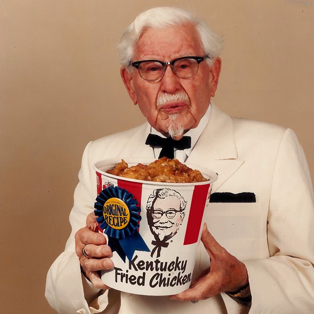 The original bucket with the original colonel Sanders.
 As part of a comprehensive rebrand and repositioning for KFC, GrandArmy was asked to re-imagine the brand's identity and visual language. Everything from buckets to napkins to signage was re-thought, and our first target was the Colonel. We simplified and stripped back the legendary Sanders, mixing heritage with a modern, flattened rendering of KFC's iconic founder. On packaging we harkened back to the playful red bars, "11 herbs and spices," and bold black Col Sander's faces that had made KFC so unmistakable.
Grand Army project page
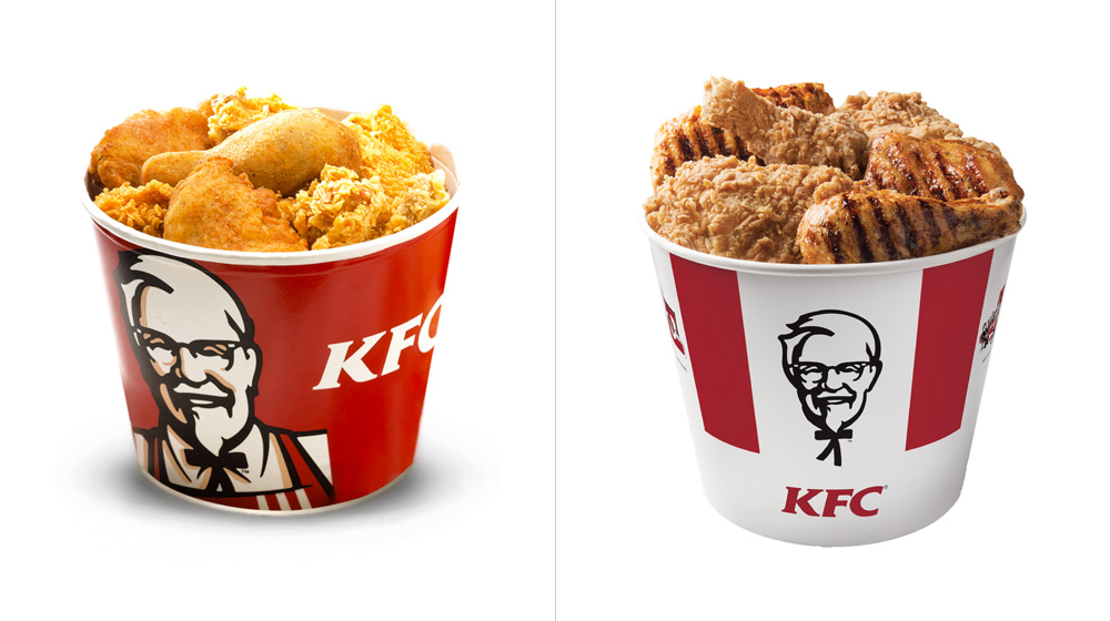 Sample of a before bucket (there are dozens of different ones so this is just an approximation) and the new one.
  The bars.
 The most significant aspect of this project and the one that undoubtedly stands out the most is the return of the ridiculously minimal red bars. It's almost baffling that such a simple and effective solution required decades to come back into style. If you search for "KFC bucket" on Google Images, the results can verge on the depressing with buckets filled with all kinds of graphics and swooshes and promotions and hash tags. Unfortunately, it won't be long before these minimal buckets suffer the same fate because money but, for the time being, we can relish in their simplicity.
Taking the graphic Colonel out of the tilted square graphic highlights the great drawing and placing it floating between the red bars frames it in a much more interesting way and is as close a modern replica as the original bucket picture a few scrolls above.
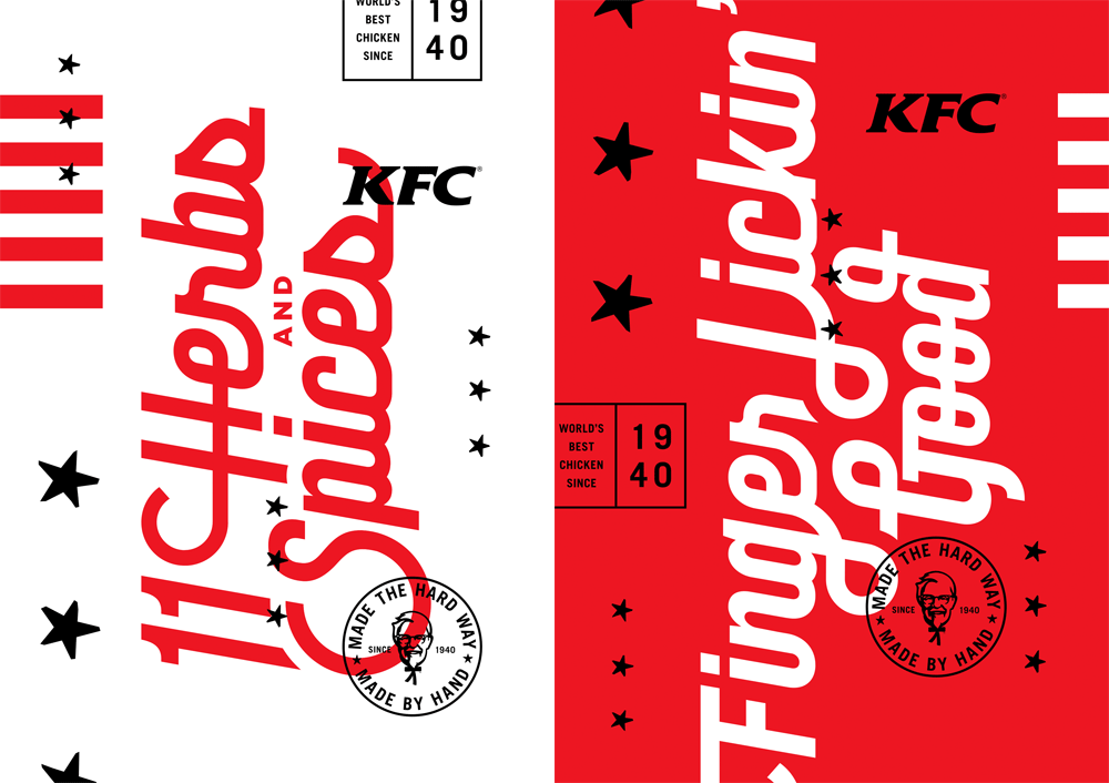

 Some typographic stylings. Not implemented but oozing with vintage grooviness.
 There are a few typographic directives established (or at least explored) by Grand Army that don't seem to have caught on with the Wieden + Kennedy campaign. But that's cool, we can still take a moment to appreciate them and wonder What if? In final execution, a condensed sans and some brush fonts have been put to use and it's quite decent.
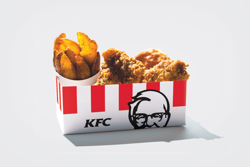
 Packaging as designed and proposed by Grand Army.
  Actual packaging in use.
  The new bucket with the new colonel.
 What's most impressive is that the original design has been carried throughout a dozen different boxes and buckets and cups. Sometimes what a design firm says is not necessarily what a major brand does. That inverted pyramid image are all screenshots of the KFC website taken this morning, so it's quite reassuring that KFC is embracing this minimalist approach. The KFC website is worth clicking through as they are doing a nice job of pushing the vintage graphics and ethos of the early days of KFC delivered in a contemporary way. Even the typography on the header of the website strikes that perfect balance between old and new. Overall, a great and cohesive effort on all fronts from packaging to advertising to digital presence that makes KFC feel more genuine and home-made than its fast food competitors. (I would still take a home-cooked meal any day of the week).

Free Hand-Picked Resources for Designers and Developers – September Edition
Here we go with another pack of curated freebies, tools and resources for designers, this month’s selection include fresh templates, fonts, icons, programming tools and more resources! Remember to share with your friends and give us some love in the comments.
View the January, March, April, May, June, August free resources here.
SomIcons: Free 152 Icons Set for Designers and Developers
A very useful 152 icons set designed by Christian Veigt in outline/stroke design fully suitable for both designers and developers projects. This set is released and distributed free for personal and commercial use.
519 Font Awesome 4.3 Sketch Icons Set
A complete set of 519 FontAwesome 4.3 Icons in Sketch format which includes both CSS Class and Unicode files. This set was released by Sasha Lantukh.
Outline Shopping Vector Icon Set
Here you have a set of 42 outlined icons designed in classic shopping style featuring bold outline borders and bicolor fillings. This set is delivered in PSD, AI, EPS and PNG files.
Socialoha: A Huge Social Media Icons Set
A huge set of 756 social media icons set that comes in six styles. They are delivered in SVG, AI, GIF and PNG format for all of the most influential social networks nowadays.
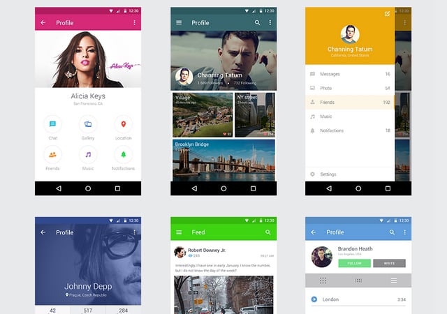
Smart Object-featured Android UI Kit
A UI kit for Android devices which features smart objects for 8 screens like profile, feed, photos, and notifications. This UI kit was crafted by Shakuro in Photoshop making it completely customizable in Adobe CS3 and free for both personal and commercial use.
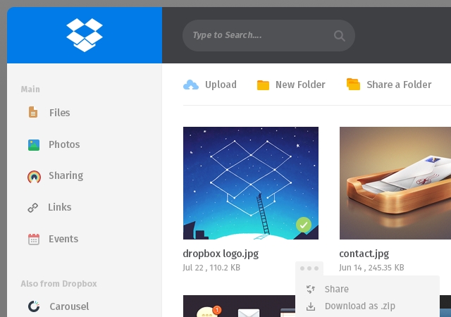
Dropbox Page Redesign PSD Template
Here you have a clean looking web template created by Muhammad Asad in which he redesigns the Dropbox interface which features flat icons and UI style. You’ll also be able to choose between two header designs, a clear and a dark one and place several menus and thumbs.
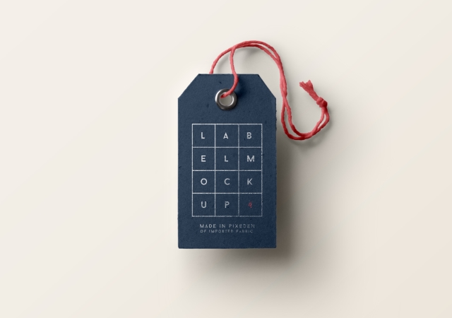
Cardboard Brand Label PSD Mockup
A high-resolution cardboard brand label mockup that helps you display in a very realistic way, what your brand logo would look like. This mockup features smart layers which give you amazing capabilities such as changing the background and cord color.
LowPoly Background Business Card Template
A huge bundle of business card templates for any type of enterprise or individuals, including plenty of textures, fonts, icons, and designs.
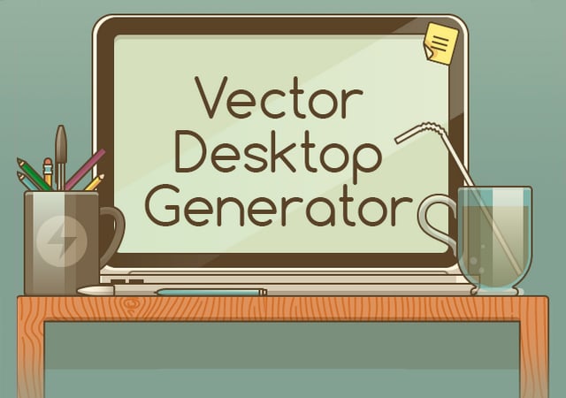
200 Desktop Elements Vector Scene Generator
A huge set of desktop elements in PSD to generate desktop scenes in PSD that features an ochre color palette and wooden texture that boosts its flat style design.
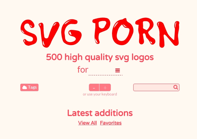
SVG PORN: 500 Categorized Vector Logos Collection
A collection of 500 high-quality logos in SVG format sorted out in 10 categories; developers, dev-ops, business, geeks, designers, teams, sharing, hackers, publishers and bloggers.
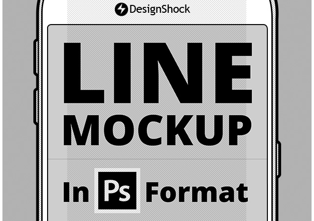
Mobile Line Mockups
A nice set of mobile outlined mockups in several views. PSD format, vector ready, smart objects based!
Bootstrap Themes Bundle
A bundle of 30 curated bootstrap themes for several sorts of websites such as agencies, catering & events, portfolios, and more.
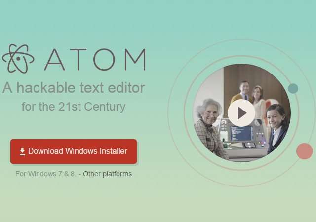
Atom: Github’s Text Editor
Atom is a modern, versatile and hackable to the core text editor developed by Github. It allows you easily using packages and themes that provide a completely customizable experience for the developer sitting by it.
JQuery Audio Effects Plugin
easyAudioEffect.js is a jQuery Plugin for adding cool audio effects to your web elements by hovering and clicking them. This plugin comes with a few sound examples and it’s licensed under MIT.
SweetAlert: A Fancy JavaScript Alert Replacement Plugin
Tristan Edwards has created this fancy-looking replacement for the typical JavaScript alert which allows you to use several type of modal like confirmations, warnings, input, and many more. This plugin is covered by an MIT license.
JavaScript Written Tooltips Featuring CSS 3D Animation Plugin
html5tooltips.js is a plugin for creating smooth and clean 3D animated tooltips fully compatible with relatively latest cross-platform browsers. This plugin also features a complete color palette and 5 different types of animation.
Google Design’s Device Metrics
A very handy tool that basically consists of a database that provides you with several metrics and physical information across assorted devices powered by Android, Chrome, iOS, OS X and Windows. Some of the main data you’ll get is screen size, aspect ratio, pixel resolution, and ideal touch size range.
TextFX: JavaScript Text Animation Plugin
TextFX is a plugin coded by Chris Cates in jQuery to make animations applied to texts. It is dependent of transit.js library since it uses CSS transforms and not jQuery animations.
Tota11y: Accessibility Visualization Toolkit
tota11y is a toolkit that helps you visualize how your site performs through exclamation tags that advice you of potential errors. It also aims to reduce the testing difficulty by helping visualize errors.
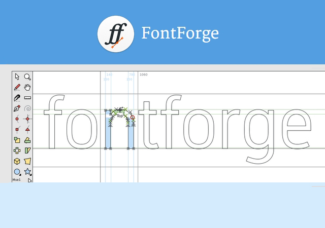
FontForge: Open Source Font Editor
FontForge is a fully featured open source font editor for Windows, Mac OS X, and GNU Linux which gives you a 96px canvas per character and comes with plenty more of features for font designing. This tool is licensed as a whole under GPL GNU, and most of its parts are covered under revised BSD license.
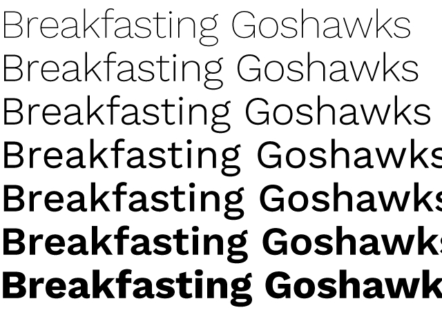
Work Sans: A Multi-weight Sans Typeface
A Sans family typeface created by Wei Huang that features uppercase, lowercase, and plenty of characters, glyphs and accentuations in 9 different weights. It is covered under SIL v1.1 license.
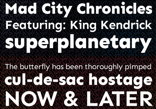
Philatype: A Collection of Diverse Modern Typefaces
Philatype is a collection of 10 different typefaces crafted with a really modern design under an SIL Open Font v1.1 license. In this collection you’ll find plenty f different styles, shapes, weights, and edges.
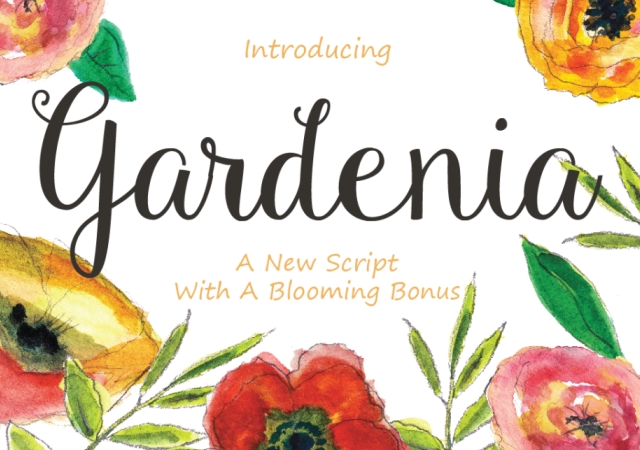
Gardenia: Botanical Suited Cursive Typeface
Gardenia is a very fancy-looking cursive typeface suitable for botanical-themed projects. This typeface features uppercase, lowercase, numerals, special characters, and accentuated vowels in both uppercase and lowercase.
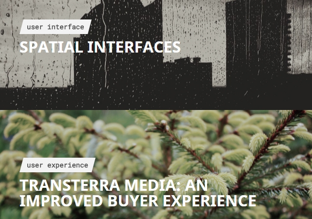
UX Handy: Daily Handpicked UX Articles
UXHandy is a daily collection of articles carefully handpicked selected in regards to user experience, user interface and user research presented in a full-width tiles layout. This collection is curated by Hubert Gawronskican and it can be delivered to your inbox day by day.
History of Icons: A Visual Brief on Icon History (Article)
A very graphic and explicative article along with examples of the whole history of icons redacted by Futuramo. The article explains the reason for designing them from the very first types to the latest ones.
Creating Realistic Text with CSS (Article)
An article that explains and shows the usage to detail of an utterly appealing realistic text creator in CSS developed by Lucas Bebber and how he managed to put bits and pieces together to create this masterpiece.
Explaining Graphic Design to Four-year-olds (Article)
Dean Vipond, a branding and interaction design consultant has documented his experience of explaining graphic design to four-year-old kids with which he got amazing results and examples from the toddlers.
There we have it, some awesome free resources from September 2015!
Noted: New Name and Logo for Karma Automotive
What Goes Around Keeps Going


(Est. 2007, originally Fisker Automotive) "Karma Automotive is a Southern California-based manufacturer of world-class luxury hybrid cars designed to challenge habitual thinking about luxury." Their only model is the $100,000+ Karma; its first make only sold a little over 2,000 units.
Design by: N/A
Opinion/Notes: Whoever typeset the old logo clearly had never set type on a curve because that F I S K E R wordmark was about to go off the rails despite being nudged in that ring. The logo itself was fairly generic and mostly forgettable. A couple of weeks ago, for the Roland Berger logo redesign, I said "if you are going to go with a steel texture, texture the hell out of it with a good rendering engine, not some half-cooked gradient" and this new logo for Karma is exactly what I'm talking about. It's not the best logo ever but they committed to a look-and-feel and they rendered the shit out of it. This looks like it could be a promo image for Interstellar. It's moody, it's futuristic, it's got a bit of HAL 9000 in it. The wordmark is unapologetically chrome-tastic and almost like a good Hollywood movie poster. It's all a little too perfect for what comes across as a pretentious luxury car that maybe does some good to the Earth.
Related Links: Karma Automotive press release
Forbes story
Select Quote: Our new logo makes a statement. Clean, elegant, modern in its simplicity. An imperfect ring, representing constant effort towards unattainable perfection, encircling the earth. With a spark of sun, the eternal symbol of endlessly renewable energy. Inner cut lines represent our three brand priorities.
 Logo detail.
New name and logo introduction. Logo animation at the end.
Linked:
Link
Love it or hate it here is my annual summary of what has happened on Brand New in the 12 months between the last and this Brand New Conference. Language NSFW in some points but you knew that already. Also, videos of all the presentations are now available for purchase at the link.


