Wrong Way
Image may be NSFW.Clik here to view.
 Image may be NSFW.
Clik here to view.

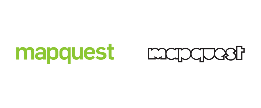
First launched in 1996, MapQuest was the first mapping service that most of us used within the confines of our desktop computer to figure out how to get places. How things have changed. Now, Google Maps and Apple's iOS Maps (and even Uber's own mapping system) are the de facto applications we use on desktop and mobile, leaving Mapquest far behind. Owned by AOL since 2000, Mapquest has yet to make its way back into the mainstream consciousness, even after a drastic redesign in 2010 by Wolff Olins. That weird being in the logo has slowly disappeared since then and a new wordmark silently replaced it at some point. Now, making another go at gaining relevance, Mapquest has introduced a new strategy and identity designed by the New York office of Futurebrand.
There was a time when MapQuest was synonymous with mobility and mapping. But in recent years, the company has suffered from declining market share and dated associations. In addition to being essentially non-competitive with similar services from Apple, Waze, and Google Maps, the brand lacked resonance with consumers. With all this in mind, MapQuest came to FutureBrand with a big ask: rebuild trust and excitement for the brand--and push consumers to rethink the internet's original discovery engine.
Futurebrand provided text
Image may be NSFW.Clik here to view.
 New messaging.
 That meant positioning MapQuest as not-another-tech-company, balancing boldness and humanity to bring the company closer to consumers' lives. FutureBrand worked with the company to carve out an ownable brand idea: everyday heroism. The new logo is inspired by the fact that every map is the start of something that could change the day. It represents the intersection of two paths and symbolizes the countless routes and infinite connections MapQuest has made possible for years. It's also the starting place for every part of a dynamic graphic tools kit that sets MapQuest up to announce itself in a new age.
Futurebrand provided text
Image may be NSFW.Clik here to view.
 Logo detail.
 It's no surprise that the animal-m-q logo disappeared and I find it hard to cope with that I was somewhat positive in its execution at the time of my review. As that logo disappeared, an unassuming wordmark appeared and there is absolutely nothing to it other than it's green. The new logo draws a line in the sand and starts over from scratch. The new wordmark is… interesting. Part of me wants to like and embrace its bluntness and awkwardness but the other part of me if is all, like, "I've been to MySpace and I don't need to go there again." The visual direction taken feels demographically off-target or confused: I don't see my parents being attracted to it, I don't find myself attracted to it (and I'm not that old), so that leaves 20-year-olds and I doubt they will embrace this. Going with a youthful and relatively edgy approach is admirable — and, hey, it's not a geometric-slash-humanist sans! — but I do question if it's the right approach.
Execution-wise, the wordmark is hard to digest. These are not pleasant shapes to look at. The "m" in particular is off-putting in its imbalance — why is the left stem almost double the width of the right stem? The "e" and "s" feel diminutive compared to the rest of the letters. The only nice thing I can find is that the strokes of the letters are shared. Perhaps others will find some genius in this — paging Mark Kingsley — but I doubt it.
Logo animation. Image may be NSFW.Clik here to view.
 Logo variations. Image may be NSFW.
Clik here to view.

Image may be NSFW.
Clik here to view.
 Logo variations on photography.
 The logo's hook is that "map" and "quest" can be separated and different kinds of icons can be inserted in between the mirrored "p" and "q" shapes. In theory this is cool but all the icons and drawings feel cheap or as if they were done in a rush.
Image may be NSFW.Clik here to view.
 Digital presence. Image may be NSFW.
Clik here to view.
 Social media presence.
Brand video.
 What makes the logo stand out in a strange way is that it has a completely different vibe from the rest of the identity, that uses moody, hipster-y black and white photography and an otherwise nice supporting sans serif (best seen on MapQuest's website). There is a contrast between the logo and the rest of the things that isn't well bridged or justified. The new identity is definitely different from anything that Google Maps or Apple's Maps is doing or will ever do but that's because they own the market and don't have to try as hard as MapQuest is right now.
Image may be NSFW.Clik here to view.

Image may be NSFW.
Clik here to view.
Clik here to view.
Clik here to view.
Clik here to view.
Clik here to view.
Clik here to view.