V is the New CMYK

(Est. 1995) "Vistaprint serves more than 16 million micro businesses and consumers each year with a broad range of customised printing, graphic design and marketing products and services at an affordable price. With a unique business model supported by an innovative use of technology, high-volume production facilities, direct marketing expertise and personalised customer service, Vistaprint offers a wide range of products and services for micro businesses and consumers. Globally Vistaprint employs over 4,600 people, operates more than 25 websites globally and ships to more than 130 countries around the world."
Design by: Tank Design (Boston, MA)
Keith Manning, Dave Ball, and Karen Bedard (In-house)
Opinion/Notes: Despite a lackluster logo history during its 19 years of business, Vistaprint has done quite well for itself printing a monumental amount of stuff to the tune of more than $1.2 billion in revenue in 2013. It could have easily kept going another 19 years with mundane, laughable, CMYK logos but has chosen instead to adopt a more mature and relatively sophisticated new identity. Its main visual premise is a healthy serving of overlays in the shape of a custom alphabet that is liberally used in applications and as the main monogram of the company, which is… fine. There is nothing overly appealing or annoying about it; it sort of exists without ruffling any feathers. It's a major improvement by comparison but, as far as it being "wicked cool"… that wouldn't be the category I would put this in.
Related Links: Keith Manning, Vistaprint creative director, project page
Karen Bedard, Vistaprint copywriter, project page
Teaser video by Indie Whip of a longer brand redesign process video
2009 logo redesign on Brand New
Select Quote: After researching global identity trends and executing many logo design studies, we determined that a simply designed, dynamic identity would best set us apart in the competitive landscape, enhance our leadership in customization and personalization, and deliver against our brand strategy. And it looks wicked cool.
 Custom alphabet.
 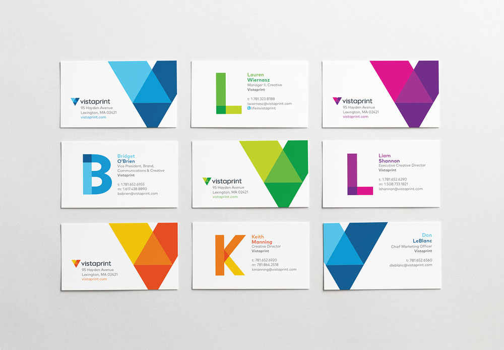 Business cards.
  Various collateral.
  Brand manifesto.