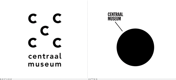
Established in 1838, the Centraal Museum in Utrecht is the oldest municipal museum in the Netherlands with an eclectic collection of old and new items — nearly 50,000 — ranging from 18th century fashion to an early twentieth-century ship stored in the basement to a special collection and wing on the work of Dick Bruna, creator of the adorable Miffy. At the end of last year the Centraal Museum introduced a new identity, designed by Amsterdam-based Lesley Moore.
A dot features as the core of the design, symbolizing the geographical location of the museum — Utrecht lies right in the middle of the Netherlands — and referring to the museum as the cultural centre of the city. […] [Director Edwin] Jacobs says: "Our museum is a dynamic place. We attract visitors and artists, but we also want to give them something to take away. This interplay between attracting and sending from this central hub is also visualized by the dot." The new logo of this new visual identity is not a static element, but an integral part of the design. The dot is always connected by a continuous line to the Centraal Museum name, and the dotted lines provide context depending on the subject matter. So the view constantly changes, pointing toward the diversity of the collection, but the Centraal Museum still clearly being the sender.
— Press Release

Logo with collections.

Stationery.

Folder.

Brochures.
What we can gather quickly from looking at the two logos is that Centraal Museum has a penchant for minimalism and starkness, expressed in equally successful ways. The old logo was an interesting allusion to "central", putting focus on the center "C" out of those five "C"s and the loose typography complemented the airiness of the icon. The new logo is anything but airy or light or subtle now. It's a big ass, heavy dot. (I think deep down many designers wish they could sell a dot as an identity as some sort of vengeance for all the stuff either we or clients end up putting on a logo). The concept of the dot in this case checks out, as the hub and core of Dutch art, and the execution has that Dutch patina of hipsterism and didacticism that can only be pulled off in that part of the world. The logo on its own is bland, of course, but in application or at least in the photographing of it together, it comes across as a lively, colorful cosmos of dots and lines and connections. Sure, any organization could adopt the concept and execution and it's anything but specific to this museum but, well, not many are, making this identity unique in its own right.


Thanks to Marc Nijborg for the tip.

Don't forget to cast your vote about this post online
