All Your Bed are Belong to Us


Launched in 2008 by two RISD graduates, Joe Gebbia and Brian Chesky, Airbnb (originally AirBed & Breakfast) is an online marketplace for people to list their property (owned or rented) for short- and long-term accommodations for other people to book. Offerings range from a tiny bedroom in someone's home or apartment to a remote villa to a full castle (of which there are more than 600 listings) and prices range from $10 to $1,000. In six years, Airbnb users have hosted over 15 million cumulative guests through more than 800,000 listings across 34,000 cities in 190 countries and has disrupted both the hospitality industry and all kinds of property laws where it's unclear what's rentable and what's not. Airbnb has grown from a company that had to promote itself by its founders hand-assembling over 3,000 boxes of fake Obama and McCain cereals during the Democratic National Convention in 2008 to being a sponsor of the 2014 New York City Marathon — this alone represents the exponential growth and awareness of the service. Yesterday, Airbnb introduced a new brand positioning, Belong Together, and a new identity designed by London-based DesignStudio.
Belonging has always been a fundamental driver of humankind. So to represent that feeling, we've created a symbol for us as a community. It's an iconic mark for our windows, our doors, and our shared values. It's a symbol that, like us, can belong wherever it happens to be.
It's a symbol for people who want to try a new tea they've never heard of from a village they couldn't find on the map. It's a symbol for going where the locals go—the cafe that doesn't bother with a menu, the dance club hidden down a long alleyway, the art galleries that don't show up in the guidebooks. It's a symbol for people who want to welcome into their home new experiences, new cultures, and new conversations.
We're proud to introduce the Bélo: the universal symbol of belonging.
Airbnb blog post from founder Brian Chesky
Introducing the new brand.DesignStudio managed to get Airbnb's attention after being shortlisted along with eight other undisclosed design firms and was literally brought on board, living and working in San Francisco (Airbnb's headquarters) for long periods of time over the course of more than a year while also taking on the arduous task of four of its team members traveling to 13 cities, staying with 18 hosts, across four continents using Airbnb. You can read more about their process here. I'm rarely impressed by design firms that go method for a project; I think it's charming but I really doubt it leads to the mythical insights one expects. Sometimes interviewing a CEO and one lowest-paid employee leads to the right answer in less time and under budget. But props to DesignStudio and Airbnb for going there.
With this project, we set out to create a top-to-bottom transformation of the Airbnb brand to reflect the growing global audience. Part of our goal was to design a marque anyone could draw — something that transcended language and formed the foundation of the new brand. The marque, named Bélo, encompasses values of belonging and is imbued with four meanings of People, Places, Love and Airbnb. This is transcended into a community symbol that can be expressed differently by each community member and in every listing — it is not bound by language, culture or location. The end result is a symbol we hope people feel compelled to share, one that accepts we are all different, one to wear with pride. Our long term aim is to create a universal symbol for Airbnb.
DesignStudio case study
 The four meanings behind the logo: People, Places, Love and Airbnb.
Logo animation, showing how People, Places, Love and Airbnb come together.
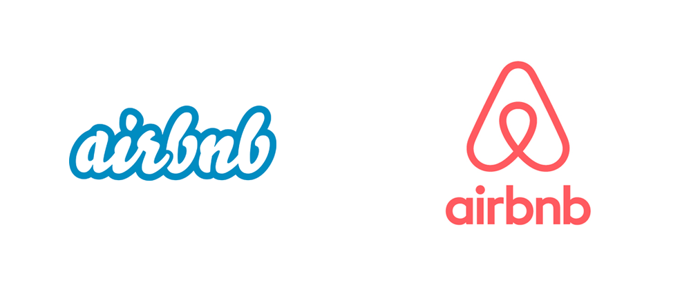
 So, let's get to it. The old logo, designed by one of its founders in mere hours, using Underware's Bello had the typical naiveté of a start-up logo and a heavy case of gradientism which was later cleaned up. The tightly-spaced, cushiony letterforms helped, in a weird unexpected way, communicate a sense of comfort and casualness that has served Airbnb quite well and built a modicum amount of equity despite the fact that you don't really see the Airbnb logo anywhere outside of their website and mobile apps. Clearly that is changing, now that the company is growing and seems to be intent on increasing its brand awareness to a more mainstream audience, and that's where the new logo comes in.
Tackling the easy part of the logo first: the wordmark. It's fine. I'm starting to believe that London-based designers have to sign a contract before being able to operate as a company stating they will only use Lineto typefaces. So it's no surprise that Lineto's Circular— although reportedly a customized version of it — has been chosen as the brand font. It's a nice, clean, and contemporary sans serif so you can't really knock it much.
To build a brand and not just a new marque, we began by creating a bespoke colour: 'Rausch'. Named in honour of the street where it all started, it is a colour which delivers the emotion and passion around the brand, without the aggression of pure red. Rausch is supported by a secondary palette, with colours and names drawn from continents and world cities, to create a memorable range to be used by Airbnb's vast internal design team.
DesignStudio case study
 Logo detail.
 Then there is the icon, nicknamed "The Bélo" (pronounced bay-loh) after the brand idea of belonging (although I would have enjoyed it more if it was in honor of the previous font). The icon is an abstraction of four principles — People, Places, Love, and Airbnb — that have been blended into this single "A" shape. Mr. Chesky waxes far too poetic about the symbol and its potential to unify cultures and people but he's not far off in trusting that this icon has the potential of being impressively representative of his company. It could possibly be as ubiquitous as "Wi-Fi" logos on cafes or TripAdvisor stickers in all kinds of travel spots if its community embraces it. It's a deceivingly simple icon that is easy to reproduce, recognize, and propagate. The dimension they have built into it (both in the renderings below and the animation where the logo spins at the 1:30 mark on the first video) show there is literally more depth to the icon than meets the eye and I hope they exploit that a little more.
To be more clear: this is a great icon. These days it's really hard to come up with an icon that can serve as an immediate identifier and sometimes it isn't about the icon — see Nike's swoosh (which ain't worth shit on its own — seriously, imagine it being launched today) — and more about the meaning imbued behind it through very dominant use and user adoption. Airbnb, right now, has the momentum to build all the meaning they want into this icon and I have a feeling they are going to pull it off.
 Airbnb insists users create their own icon, which you can do here.
 I wish they would back off on the "let's all make logos" gimmick. I understand the goodwill of wanting to give users some sense of ownership in the icon but I think if they were less obvious and adamant about it there would be a more genuine adoption of the icon. Some of the alternate versions of the logo, as created by Airbnb or DesignStudio, are cool (see animated GIF above) but the ones created by users with the Create tool are downright terrible and don't do much in advancing the brand. Make cool window stickers — like those that come in every single Apple product — and let people put them on their properties.
Now, there is the matter of the mob mentality who, yesterday, got all riled up about two things: 1) The new icon looks like the logo of Automation Anywhere and have claimed it was ripped off, and 2) the new icon looks like every sexual reproductive organ in the male and female anatomy. To the first claim: had you ever heard of Automation Anywhere before yesterday? Right, didn't think so. To claim that DesignStudio or Airbnb copied or stole the logo is idiotic. It simply points to the fact that neither logo is highly original in its shape and that it's possible that out of the millions of companies out there designing logos for themselves to arrive at similar solutions. To the second claim that the logo looks like testicles, a vagina, a butt, a penis, and an asshole — all already dutifully illustrated in this Tumblr (NSFW)— seriously, how old are y'all, 13? Grow up. It's a fucking "A".
 Business card and letterhead.
  Fashion-y prototypes.
  The main message.
 The icon isn't perfect and perhaps there was a little too much pomposity/grandiosity in its release, introduction, and language used but this is a really good change for Airbnb, signaling a maturity in its branding and an ambition to become a globally-known brand — you do need a certain amount of self-fanfare to pull that kind of stuff off but, mainly, Airbnb just has a really good offering that a very specific generation of affluent, globe-trotting, social-media-pumping users is embracing and you can't ask for better ambassadors than that. If Airbnb finds a way to make the icon adoption feel more organic (and state/country laws to be more favorable) I do think this icon has the 5- or 10-year potential to become more than just a corporate trademark.
