Established in 2001 in Edinburgh, Scotland and now with offices in Singapore, Skyscanner is an online travel search site that finds the best deals and connects users directly to the airline, hotel, car rental service, or travel agent, so it doesn't take commissions from the user. Skyscanner is available in over 25 different languages and has been lauded as one of the best travel search sites by media publications across Europe. Last week, Skyscanner introduced a new identity designed by Glasgow, Scotland-based Stand.
Logo animation.
![]()
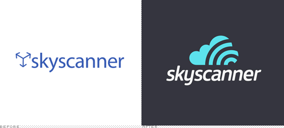
Perhaps it's the combination of the name, the soulless diagrammatic icon, and the default-looking typography of the old logo that the only thing I can think about is that this was the travel agent of the evil Skynet corporation in Terminator. For a site that boasts about friendliness and usability the old logo didn't portray that at all. In contrast, the new logo is a lovely and fluffy interpretation of the name, literally scanning the sky. A simple and smart concept leads to an equally simple and smart icon that proves to have amazing flexibility with the different offerings of Skyscanner as seen above — the "hotels" icon being one of the best extensions while "car hire" being one of the silliest, but still effective and within the style. The main drawback to the logo and identity is the typography, a very tightly tracked FS Jack set in italics, that doesn't quite complement the icon very well. Nonetheless, this is a drastically positive redesign.

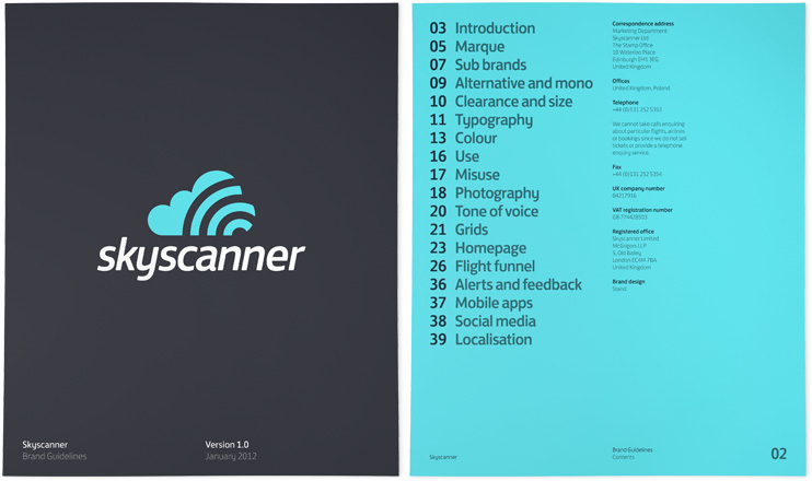
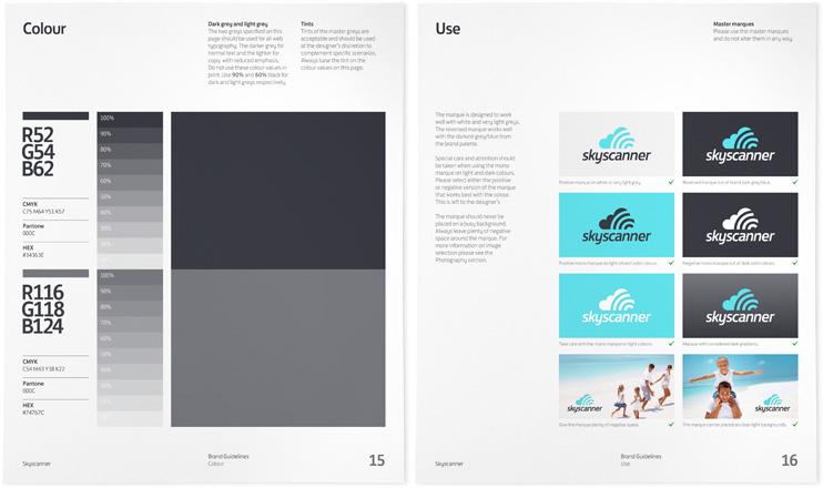
Some sample guideline pages.


Promo.
Thanks to Martin Eriksson for the tip.

Don't forget to cast your vote about this post online
