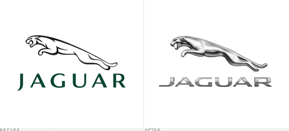
Established in 1922, Jaguar is a British luxury car manufacturer that makes real pretty and expensive cars. Jaguar is part of Jaguar Land Rover, which in turn is owned by Tata Motors. This week, Jaguar introduced a new marketing campaign created by Spark44 — a communications agency owned in part by Jaguar Land Rover — that "is driven by the belief that Jaguar makes the world's most instinctively rewarding performance cars," and aims "to increase awareness of the brand amongst a new audience in line with the brand's ambitious future plans." With it came a revised logo and corporate typeface.
The campaign, created with Spark 44, the international communications agency that's part-owned by Jaguar Land Rover, will feature print, TV, digital advertising and a new look that contemporizes the aesthetics of the brand at every customer touch point. The Jaguar brand will have new corporate identification and a new font, created exclusively for the brand. The dramatic alteration, including significant changes to the brand symbols of the "leaper" and "growler," is the most extensive change Jaguar has made to its visual identification in 40 years.
— Press Release

New "Machines" TV spot.

New print ad. Such a dumb, trite concept.
I have always liked the Jaguar logo, for no particular reason other than it's well executed, seems well managed, and it's never tried too hard. With this last version it is trying so hard to be cool and relevant it's become annoying and, worse, noticeable. Not so much in the jaguar itself, or "Leaper", which has always featured some kind of metal finishing, but in the typography. Whereas the previous wordmark looked like a luxury, fashion-line brand, the new one has lost all sophistication in exchange for an overly extended, industrial look that cheapens its appearance. It reminds me of the Dodge logo, which I don't associate with hundred-thousand-dollar cars. The sample of print advertising I found does not help their cause either: I mean, seriously, a sonogram? They seem to have lost track of their audience or what a luxury brand should look and talk like. The TV spot is more successful in establishing Jaguar as an integral part of innovation and industrial evolution as well as defining a slightly edgier personality. Overall, there is a lot of confused messaging and execution. I won't be buying a Jaguar anytime soon … not out of principle of their poor branding but because I can't afford it.

Don't forget to cast your vote about this post online
