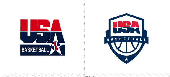
Established in 1974 as the Amateur Basketball Association of the United States of America, USA Basketball — renamed as such in 1989 when FIBA modified its rules to allow professional basketball players to participate in international competitions — is a non-profit organization that acts as the governing body for men's and women's basketball in the U.S., responsible for selecting and training the teams that participate in events like the Olympics and FIBA World Championships. This week USA Basketball introduced a new logo that replaces the current version, in use since 1989 and made world famous by the original Dream Team at the 1992 Summer Olympics in Barcelona.

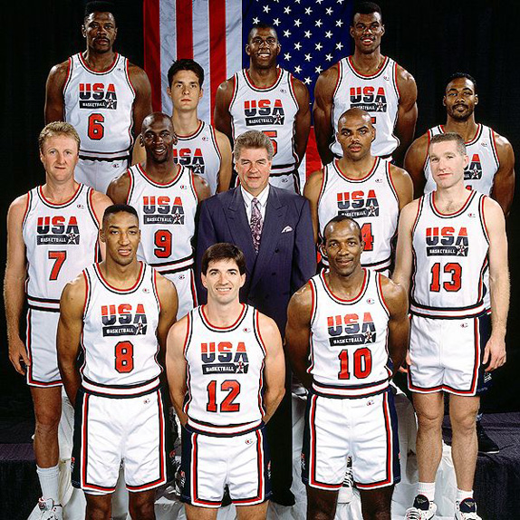
1992 Dream Team. They don't make 'em like they used to. Look at that roster (just ignore Laettner).
USA Basketball's new logo incorporates the existing USA type into a badge-shaped mark which reflects the honor of playing for the United States of America's national team. Also featured is a basketball, a nod to the original Amateur Basketball Association of the United States of America (ABAUSA), and a single star, symbolizing players from all over the country coming together as one team with a common goal.
— Press Release

With so many NBA teams sporting vintage uniforms and logos this season, the old USA Basketball logo doesn't seem that much out of place right now, even if it looks as if it could have come straight out of the Julius Erving-1970s-ABA days. But today's USA teams look nothing like they used to so a more contemporary logo is a welcome change — and lo and behold, it doesn't entirely suck. It's a restrained effort with few elements executed as minimally as possible without gradients and ten different strokes. The "USA" block lettering could have used some additional finesse but I really like how the white line that strikes its middle aligns with the top of the shield creating a curve that extends all across. The "Basketball" type is simple and decently tracked, considering all the area it has to cover and I mostly appreciate that it doesn't have spikey serifs to signify speed and movement. Even the change of the star's size, from a main to a supporting element, is remarkably (and relatively) sophisticated. Overall, a definite improvement.
In Related USA Basketball News

Last week Nike also unveiled its Team USA uniforms, to be used at this year's Summer Olympic Games, that showcase their very own "USA" logo. The story first broke on Yahoo! Sports with a post titled "Nike's Team USA basketball logo is hideous". It's not the next IBM logo, for sure, but it's far from hideous. It's actually a highly energetic and aggressive rendition of "USA". I love how it "points" up; a nice allusion to the fact that these people can literally jump over you. The writer mentions that the logo "has earned derision for looking too angular, too Superman-like and way too ugly." I actually like the Superman reference as, again, the athletic abilities of these folks are not quite ordinary. The logo isn't perfect and I'm not sure why I am defending it that much but given the propensity of sports branding to go awry, Nike's logo, along with the USA Basketball, show that there is still potential for decent executions.


Don't forget to cast your vote about this post online
