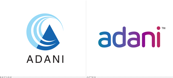
Founded in 1988, Adani Group is one of the largest conglomerates in India with businesses in industries ranging from coal trading and mining, to ports and transportation, to power generation and gas distribution. These activities have now been organized under three main headings: Resources, Logistics, and Energy. Adani has 9,000 employees with offices in India, Australia, and Indonesia. Looking to further expand its reach and business as well as "to manage its brand actively and professionally" Adani Group has introduced a new identity designed by the Dubai office of Wolff Olins.
The logic behind the new brand is encapsulated in the phrase 'Thinking big. Doing better.' This is not intended to be an advertising strap-line but simply a shorthand to explain the spirit in which the Group works. […]
Adani has also chosen to adopt a new visual expression to symbolise the modernity and international potential of the Group's business as well as the simplicity of the integrated model.
— Wolff Olins Case Study

![]()
Icons for the three divisions — Resources, Logistics, and Energy — above. The full chain of their business, below.
![]()
Logo animation.
Brand video.
The old logo looked like what the logo for a fake global conglomerate that George Clooney has to infiltrate to reveal its wrongdoings would look like in a movie. It was generic, swooshy, and with really bad typography. The new logo corrects at least two of those traits: The swooshes are gone and the typography isn't "really bad" anymore — as set in Miles Newlyn's Rubrik — but the generic feel, now attuned to the twenty-first century, is still there. The lowercasing, the rounded sans serif, the colorful patina against a white background — it's all there. That is not to say that the logo is bad, it's not, it's a perfectly capable execution, but we've been there and done that many times over. The real star of this identity is the icon set that gives personality and presence to the three areas of business that create a shorthand for an otherwise complex company. The icons are succinct and strong, if perhaps a little cartoonish, but you have to like that miner! Overall, it's a good redesign and it's a drastic and positive change for this company but, for the rest of us identity nerds, there isn't much to mine from.
Thanks to Vinit Basa for the tip.

Don't forget to cast your vote about this post online
