Brand Lightning

Established in 2005, Experticity, as its name sort of implies, is focused on the empowerment of experts who work in retail. The gist, as I understand it, is that Experticity works with consumer brands and retailers to better train, inform, and reward their people on the floor with the goal of turning them into brand experts and ambassadors with the acknowledgment that passionate salespeople have a higher percentage of sales and, when applicable, would make more on commissions. As a consumer it's always rewarding when you leave a store with a purchase that you feel confident about because the person that helped you knew their stuff. Those memorable shopping experiences is what Experticity tries to increase for the retailers and brands — like Dillard's, GoPro, REI, The North Face, and UGG — that hire them. In January, Experticity introduced a new identity designed by San Francisco, CA-based Attik.
According to [Stu Melvin, who led the project at ATTIK], the new VIS had two major goals: projecting a memorable, human-centric brand identity reflecting the electric experience of interacting with a passionate expert; and accommodating the brand's need to be effective across all industries.
"The concept of the lightning bolt was retained from the previous identity," Melvin explained. "The bolt is a powerful brand icon that we applied throughout the larger system. From there, we incorporated a 'human touch' approach to key elements of the completed VIS by using texture on a warm color palette, handcrafted typography, playful illustrated iconography, and an optimistic style in our photographic elements."
Attik press release
 The elements of the identity: 1) Tone-of-Voice 2) Logo 3) Bolt 4) Badges 5) Photography 6) Texture 7) Typography
 The Experticity logo was created from custom letterforms to create a classic look. This smooth, scripted mark uses the connection of the T's to create fluid movement from left to right and enhance legibility.
Brand guidelines
When I first glanced at this project, I thought, "Meh, it's fine". The before logo was bad enough that almost anything would be an improvement over its wonky lettering and forced-X-into-human-sprite feature. The new script logo is a charming enough script to pass muster and the lightning bolt going from "t" to "t" was a nice touch. But the lack of refinement or, more importantly, the lost opportunity to craft a truly unique script wordmark with better rhythm turned me off. Peeking at the limited pages of guidelines posted along with the press release, however, made me think there was more to this. After asking, receiving, and perusing the full brand guidelines I saw what an exemplary and well thought out identity system this was… despite the coulda-been-awesome logo. (With so many Dribbblers churning out wonderful script wordmarks there was no going wrong with hiring someone).
The Experticity color palette is a strong representation of a brand that informs and engages a broad range of industries. The colors are bold, but not overwhelming; playful yet elegant. Each color was tested (as shown in the examples that accompany the color information) multiplied over an image in order to create an overlay system for images if needed. This allows flexibility with images of questionable quality, or images that struggle to host typography or other graphic elements.
Brand guidelines
 Color palette for the logo.
 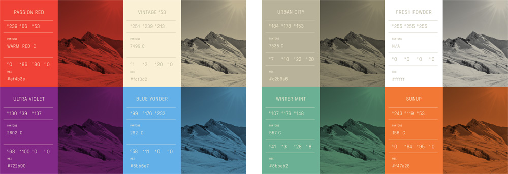 Primary (left) and secondary (right) color palettes.
 Through a really tight presentation in the guidelines — most of the images here are pulled directly from them (sans all the longer explanatory texts and page layouts) — the identity has a seemingly simple execution of a bolt here, spaced typography there, sparks of bright colors everywhere that fall in line with plenty of today's trends but here all of the ingredients come perfectly into place creating a vibrant and energetic visual language for a service where you would least expect to find something cool (i.e., training people to better sell you more shit).
The large bolt acts as an elegant and refined form when reduced and is very effective when used as a divider, particularly when separating a headline from a subhead or a block of text.
The small bolt, though shorter in limb and smaller in stature, creates a powerful effect when used as a division tool or graphical element. It's also good for calling attention to text and infusing it with a 1950s utilitarian aesthetic.
Brand guidelines
 The bolts.
  Typography application. Fonts are Pressura from Grilli Type as the sans serif and Mr. Dafoe from Sudtipos as the script.
  Explanation for how to use the underline with Mr. Dafoe.
  A third kind of type treatment is the hand-drawn typography for large headlines.
  Other types of badges denoting category expertise or that a brand is Experticity-certified.
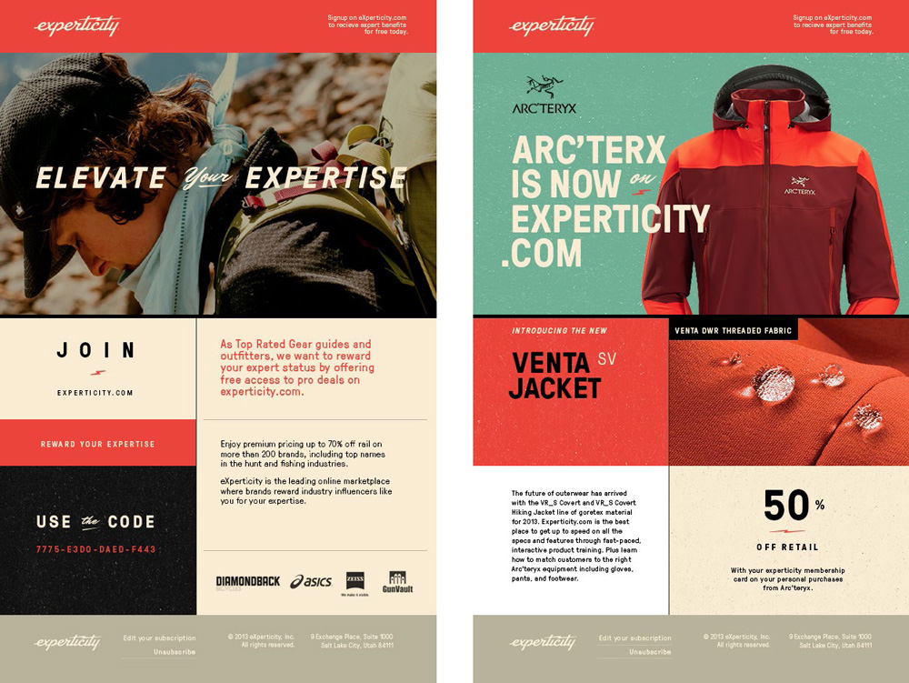
 Sample e-mail blasts.
 The extent of the work — from detailing how to use large bolts, big bolts, and tiny underlines to an exhaustive library of category icons — is remarkable and shows that what may seem like the stylings du jour are part of a very considerate visual system that provides a kit of parts to generate all kinds of motivational, educational, and persuasive materials around the subject of brands and brand ambassadors. Not an easy challenge. Solved with great panache by Attik.
