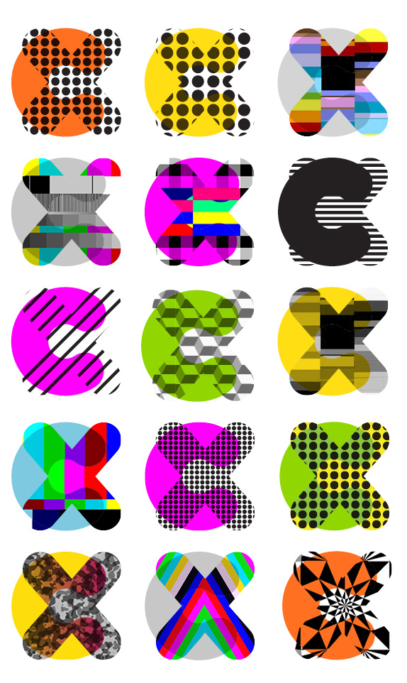
In Beta and Alpha versions last year, CX (formerly Cloud Experience), a "cloud storage and data file management system," launched this month. Aiming to compete against Dropbox, CX allows users to sync their files, e-mail, and calendar on the magic place that is the cloud and they are trying to do it with more graphic and social media flair than Dropbox. Their new identity has been designed by Moving Brands.
Cloud Experience had already invested heavily in the domain name [cx.com], so a thorough naming process working within these limitations led to the solution of 'CX.' The aspirational and user-focused strap line "Cloud to the Power of X," suggests an offer that encompasses all you expect from the cloud, magnified to the infinite power.
The visual identity system was driven by the important relationship between the copy and graphic language. The vibrant core assets are complemented by a library of color and pattern elements. A bespoke typeface was created that includes a built-in open-type iconographic system. The unique graphic language is supported by a tone of voice and messaging system built of the Brand Behaviour and Brand Character attributes. A system of curated photography completes the system.
— Moving Brands Case Study
Redesign process video.


Considering that it was a logo for a start-up in a buzzy-word industry, it wasn't that terrible. Yes, it had the obligatory gradients, app-like aesthetic, and bad typography, but we've seen worse now and in 1999. The new logo is a great revolution of the identity from something shy and generic to something full of personality and confidence; and even though it follows some of the generic formulas of most recent identities — bold, rounded, bright colors, changing textures — it manages to mix the familiar ingredients in a cohesive way. From what I can see online, it doesn't seem like CX is eager to try any of the psychedelic texture combinations of the logo but it does use the texturing in some of the supporting graphics, which look, for lack of a more dignified and serious critique, pretty darn cool. I'm not sure exactly how "bespoke" the chubby rounded sans serif is as I feel like I've seen it before but, if anything, it needed more bespoken-ness to take it to the next level. There is also a supporting appearance from light versions of Gotham Rounded that seem out of place, despite matching the roundedness. Overall, this is a high-energy redesign for a service that could use some swagger to debunk its competition.

Tagline: "Cloud to the Power of X".
![]()


Don't forget to cast your vote about this post online
