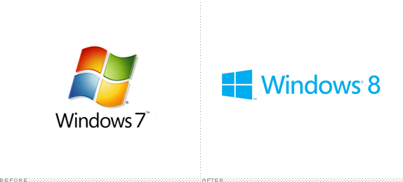
Gearing for its latest OS release — after a couple of lackluster and user panned versions in Windows Vista and Windows XP (and continued mockery from OS X users) — Microsoft has been slowly releasing previews and developer versions of Windows 8, a complete rethinking of one of the most frightening computer-using experiences. Based on Microsoft's "Metro" design language, Windows 8 adopts the user interface currently in play on the Windows Phone OS. By the end of February, Microsoft will release a consumer preview (don't call it Beta) of Windows 8 and its new logo was recently spotted. Update: This post has been revised with design credit to Pentagram partner Paula Scher and text from Sam Moreau, Principal Director of User Experience for Windows; scroll to the bottom.


Principles of Microsoft's "Metro" design language.
Official video from Microsoft introducing the new user interface of Windows 8. A sample screen below.

Windows Phone user interface.
You have to hand it to Microsoft for reigning in their design approach to something more simple and useful — and dare I say pleasant to look at. The Metro approach relies on the Segoe font family, originally designed by Steve Matteson for Agfa Monotype and later licensed by Microsoft, which has been deployed on most Microsoft materials in the last four or five years. It's a fine font, but pretty it is not. It's a kind of middle-of-the-road sans serif without any memorable attributes and with a very peculiar "Default" aesthetic to it. It works best as a user interface ingredient but as the typography on a logo, it's extremely underwhelming — pair it with the worst rendition yet of the Windows window and you have a real loser. I'm not saying the previous Windows icons were good, but they had enough abstraction (and gradients and shadows and highlights) to at least look techie and Microsoft-ey, but this "minimal" approach looks like, well, a window. A window in a $400-a-month studio apartment rental with beige carpeting and plastic drapes. Moving away from the more flag-like icon seems like abandoning two decades of equity — crappy equity, but equity nonetheless.
Update 02/17/12 @9:53 am: Just got a note from a very unexpected source (on the design side) that this is indeed the wrong release logo and that the proper one should be launched next week. Stay tuned.
Update 02/17/12 @11:47 am: The Windows Team has just published a post on their blog with details on the new logo, designed by Pentagram partner Paula Scher.


1. We wanted the new logo to be both modern and classic by echoing the International Typographic Style (or Swiss design) that has been a great influence on our Metro style design philosophy. Using bold flat colors and clean lines and shapes, the new logo has the characteristics of way-finding design systems seen in airports and subways.
2. It was important that the new logo carries our Metro principle of being "Authentically Digital". By that, we mean it does not try to emulate faux-industrial design characteristics such as materiality (glass, wood, plastic, etc.). It has motion — aligning with the fast and fluid style you'll find throughout Windows 8.
3. Our final goal was for the new logo to be humble, yet confident. Welcoming you in with a slight tilt in perspective and when you change your color, the logo changes to reflect you. It is a "Personal" Computer after all.
— Sam Moreau, Principal Director of User Experience for Windows
My opinion now that this has come to light? Remains the same. Nicer blue, though.

Don't forget to cast your vote about this post online
