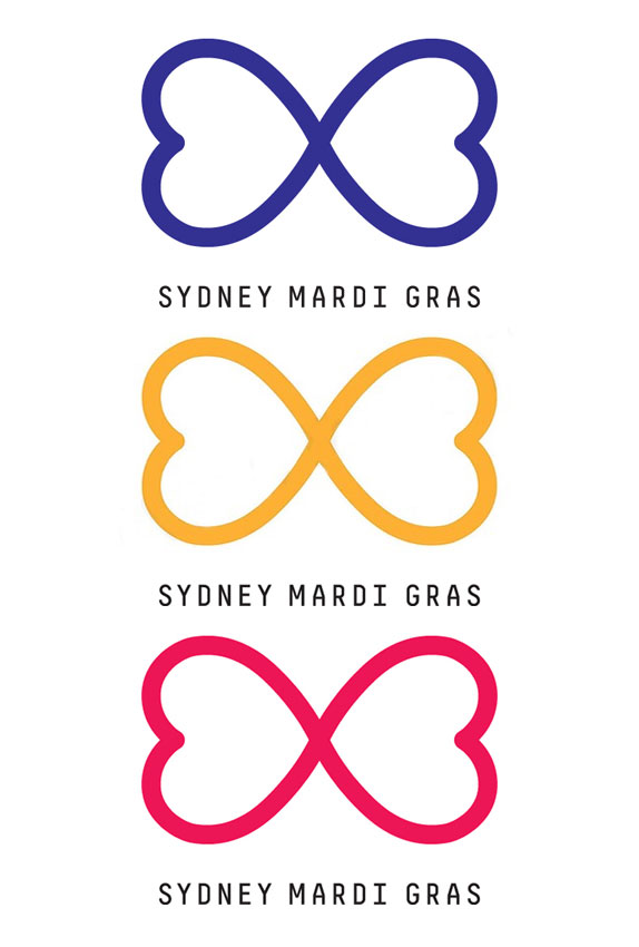
Since 1978 Sydney's Gay & Lesbian Mardi Gras has evolved from an act of protest, into one of the city's biggest annual parties, with an associated festival program that celebrates the diversity of the Gay and Lesbian community. The event draws tourists from around the world, and is renowned as one of the biggest, brightest, and most fabulous celebrations of all things LGBT. Every year, one of the city's main thoroughfares, Oxford Street, is taken over by thousands of people who dress up, (or in many cases, dress down), to parade and party all night. After a few ups and downs in previous years, including a bankruptcy and a rename, the festival has revealed a new logo, designed by Sydney-based Moon.
The above video tells the back story of Mardi Gras, as well as explaining the strategy and insight behind the new brand. The idea of love being an endless resource, as reflected in the mark, brought a smile to my face. Perhaps a little bit on the cheesy and earnest end, but then the world needs more brands that really believe in and support something, rather than window-dressing for a profit motive. The old mark, a stylised representation of the Sydney Opera House, looked nice enough but always puzzled me as to its appropriateness. Whilst it did a great job of communicating "Sydney" — through colour, often fluorescent pink, and graphic treatments, often rainbows or worse — it focused too much on the location, and not enough on the core idea or beliefs of an LGBT festival.

The new mark, a stylised infinity symbol / butterfly / bowtie / boobs / bums, is made from two love hearts gently pecking each other at their points (no euphemisms intended but, wow, didn't that turn out laden with meaning?!). Whatever the heck this mark is supposed to be, it's just fine the way it is in all its beautiful uniqueness, and it's definitely a vast improvement on the previous symbol. The concept behind the mark, communicated as "an expression of our one endless resource, love" is compelling, despite my inbuilt reaction against anything with even a whiff of an infinity symbol. I found the mark instantly endearing in a friendly, squishy, kind of soft and cuddly way, whilst the simplicity and clarity give it the potential to become iconic and instantly recognisable over the coming years.

The typeface choice, Simple by Lineto if I'm not mistaken, plays a very secondary role in support of the mark, which is fine. Perhaps it's too secondary and recessive, but the plan seems to be for the brand to be clearly focused on the mark. Beyond the mark, the identity elements seem to fall into some of the more tried and tested conventionalities of being "innovative" these days. Colour? Sure, choose whatever you want! Images in the logo? Yep, go right ahead, have a ball! The difference here is that this is one of the few organisations where a multi-coloured, image-embracing container, free-for-all, do whatever you want as long as you're "out there and loving every minute of it" of an identity system is not only permissible, it's probably required.

This new mark for the Mardi Gras will live on almost every imaginable medium, from printed brochures and posters to online and broadcast to serving as a small endorsement and on massive scale banners — it'll even get painted on faces and plenty of other places of the body. Some might love the brand so much they might even be tattooed with it, like the Head of Marketing & Communications at Mardi Gras has done. Well now I really have seen everything!

Don't forget to cast your vote about this post online
