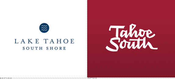
Located smack in the middle of the border between California and Nevada states, Lake Tahoe is one of the most popular vacation and fun-having destinations in the U.S. with a mix of nature-y stuff like skiing, hiking, boating, and more as well as, thanks to its Nevada location, plenty of gambling. Lake Tahoe has two main cities, Tahoe City to the North on the California side and South Lake Tahoe on the South still in California but a stone's throw away from Nevada, making it more attractive to the work-hard-play-hard crowd. In charge of the South side is the Lake Tahoe Visitors Authority who are intent of making their side the side to be in. Changing the destination name from Lake Tahoe South Shore to simply Tahoe South, they have introduced a new identity designed by San Francisco, CA-based Duncan/Channon.
The strategy embraces the truth of the destination, that it's the place for the up-all-day-and-night visitor, and the brand identity celebrates this spirit.
— Duncan/Channon Case Study

I have recently stayed away from doing full reviews and opinions of destination branding because most aren't that inspiring or different, but this one got my attention. First, because the old logo was quite decent, with a sophisticated if slightly generic icon, and some generously spaced Mrs Eaves. But the new logo has a very unique energy and roughness to it that, even if also slightly generic in that any fun, rough-and-tumble-outdoorsy destination could adopt, makes it boldly unique and different. Executed by lettering experts Underware, the logo has a great presence with bold, hard-angled strokes and it pairs beautifully with properly curated photography and it stands out nicely on the website, whether it's next to a few douchebag-ey-looking dudes or shots of the lake itself. This is probably not the best destination branding job of the year, but definitely one of the best examples of commissioned lettering with a strong purpose.


New winter out-of-home campaign, with illustration by Kustaa Saksi.

Don't forget to cast your vote about this post online
