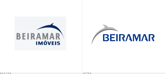
Established in 1981, Beiramar is one of the largest real estate companies in Brazil with over 3,000 rental properties and over 30 builder partners with whom they develop properties. A new identity has been designed by Bertoni Design.


I really enjoy redesign jobs like this one, where it's a graphic exercise in betterment that doesn't require layers of meaning and rationalization. You can just decide "Better" or "Worse" without much remorse. The previous logo was terribly executed with a dolphin that looked as if it hadn't eaten in a long time and an unfortunate combination of sans serif typefaces that have nothing to do with each other. The new logo is a vast improvement, even if far from perfect. The dolphin is very nicely executed and is an example of a proper use of a swoosh. Changing the dolphin's orientation puts the logo in the right direction and movement. The wordmark is where things get a little awry. The "A"s look nice and match with the dolphin; the "R" sort of does the same; the "E", "I", and "M" just sit there; and the "B" is like from a completely different logo with the squared- and cut-off crossbar. So, not ideal, but definitely more palatable than the previous typography. The applications get a little sinuous for my taste, but there is some decent integrations of the dolphin's fin and the use of dark blue keeps it from becoming too unsophisticated. Overall: Better!

Don't forget to cast your vote about this post online
