Stars and (Wavy) Stripes

Established in 1891 in Eindhoven, the Netherlands, Philips now endeavors in a wild variety of industries including (take deep breath): "cardiac care, acute care and home healthcare, energy efficient lighting solutions and new lighting applications, as well as lifestyle products for personal well-being and pleasure with strong leadership positions in flat TV, male shaving and grooming, portable entertainment and oral healthcare." Because its products and areas of specialty are so broad it is understandable why Philips prefers to be described as "a diversified technology company, focused on improving people's lives through meaningful innovation". Last week, Philips introduced a revised logo and identity created by Philips' in-house design team, led by Global Head of Brand Design Thomas Marzano, working in partnership with Interbrand, Ogilvy, and OneVoice.
 Comprehensive timeline.
 Originally launched in 1938, the updated shield retains the core elements symbolizing Philips. Stars represent sparks of innovation, waves show our digitally connected lives and the circle expresses the people we touch around the world.
The design story of the new Philips shield on YouTube
 New tagline, read as "Innovation & You".
Explanation of the new design.
New tagline, read as "Innovation & You".
Explanation of the new design. This is a relatively hard redesign to assess as it hinges on whether you like or not like — "like" is perhaps the wrong word, so maybe we'll go with "appreciate" — the legacy and long-standing visual manifestation of the Philips brand as a logo in a shield with wavy lines and stars in it. I have never felt emotionally charged one way or another towards it. It's neither great nor terrible. It has been like that for so long that I really can't imagine it being any other way. And most likely it will never be another way. So a subtle redesign — or, conversely if you think about it, drastic in the context of its consistent history — is as good as it's going to get.
The new shield looks more relaxed and less machine-like, mostly thanks to the little bulge on the top and softening the joints of the stars. Getting rid of one wave simplifies the design for small applications. (Although I liked the line-thickness consistency between the three waves and the shield shape). Going with a color-filled shield also helps establish a bolder presence. It's hard not to like it, because most changes have been made for the benefit of the "physicality" of the logo — they may not make for an iconic and historic piece of logo design but it functions. I will probably voice what others are thinking: I could do without all the golden ratio rhetoric and be satisfied with an "it just works better, see?" explanation but that don't make for good investor relations!
Logo launch projection mapping presentation in Amsterdam. Business card.
  Sample use on packaging.
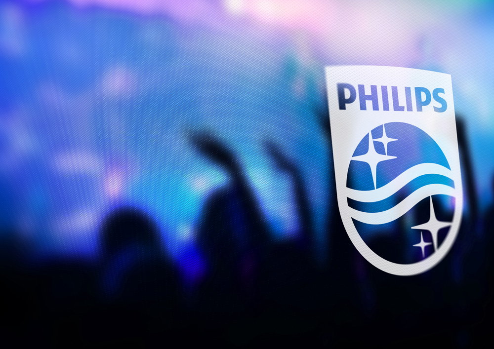 Logo on big TV.
 Online applications.
  Outdoor ad.
 In application there isn't much to see yet, as it will be a slow rollout for sure. The key element is the rounded corner, which may be too subtle for mainstream appreciation and I doubt it will become a truly defining and distinctive feature that will make the Philips aesthetic stand out in the marketplace. Nonetheless, the prototype business cards and packaging look promising in their simplicity. Overall, no surprises here: it's a safe and smart evolution for an extremely large brand.
